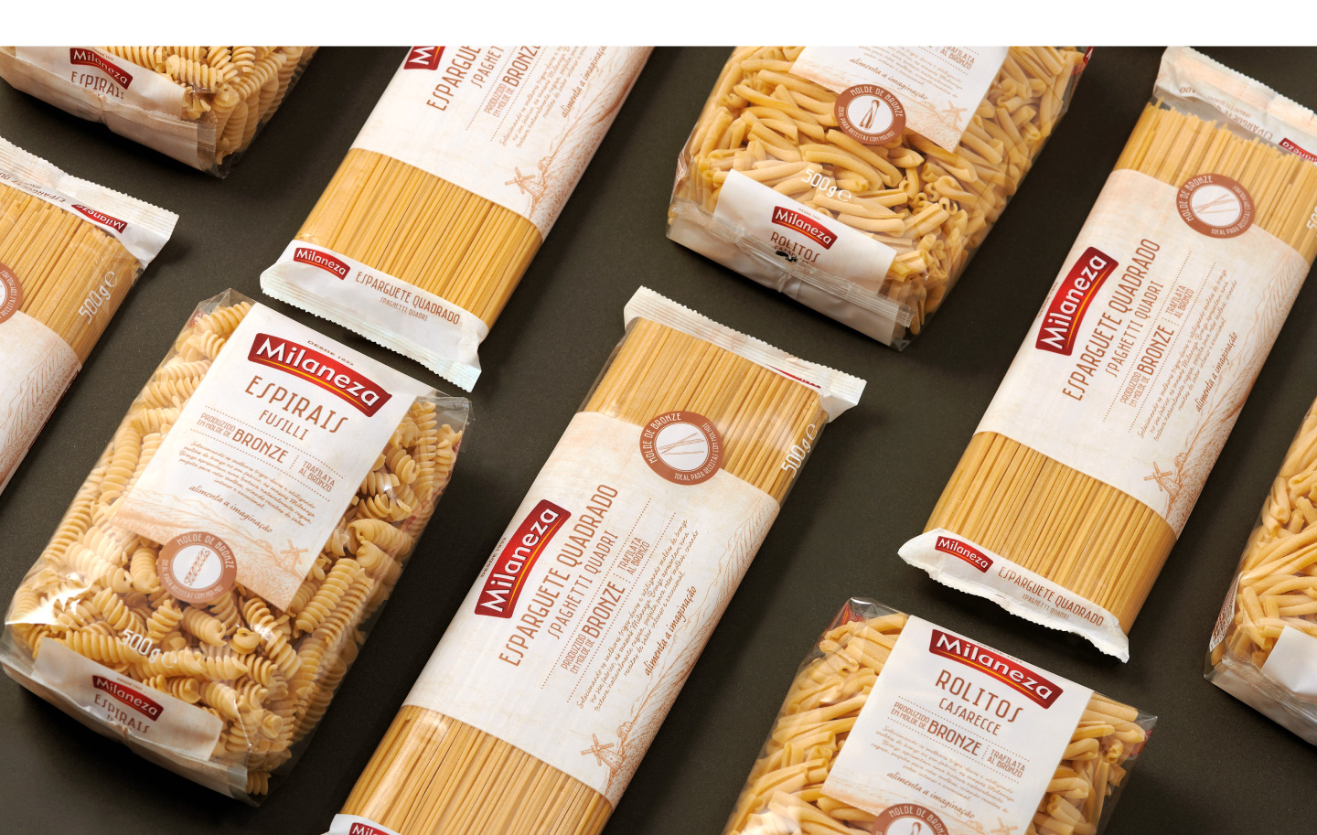
In Portugal, Milaneza is synonym of pasta. It’s the number one brand in sales and the most innovative within the Cerealis company, always relying on products with added value for the consumer. They have entrusted Little Buddha Agency the launch of the new range Milaneza Bronze Die.
The challenge for the agency was to introduce an innovation on the Portuguese market, which is actually a “revival of a tradition”. The launch of a type of pasta that is based on a traditional method of production: pasta made in a bronze die (or “mold”), much more artisanal and which allows, due to its porosity, to better retain the sauce of the dishes and provides more flavor to the consumer when compared to traditional pasta.
On one hand, a powerful and informative packaging design which allows explaining this proposition of a differential value, knowing that there is no media investment planned for the launch: Packaging as a “superhero” on the supermarket shelf.
A proposal that conveys a premium and sophisticated positioning, but not elitist/distant for the traditional pasta consumer. The aim is to attract consumers from other more premium pasta products already on the market. To achieve this positioning, the following were used:
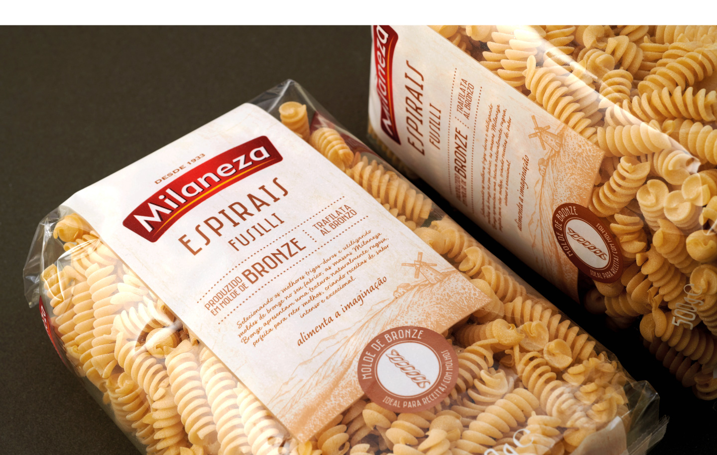
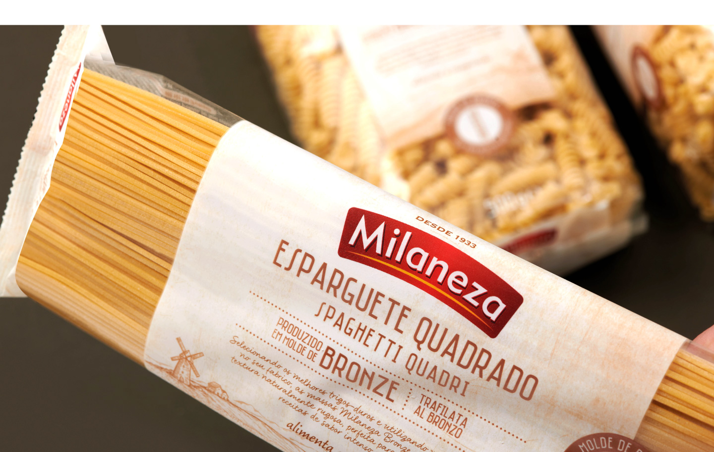
– Premium graphic resources, such as special inks and with a special texture.
– A chromatic range away from the usual green color of Milaneza to gold, beige and Kraft paper tones, to reinforce the rustic and handmade attributes.
– A strong quality seal to emphasize the traditional “Molde de Bronce” (Bronze die) method.
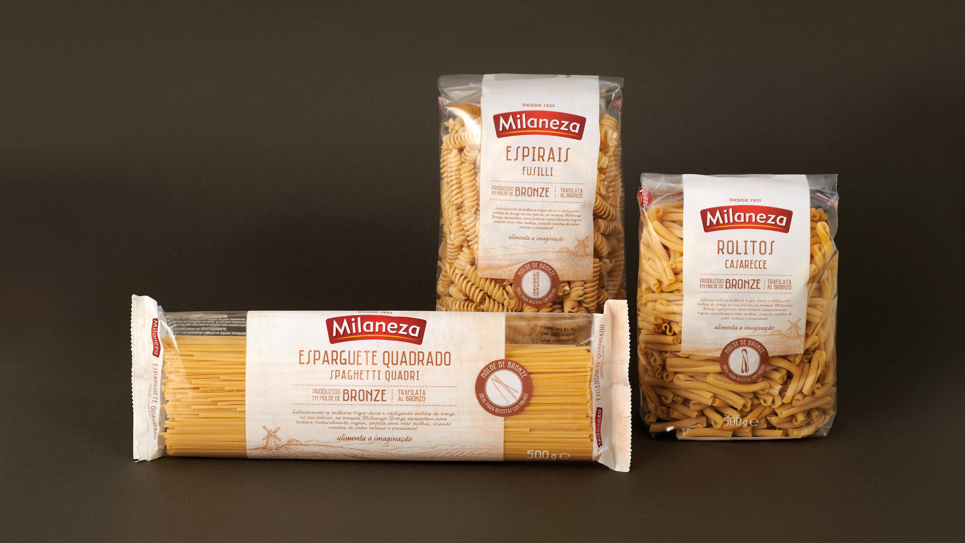
On the other hand, execution of a transversal design that should work for the whole “Bronze Die/Mould” (Molde de Bronce) range, initially composed of 3 varieties: Spaghetti, Fusilli and Casarecce. A design that reinforces the naturalness conveyed by all Milaneza brand products.
The result is a sophisticated and distinctive design, for an exceptional range that retrieves the traditional Italian production method. An eye-catching packaging that adds value for the consumer.


CREDIT
- Agency/Creative: Littlebuddhagroup
- Article Title: Milaneza Pasta Packaging Design a Perfect Blend of Tradition and Innovation
- Organisation/Entity: Agency, Published Commercial Design
- Project Status: Published
- Agency/Creative Country: Spain
- Market Region: Europe
- Project Deliverables: Packaging Design, Product Architecture


