


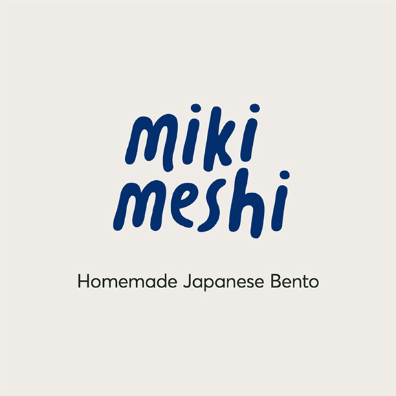
miki meshi is a group of Japanese mums who love cooking and eating; brought together by their appetite to share the home-cooked food they grew up on. Miki (a girl’s name in Japan) comes from a combination of the three founders’ names, whilst meshi loosely translates to ‘grub’.
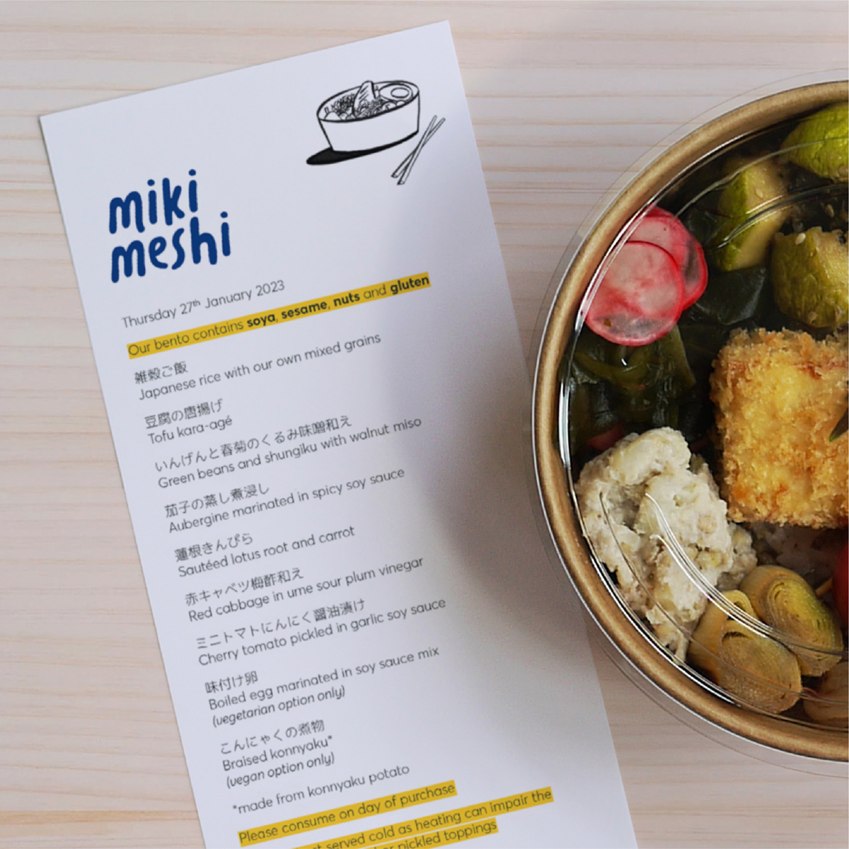
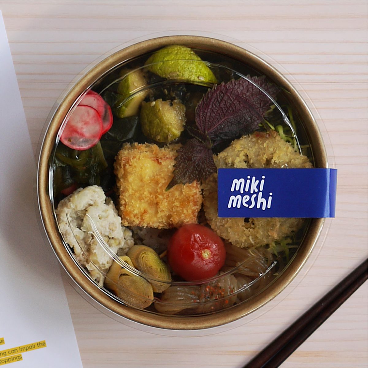
Originally starting out in 2013, they began by hosting the occasional supper club for local friends, showcasing traditional Japanese food. Putting things on hold in 2017, they came back in 2020, this time making vegetarian bento lunchboxes for people working from home. Japanese people cherish bento as they grow up, especially those lovingly made by family members.
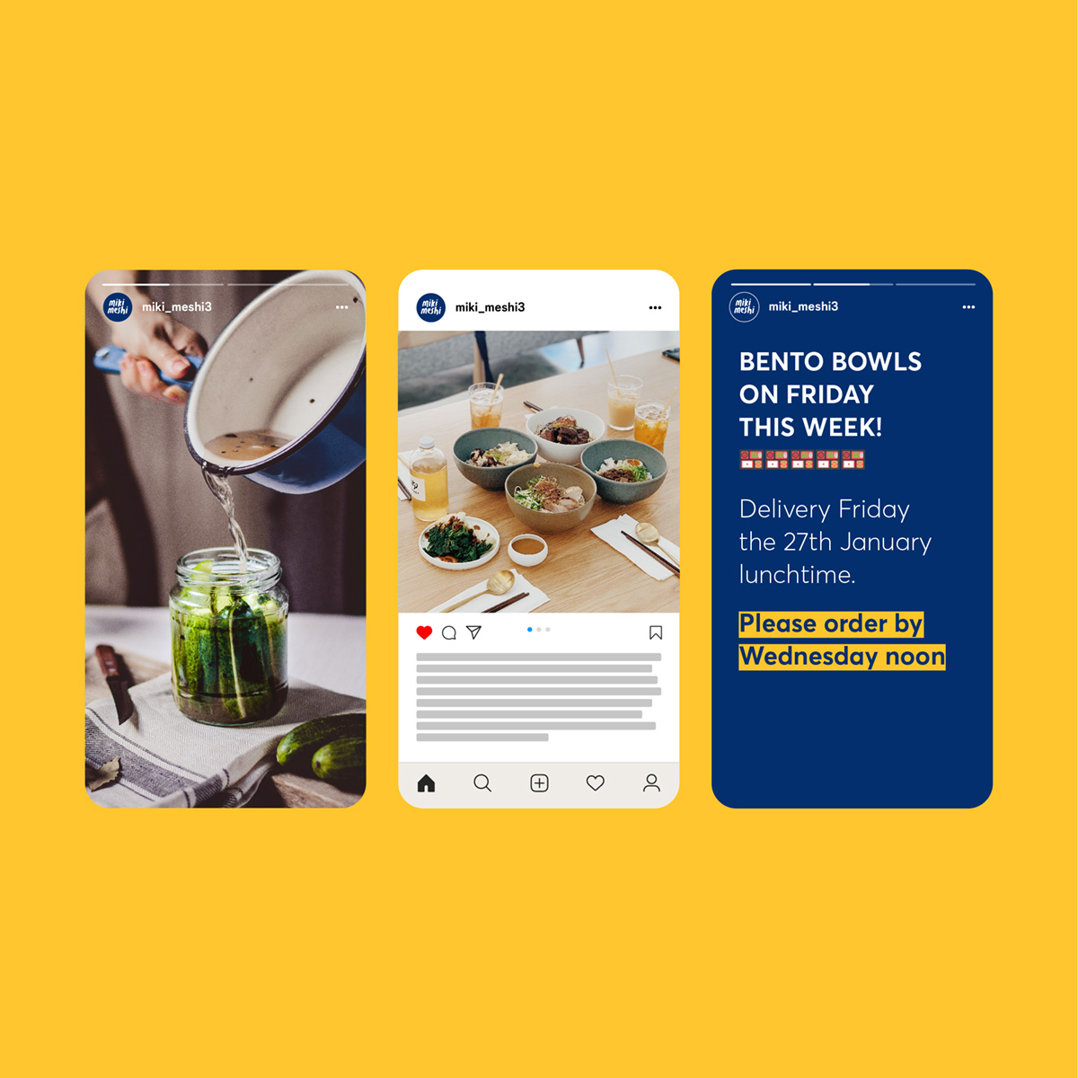
With more and more people working from due to the pandemic, the business grew quickly and they felt they needed an identity that better reflected their offering and values.
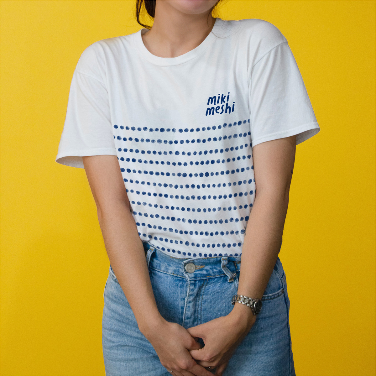
Working closely with their founders, we wanted to create an identity that felt humble, familiar and lovingly crafted. It’s this casual familiarity that inspired the logo, like a handwritten note that’s been bundled into your bento box before heading off to work/school.
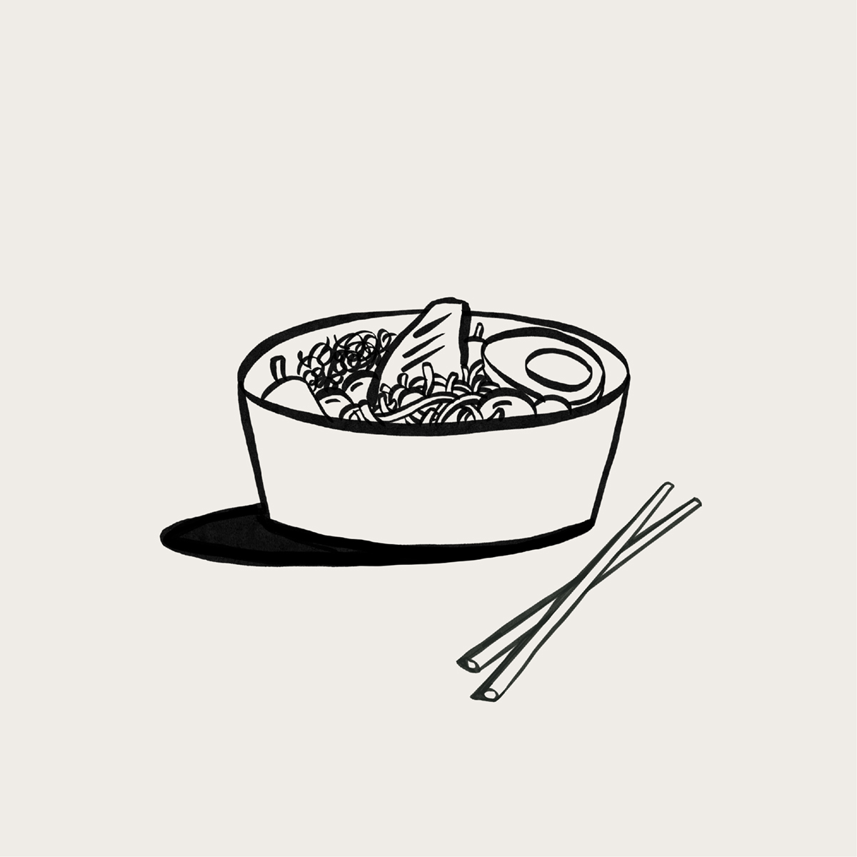
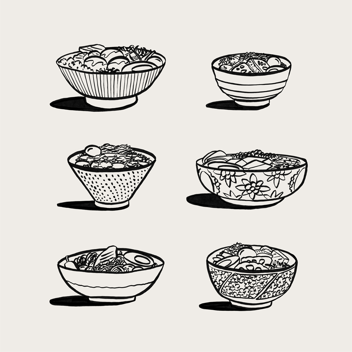
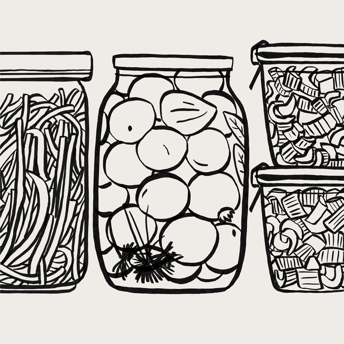
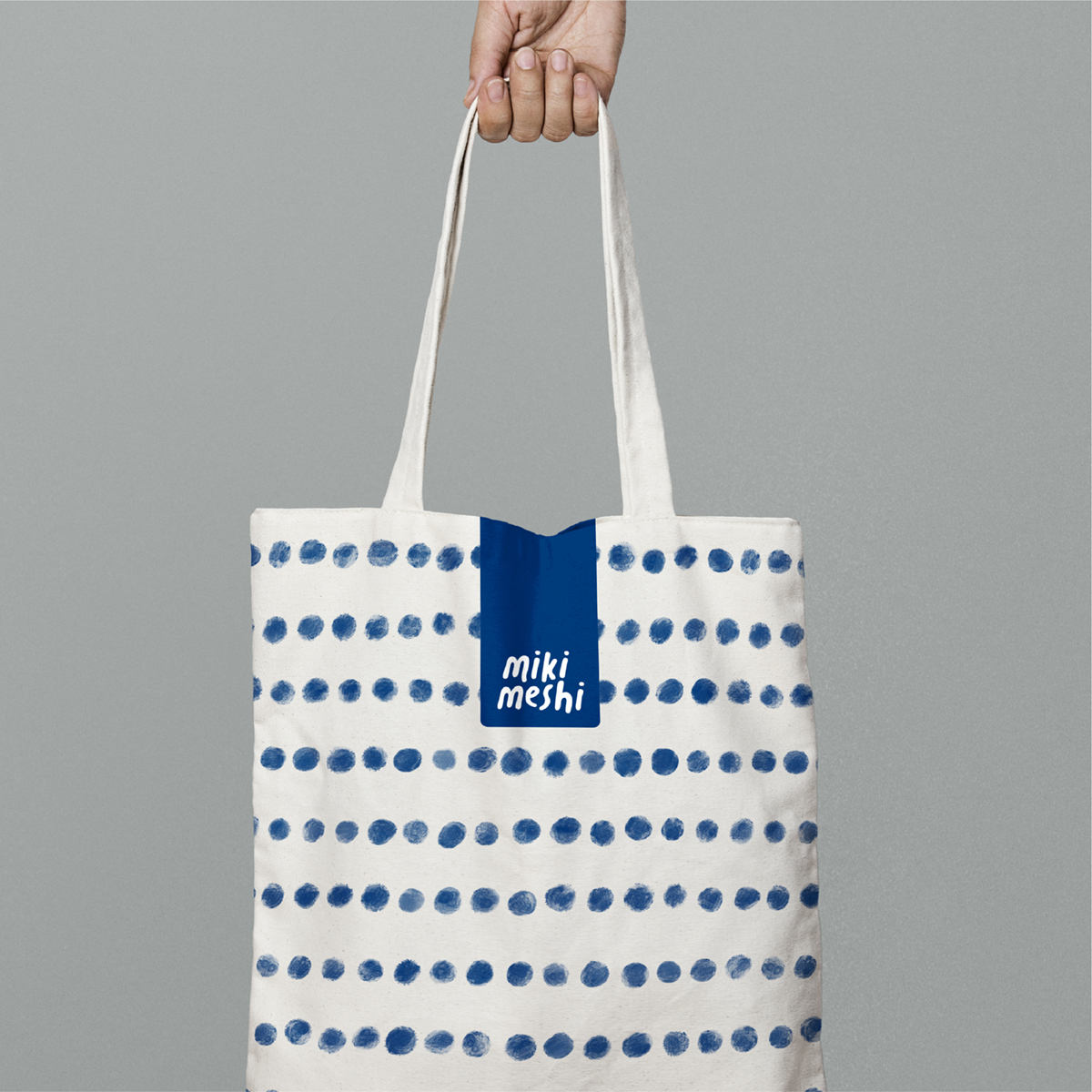
The other brand ingredients followed suit, taking cue from parts of Japanese culture without veering into the clichéd. Simple brush pen style illustrations add a touch of playfulness and nod to the artistry of calligraphy, and the polka dot pattern, ‘mame shibori’, is a symbol of good health and long life. Incorporating it into the identity felt like a natural fit with their ethos of making healthy, home-cooked food.

CREDIT
- Agency/Creative: So Savoury
- Article Title: miki meshi Brand Identity
- Organisation/Entity: Freelance
- Project Type: Identity
- Project Status: Published
- Agency/Creative Country: United Kingdom
- Agency/Creative City: London
- Market Region: Europe
- Project Deliverables: Brand Creation, Brand Identity, Branding, Design, Illustration, Logo Design, Packaging Design
- Industry: Food/Beverage
- Keywords: Brand identity and stationery
-
Credits:
Design Director: Matt Gray


