


Small Surprise. Concept identity for Oki Sato exhibition.
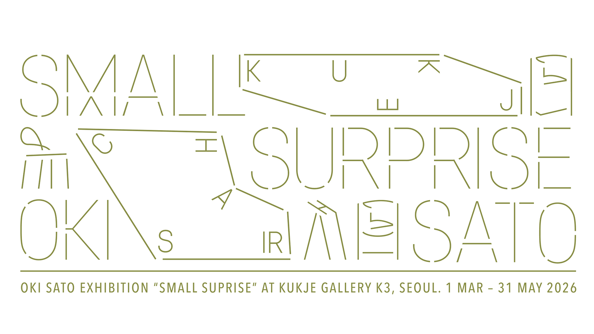
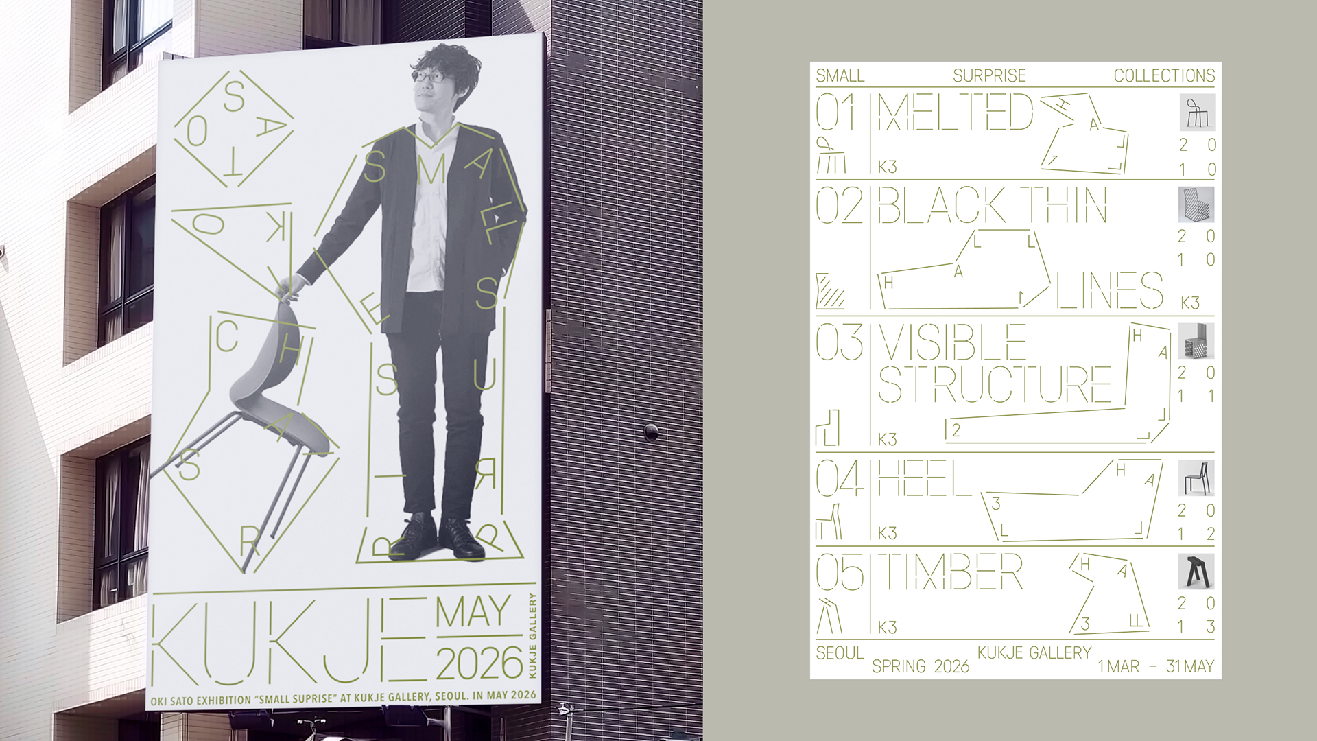
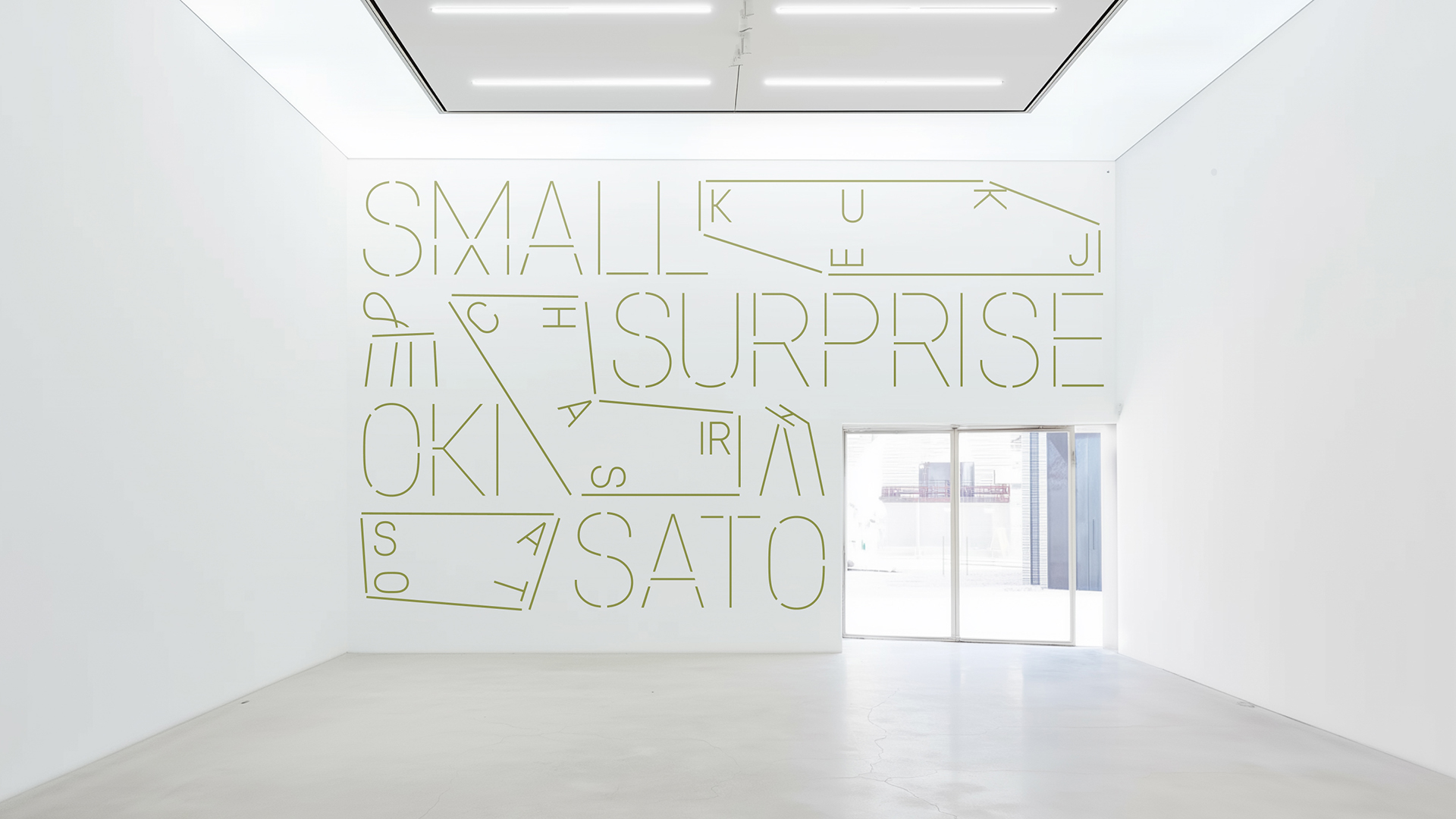
Small Surprise is an exhibition identity concept for interior objects by Japanese designer Oki Sato, built around the idea of a minimal shift and the effect of surprise within everyday forms. The accent typeface borrows the strictness and lightness of the objects themselves and extends the logic of Oki Sato’s design “surprises.”
The project explores how subtle visual interventions can reshape perception without overwhelming the viewer. Inspired by Sato’s philosophy of quiet wit and restrained intervention, the identity avoids overt expressiveness and instead relies on precision, balance, and carefully calibrated accents. Every element is designed to feel intentional, lightweight, and slightly unexpected — mirroring the designer’s approach to form and function.
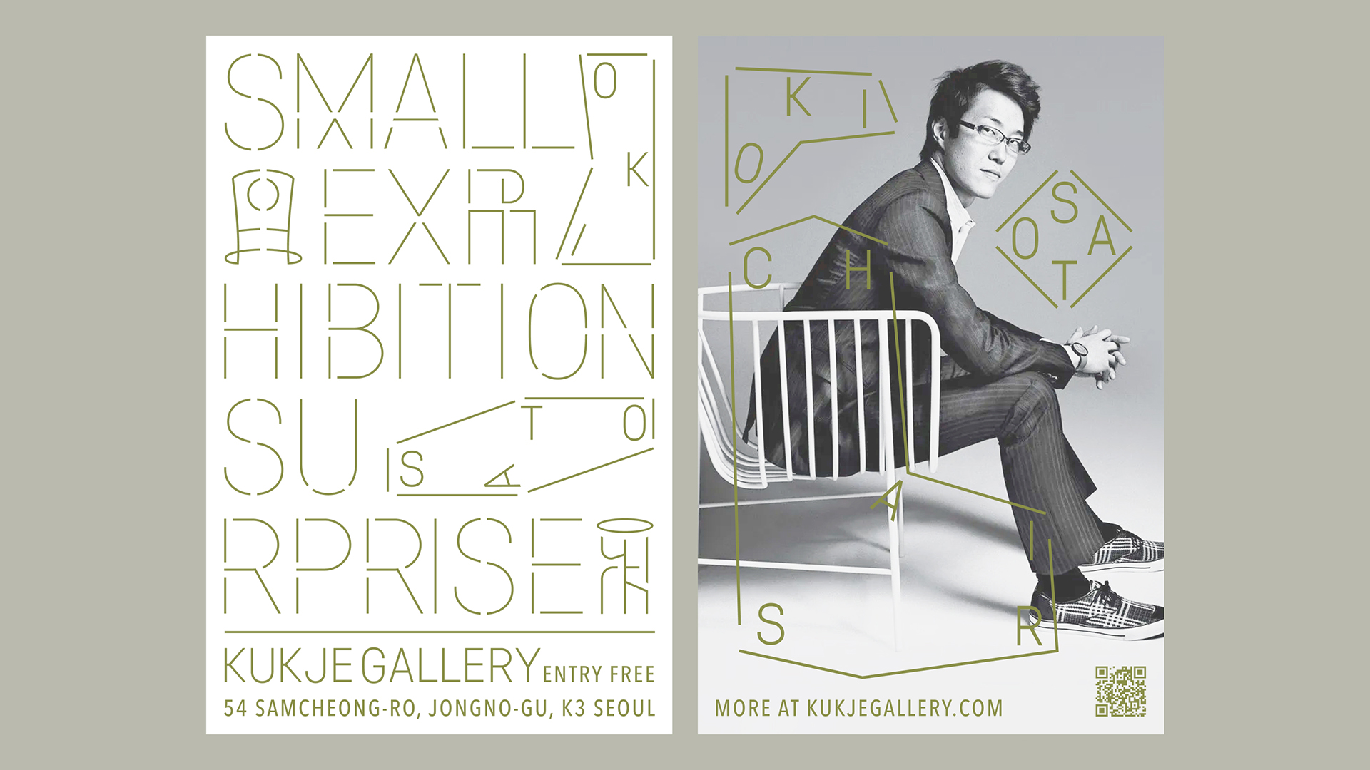
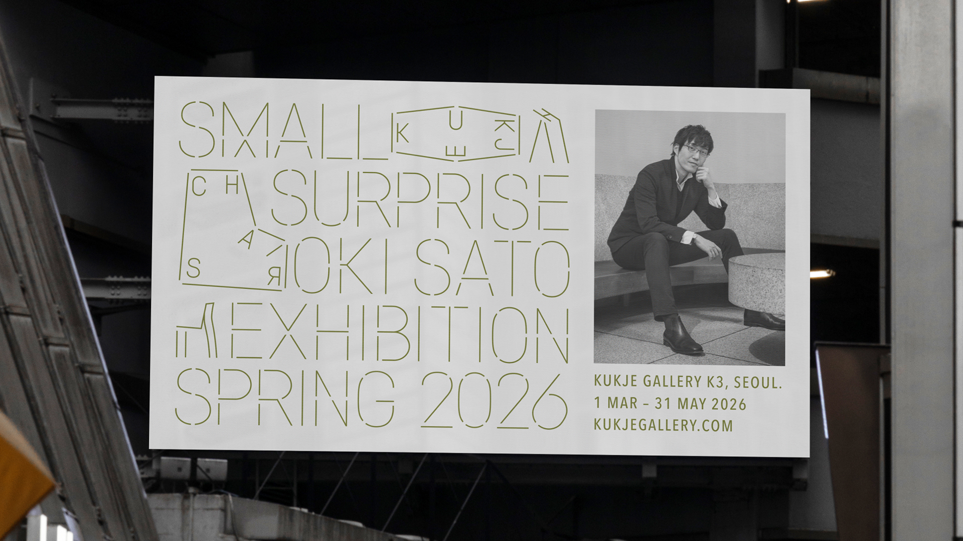
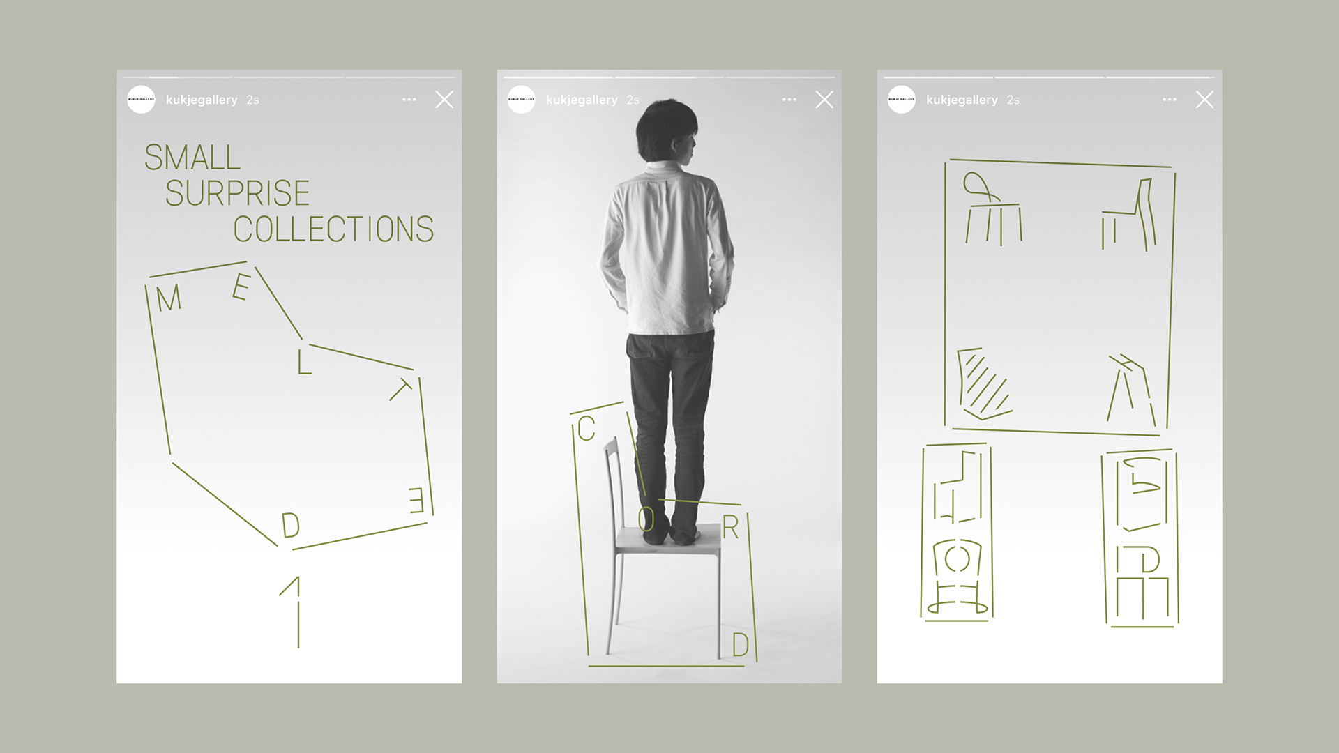
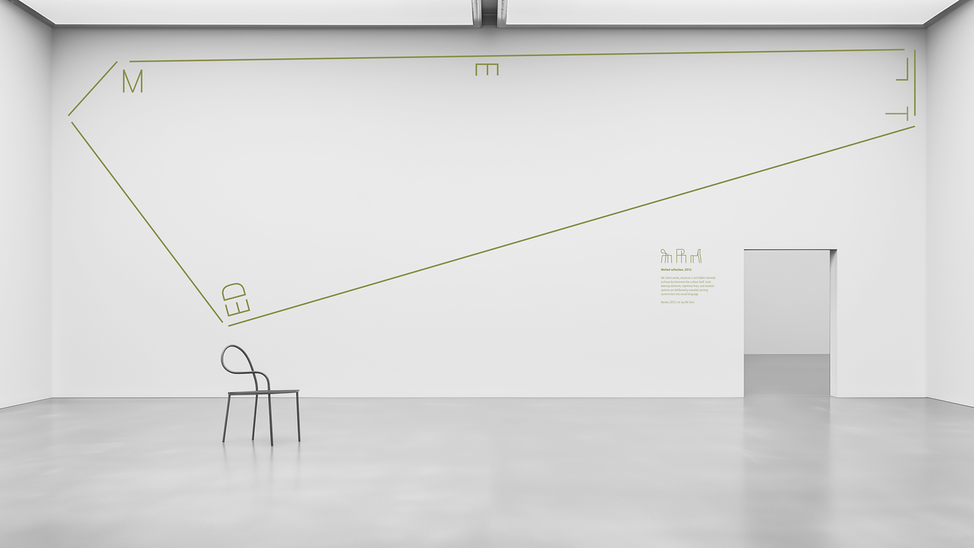
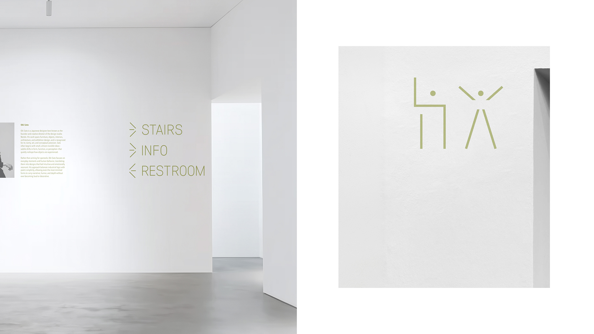
Typography plays a central conceptual role. The custom accent typeface acts not as decoration, but as a structural continuation of the objects on display. Its sharp yet delicate character reflects the physical qualities of the interior pieces, while small typographic shifts introduce moments of visual tension. These deviations echo the exhibition’s core idea: a “small surprise” that subtly disrupts familiarity and invites closer attention.
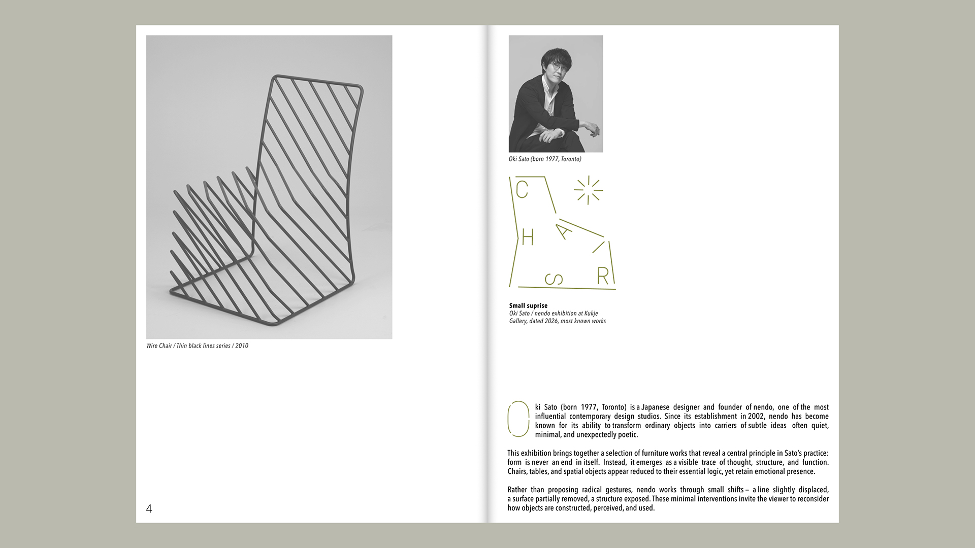
The visual system is deliberately restrained, allowing negative space, rhythm, and scale to guide the experience. Layouts are composed to resemble exhibition labels or museum captions, reinforcing the curatorial nature of the project. This approach creates a calm, contemplative environment in which each object — and each typographic gesture — is given space to resonate.
Rather than relying on bold contrasts or graphic excess, the identity emphasizes nuance and sensitivity. The result is a coherent visual language that does not compete with the exhibited objects but enhances their presence, supporting the narrative of everyday forms transformed through minimal yet meaningful design decisions.
Small Surprise ultimately reflects a shared design attitude: that innovation does not require radical transformation, but can emerge from the slightest shift in perspective. Through typography, composition, and restraint, the identity translates Oki Sato’s design thinking into a visual experience that feels quiet, intelligent, and unexpectedly engaging.

CREDIT
- Agency/Creative: Mikhail Grinevich
- Article Title: Mikhail Grinevich Translates Oki Sato’s Philosophy Into Small Surprise Exhibition Identity
- Organisation/Entity: Student
- Project Type: Identity
- Project Status: Published
- Agency/Creative Country: Russia
- Agency/Creative City: Москва
- Market Region: Global
- Project Deliverables: Art Direction, Exhibition Design
- Industry: Education
- Keywords: Exhibibtion, Design, Interior, Chairs, Oki Sato, Nendo, Kukje Gallery
-
Credits:
Designer: Mikhail Grinevich
Curator: Leonid Slavin


