


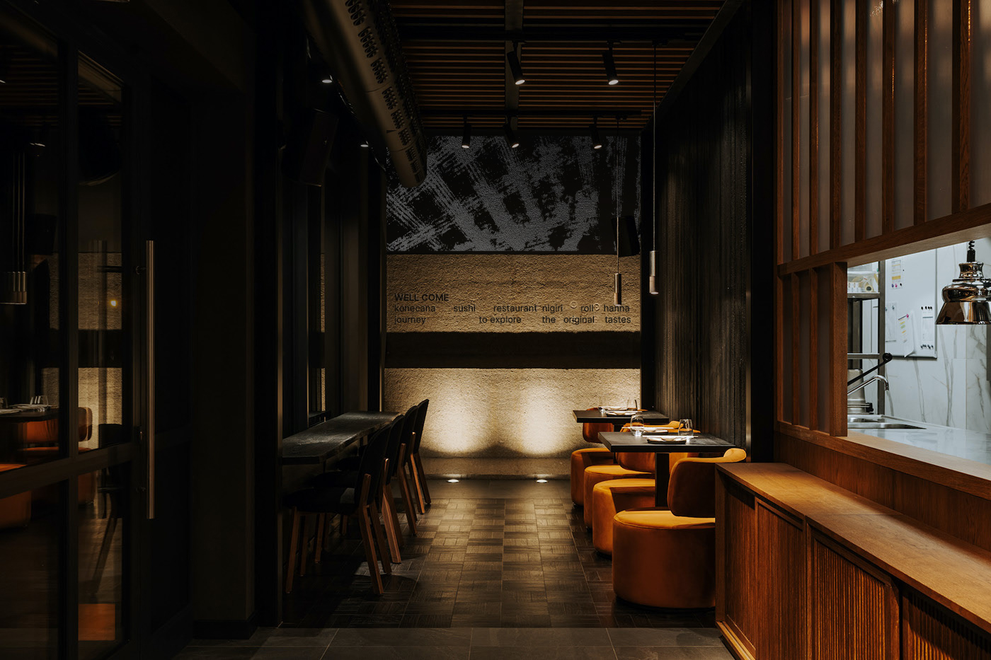
Konecana is a sushi restaurant offering omakase-style dining, where guests embark on a journey to discover the pure essence of original sushi flavors. With minimal decoration, no additives, and no variations, Konecana provides an authentic sushi experience – a culinary beauty of Japan.
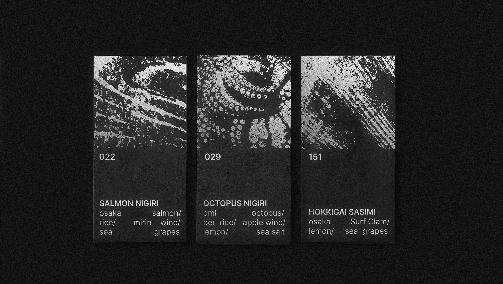
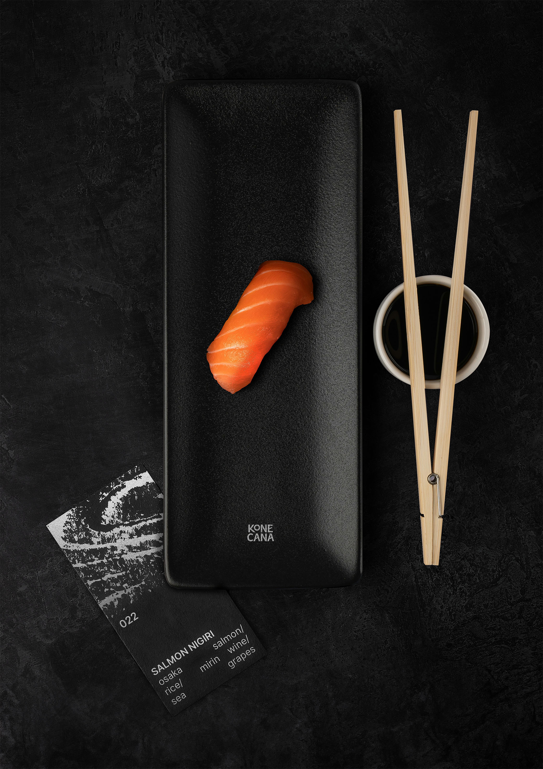
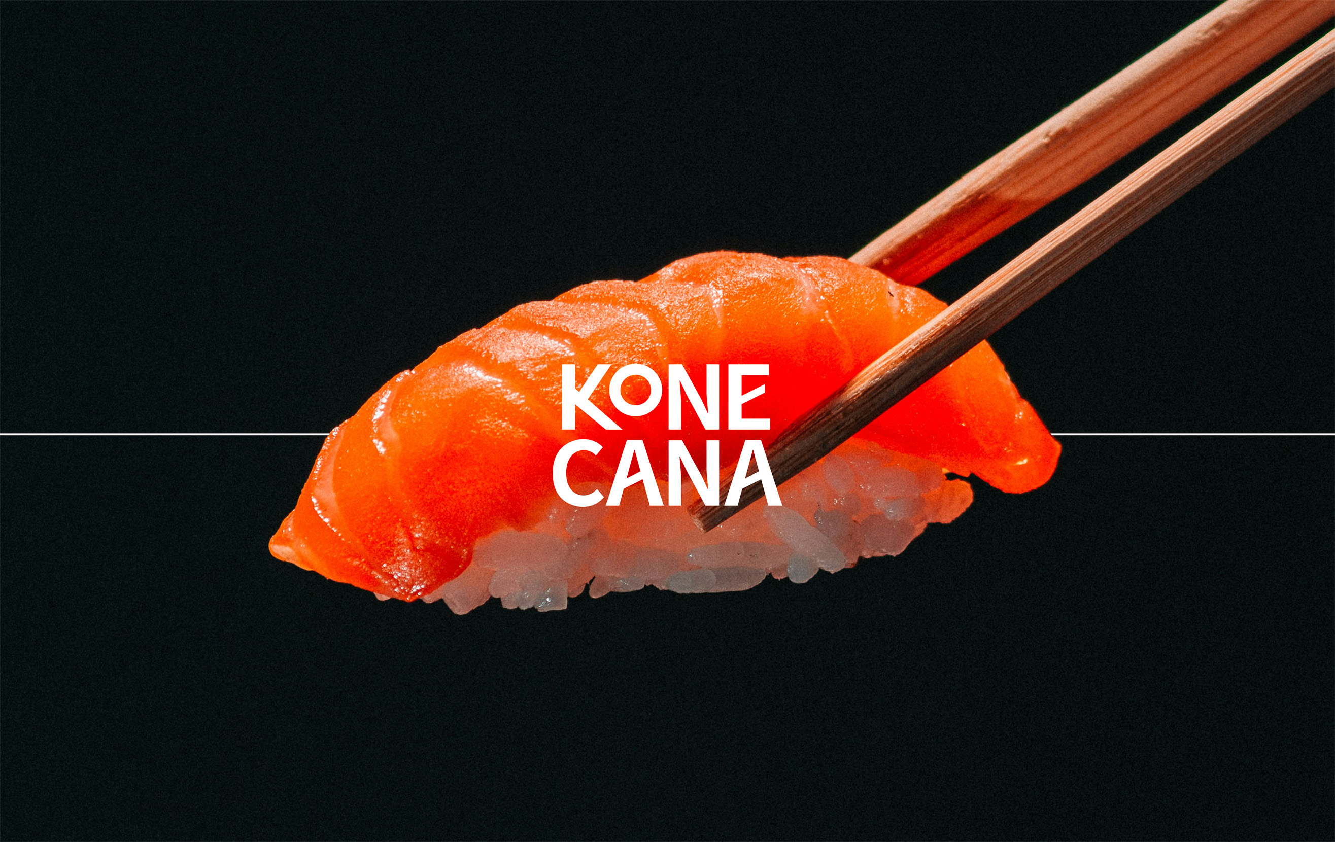
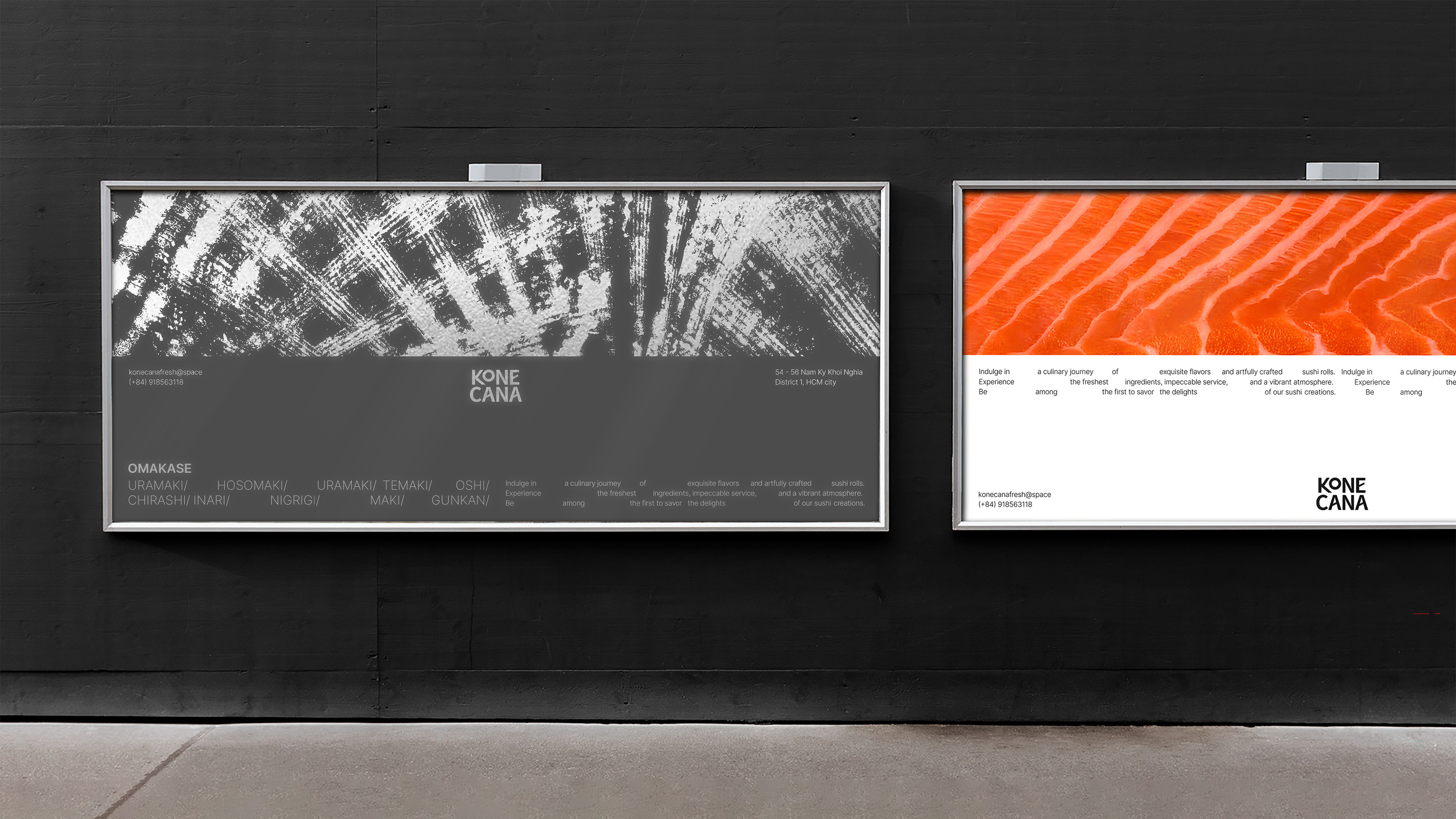
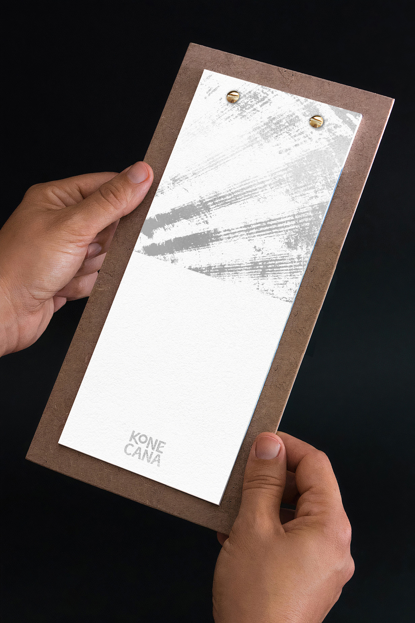
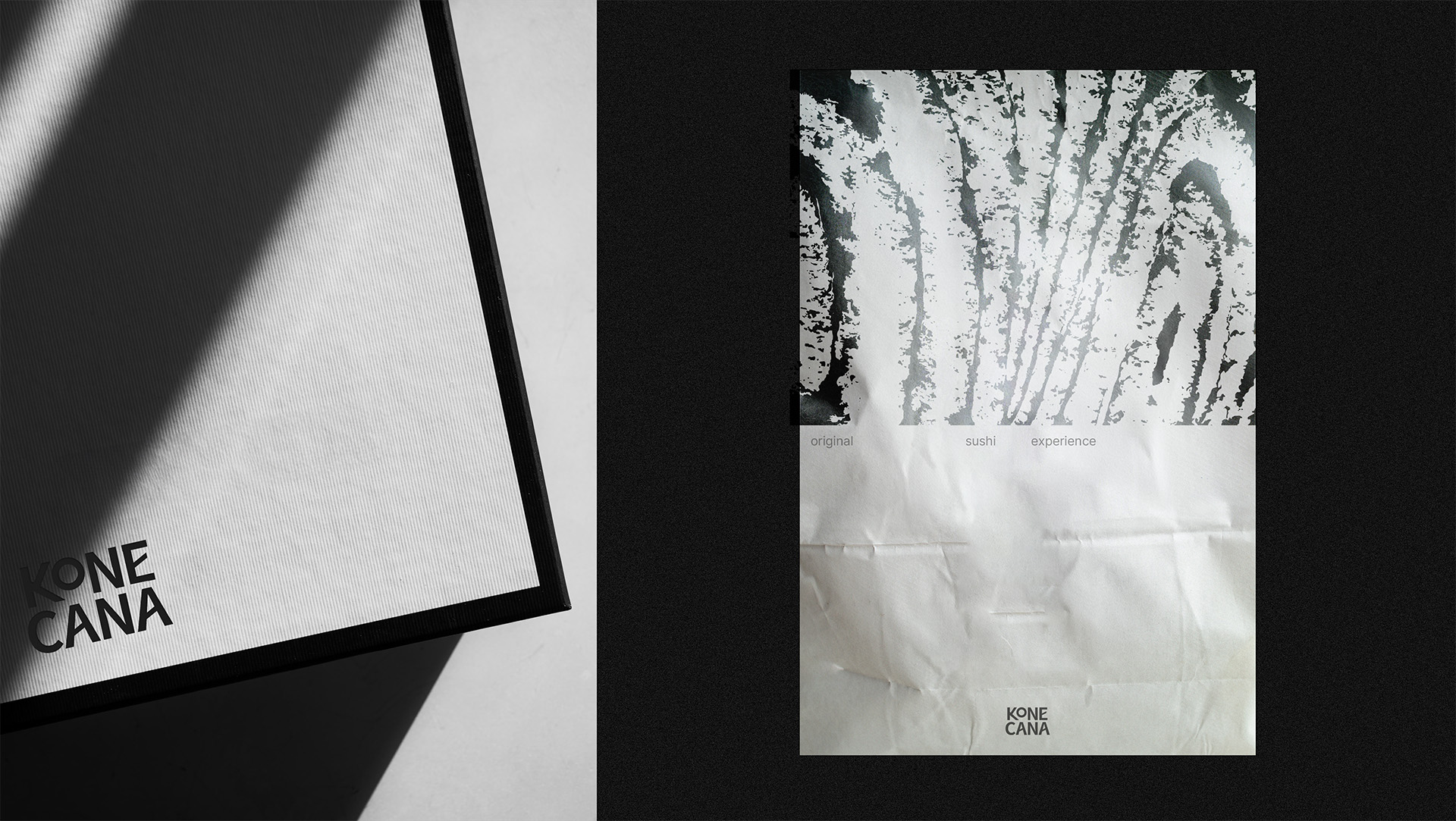
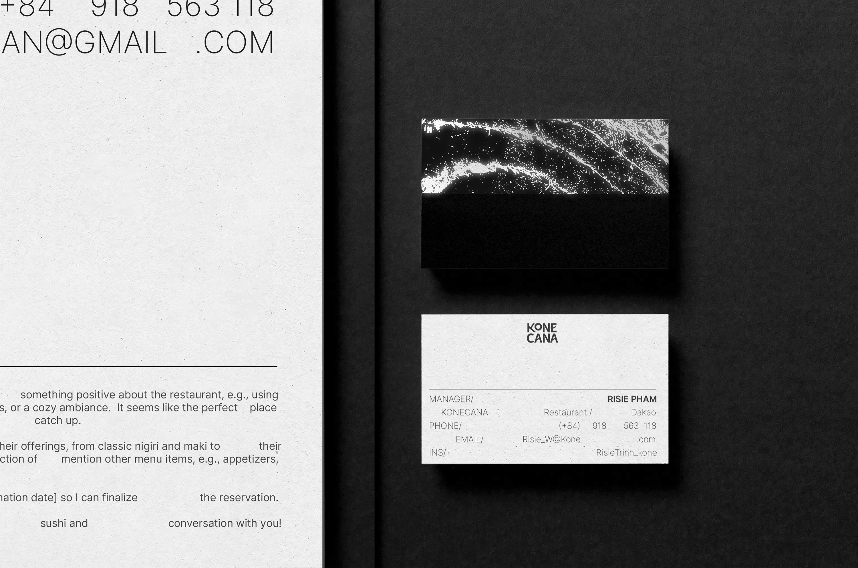
The Konecana logo is divided into two parts, resembling a delicious piece of sushi. The predominant colors of Konecana are neutral tones such as black, white, gray, and silver, drawing the diner’s focus to the main dish. Silver foil stamping on black paper creates a sparkling effect reminiscent of fish scales, adding a touch of elegance to the omakase dining experience.
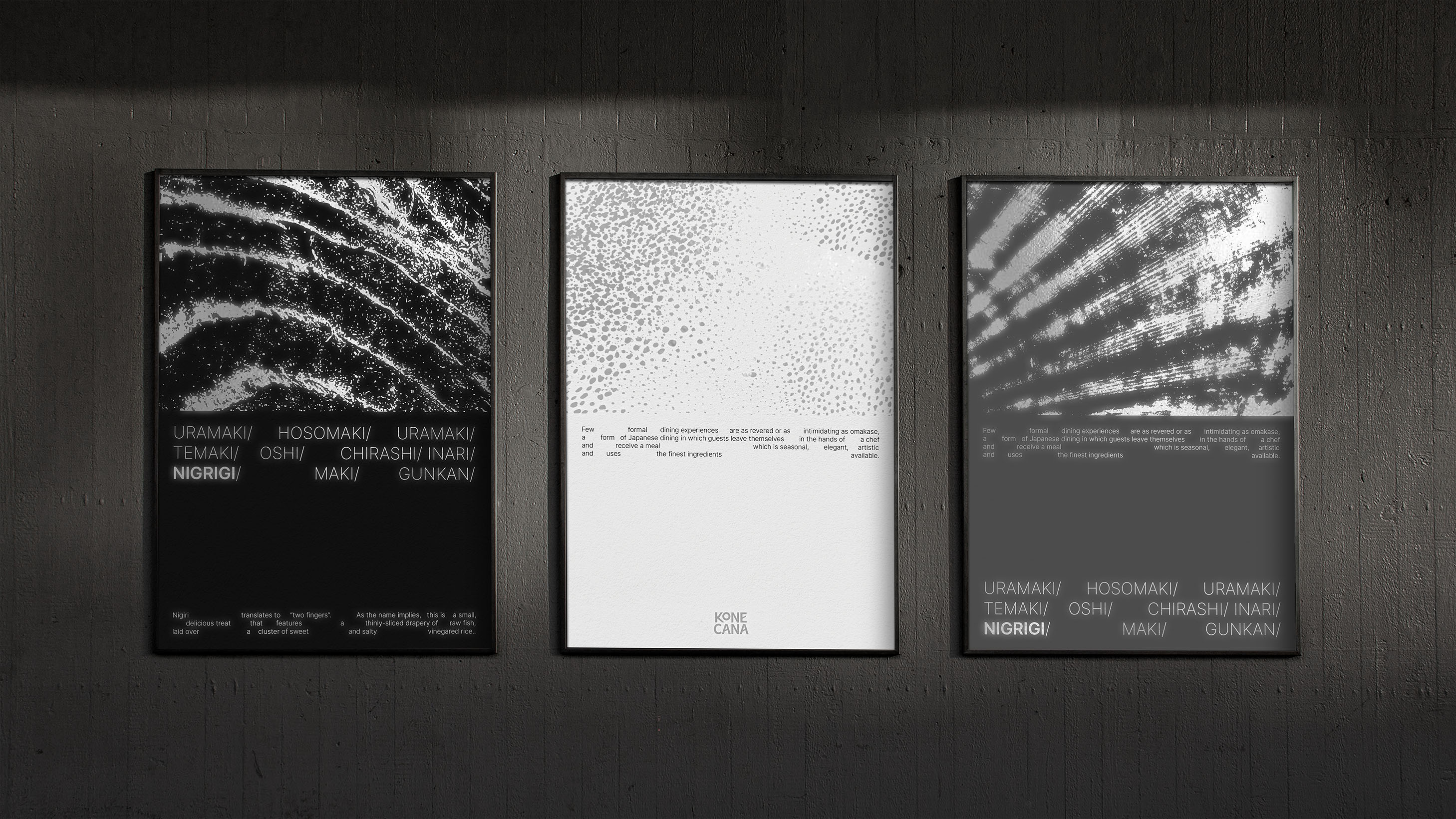
The concept of Konecana is originality. It mimics the image of nigiri sushi with fresh seafood (salmon, tuna, scallops, squid, etc.) on top and rice below. The design divides the layout into two distinct parts, with textures of various seafood above and the simplified text randomly arranged, evoking thoughts of the “rice” component below. The diversity these two key visuals offer brings both unity and unique characteristics to each design.
Each dish is served with a card detailing the ingredients and their origins. The gustatory experience is guided clearly, distinguishing between the aromas and flavors of the hundreds of randomly served sushi varieties.
In conclusion, Konecana is a luxurious dining establishment that promises an authentic sushi experience, allowing guests to indulge in the pure essence of Japanese cuisine.
CREDIT
- Agency/Creative: Mike Ly
- Article Title: Mike Ly Creates Branding for Konecana Sushi Restaurant
- Organisation/Entity: Freelance
- Project Type: Identity
- Project Status: Published
- Agency/Creative Country: Vietnam
- Agency/Creative City: Mike ly
- Market Region: Asia
- Project Deliverables: Brand Identity
- Industry: Food/Beverage
- Keywords: sushi, konecana, omakase, restaurant, sushi brand identity
-
Credits:
Designer: Lý Nhật Lâm


