


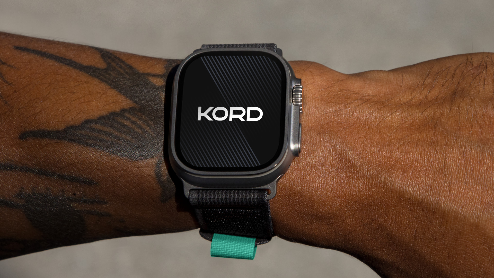
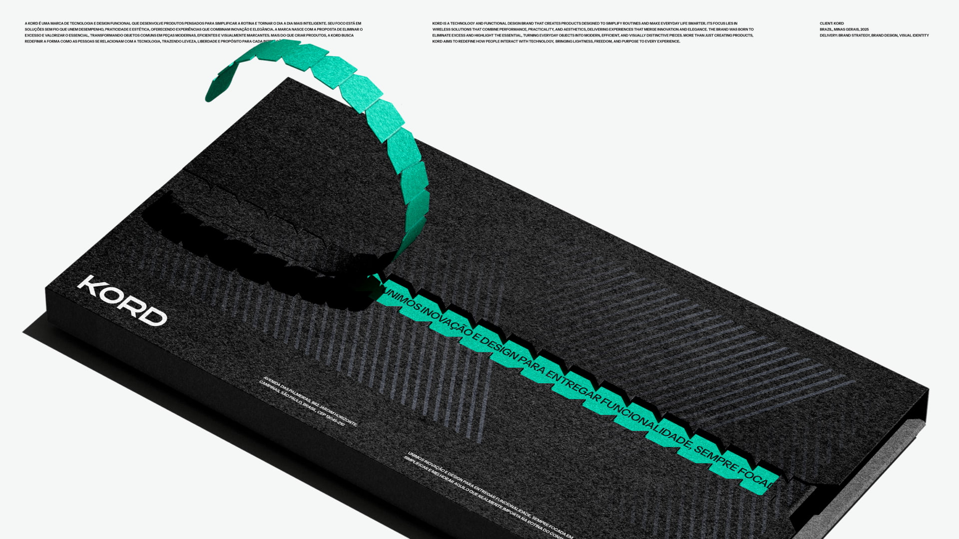
Kord is a technology and functional design brand created to simplify everyday life through smart, wireless, and visually sophisticated products. Its focus is on developing solutions that merge performance, aesthetics, and practicality, turning ordinary objects into modern and intuitive experiences.
More than a manufacturer, Kord operates as a design- and engineering-driven brand, guided by technical criteria of precision, durability, and proportion. The name derives from cord, and the cord-less concept embodies the essence of the brand: freedom, lightness, and modernity. This absence becomes identity — a symbol of invisible yet present technology that enhances life without complicating it.
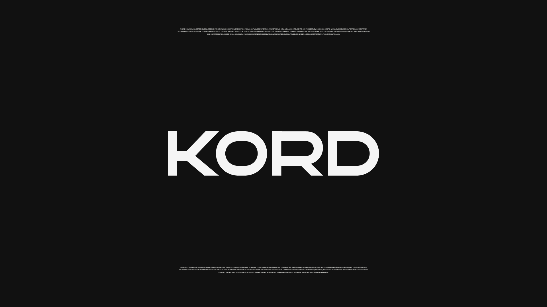
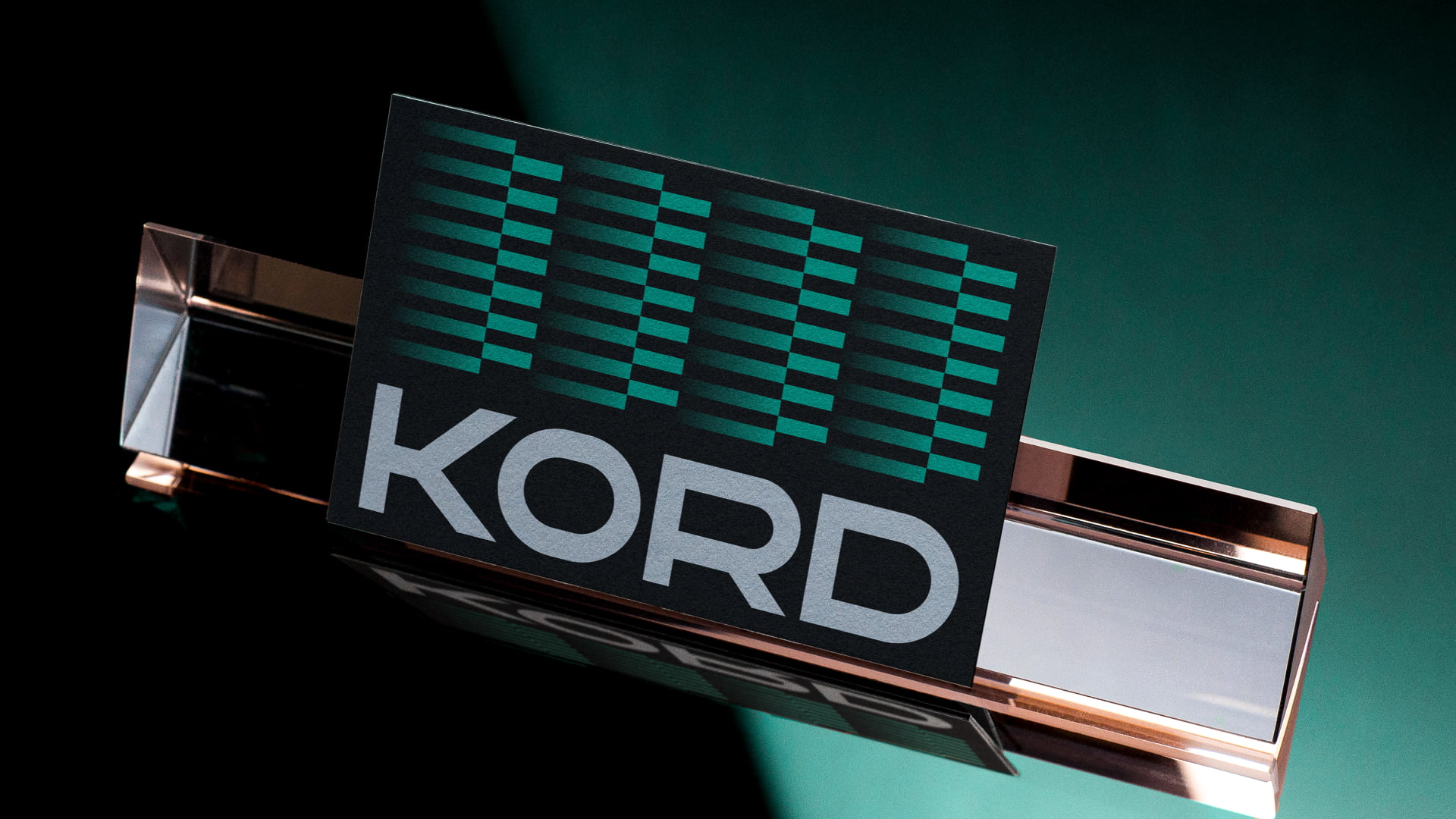
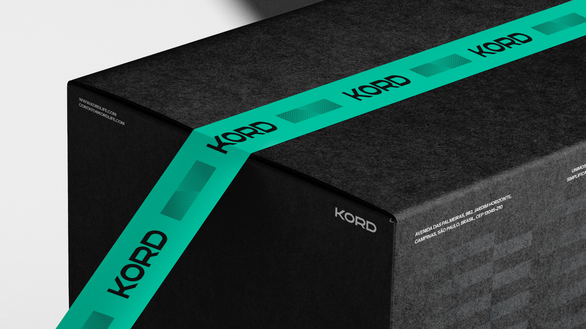
The visual identity of Kord was designed to reflect this philosophy. The logo structure communicates strength, confidence, and stability through sharp edges, balanced by subtle roundings that bring fluidity and visual accessibility. The internal geometry of letters such as “R,” “O,” and “D” follows a precise grid system, ensuring harmony, proportion, and consistency across all applications.
Choosing a typographic logo reinforces the brand’s commitment to clarity, modernity, and universality. It also avoids cultural ambiguities associated with symbols, ensuring global legibility and coherence in every visual context. The result is a strong, straightforward, and versatile brand mark that conveys innovation without the need for graphic embellishment.
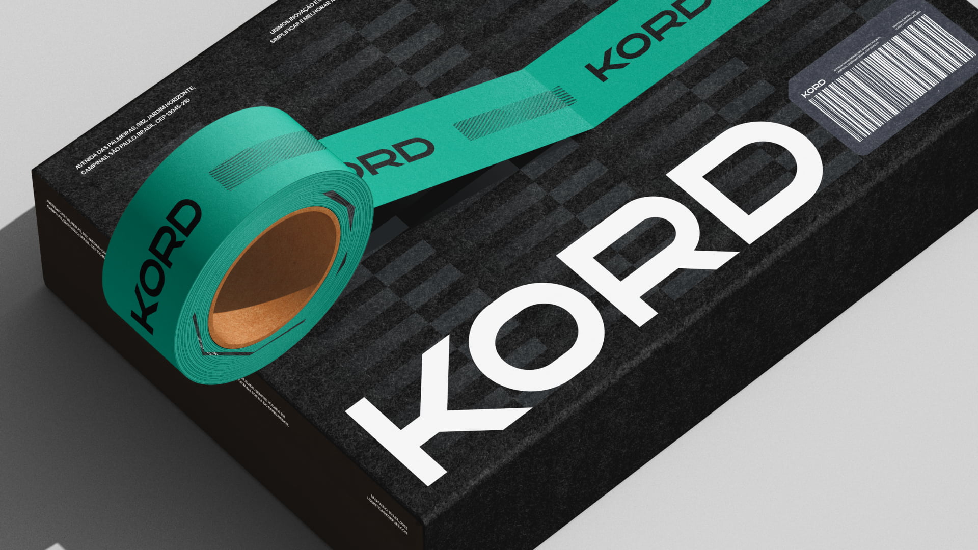
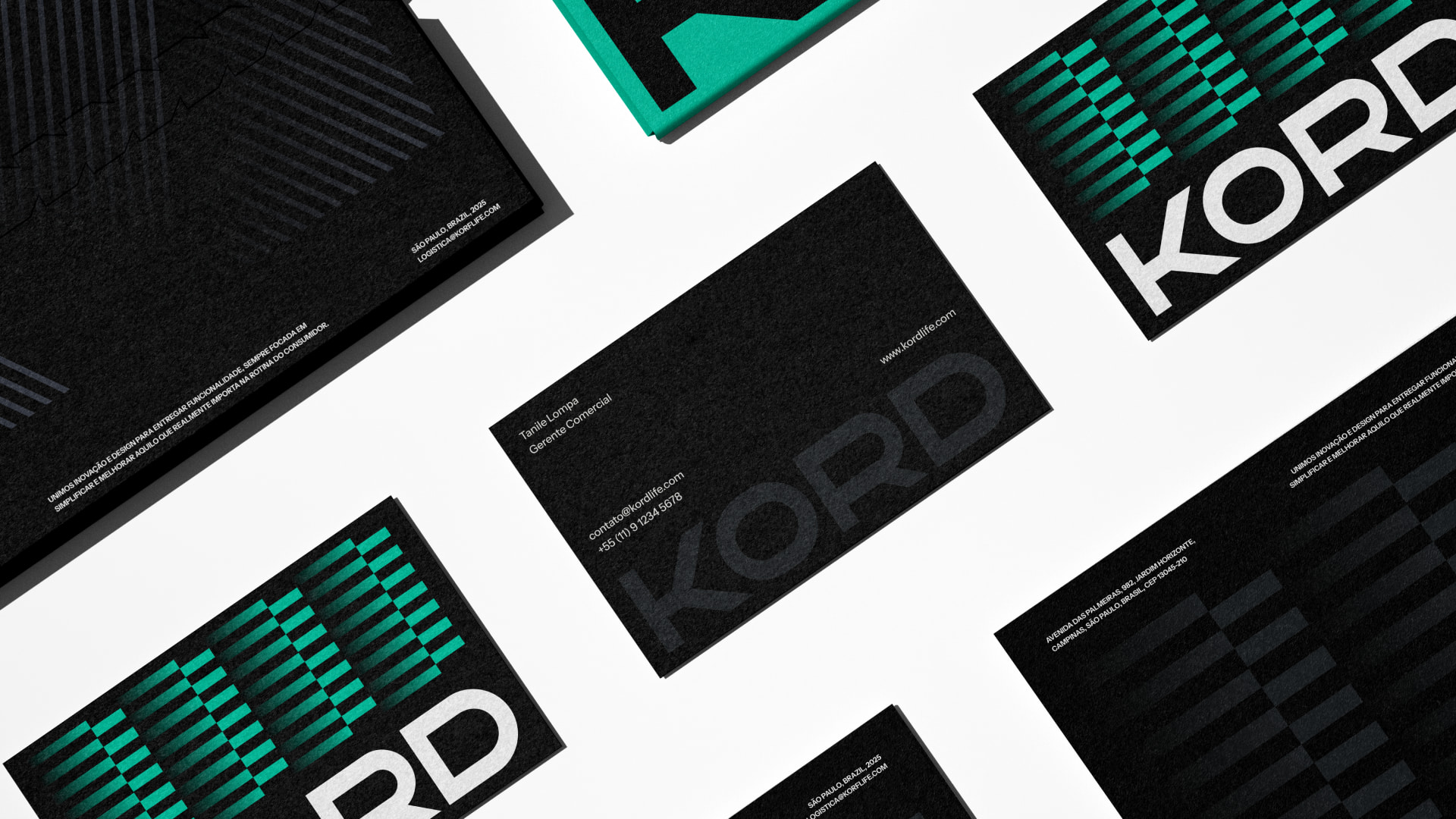
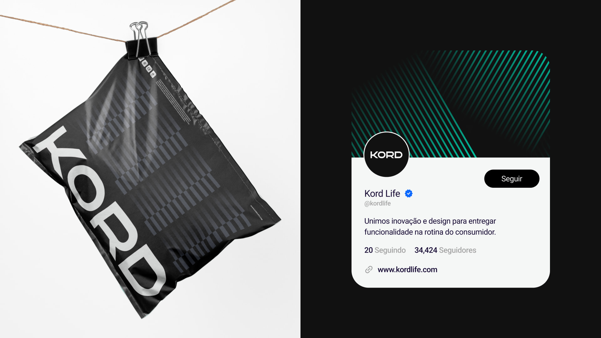
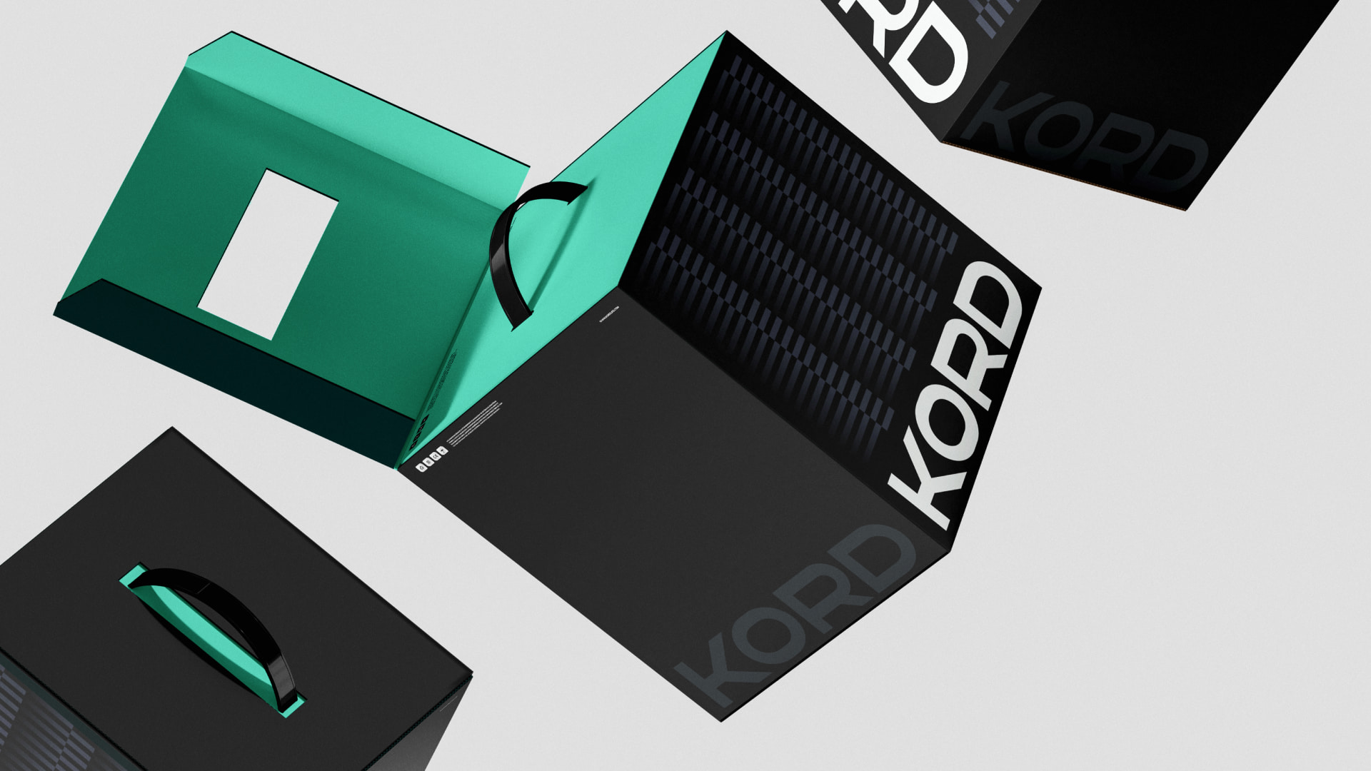
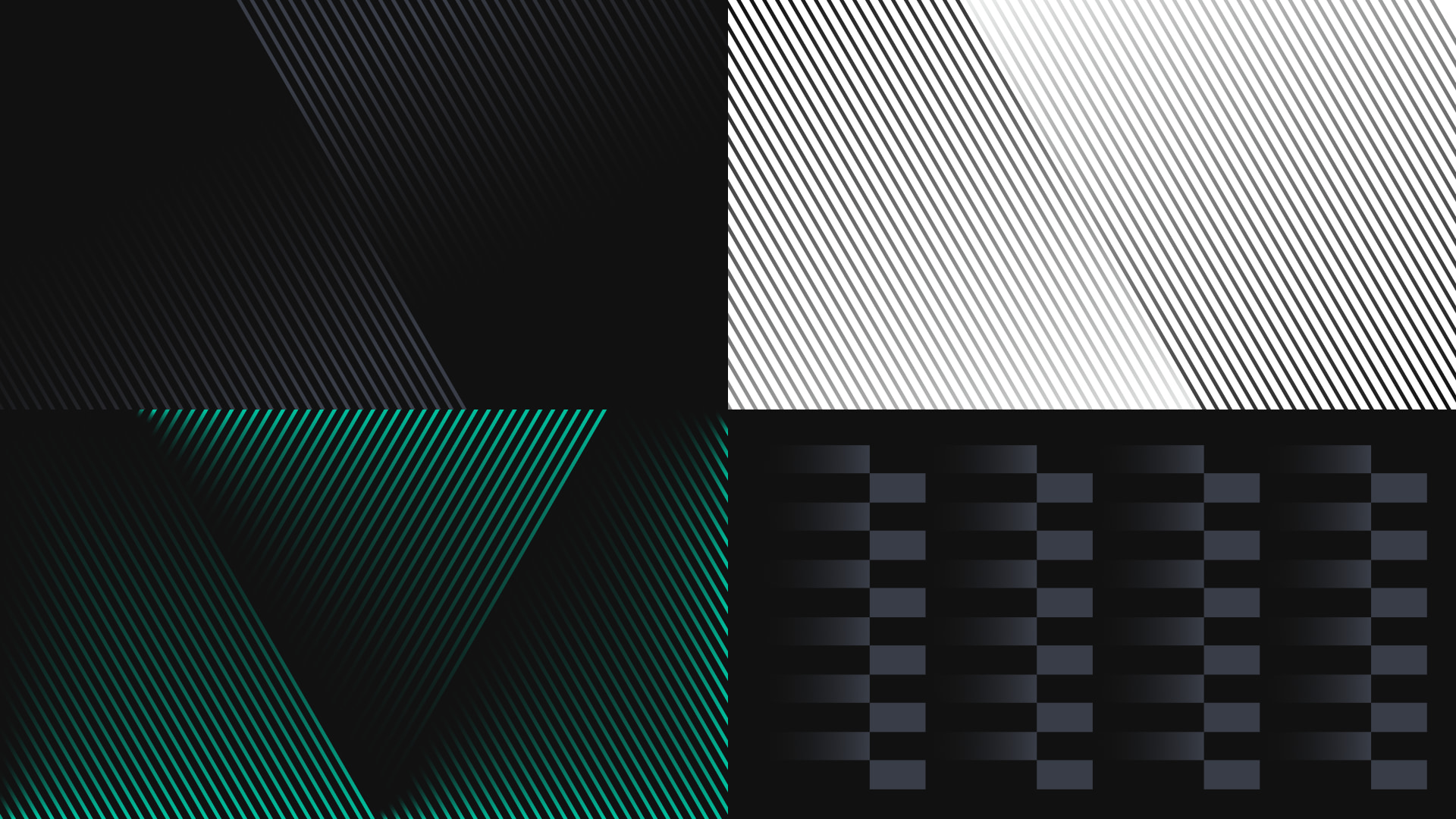
The color palette strengthens this vision: dark and neutral tones communicate stability and sophistication, while Fresh Mint introduces contrast, modernity, and freshness — a distinctive color accent that establishes Kord within a unique visual territory. The interplay between depth, contrast, and balance enhances the perception of a premium, minimalist, and technology-driven brand.
Kordbelieves that technology and design should coexist in a way that is silent, intuitive, and human. Every product is conceived to integrate seamlessly into daily life, reducing visual noise and maximizing efficiency. This harmony between form and function positions KORD as a symbol of conscious innovation — the expression of the future in its most simple, precise, and elegant form.
CREDIT
- Agency/Creative: Miguel Munis
- Article Title: Miguel Munis Reimagines Kord with a Refined Design Language Rooted in Clarity and Function
- Organisation/Entity: Freelance
- Project Type: Identity
- Project Status: Published
- Agency/Creative Country: Brazil
- Agency/Creative City: Divinópolis
- Market Region: South America
- Project Deliverables: Animation, Art Direction, Brand Architecture, Brand Creation, Brand Design, Brand Mark, Brand Strategy, Branding, Design, Directing, Editorial Design, Graphic Design, Identity System, Logo Design, Packaging Design, Typography
- Industry: Retail
- Keywords: logo, visual identity, package, packagin, brand, branding
-
Credits:
Brand Designer: Miguel Munis
Creative Agency: 2Maker Web


