


Midnight Oil Tattoo Society – Art Deco Inspired Identity
The visual identity for Midnight Oil Tattoo Society was designed as a refined tribute to the timeless aesthetics of classic tattoo culture and the elegance of Art Deco design. The concept blends vintage symbolism, geometric ornamentation, and modern minimalism to create a distinctive brand language that feels both nostalgic and contemporary.
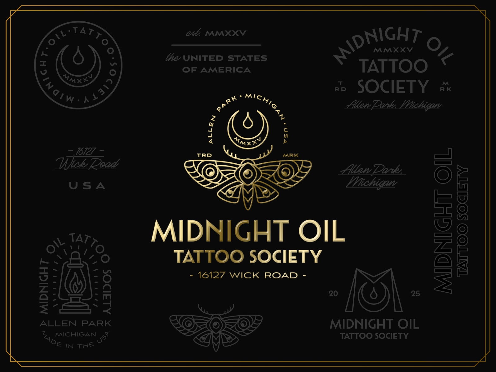
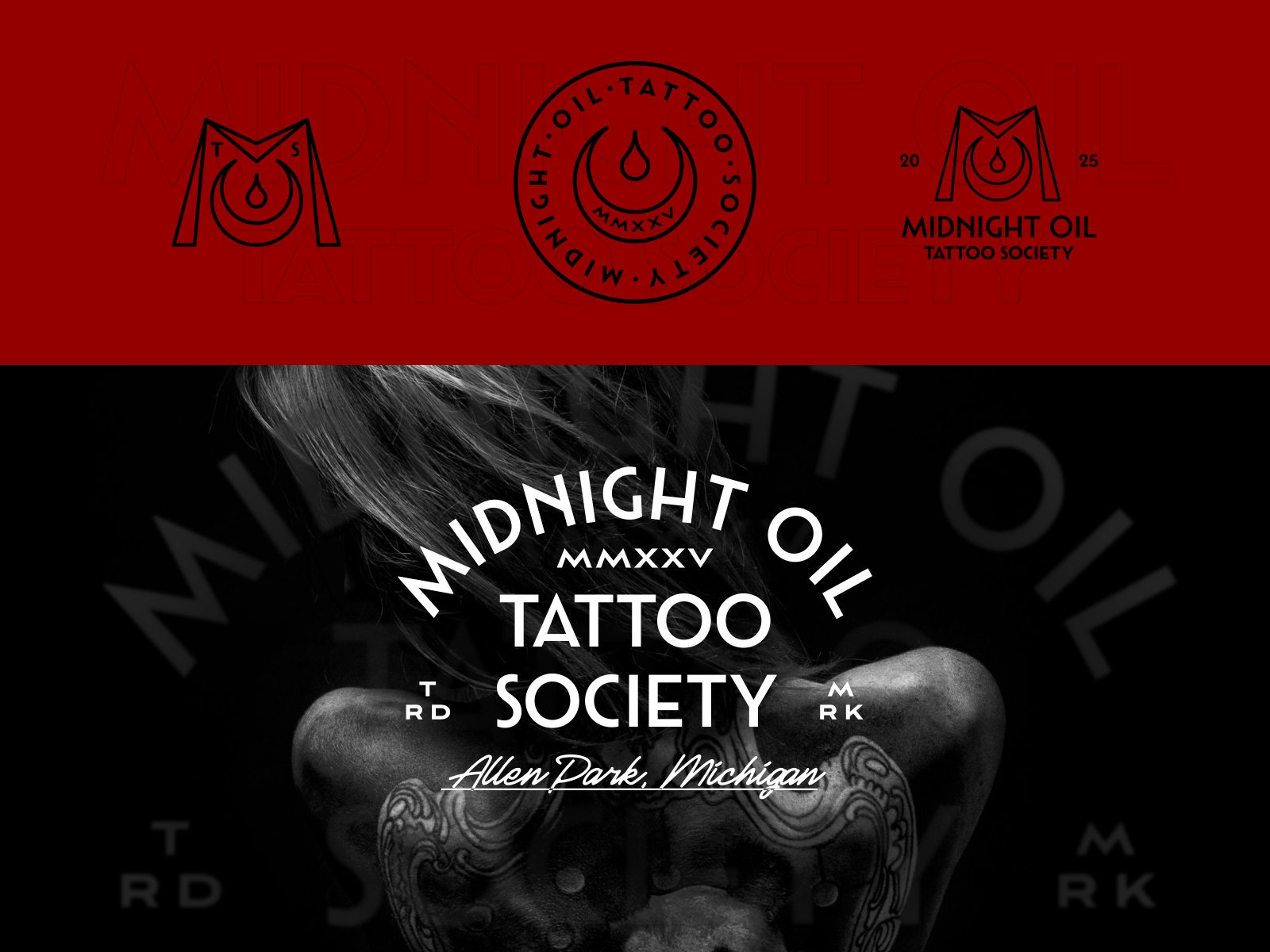
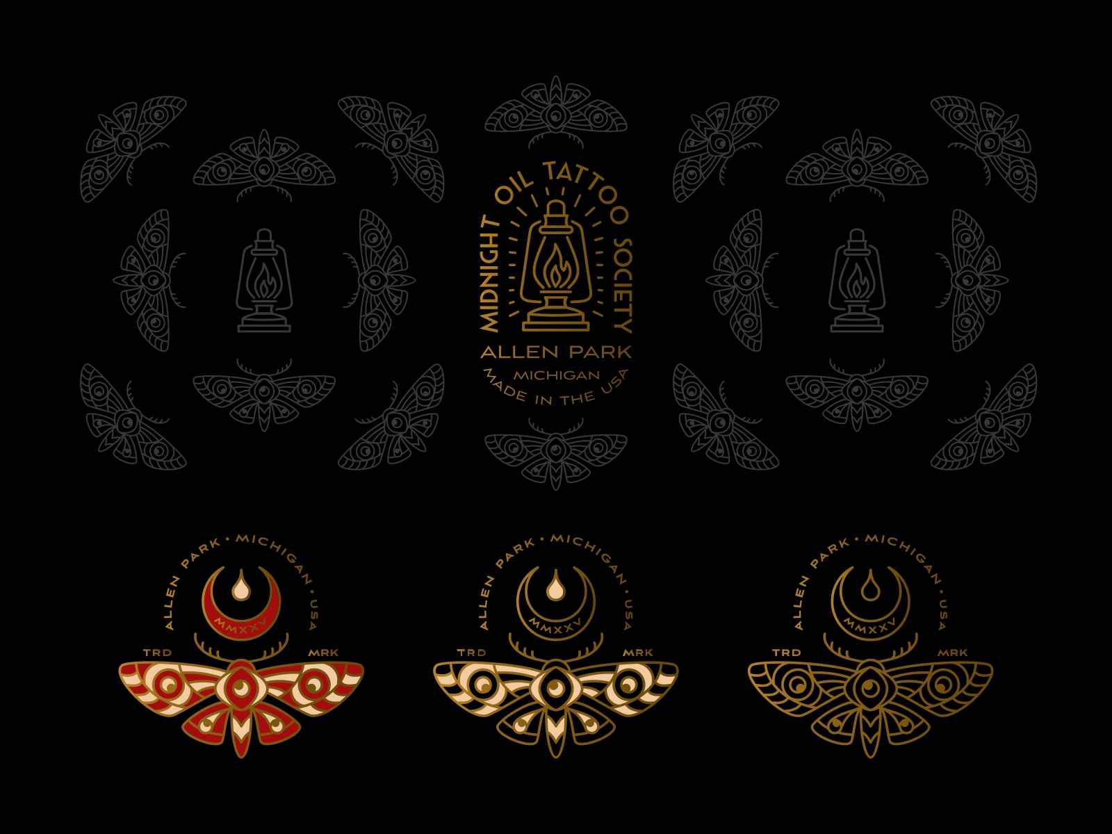
At the heart of the identity lies a symbolic emblem built around a stylized oil drop and crescent form — a metaphor for dedication, craftsmanship, and the phrase “burning the midnight oil,” which reflects the passion and late-night creativity often associated with tattoo artists. This central mark evolves into a striking moth illustration, a creature traditionally attracted to light. In this context, the moth symbolizes curiosity, transformation, and the magnetic pull of artistic expression.
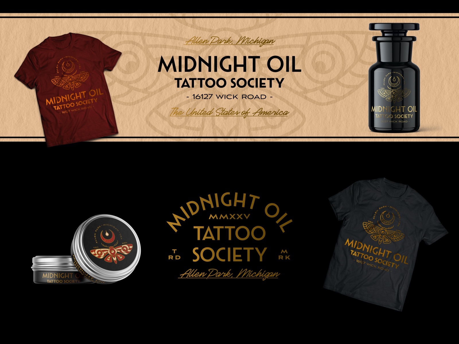
The visual system draws strong inspiration from Art Deco principles: symmetry, elegant linework, and balanced geometric composition. The moth emblem is constructed with ornamental yet controlled lines, creating a sense of sophistication while maintaining a bold, recognizable silhouette. This allows the mark to function equally well across different applications, from studio signage to merchandise and tattoo flash sheets.
A rich black and gold palette was chosen to reinforce the luxurious and nocturnal character of the brand. Gold linework evokes vintage engraving and classic tattoo machine detailing, while the deep black background creates a dramatic contrast that enhances the graphic precision of the design. Supporting marks, including circular seals, typographic badges, and minimal monograms, expand the identity into a cohesive system that can be flexibly applied across packaging, apparel, and studio materials.
Typography plays an essential role in the identity, referencing early 20th-century American signage and traditional shop lettering. The combination of structured display lettering with elegant script accents introduces hierarchy and personality, reinforcing the heritage feel of the brand while keeping it visually fresh.
The result is a bold yet sophisticated identity that captures the mystique of nighttime creativity, the heritage of tattoo artistry, and the timeless elegance of Art Deco design. The system was developed to be versatile, iconic, and memorable — allowing Midnight Oil Tattoo Society to stand out as a modern studio rooted in classic craft traditions.
CREDIT
- Agency/Creative: Hamster and Hammer
- Article Title: Midnight Oil Tattoo Studio Logo and Illustrations Design by Hamster and Hammer
- Organisation/Entity: Agency
- Project Type: Identity
- Project Status: Published
- Agency/Creative Country: United States
- Agency/Creative City: Belarus
- Market Region: North America
- Project Deliverables: Brand Design, Brand Identity, Branding, Illustration, Logo Design
- Industry: Beauty/Cosmetics
- Keywords: logo design, brand design, logotype, brand identity, hand drawn, illustration, tattoo logo
-
Credits:
Designer, Illustrator: Aliaksei Hvozdzeu
Designer: Alesia Kutsian


