


Microdosify is a premier online source for high-quality microdosing gummies and capsules in Canada. Similar to a resilient plant emerging from a small seed, it has evolved from a place of personal adversity into a powerful catalyst for positive transformation. Their mission extends beyond merely offering microdosing products; they are spearheading a comprehensive mental health revolution, one dose at a time.
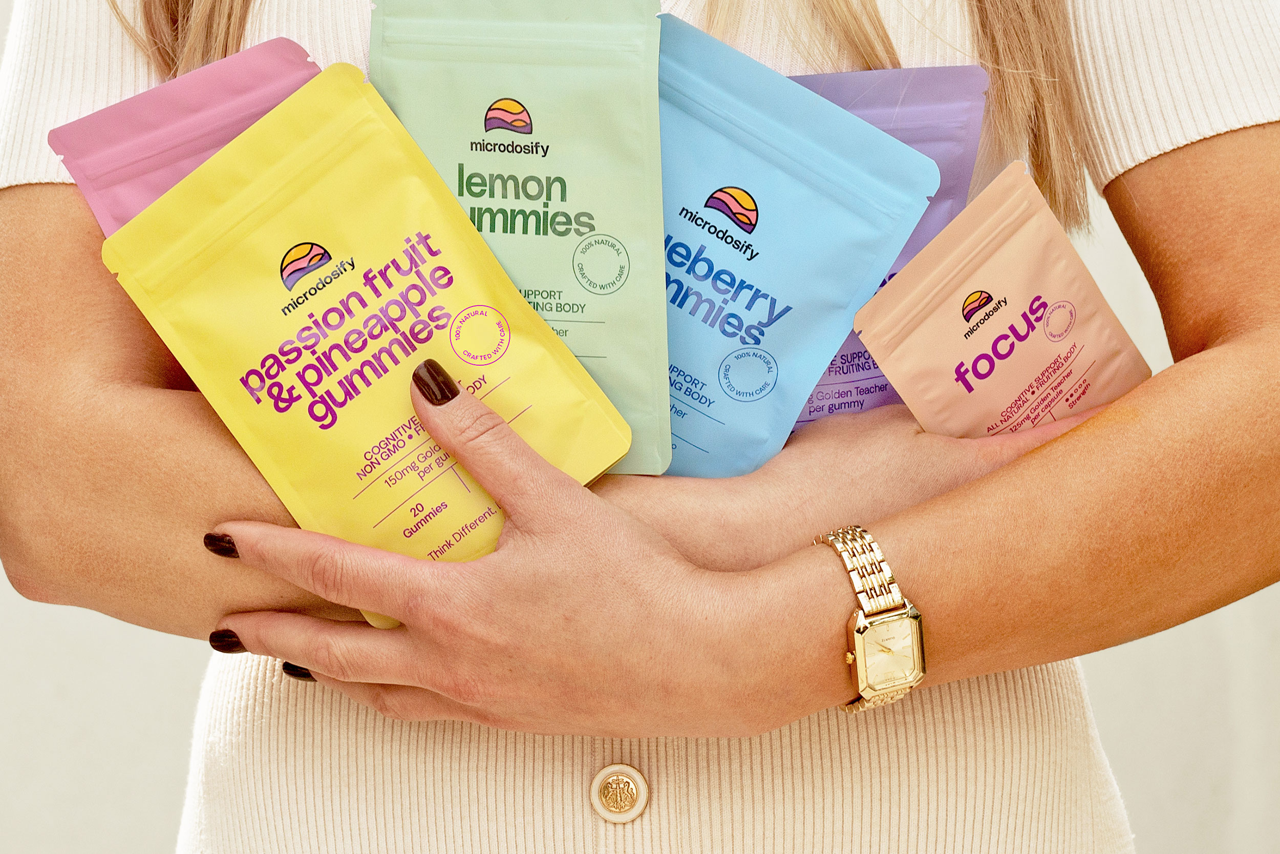
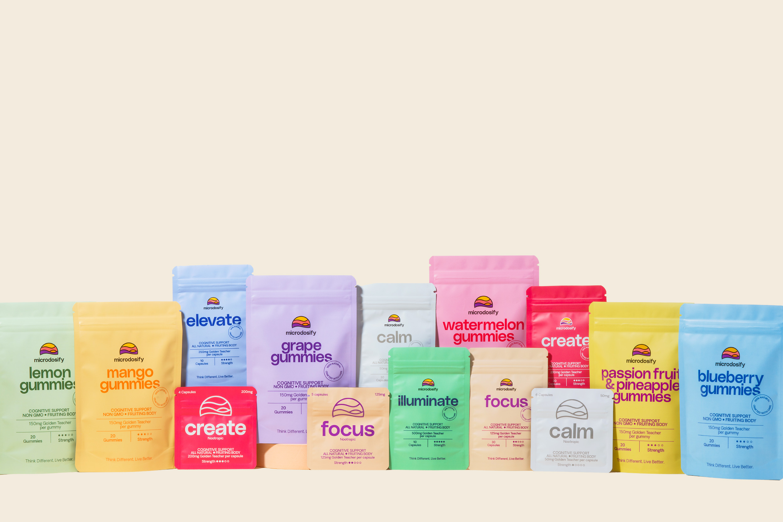
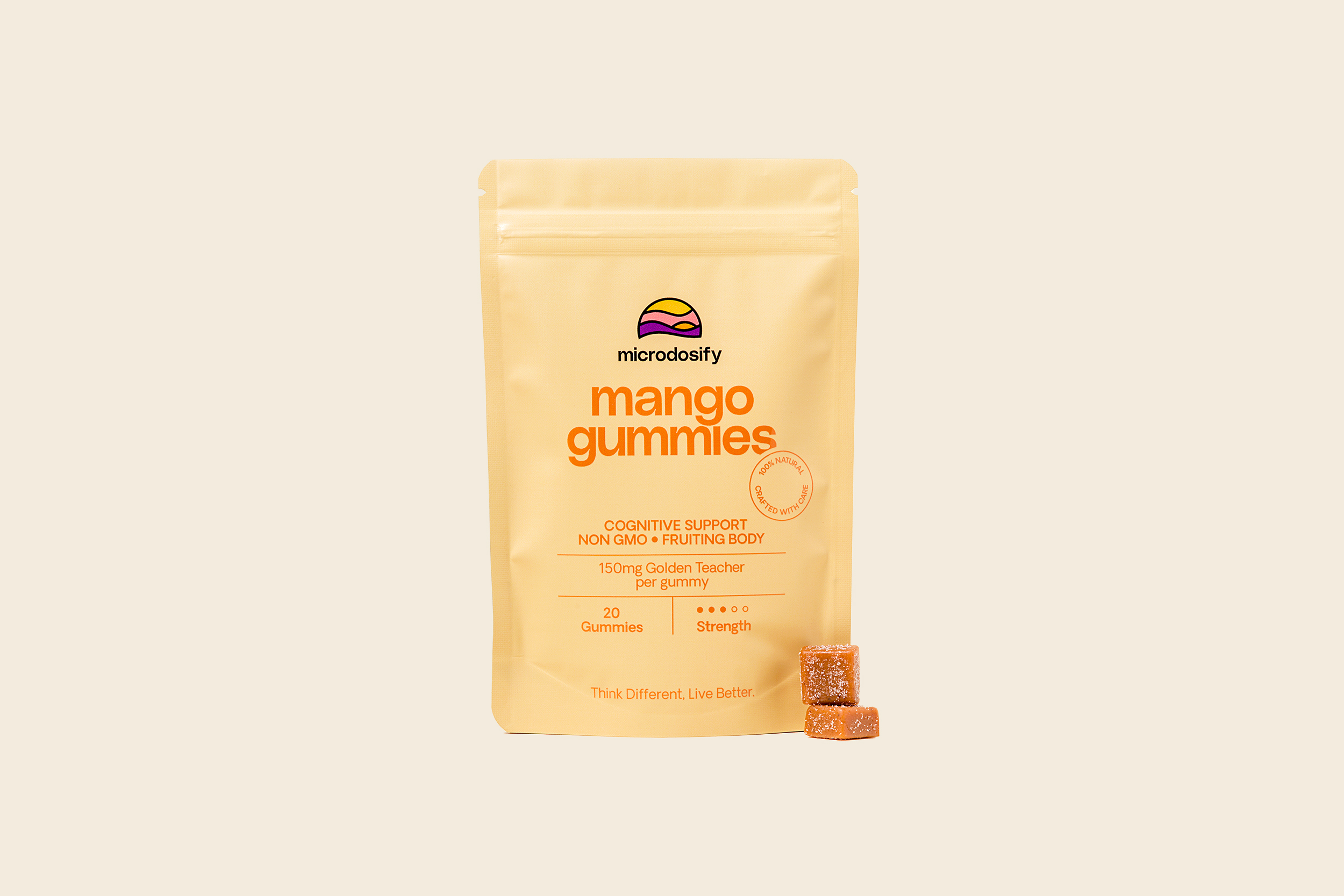
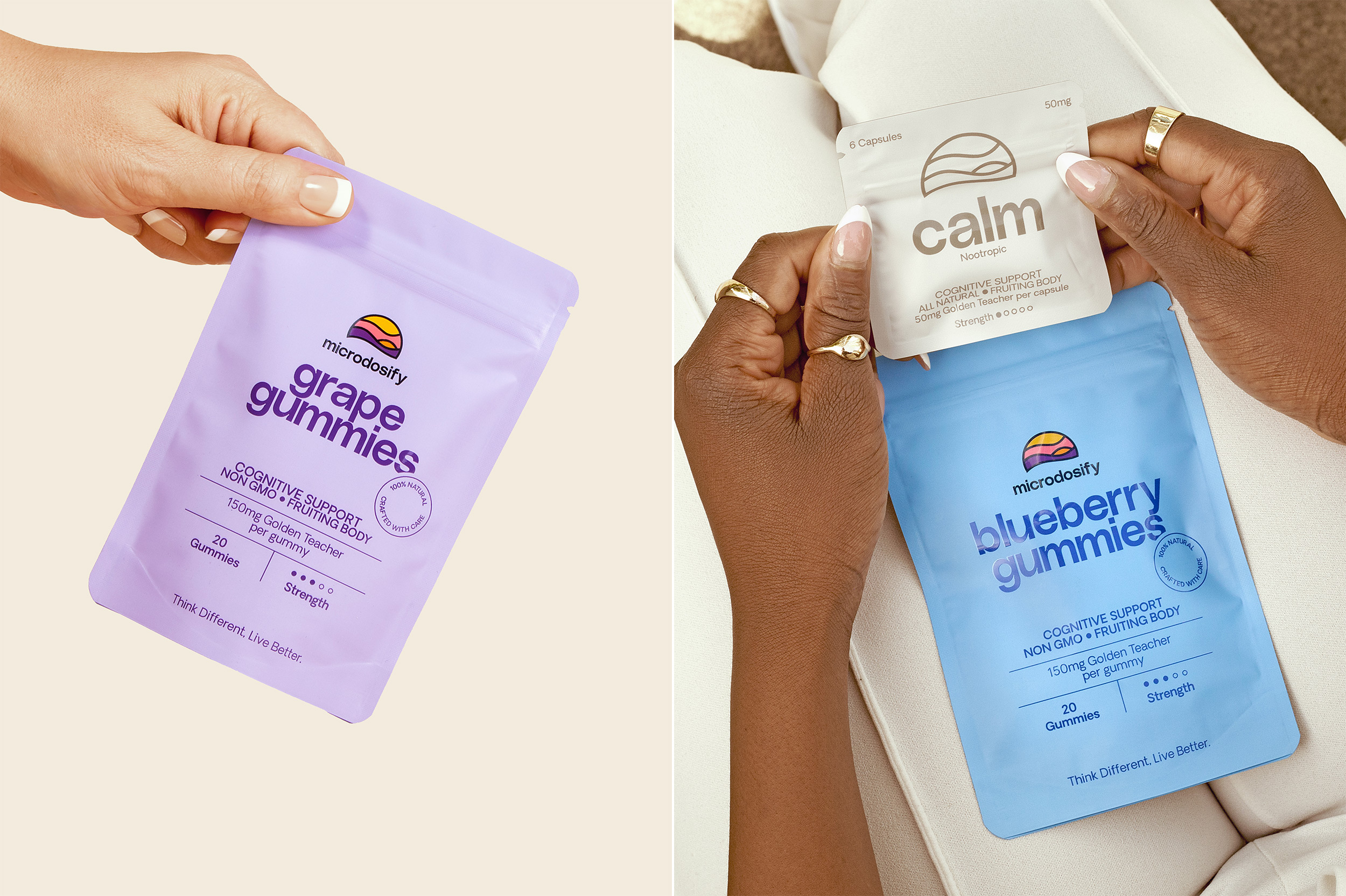
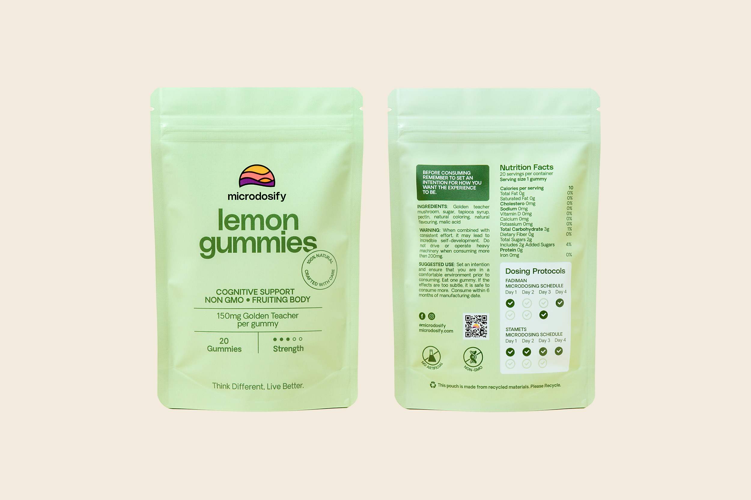
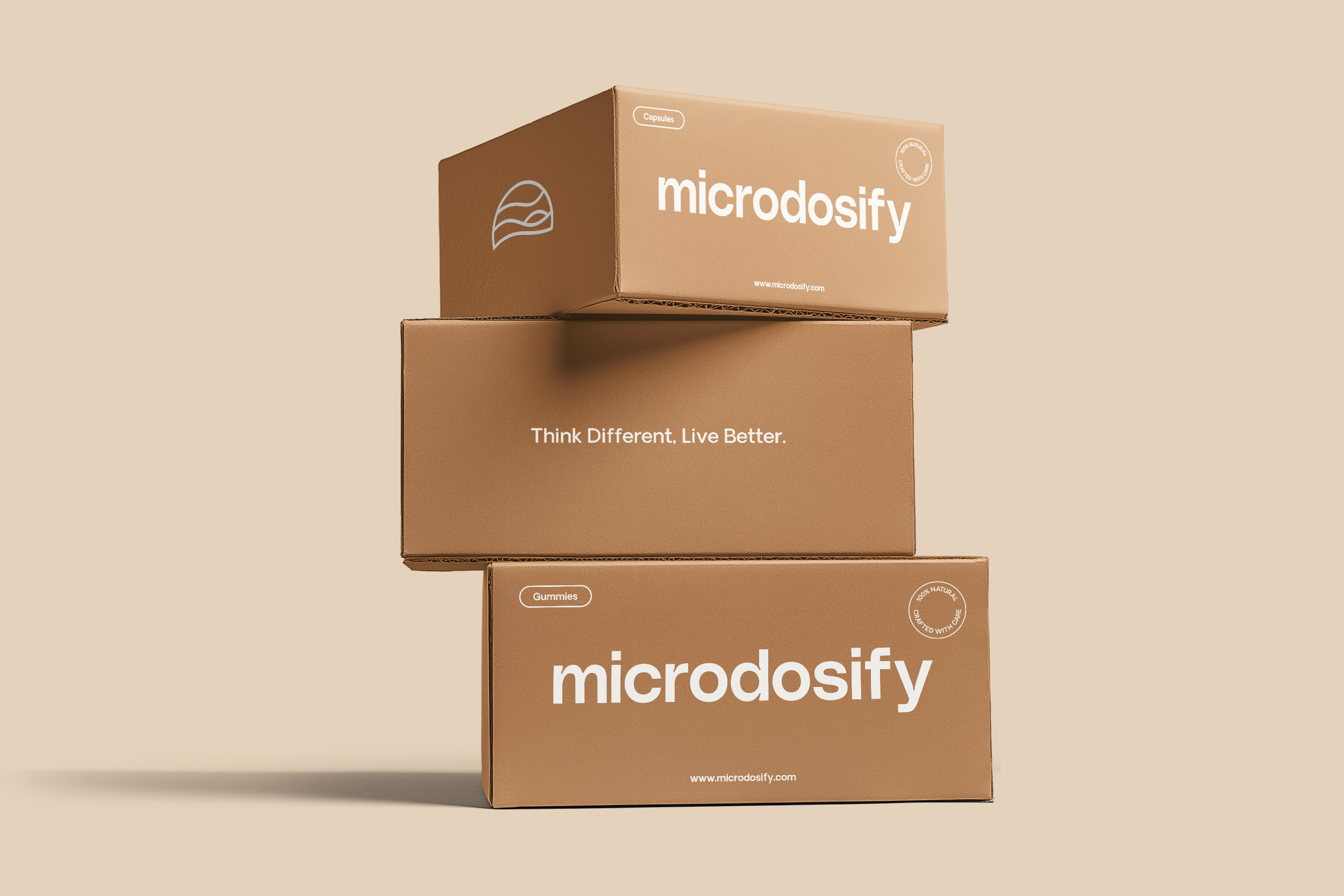
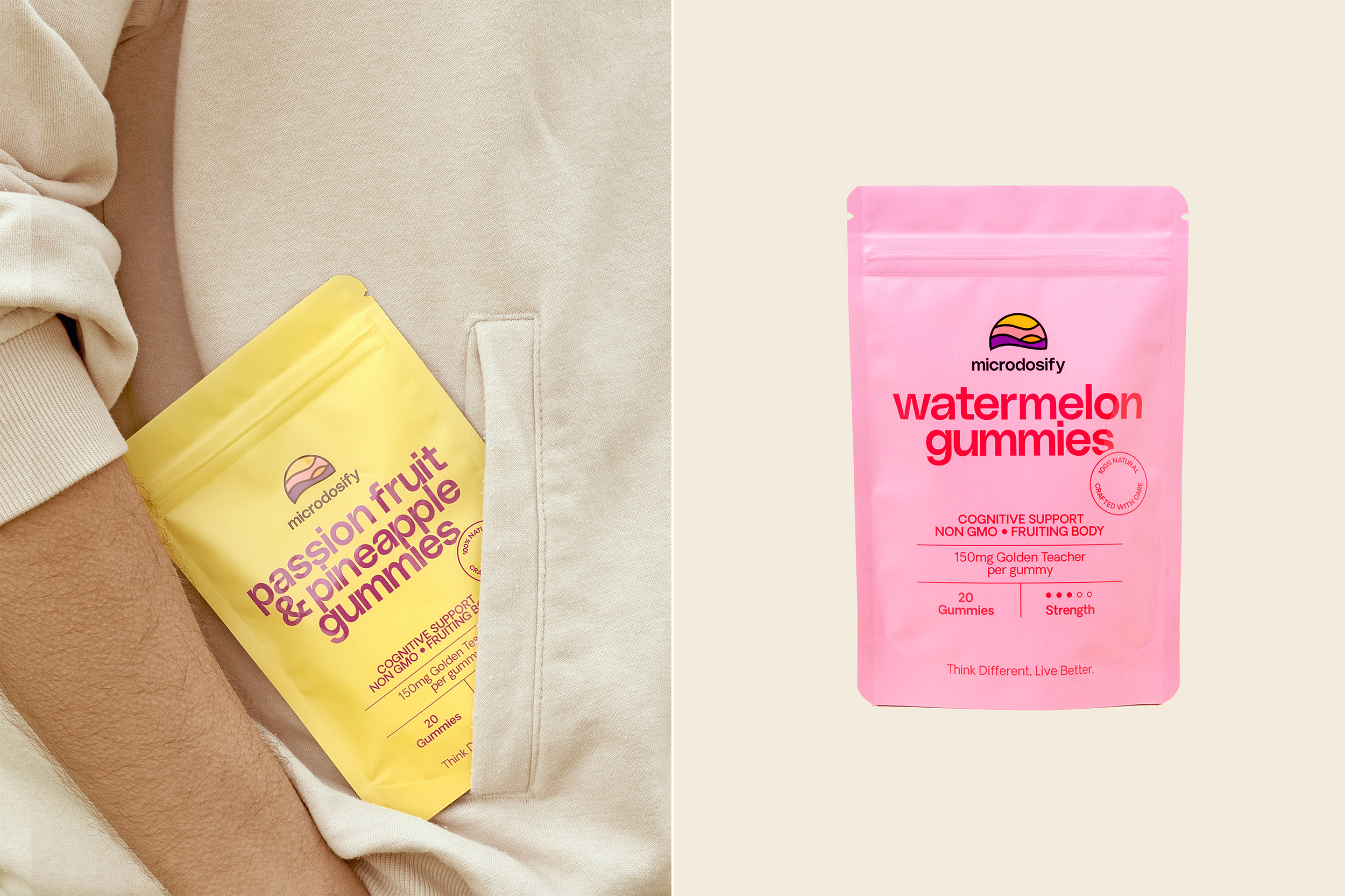
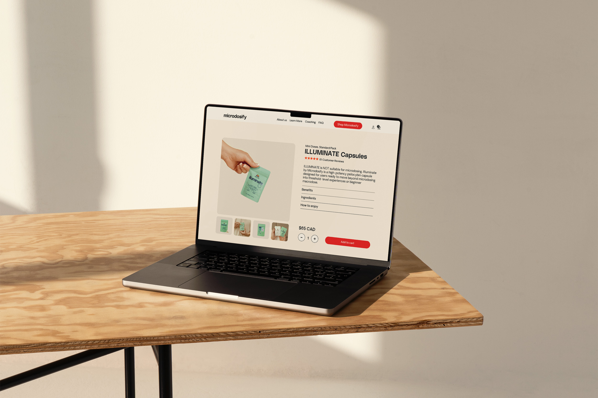
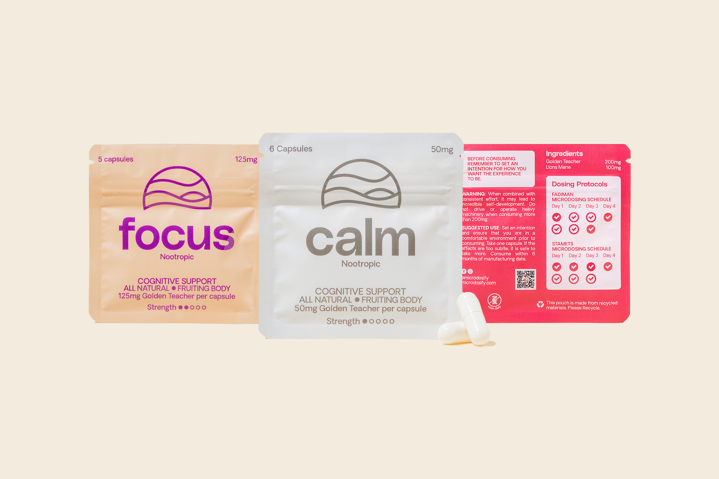
BROKLIN partnered with Microdosify to develop a colourful brand identity including the design of a new website that sets it apart in the market. The new visual system needed to reflect the company’s values and beliefs, as well as its mission to make use of the precious resources nature provides. It was crucial for the design to appear elegant and stylish, appealing to a discerning, adventurous, and health-conscious audience. We employed a variety of colours for different flavours, inspired by the name and organic ingredients. The logomark was redesigned with a thick, consistent stroke weight, resulting in a modern, clean, and balanced appearance. Typography plays a key role in the project. Accompanying the logo is a new sans-serif wordmark set in PolySans Median Wide by Gradient Type, which matches the logomark’s stroke weights and serves as the primary typeface. For both Microdosify lifestyle and product photography, the team developed two distinct approaches to reflect the health-related aspects of positive transformation and the brand itself. A bright, clean background photography style is used to convey clarity, highlight details, and build trust. At the same time, the real-life approach helps create an emotional connection and shows how the product fits into a customer’s everyday life.
CREDIT
- Agency/Creative: Broklin
- Article Title: Microdosify Brand Identity and Website by Broklin Builds a Color-Forward System for Modern Microdosing in Canada
- Organisation/Entity: Agency
- Project Type: Packaging
- Project Status: Published
- Agency/Creative Country: Canada
- Agency/Creative City: Vancouver
- Market Region: North America
- Project Deliverables: Brand Identity, Packaging Design, Web Design
- Format: Bag, Pouch
- Industry: Health Care
- Keywords: mental health, packaging, gummies, capsules, brand design, identity design, graphic design, pouch bag, website
-
Credits:
Art Direction, Brand Design Lead, Web & UX Designer: Broklin Onjei
Lifestyle Photographer, Web Designer: Leiah Choi


