


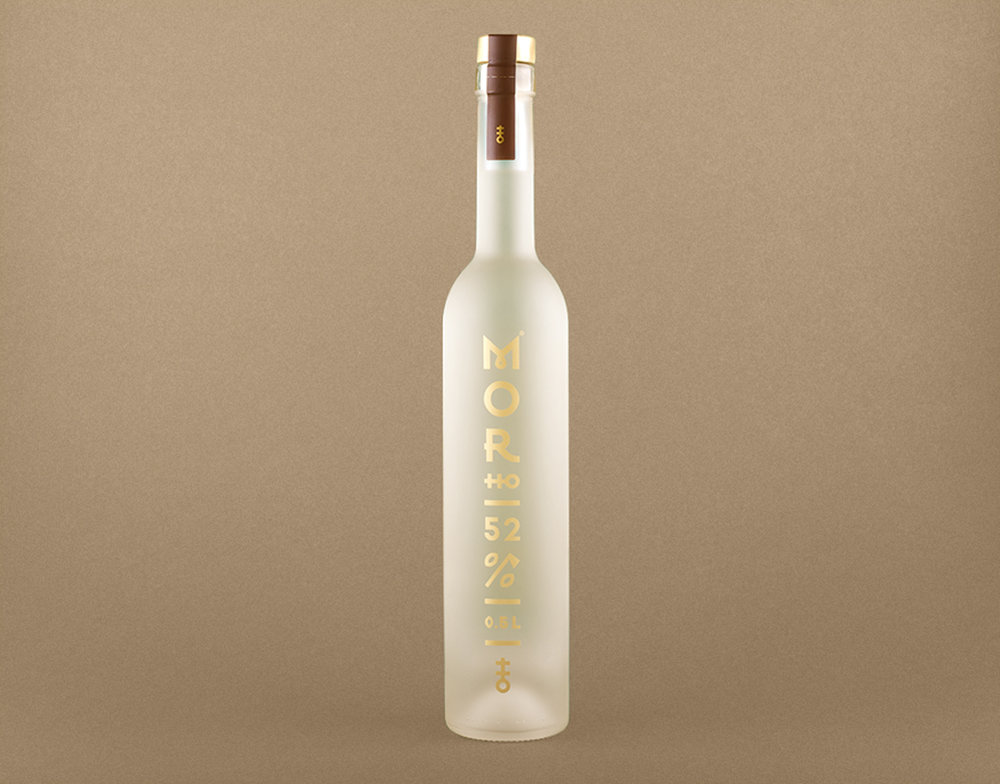
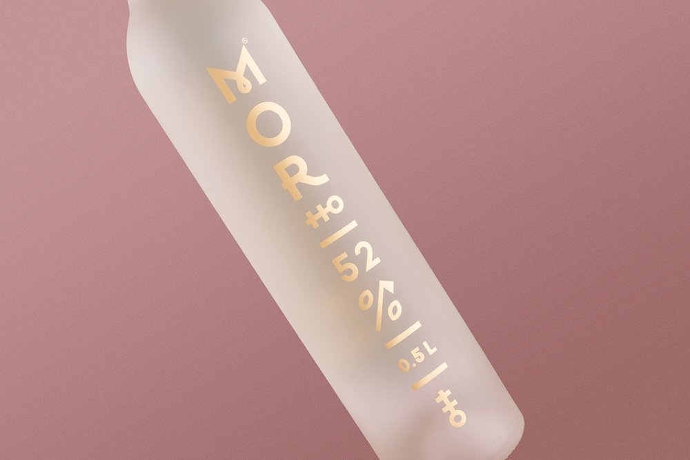
” Morho is hand-malted and fermented rye spirit based on an old recipe of the brand owners grandfather.
The assignment was to make the bottle shape, logo and identity of the brand. We wanted to avoid clichés with using traditional folklore patterns so I introduced a modern take on folklore with symbolism. The bottle was to define the rye spirit as the product that is exclusive though very traditional. Its target is mainly Slovak market where it is recognised as a premium spirit alternative.
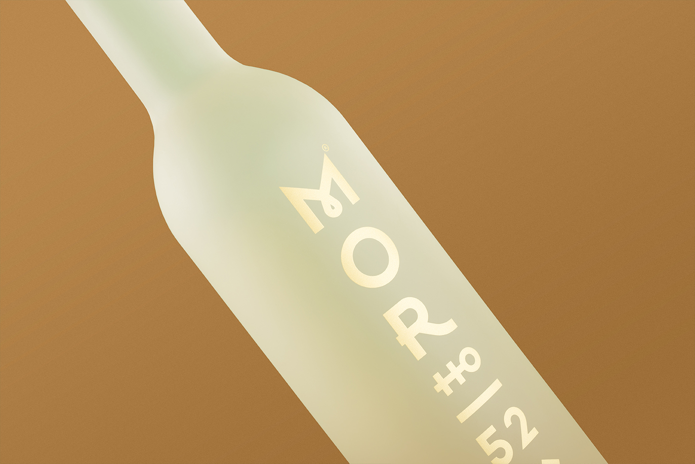
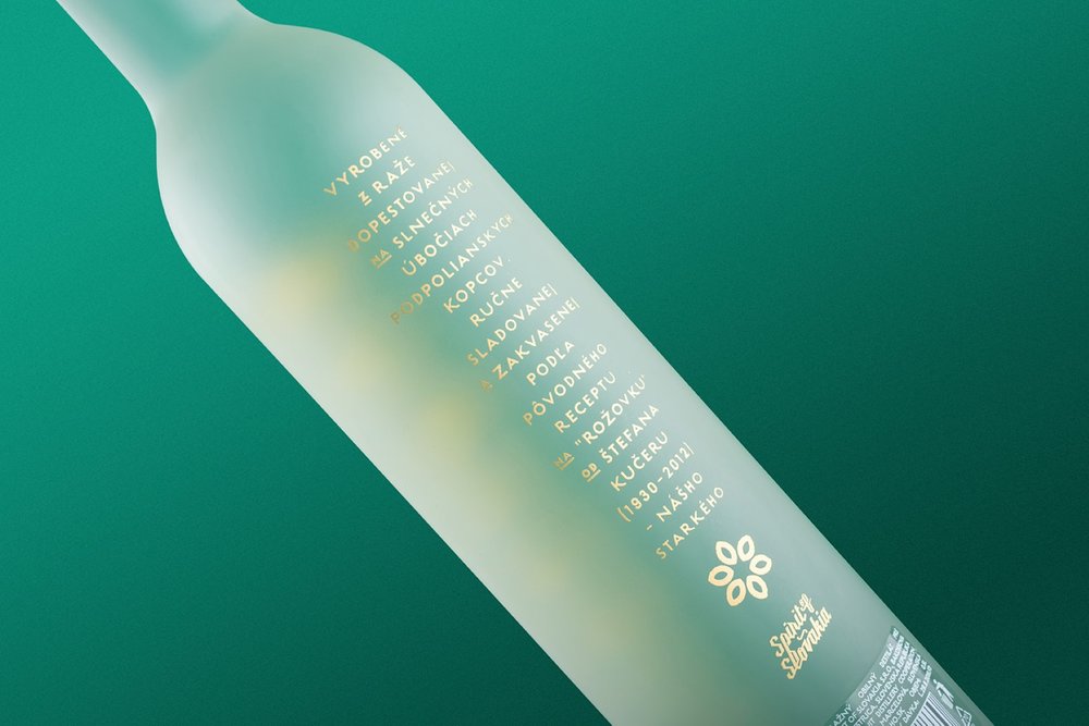
A final minimalistic design has a vertical image to match the shape of the bottle. The brand name refers to one of the most significant Slovak poems by one of Slovak national revivalist Samo Chalupka. The word HO represents the double cross relating to the state symbol of the Slovak Republic. Another folk motive is the letter M that has a tear drop in the center. Details like the percent (%) symbol formed with traditional Slovak shepherd’s axe which is on the list of UNESCO’s World Culture Heritage and two rye grains help enhance an image of folk embroidery.”
CREDIT
- Agency/Creative: Michal Slovák
- Article Title: Michal Slovák – Morho – Rye Spirit
- Project Type: Packaging
- Format: Bottle
- Substrate: Glass


