


” I had the pleasure to redesign the identity of Mumbai’s most exciting fashion select store; Bombay Electric. Bombay Electric has been compared to Barneys New York or Colette in Paris.
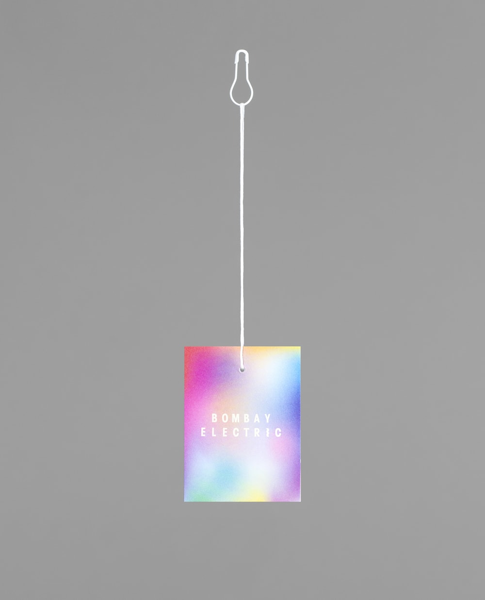
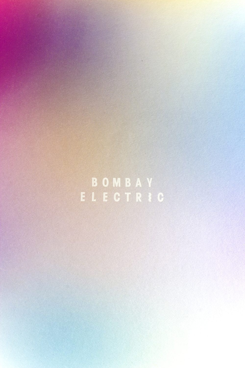
When approaching the work to put a new image on the company I knew that there was no way around colors and vibrancy. Framed by a rather minimal typography and grid, the intense color gradients are drawn to look like blurry abstract photographs, as if taken inside an Ann Veronica Janssens installation.
The logo follows the minimal half of the identity visualizing the almost utilitarian name of the company, where the vibrating letter “I” represents the restless curiosity that Bombay Electric stands for.”


CREDIT
- Agency/Creative: Michael Thorsby
- Article Title: Michael Thorsby – Bombay Electric
- Project Type: Packaging
FEEDBACK
Relevance: Solution/idea in relation to brand, product or service
Implementation: Attention, detailing and finishing of final solution
Presentation: Text, visualisation and quality of the presentation


