The project for the Terminal de Autobuses de Pasajeros Oriente / TAPO (Eastern Passenger Bus Terminal), one of the busiest terminals in Mexico City, aims to improve accessibility, mobility, and the user experience through a graphic identity design, signage, and multimodal maps. With an inclusive and innovative approach, the project seeks to transform the terminal into a more accessible and easy-to-navigate space for everyone, including people with disabilities. In addition to enhancing functionality, the goal is to create a friendlier and more understandable environment for all.
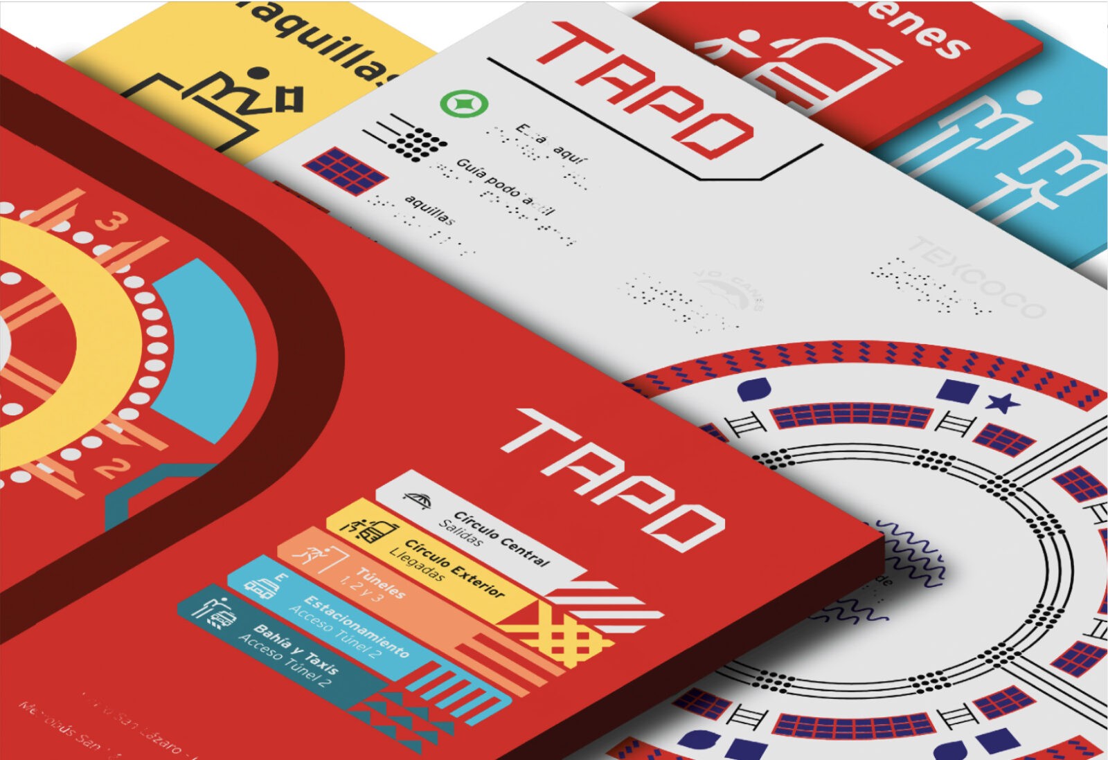
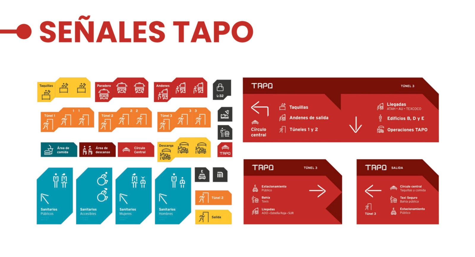
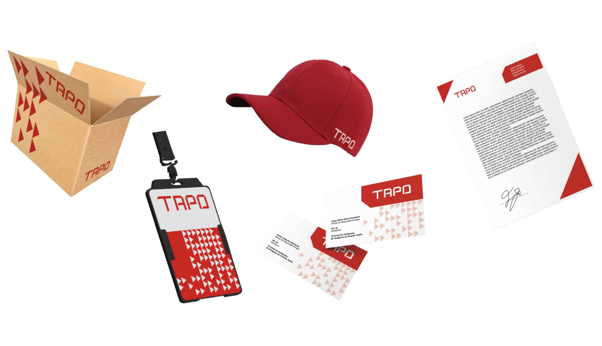
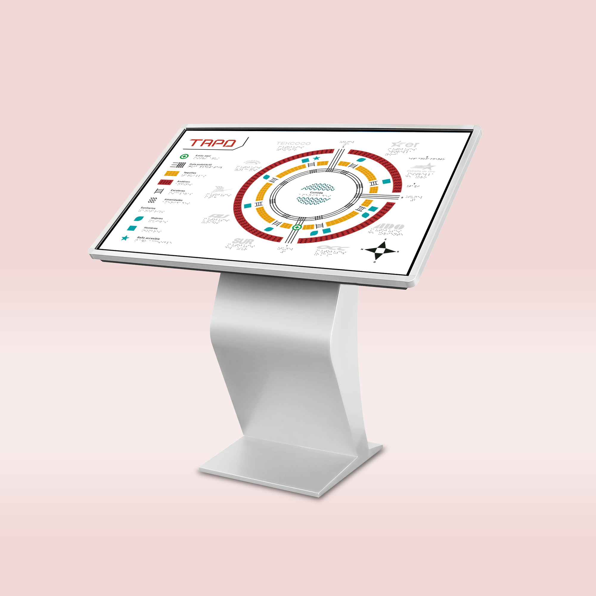
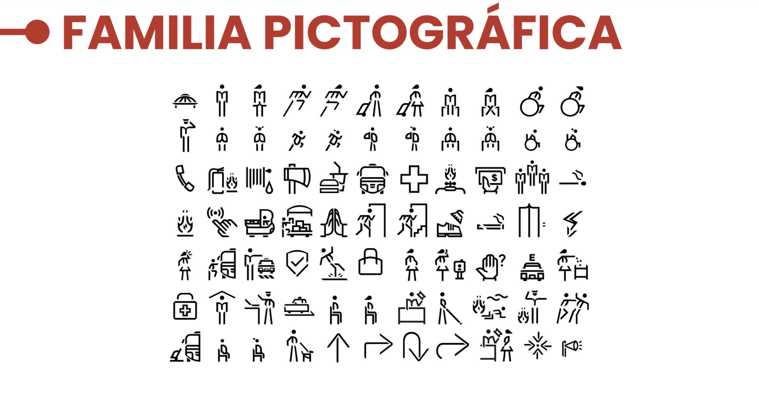
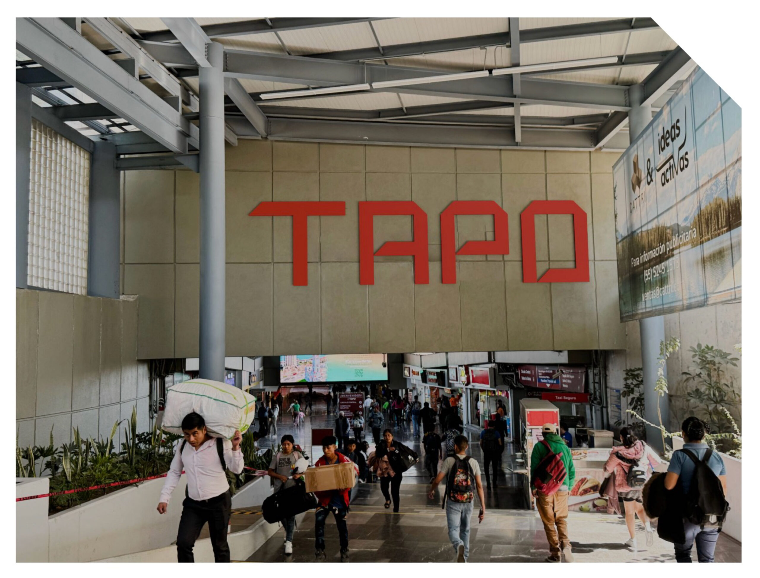
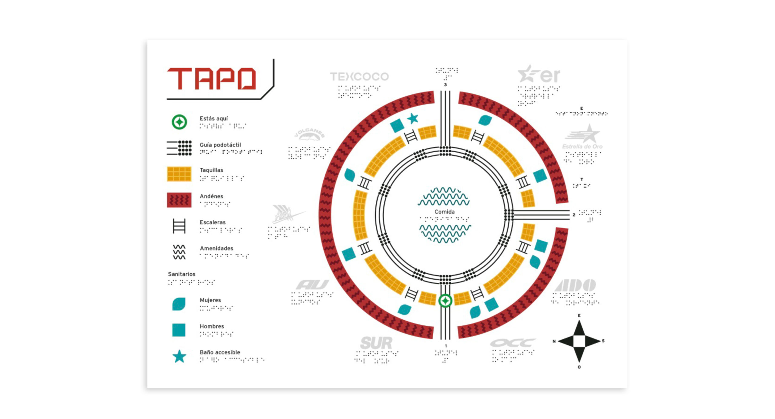
The redesign of TAPO’s visual identity includes a new logo proposal, accompanied by a pictogram family specifically designed to facilitate navigation within the terminal. Signage is one of the key elements of this project, as it uses clear and understandable iconography designed to ensure that users can move easily through the space, regardless of their abilities. Additionally, tactile maps are included as an essential tool for guiding people with visual impairments, featuring not only raised elements but also complementary tactile signals.
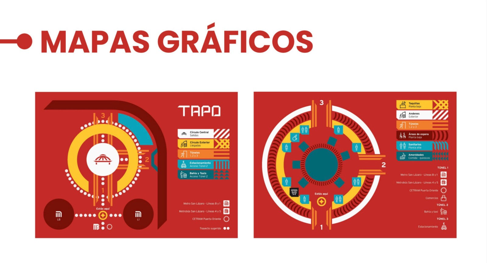
The multimodal map design complements this strategy by integrating different types of information (such as bus routes, access points, services, and key locations) in a clear, accessible, and easy-to-understand manner. This integration aids in comprehension not only for people with physical disabilities but also for those with psychosocial disabilities, helping to improve autonomy for all users. The implementation of these improvements not only optimizes the terminal’s operational efficiency but also promotes inclusion and equal opportunities, providing a smoother, more accessible, and enjoyable experience for all users, regardless of their abilities.
In summary, the project aims to create an accessible, safe, and welcoming environment that facilitates mobility and orientation within TAPO, promoting equal opportunities and enhancing the quality of life for all users, regardless of their accessibility needs.
The redesign of TAPO’s visual identity includes a new logo proposal.
CREDIT
- Agency/Creative: María Elizabeth Angel Mejía , Aldo Sánchez Cázares, Camila Monserrat Parra Ponce ,Julieta Carolina Maruri Garcia
- Article Title: Mexican Students Redesign TAPO Terminal for Inclusive Accessibility and Enhanced User Experience
- Organisation/Entity: Student
- Project Status: Non Published
- Agency/Creative Country: Mexico
- Agency/Creative City: Ciudad de México
- Market Region: México
- Project Deliverables: Design, Environmental Graphics, Signage Interior
- Industry: Transport
- Keywords: WBDS Student Design Awards 2024/25 , accessibility, mobility, user experience, graphic identity design, signage, multimodal maps
- Keywords: WBDS Student Design Awards 2024/25 accessibility, mobility, user experience, graphic identity design, signage, multimodal maps
-
Credits:
Educational Institution: Universidad Iberoamericana, Ciudad de México, Departamento de Diseño , Diseño Sensorial y Dirección Creativa
Educator's Name: Angélica Martínez de la Peña y Carolina Alba


