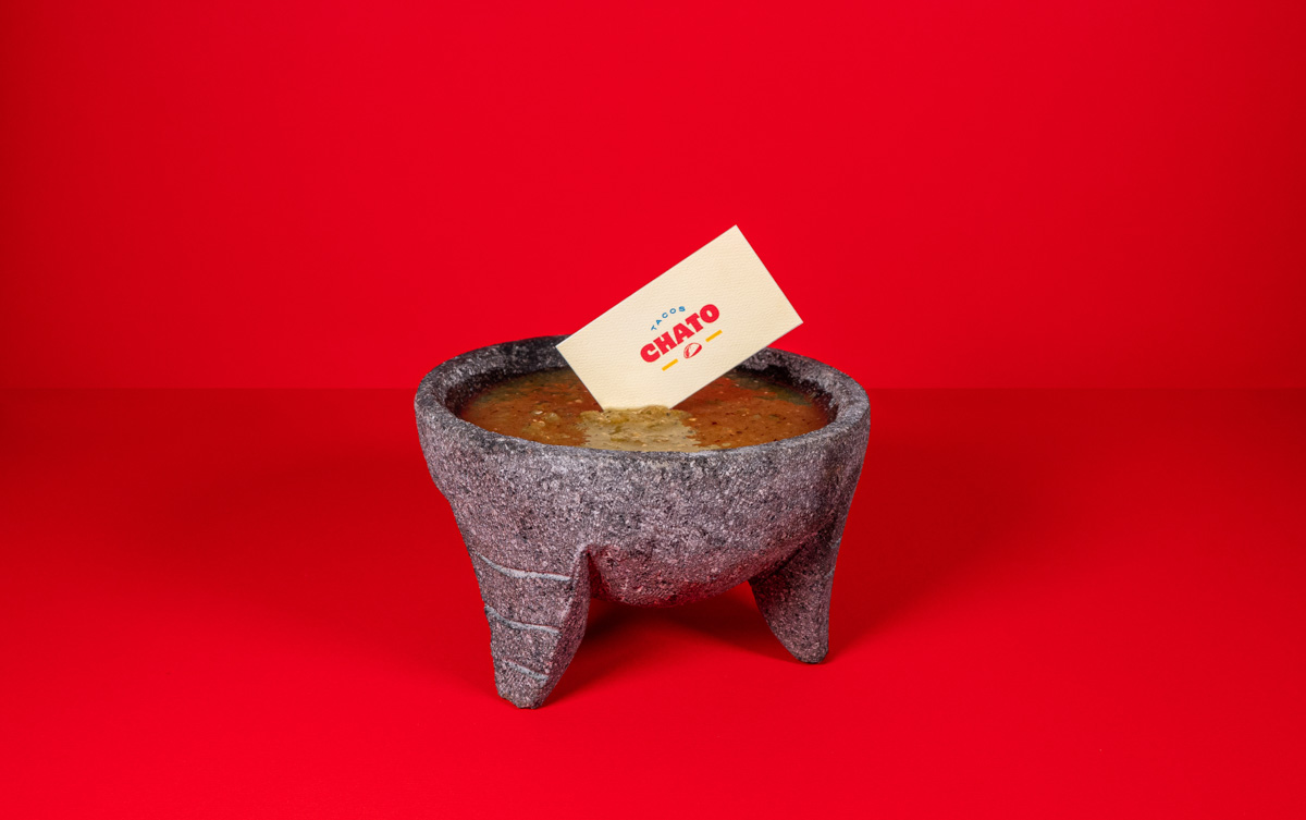
Tacos Chato is a Mexican taco restaurant aimed at everyone who is looking to experience and taste the traditional Mexican flavors that are found in the local street taco shops all around the country while offering a restaurant vibe where you can hang out and have a beer with friends. Unlike a classic taco shop, Tacos Chato offers the comfort, convenience and great service of a casual dining restaurant or a bar.
Chato or Chata, is a common Mexican word used by people to refer to someone that they are talking to, but they don’t know personally. And it is often used by “Taqueros” to refer to their clients when they are serving their orders, like: What sauce would you like, Chato? Want onion on your tacos, Chato?
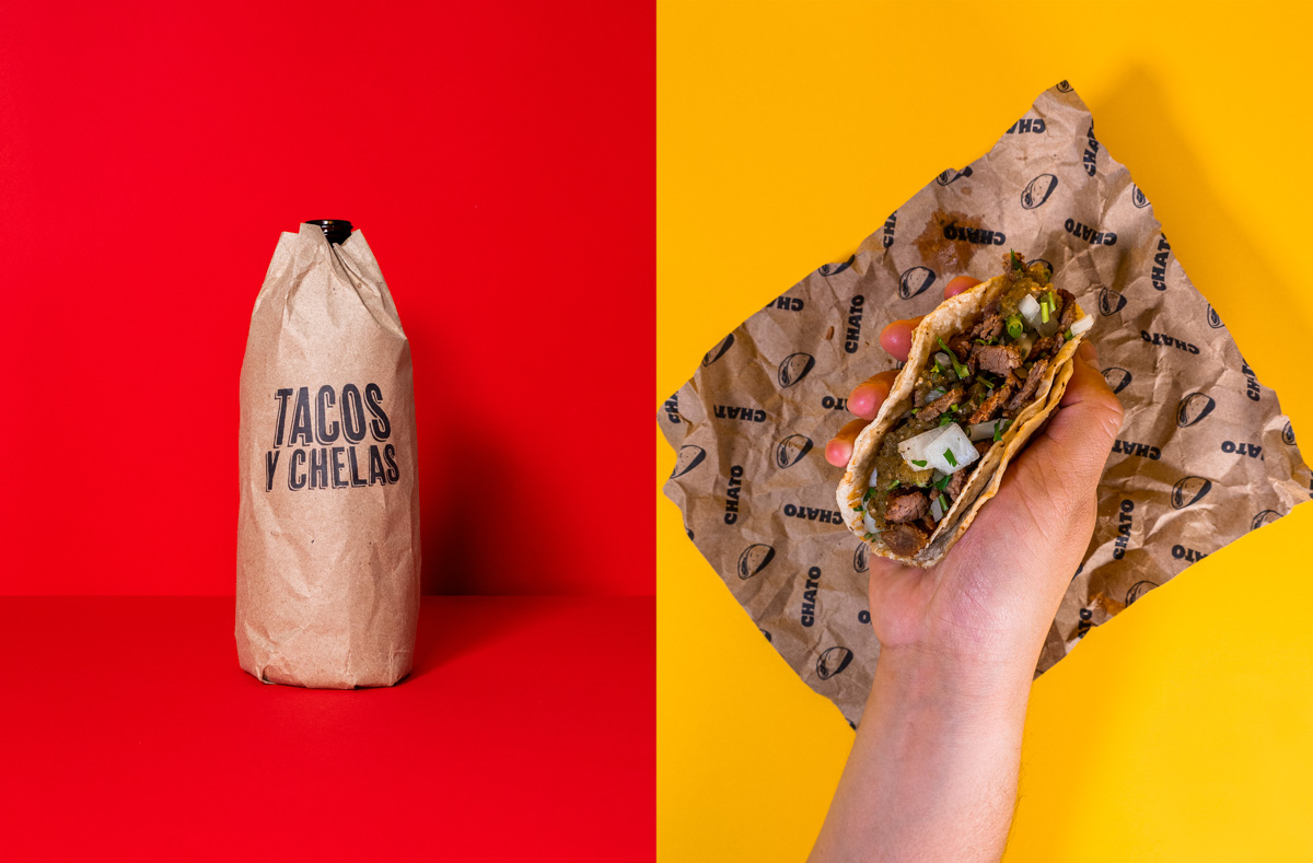
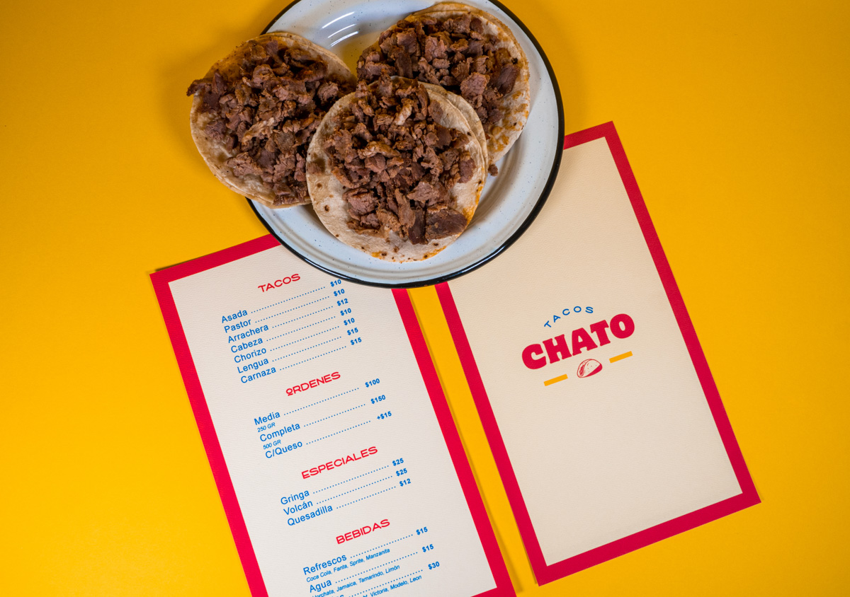
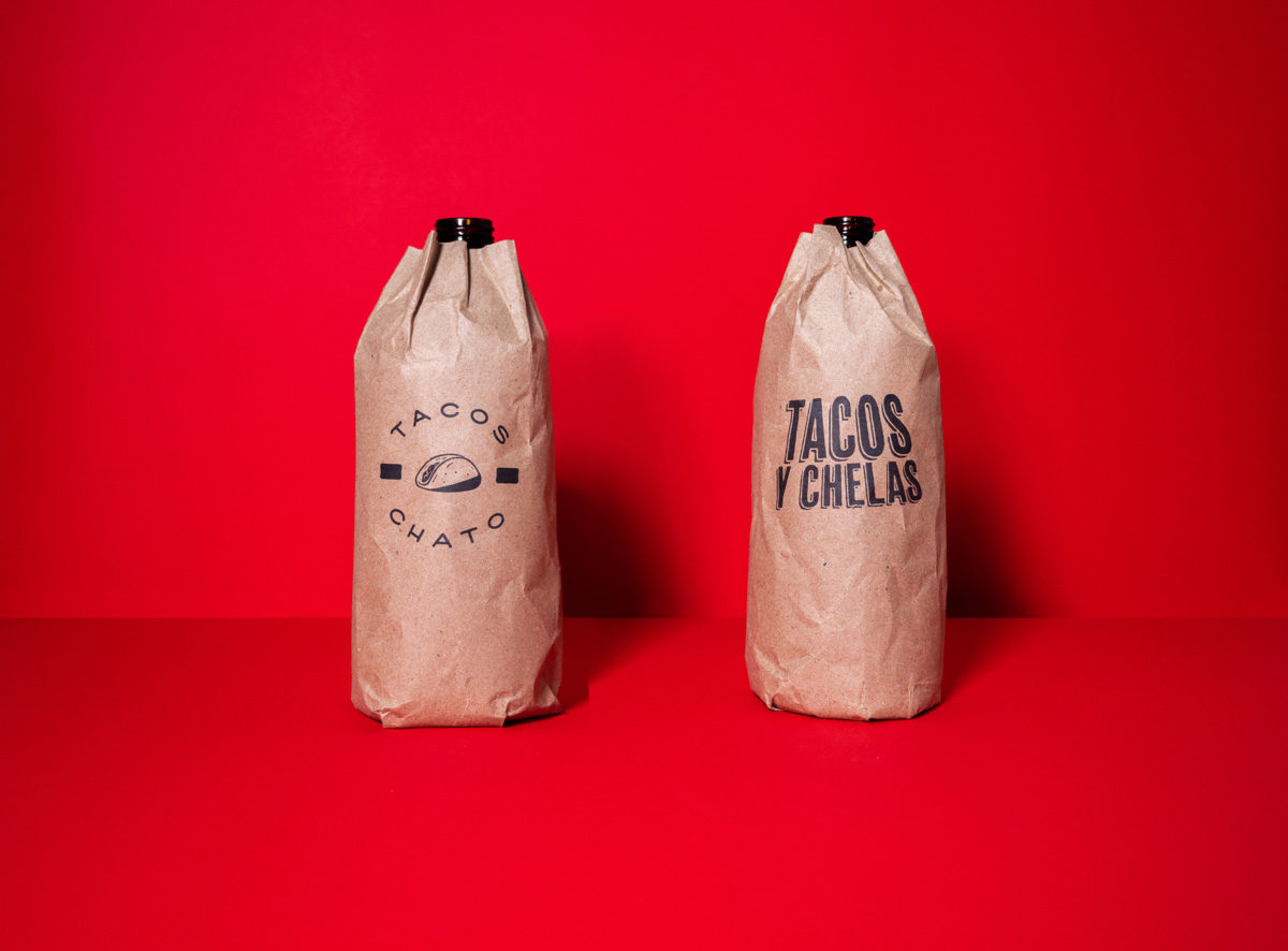
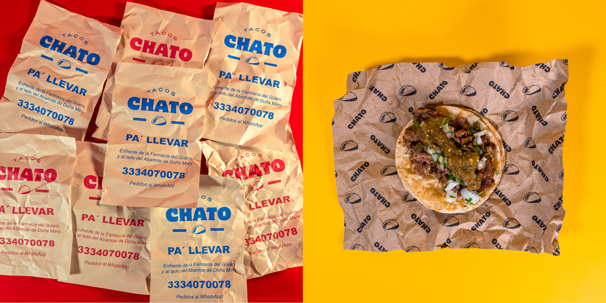
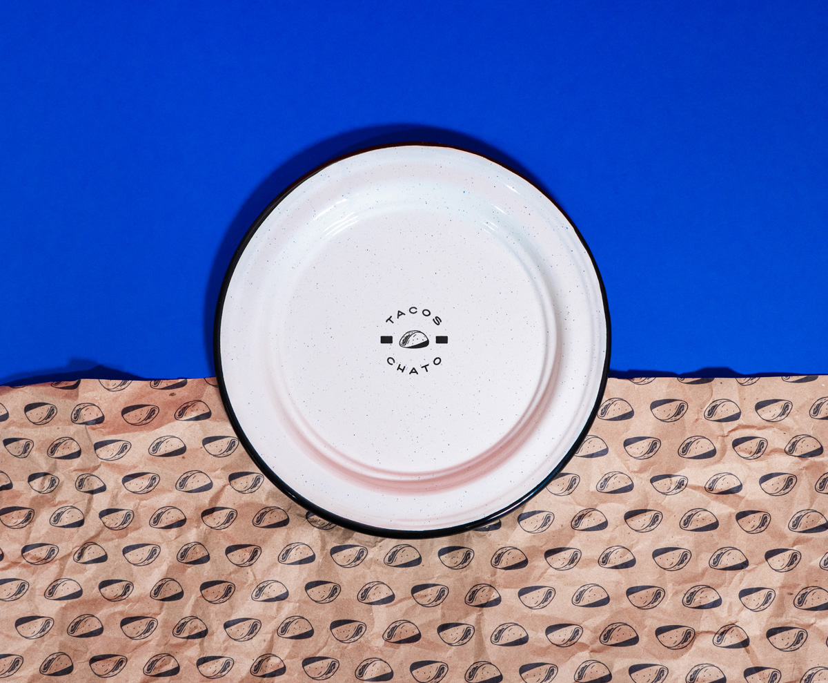
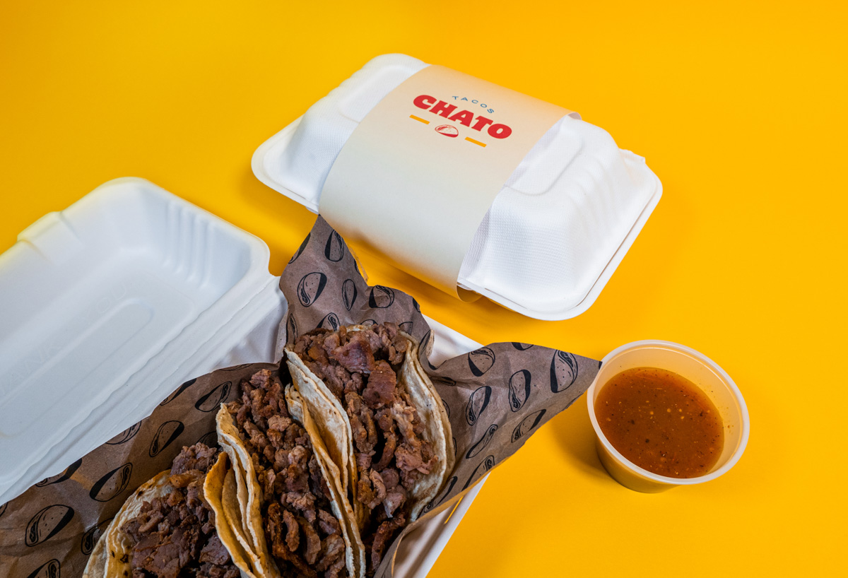
Many challenges were presented as we were developing this project, like being faithful to the spirit of the brand where tradition, sophistication and Mexican culture coexist. We had the creative freedom to work with the brand allowing us to push the boundaries on its personality. We were able to find a balance between the elements that every Mexican street taco restaurant has and the sophistication and comfort offered by a restaurant or a bar, to achieve that, we decided to bring many key Mexican traditional elements like the use of the brown paper that is widely used in the streets to serve tacos but instead of keeping it plain, Tacos Chato combined it with classical crockery proper of a casual restaurant.
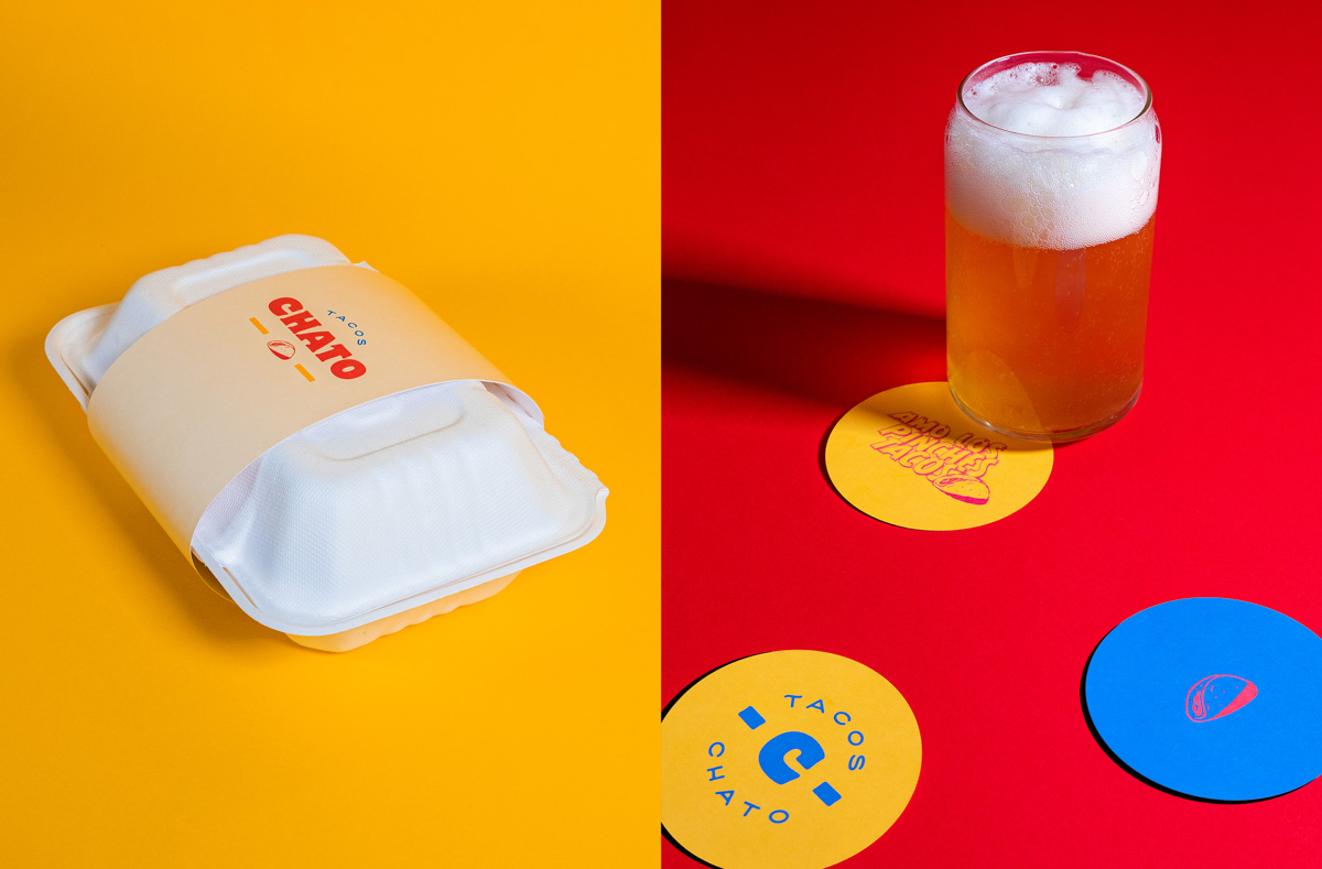
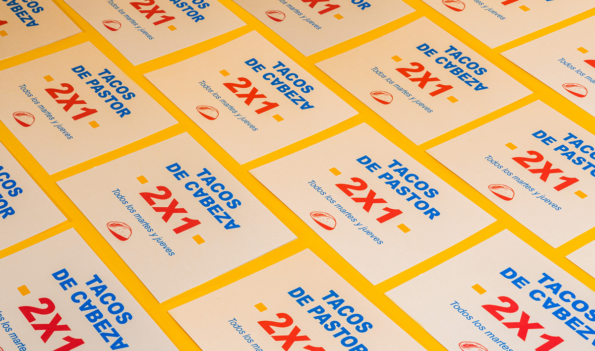
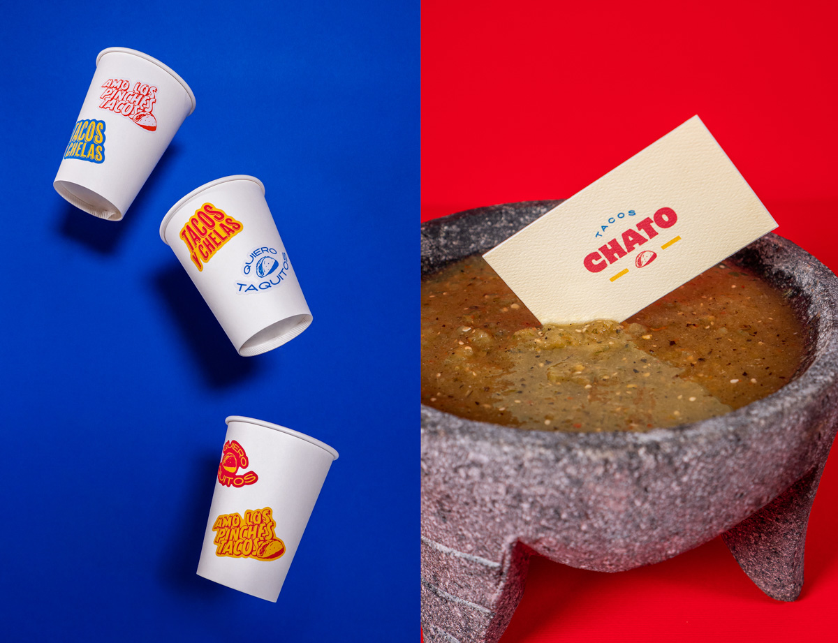
We generated the full visual and brand system: personality, messaging, logotype, sticker language, colors and created a system of multiple packaging containing the different food and drink options, summarizing the essence of the brand.
Our graphic solution for this project is based on the key elements that make up the Mexican street life so unique, like the street language, the colors, the sounds and aesthetics.
For the communication style we employed vernacular Mexican slang phrases that are constantly heard in the streets, like “Quiero unos pinches tacos” “Quiero taquitos” or “tacos y chelas”, with the purpose of building a brand language true to the people’s original way of expression. We also developed to-go packaging and stickers as a part of the identity.
The client is really satisfied with the results, it is such an organic and Mexican branding, that the implementation of the branding has been really easy to make.
We really enjoyed creating this branding, we hope you enjoy it as much as we did.
CREDIT
- Agency/Creative: Mínimo Estudio
- Article Title: Mexican Restaurant Tacos Chato Branding by Mínimo
- Organisation/Entity: Agency, Non Published Concept Design
- Project Type: Identity
- Agency/Creative Country: Mexico
- Market Region: South America
- Project Deliverables: Brand Creation, Brand Guidelines, Brand Identity, Brand World, Branding, Identity System, Packaging Design, Product Naming, Tone of Voice
- Industry: Food/Beverage
- Keywords: tacos, mexico, street food, restaurant


