Overview
Mettlesome is an American bar and wine tool company dedicated to crafting optimal grade, high-quality tools for bartenders and mixology enthusiasts. The brand’s “new vintage” look and feel is designed to appeal to an older crowd, with a focus on timeless elegance and enduring quality. Mettlesome’s minimal packaging, bold identity, and premium feel ensure that the brand stands out on the shelf, making it a preferred choice for those who appreciate both style and substance in their bar tools.
Solution
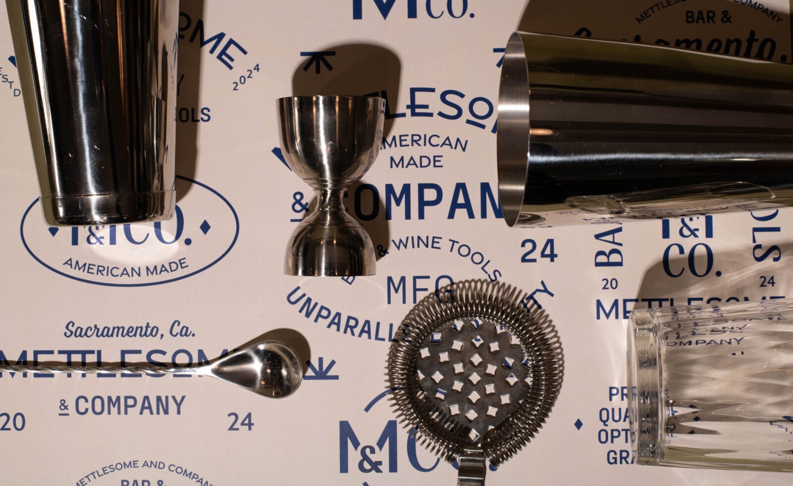
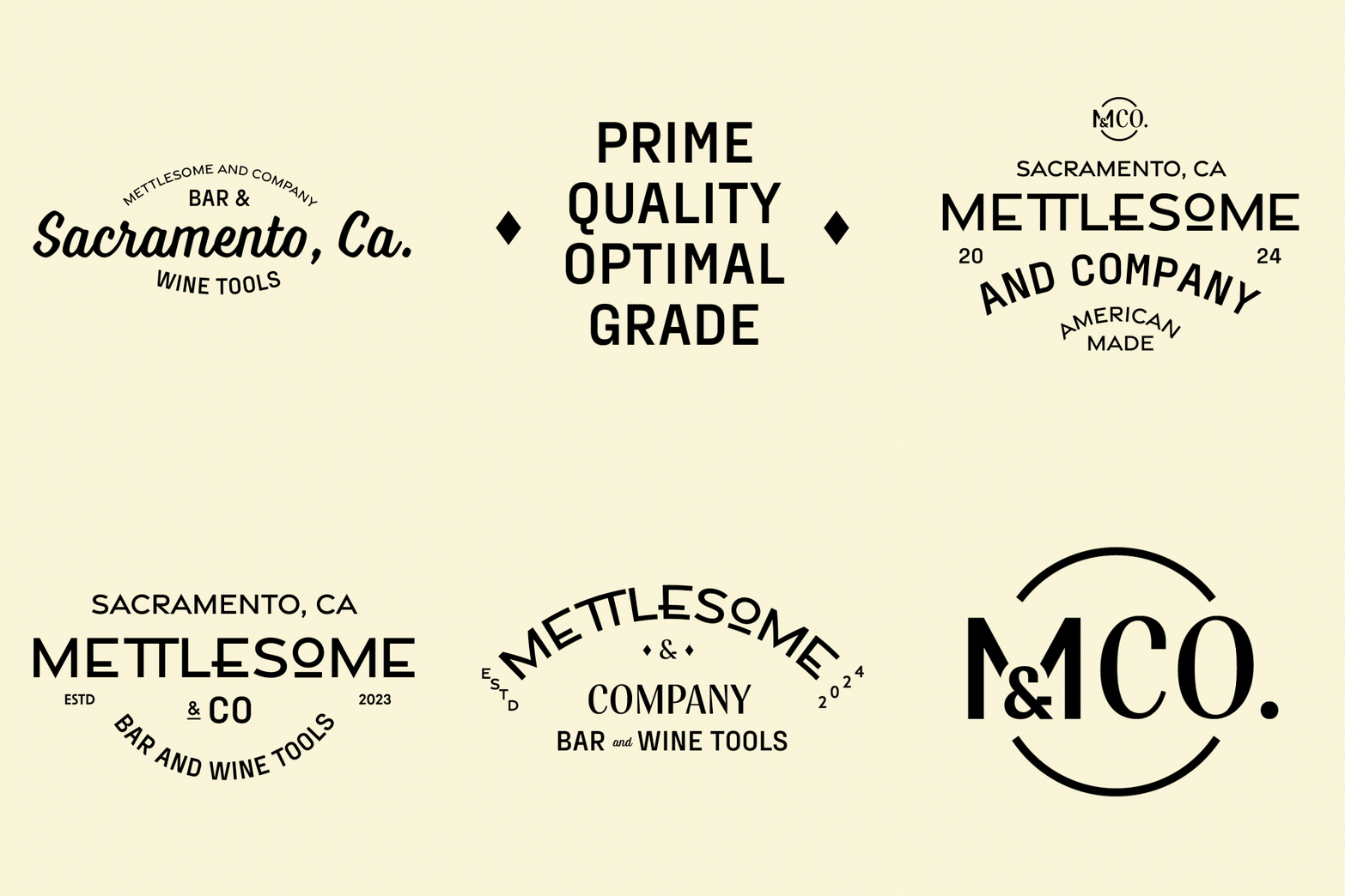
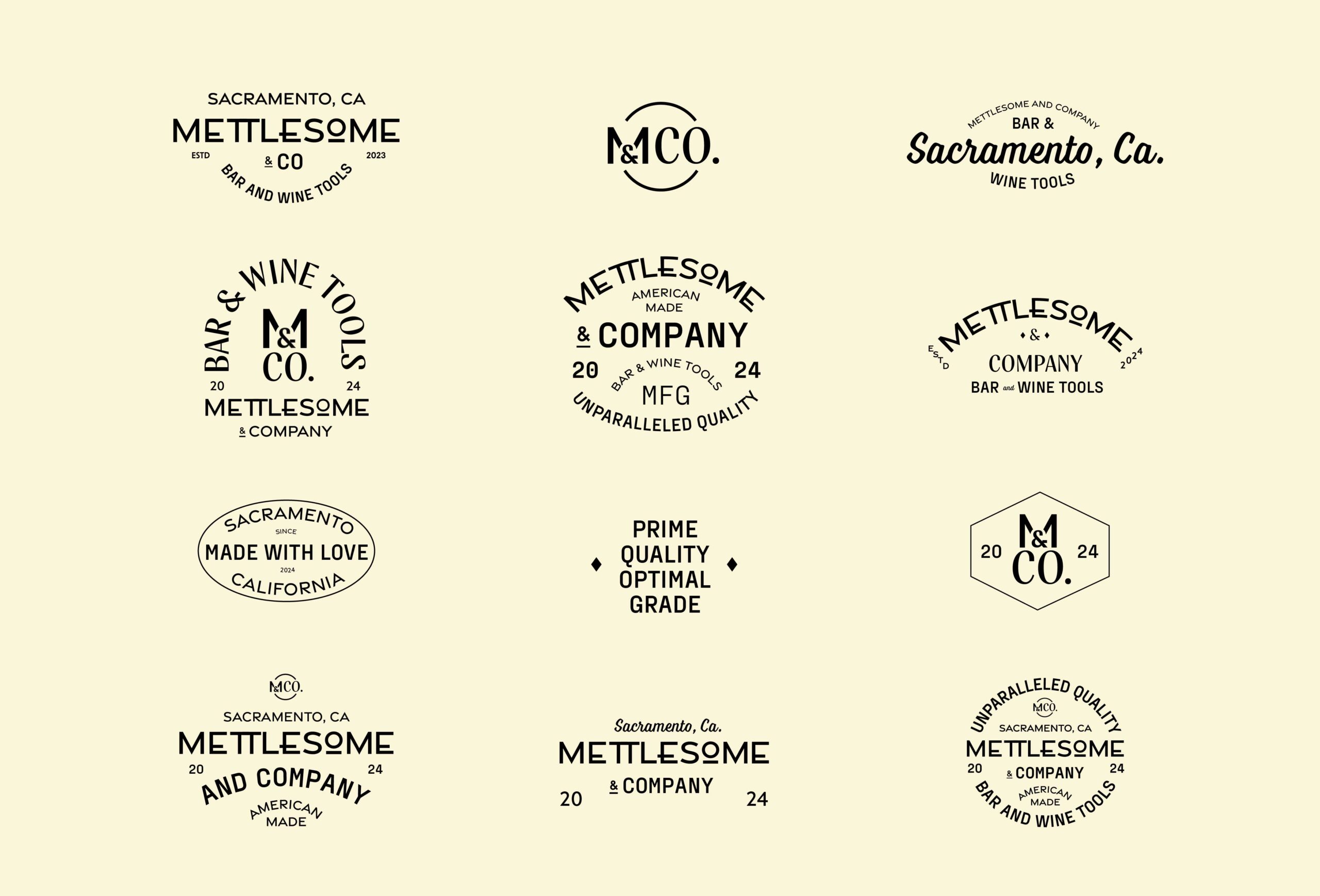
The inspiration for Mettlesome’s brand identity is deeply rooted in vintage typography and Americana, reflecting the brand’s connection to classic American craftsmanship. The branding process began with a wide exploration of logo formats, conducted through an extensive sketching phase. This creative exploration resulted in a final branding package featuring over 12 different logo marks. These marks are used interchangeably throughout the brand, adding authenticity to the vintage aesthetic while evoking the charm of an old-fashioned mom-and-pop company. This variety in logo marks allows Mettlesome to maintain a cohesive yet dynamic brand presence, reinforcing its commitment to quality and tradition.
The typographic palette for Mettlesome is carefully curated to enhance its vintage appeal. The typeface Graved Sans is used for its extended geometric characters that give the brand a luxurious and timeless look. This is contrasted with Voltage, a vintage script typeface with angular strokes and a charming personality, which adds warmth and character to the brand’s visual language. Additional typefaces like Fraktion Sans and Nooks Script are also incorporated to provide texture and variety to the typesetting, ensuring that each piece of branded material is as engaging as it is visually cohesive.
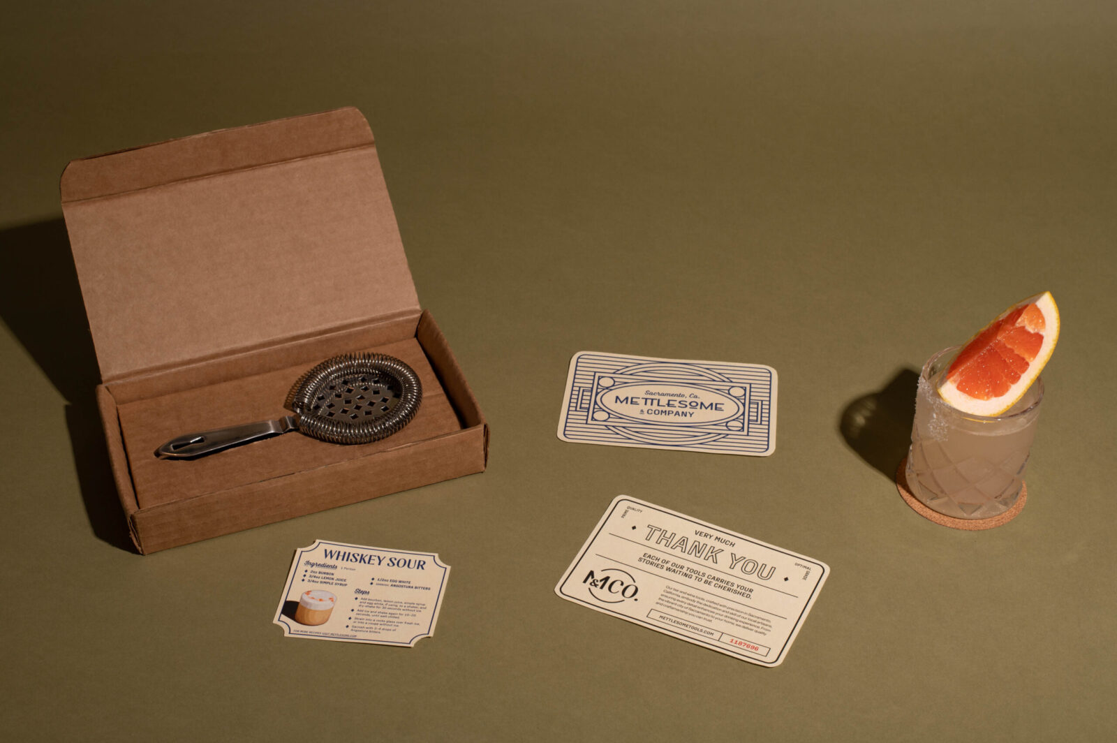
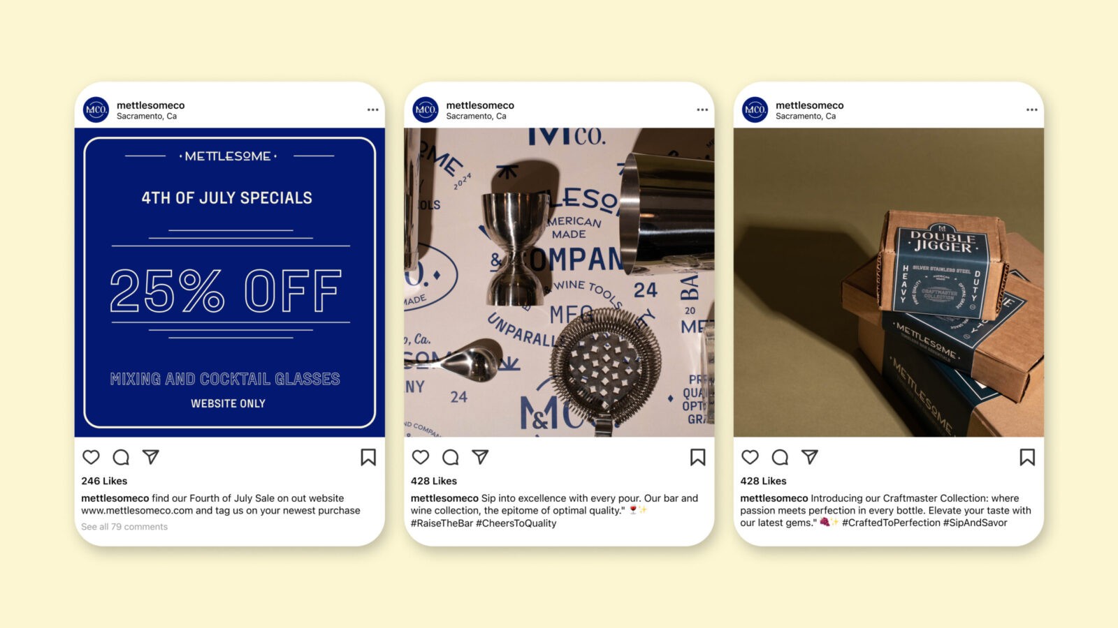
Mettlesome’s visual identity is further enriched by a variety of vintage-inspired graphic elements, including icons, lines, borders, and corners. These elements are thoughtfully integrated into the brand’s design, providing structure while enhancing the overall personality of the brand. The combination of these graphic elements with the diverse typographic palette creates a visual language that is both nostalgic and modern, appealing to those who appreciate the finer details of design.
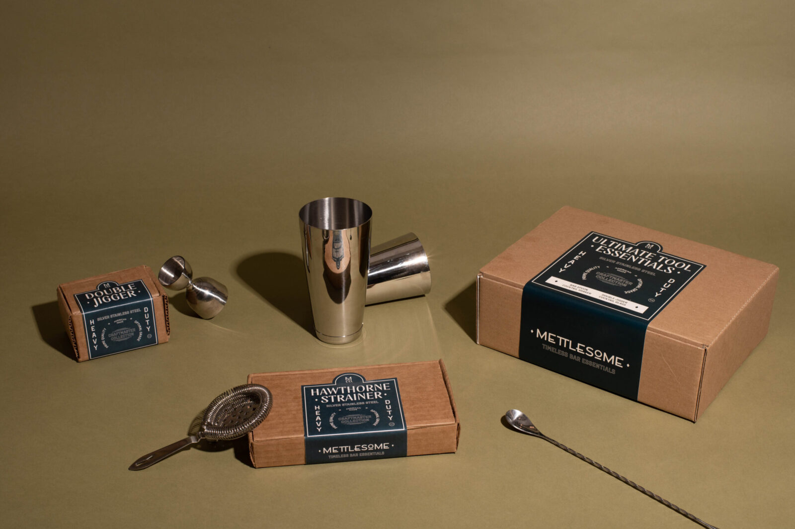
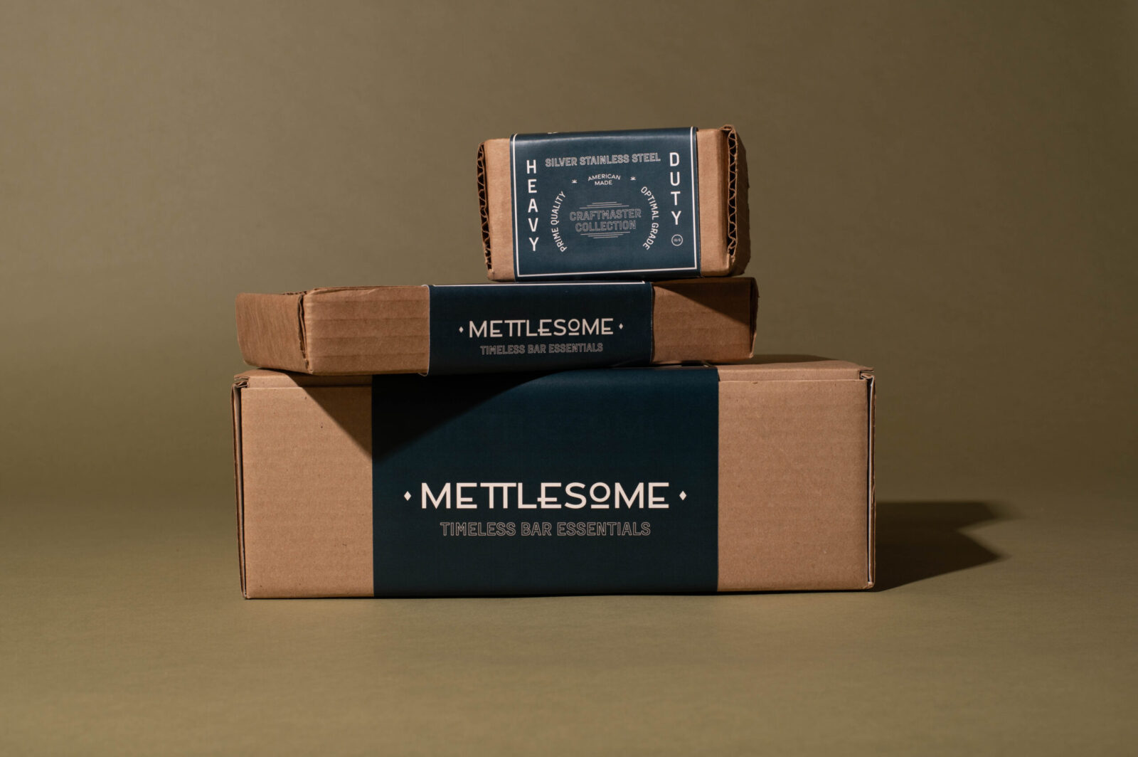
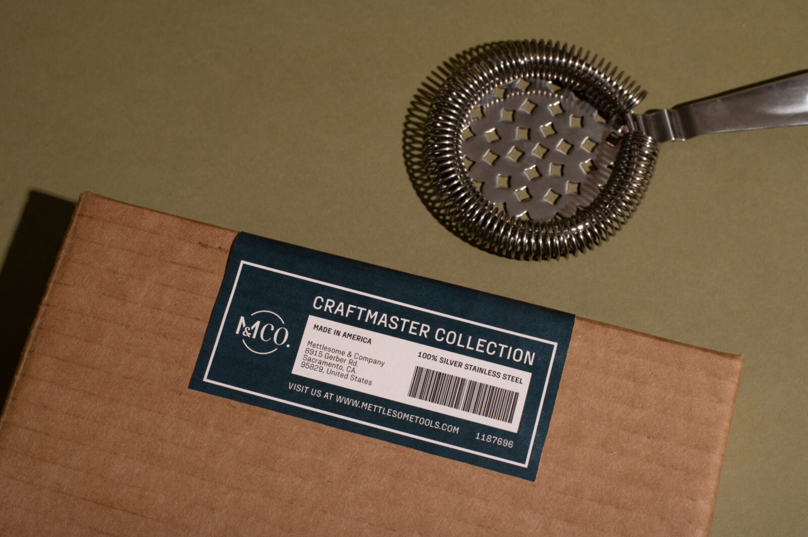
The packaging for Mettlesome products is designed with both form and function in mind. Utilizing inexpensive corrugated material, the packaging is both durable and cost-effective. Cleverly designed labels wrap around the forms, sealing the boxes and segmenting information across the package design. This approach not only ensures that the packaging is easy to remove and free from hidden details but also reinforces the brand’s emphasis on transparency and quality.
Mettlesome’s look and feel successfully connect with the essence of an All-American brand, bringing vintage elements into a fresh and limitless space. Every detail of the brand, from the logo marks to the packaging, is crafted to reflect the prime quality of Mettlesome’s tools. This is a brand made to last, designed to be a part of your Sunday evening sips and every special occasion in between.

CREDIT
- Agency/Creative: Lina Guerrero
- Article Title: Mettlesome’s American Vintage Packaging Design by Student Lina Guerrero Elevates American Bar Tools for Modern Mixologists
- Organisation/Entity: Student
- Project Status: Non Published
- Agency/Creative Country: United States of America
- Agency/Creative City: San Diego
- Project Deliverables: Packaging Design
- Industry: Retail
- Keywords: WBDS Student Design Awards 2024/25
- Keywords: WBDS Student Design Awards 2024/25
-
Credits:
Educational Institution: San Diego City College
Educator’s Name: Sean Bacon & Bradford Prairie


