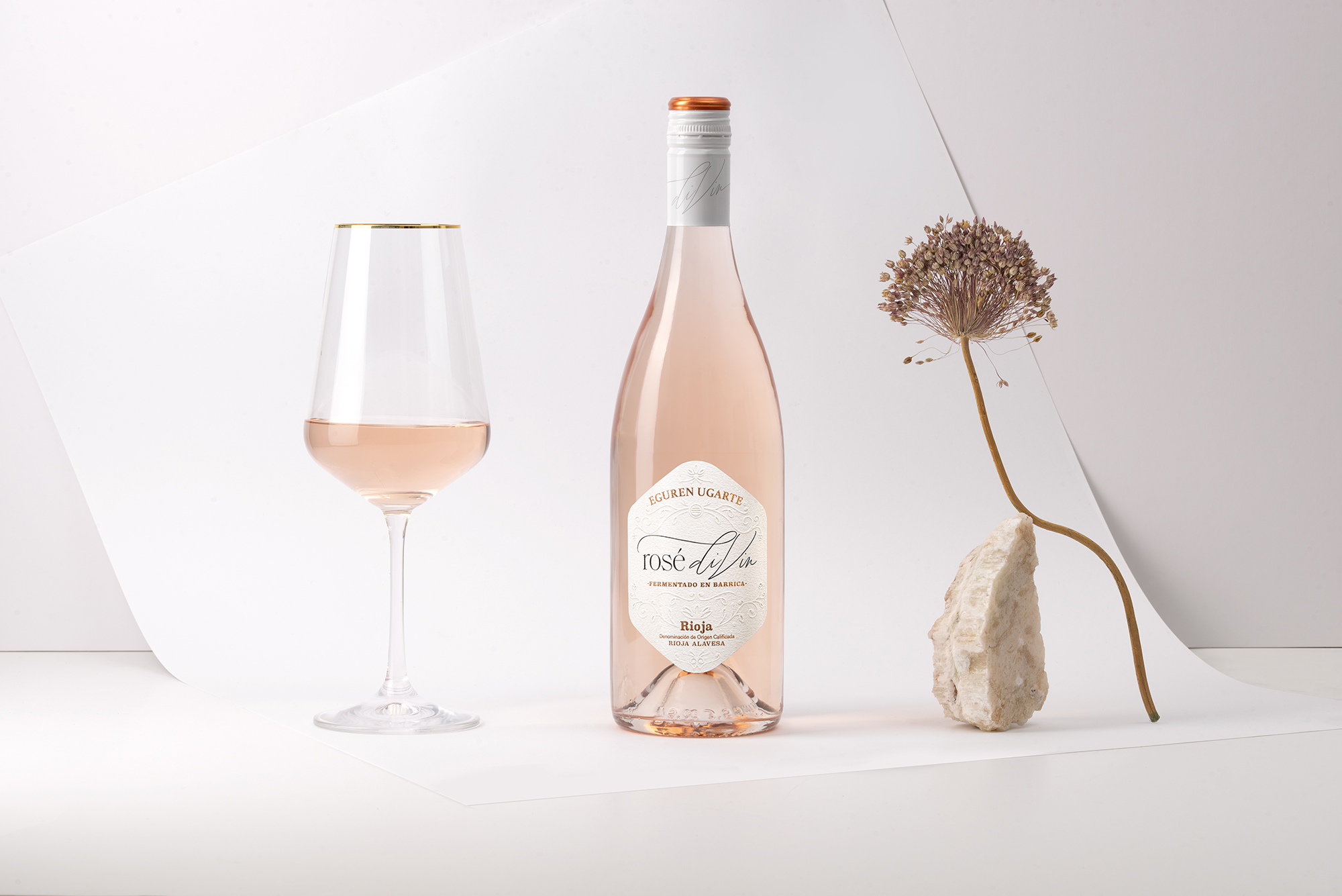
Rosé diVin is a unique, barrel-fermented rosé wine made in the prestigious Rioja Alavesa region. This wine stands out for its elegance and sophistication, offering a fruity character that makes it an irresistible experience for lovers of good wine. Its color, a delicate pink hue that reflects the light with a special shine, is one of the characteristics that makes it so spectacular. This wine has been created to conquer both for its flavor and its appearance, positioning itself as an exceptional option within the world of rosés.
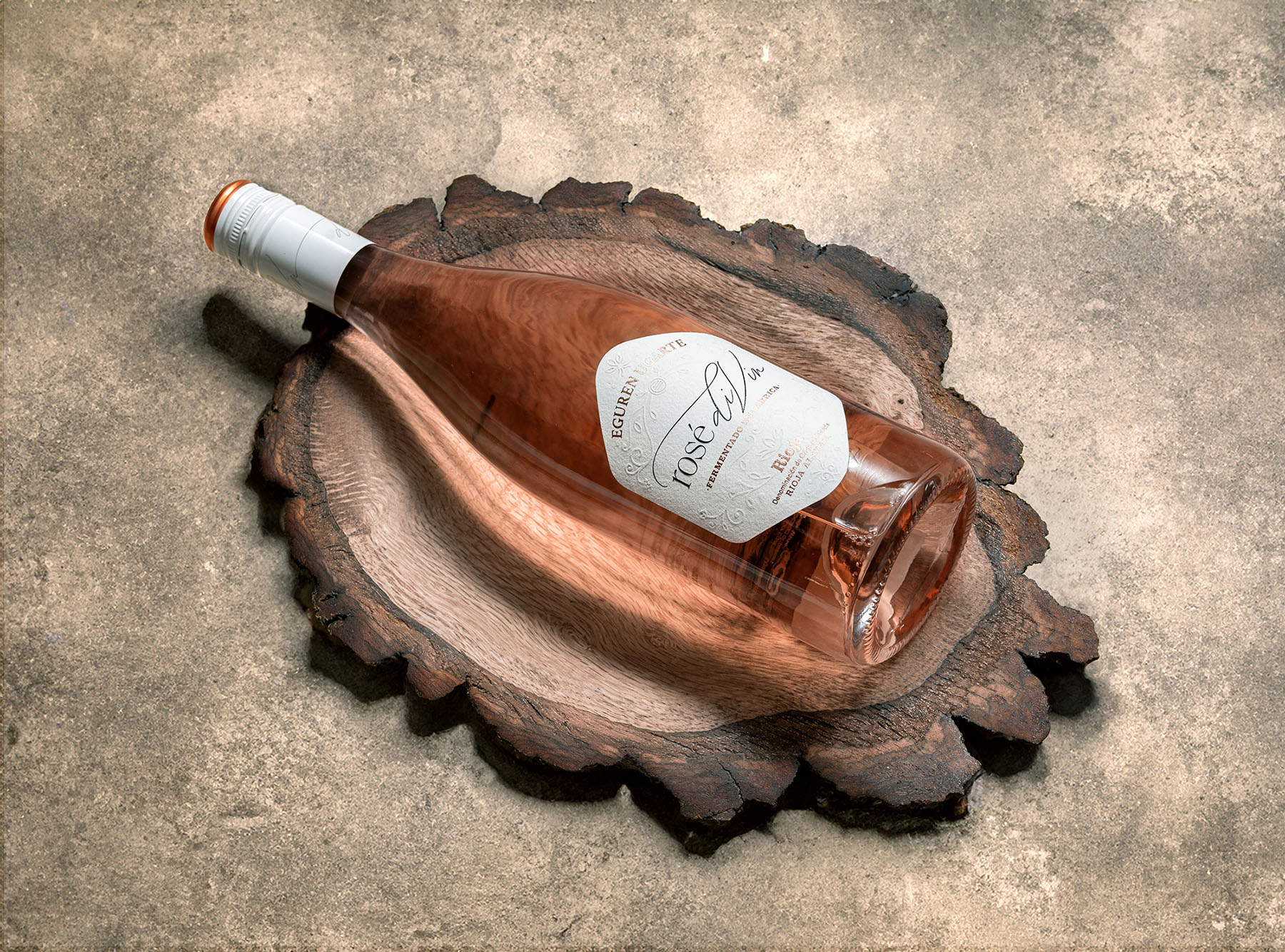
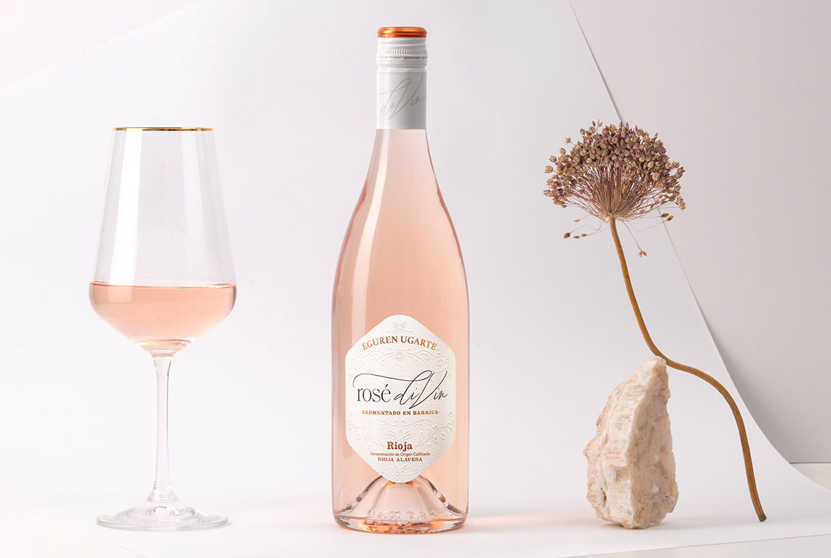
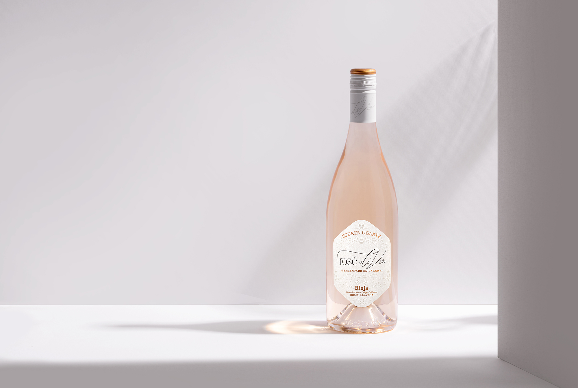
When designing its label, we faced the challenge of reflecting all these qualities and transmitting, with just one look, the essence of Rosé diVin. We opted for a white background label, a color that brings a feeling of purity, simplicity and elegance, letting the main protagonist be the wine itself. This decision was key to not overshadow the visual appeal of the wine’s color, allowing it to shine in all its glory through the bottle.
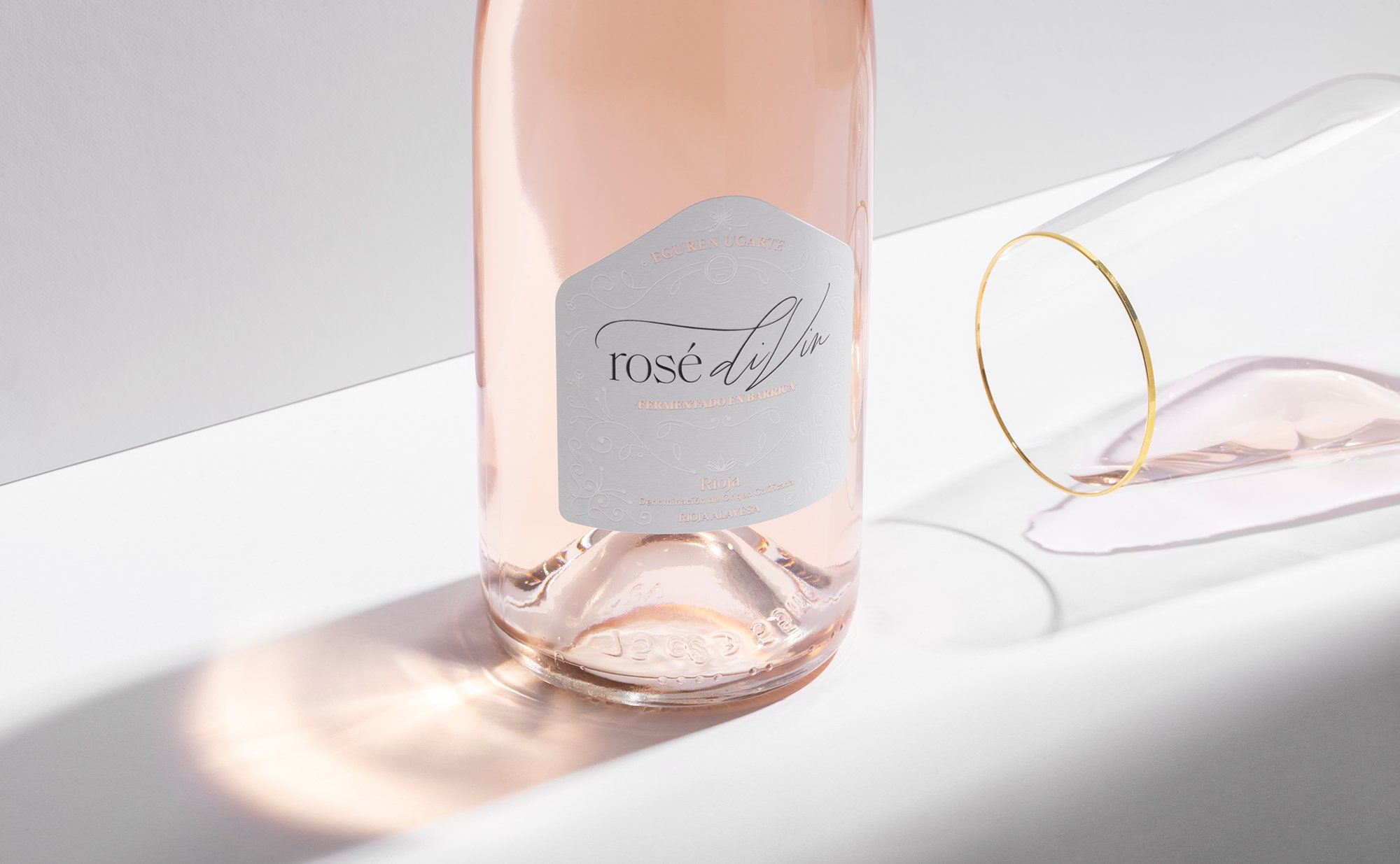
The name of the wine, Rosé diVin, is rendered with the ease of an autograph, giving a sense of closeness and exclusivity at the same time. This dynamic and fluid calligraphy reinforces the idea that each bottle is special, as if the creator of the wine had personally left his signature on each one. This detail brings a warm and human dimension to the design, emotionally connecting with those who choose it.
To complement this presentation, we used a metallic foil in a delicate rose gold tone. This element not only adds a touch of luxury and sophistication, but also creates a subtle and harmonious contrast with the white background and the tone of the wine. The metallic foil captures the light in a unique way, creating soft reflections that add depth and dynamism to the label.
In addition, we included embossed details, carefully applied to highlight certain areas of the design and give texture to the whole. This use of embossing not only adds visual interest, but also a tactile experience when interacting with the bottle. The combination of cotton-textured paper, rose gold details and reliefs creates a set that conveys quality and attention to detail from the first contact.
The Rosé diVin label is much more than a decorative element; it is a window to the essence of the wine. Every decision in its design was made to create an immediate and memorable connection with the consumer. It reflects the dedication and passion put into the making of this wine, from its production to its final presentation. It is a perfect example of how design can be a powerful tool to tell the story of a product and highlight its unique qualities.
Rosé diVin is not just a rosé wine; it is a visual and sensory experience that begins from the moment the bottle is seen. The label, with its careful and elegant design, accompanies the wine in its mission to conquer palates and hearts, making it clear that it is a special product, worthy of any memorable occasion. This union between the wine and its design demonstrates how every detail counts to convey a message of excellence and exclusivity.
CREDIT
- Agency/Creative: Hula Estudio
- Article Title: Metallic Foil and Minimalism: Hula Estudio’s Artistic Approach to Rosé diVin
- Organisation/Entity: Agency
- Project Type: Packaging
- Project Status: Published
- Agency/Creative Country: Spain
- Agency/Creative City: Logroño
- Market Region: Global
- Project Deliverables: Label Design
- Format: Bottle
- Industry: Food/Beverage
- Keywords: wine, rosé, label design, packaging
-
Credits:
Designer: Hula Estudio


