


Floreused stands as a beacon of unique innovation amidst the vast sea of handcrafted floral products. As a purveyor of metallic flora, we harbor a fervent desire to broadcast and invigorate creativity through the use of metal materials. We introduce novel elements into the process of buying and bestowing bouquets. Concurrently, we aspire to impart a measure of value to the community and the environment by repurposing metal objects that are fibrous or pliable through our workshop initiatives. Despite being a nascent product & service in the marketplace, metallic flowers possess the capability for rapid assimilation with the majority of youthful, vivacious clientele who are ever-eager to explore and revolutionise their thought processes. It is due to this burning passion to disseminate a new product and philosophy that workshop activities constitute a significant aspiration of ours in Vietnam.
If you harbor a zeal for florals and yearn to alter your perceptions and unearth your creative potential in the acts of purchasing, arranging, presenting, and receiving flowers in a distinctive, innovative manner that strongly reflects your personality, venture to Floreused to fulfill this ambition.
Concept
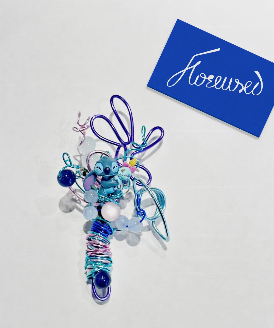
“Metal flower beyond limits” concept carries two meanings. Firstly, it transcends the limitations of using traditional flowers to address the issue of perishability in the floral business market, as real flowers wilt after a few days. Secondly, it surpasses the physical boundaries of flower species, embodying creativity by transforming flowers into various shapes according to preferences and the messages intended to be conveyed.
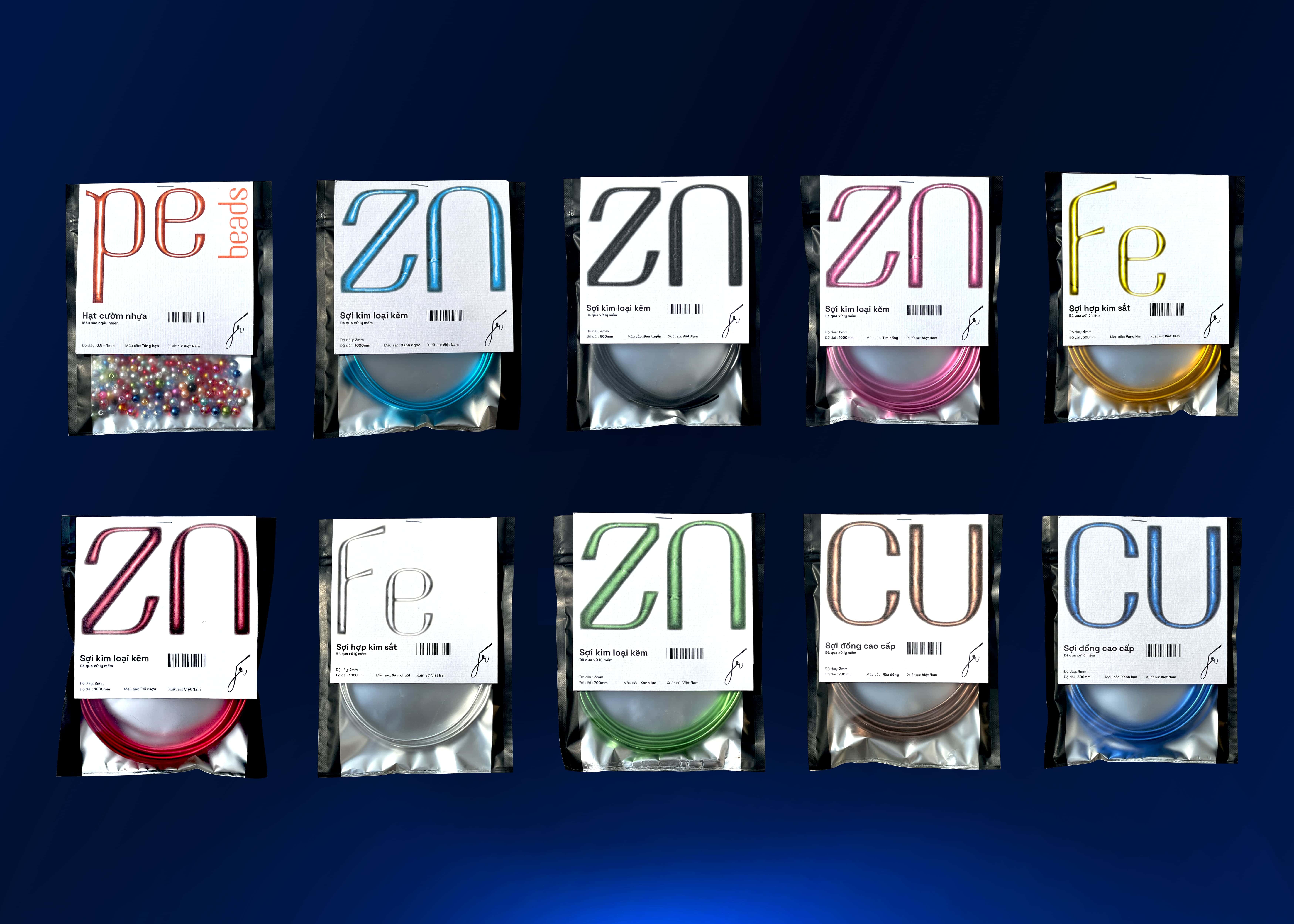
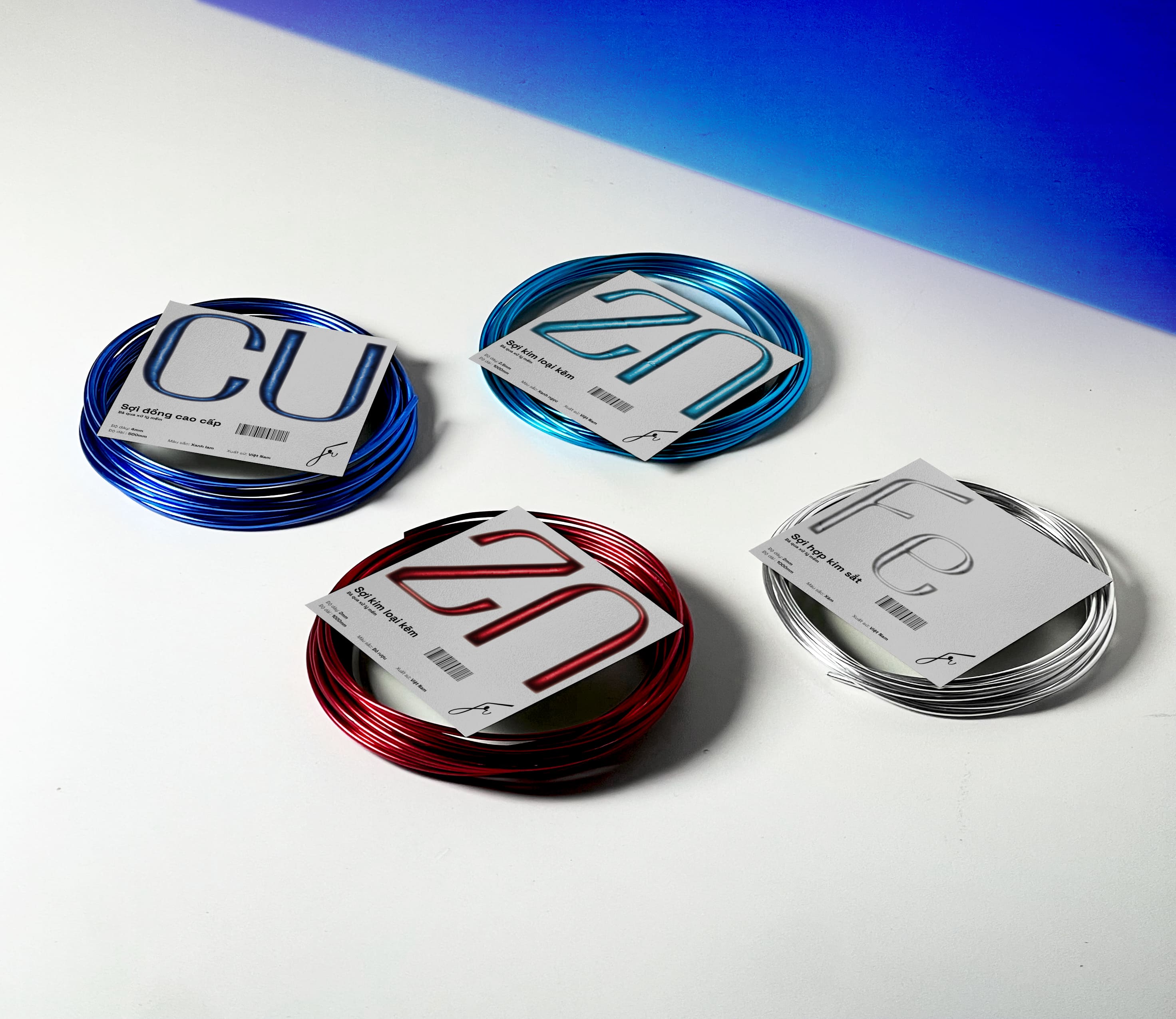
The design concept for Floreused brand identity merges the product’s intrinsic qualities of being a soft, fibrous metal with creativity and dynamism. It delivers an engaging and curiosity-piquing experience in a floral product. We leverage the metallic characteristics of the actual product to forge a brand identity that is as visual and definitive as possible. For example, metal threads are hand-bent to craft a flower with a strong personality. This clearly illustrates how the product is created and the creativity and uniqueness of the bouquet maker.
All design concepts are focused on the product, its practicality, novelty, and problem-solving ability, conveying a new mindset within the product. Floreused is on a mission to affirm its position in the general floral industry to unlock the personality and thinking of those who buy, gift, and explore flowers.
Visualisation
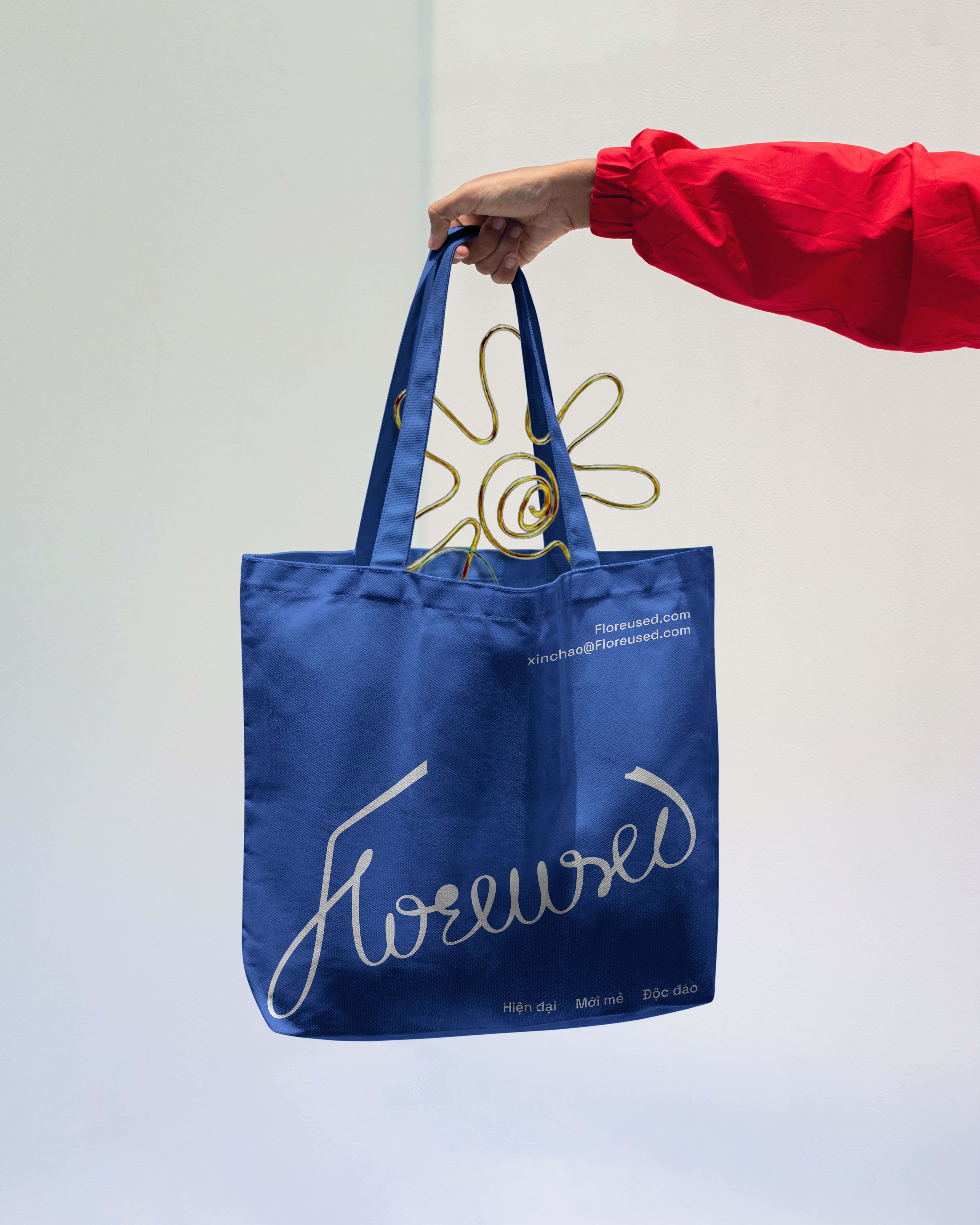
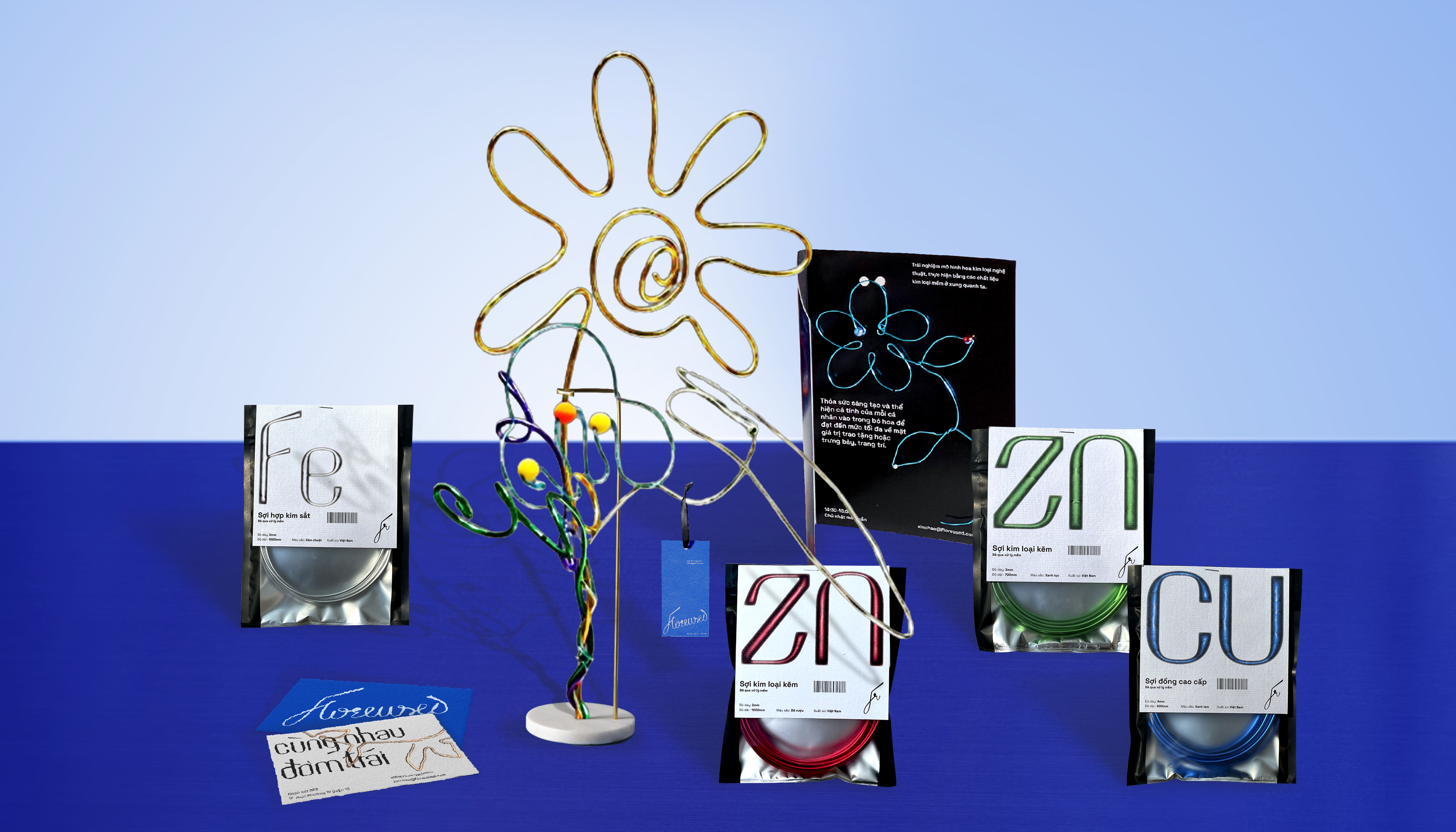
The logotype of the Floreused brand is stylised from its exclusive typeface and incorporates the “one line art” technique, capturing the spirit of the product where a single metal thread is sculpted into a floral form. Opting for a logotype logo enhances brand recognition and facilitates customer recall of the brand name. Additionally, we have crafted a lettermark logo to offer flexibility across various print materials and layouts, contributing to a modern, distinctive, and fresh brand identity system.
Regarding color, we draw inspiration from the elements that constitute metal threads, such as the extreme heat involved in forming metal objects, which then cool to a state that feels cooling to the eye. Moreover, our brand identity resonates with modern, youthful, and strong color elements that enhance its appeal.
Key Visual System
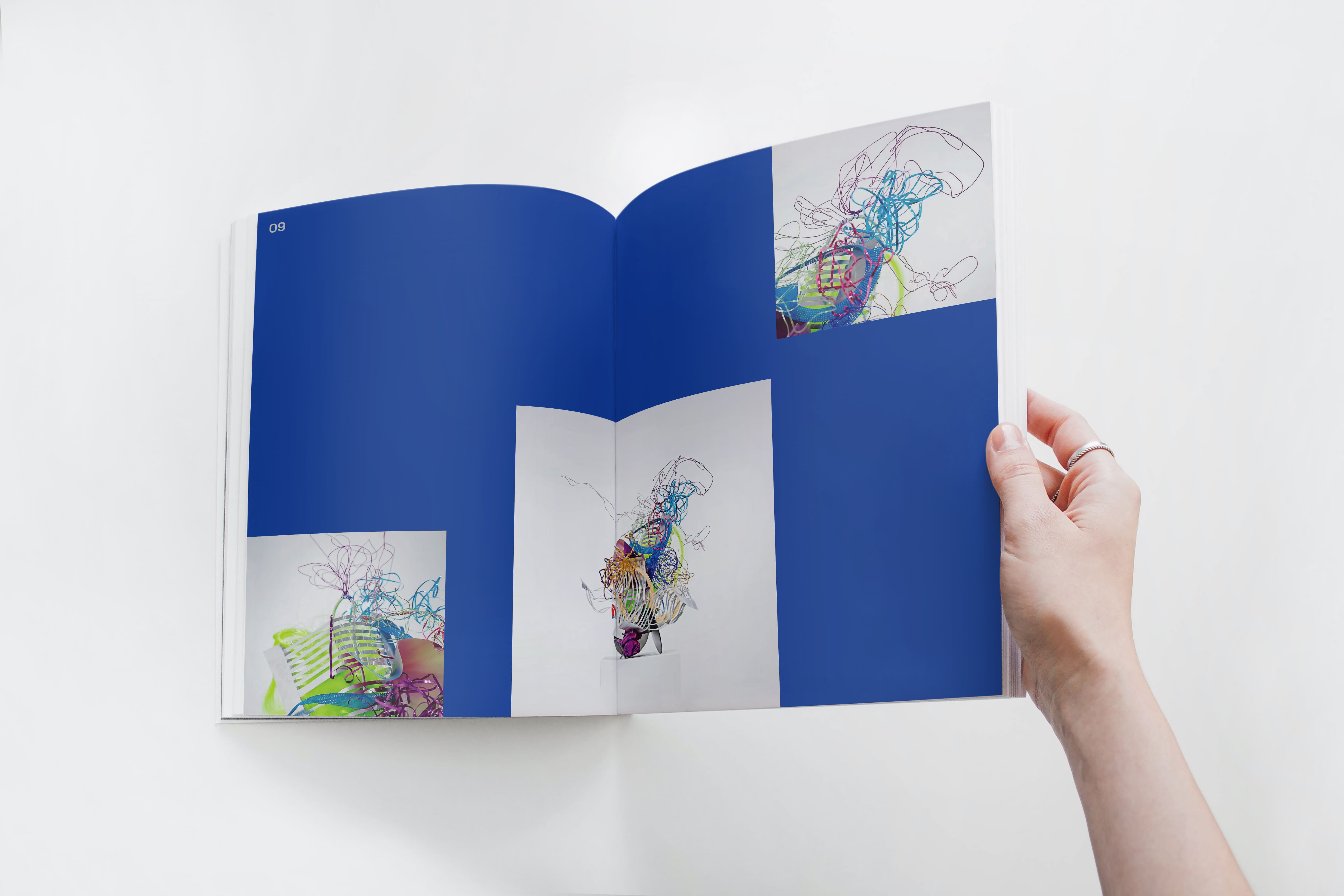
The graphic design utilizes line drawings combined with metallic effects to create trees, flowers, leaves, etc., emphasizing the product. These are integrated into promotional media materials, and we also directly incorporate actual products into flyers to evoke curiosity, interest, and visual appeal for the recipient.
The design layout is structured with a solid grid column system, employing Swiss Design graphics to clearly present the products & services we offer. Visual elements are arranged flexibly and diversely within a unified system, providing a seamless yet engaging experience for the customer.
The typography system is aligned from left to right and maintained throughout the brand identity, with concise, understandable, and practical sentence structures. The colors blue and orange, combined with modern, dynamic, and strong colors, are used consistently across the brand identity system to remind customers of the core essence of the product.
CREDIT
- Agency/Creative: Son Ngoc Tran
- Article Title: Metal Meets Nature: Exploring the Intricate Designs of Student Concept by Son Ngoc Tran
- Organisation/Entity: Student
- Project Type: Identity
- Project Status: Published
- Agency/Creative Country: Vietnam
- Agency/Creative City: Hồ Chí Minh
- Market Region: Asia
- Project Deliverables: Brand Creation, Brand Design, Brand Identity, Brand Naming
- Industry: Retail
- Keywords: Flower, florist, metal
-
Credits:
graphic designer: Son Ngoc Tran


