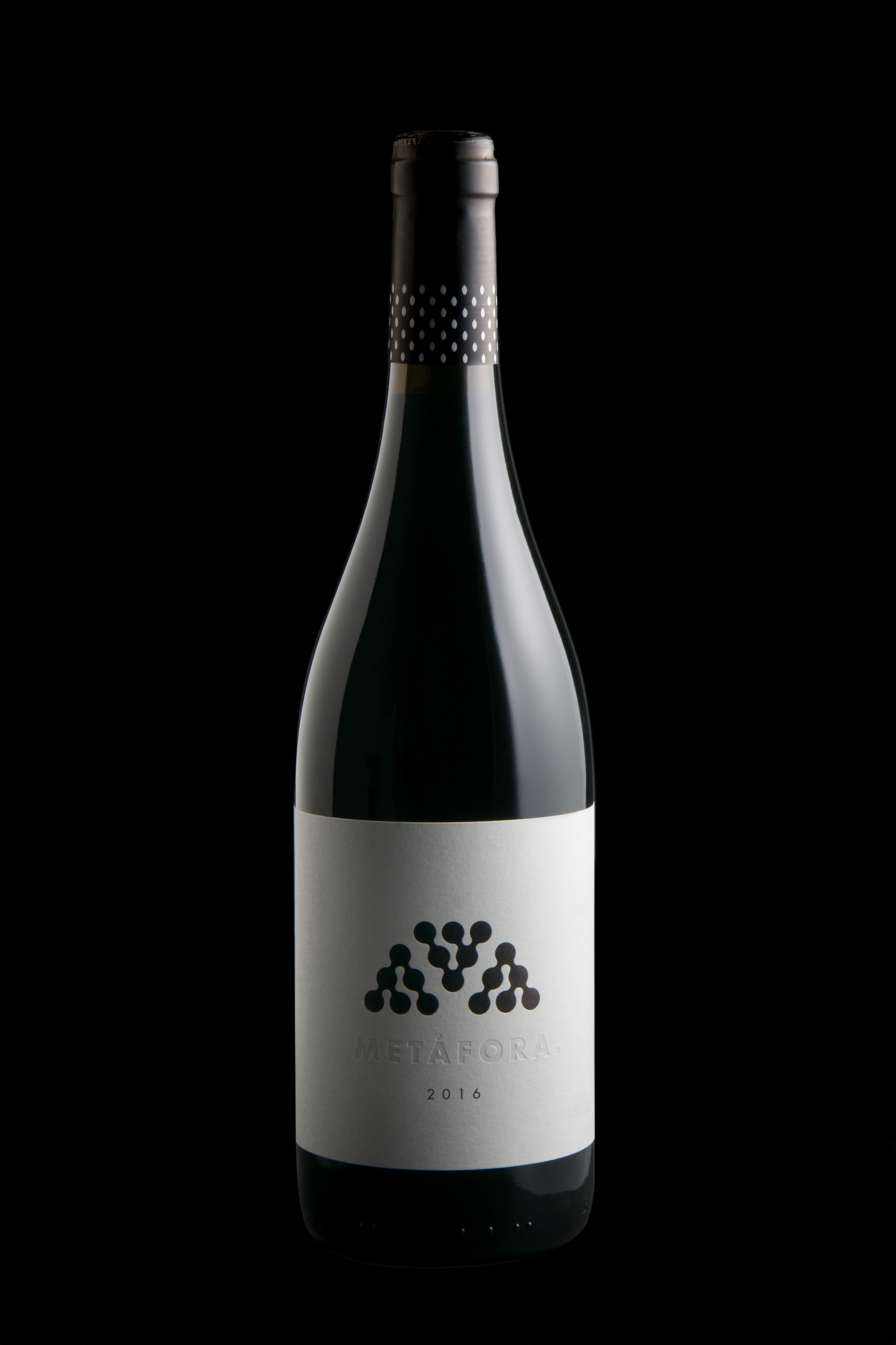
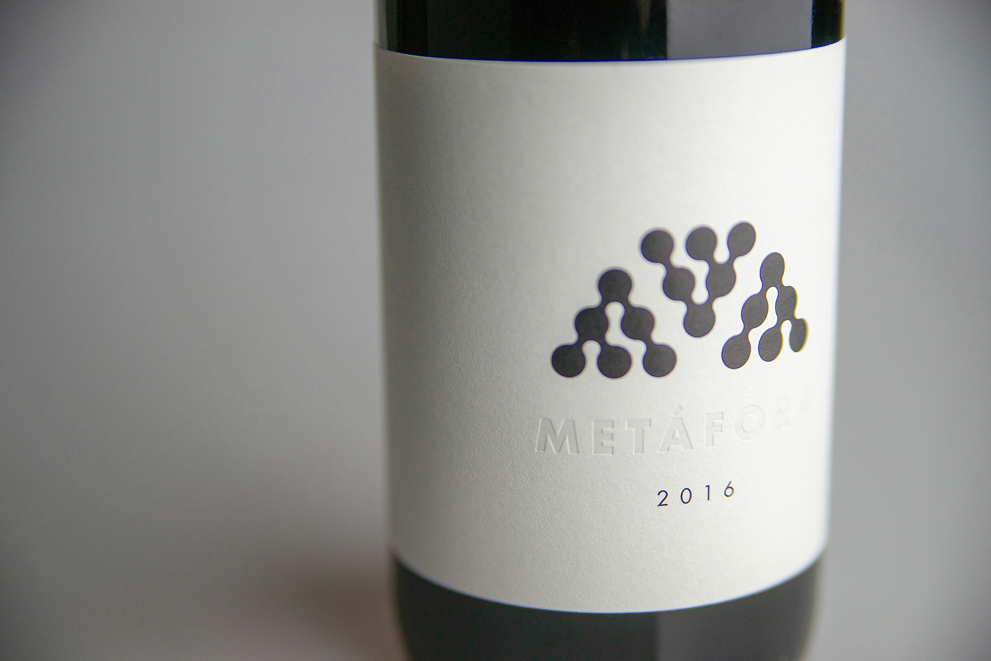
Regarding the name of the wine, Metáfora is the acronym of mencía and amphora. The last creation of the Bodega Feo family.
We carried out a research of a graphic rhetoric to design its label so that it gives the wine a kind of mystery, intelligence and attraction. The minimalism of its label is synonym of elegance. We also designed an organic and clustered structure enabling us to play with repeated modular designs, and by toying with the figure and ground it suggests the M of Metáfora and mencía.
It spreads the concept of porosity, minerality, freshness and a high level of purity, so common among amphora-aged wines. The repeated graphic development of the filigree provides the label with a refined and clean ornamentation.

CREDIT
- Agency/Creative: Salvi Design
- Article Title: Metáfora Organic and Mineral
- Organisation/Entity: Freelance, Published Commercial Design
- Project Type: Packaging
- Agency/Creative Country: Spain
- Market Region: Europe
- Project Deliverables: Brand Naming, Branding, Packaging Design, Product Naming
- Format: Bottle
- Substrate: Pulp Paper
FEEDBACK
Relevance: Solution/idea in relation to brand, product or service
Implementation: Attention, detailing and finishing of final solution
Presentation: Text, visualisation and quality of the presentation


