Merryweather Law founder Constance Liu has spent over 15 years as an estate planning and tax attorney at law firms working with first generation wealth creators as well as families with multi-generational wealth. With a superpower for simplifying the complex and demystifying the arcane, she set out to gently disrupt the legal industry by modeling a new way of doing law: one where attorneys are encouraged to gain exceptional expertise and maintain a sustainable law practice, and clients can get honest and effective legal care.
It’s law for the modern world: clear, creative, and collaborative.
As a new player in the legal field, Merryweather wanted to establish a brand that resonated with their values and connected with a diverse clientele. The challenge was to create a brand that not only reflected their commitment to clarity and collaboration but also differentiated them in a field often perceived as stodgy, stuck-up and impersonal.
To reflect Connie’s fresh, new approach to legal services, I knew we needed to add a touch of the unexpected — a new take on a traditional concept. Here’s what we did:
Brand discovery and strategy: We began with a comprehensive discovery phase, engaging in in-depth conversations to articulate and gain a deep understanding of Merryweather’s vision, values, and target audience. These insights were then refined into a solid brand strategy to act as a roadmap for the branding journey ahead.
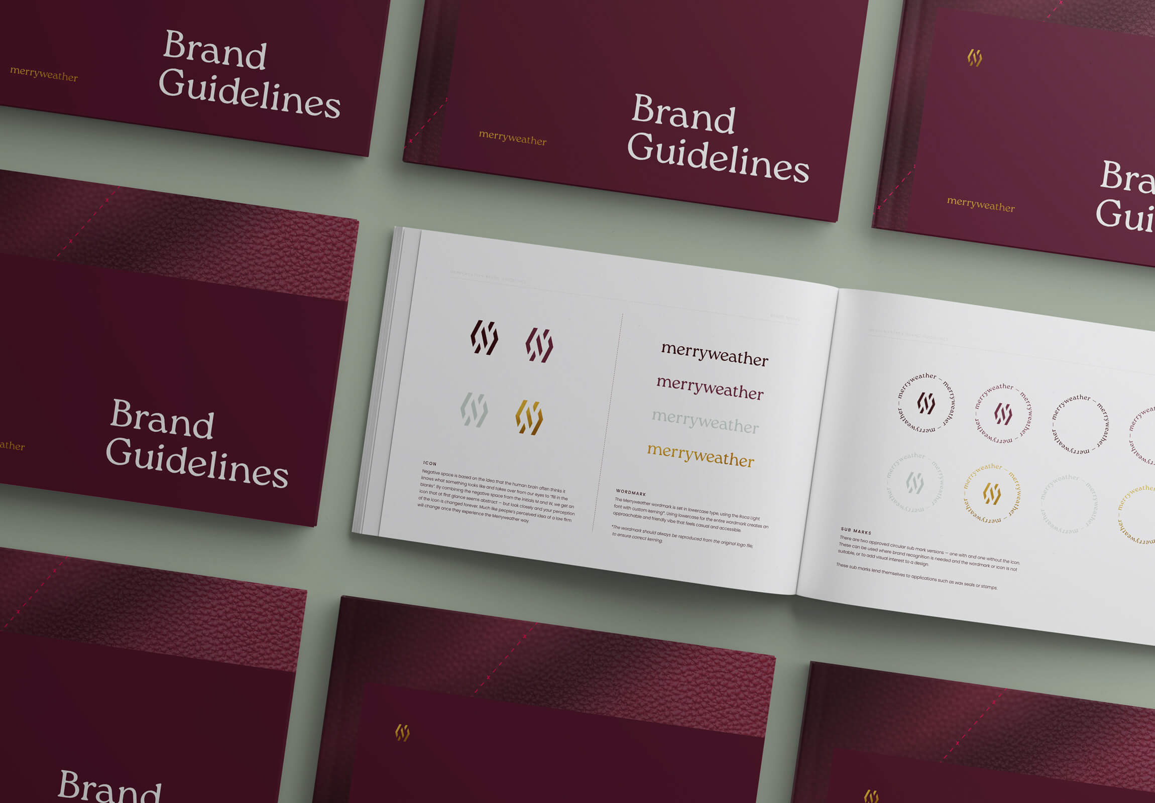
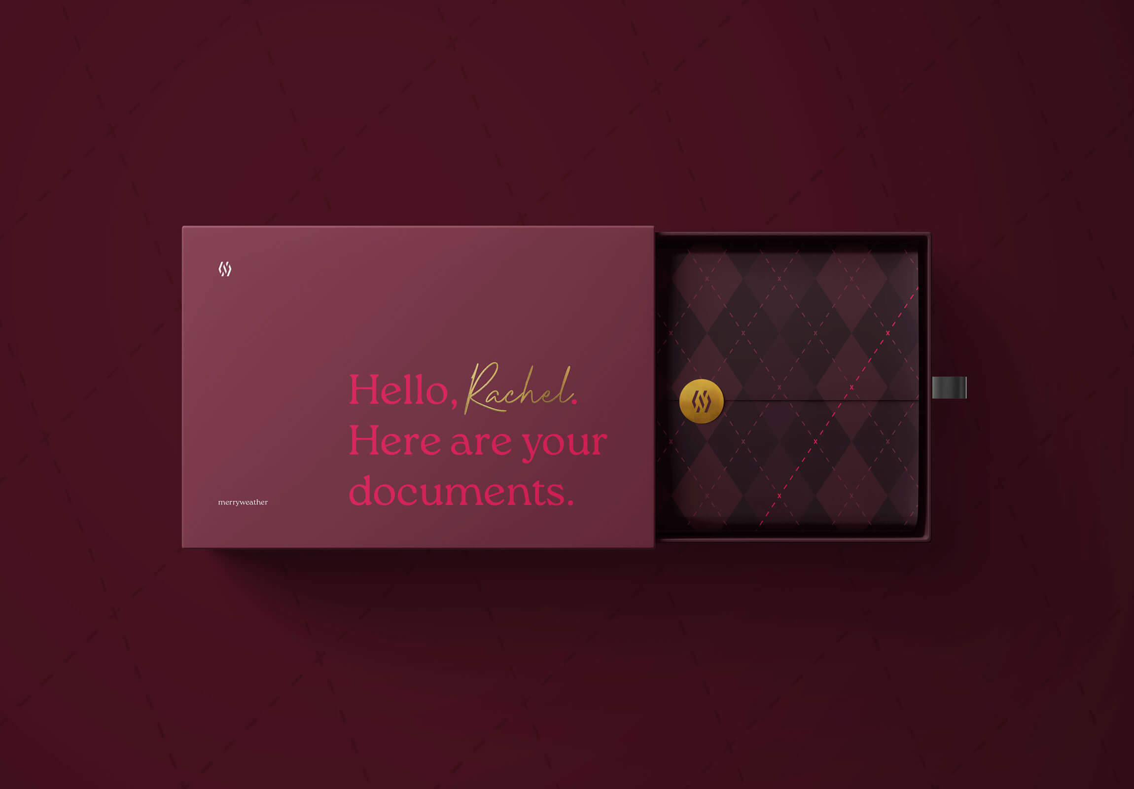
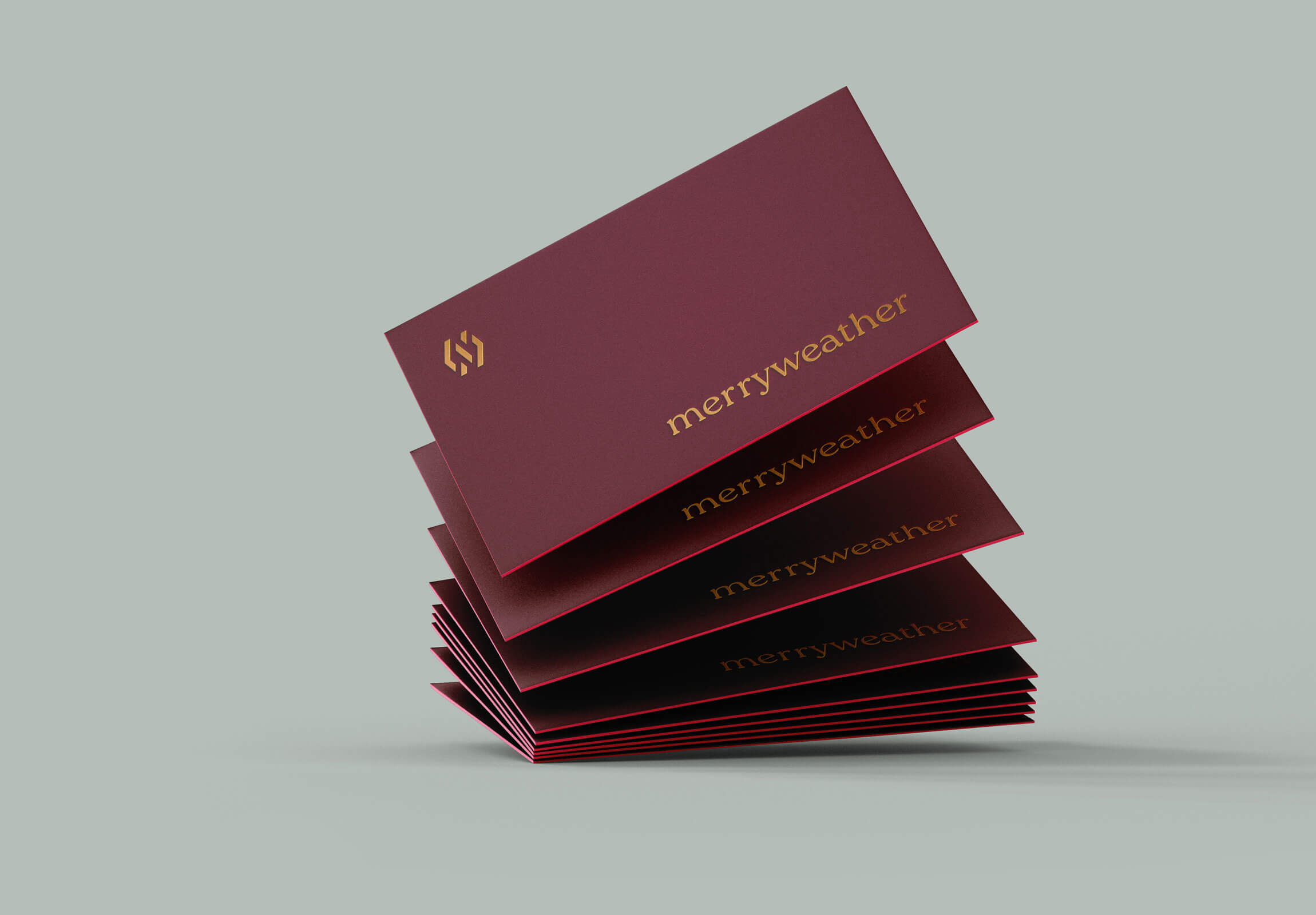
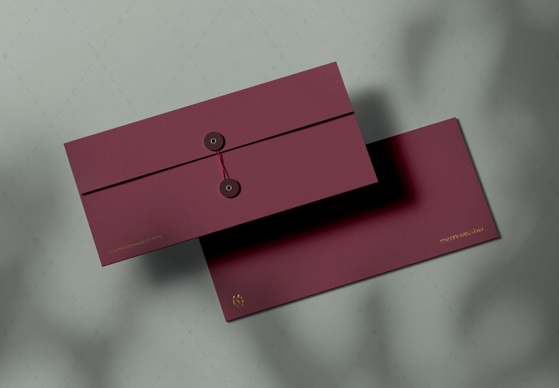
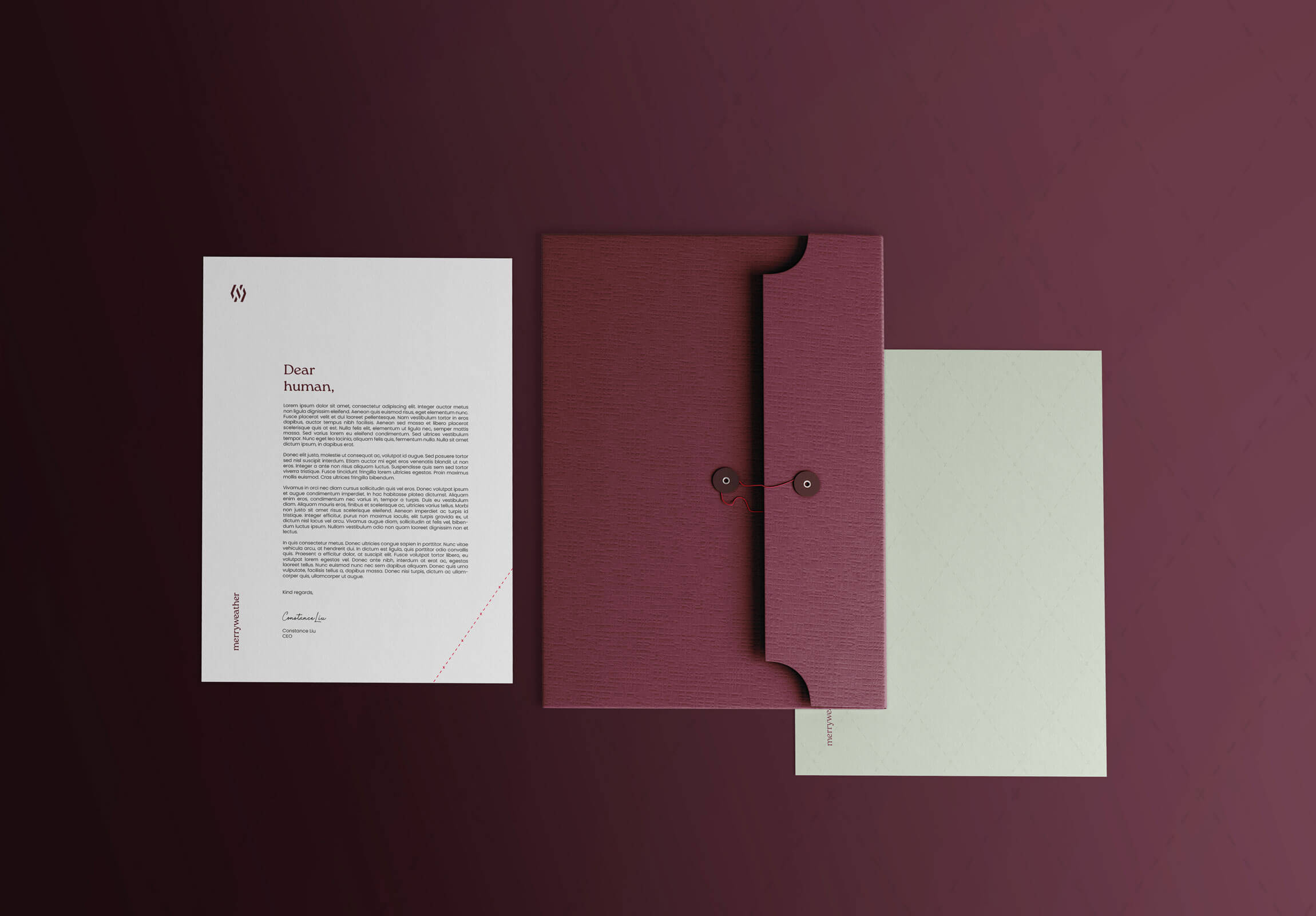
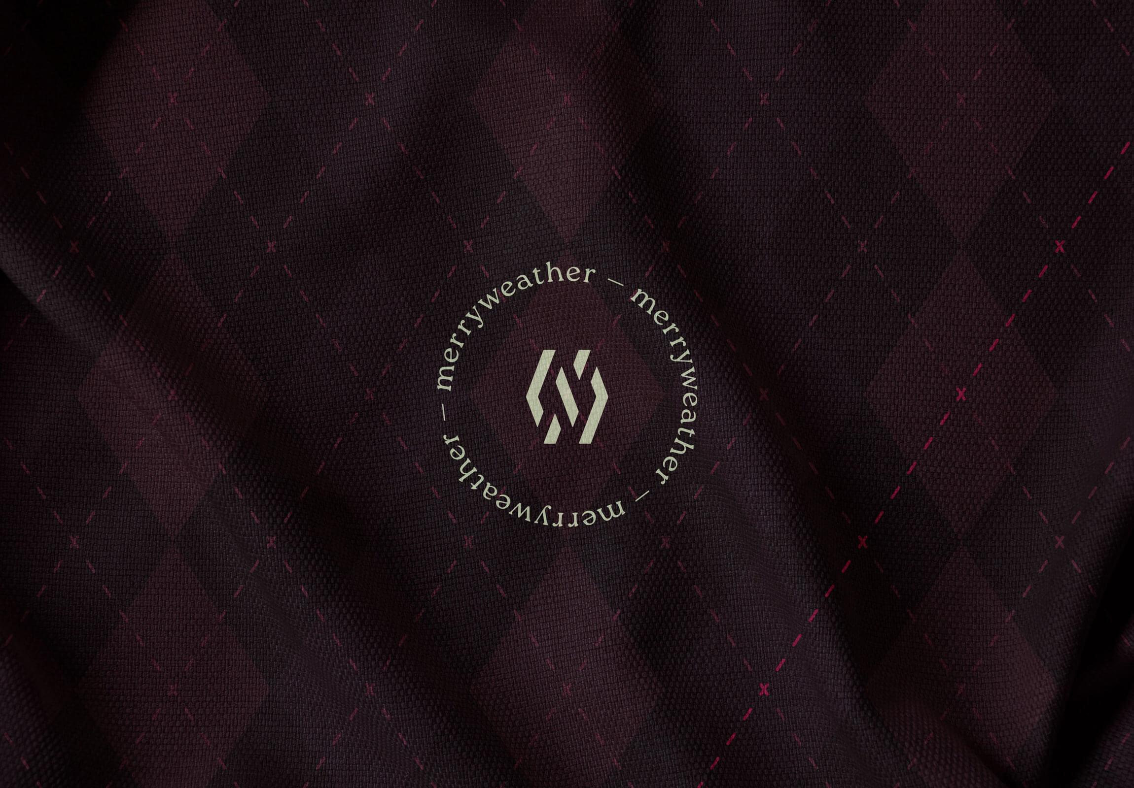
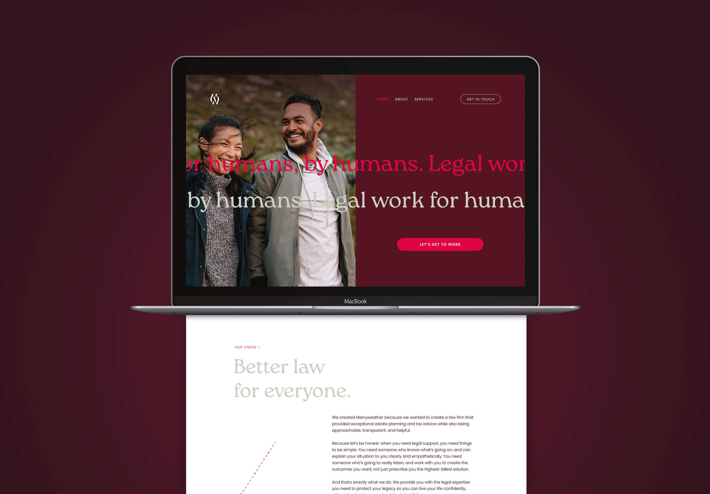
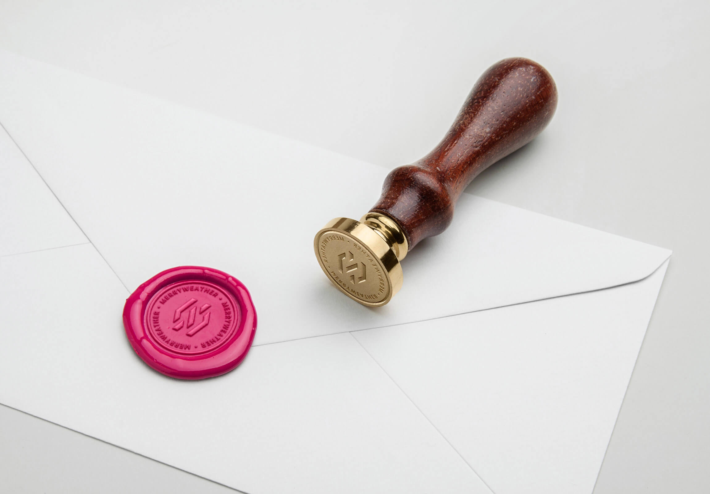
Brand identity: The strategic foundations were translated into a visual brand identity that communicates expertise and trustworthiness, while incorporating subtle and delightful visual surprises for those with a keen eye for detail. By combining the negative space from the initials M and W, we get a simple, but sophisticated monogram that at first glance seems abstract; but look closely and your perception of the icon is changed forever — much like people’s perceived idea of a law firm will change once they experience the Merryweather way. The colour palette features a classic deep maroon, teamed with a burst of berry pink and a touch of elegant gold. An argyle-inspired brand pattern — featuring a dashed pink line — sets Merryweather apart, while nodding to their distinct approach. Incorporating traditional elements, with an unexpected twist, is a recurring theme throughout — like classic string closure envelopes featuring a hot pink string, or a pink wax seal. Typography-wise, the chosen brand typeface is a new take on a classic serif, that upon closer inspection reveals some delightful quirks and details that further support the idea of a gentle disruptor.
The final result is a distinctive brand presence that lets Merryweather shine in an industry known for formality. They now stand as a trusted and approachable choice for estate planning and tax services, making waves in a traditionally formal landscape.
CREDIT
- Agency/Creative: Petchy
- Article Title: Merryweather Law Set Out to Gently Disrupt the Legal Industry — Unveils Strategic Brand Design by Petchy
- Organisation/Entity: Freelance
- Project Type: Identity
- Project Status: Published
- Agency/Creative Country: Norway
- Agency/Creative City: FREI
- Market Region: Global
- Project Deliverables: Brand Creation, Brand Design, Brand Guidelines, Brand Identity, Brand Strategy, Branding, Logo Design
- Industry: Professional Services
- Keywords: branding, brand design, brand identity, legaltech, legal services, lawyer
-
Credits:
Brand & Creative Direction: Solveig Petch
Brand Voice & Marketing Strategy: Rachel Allen, Bolt from the Blue
Web Development: Week of the Website
Client: Constance Liu


