


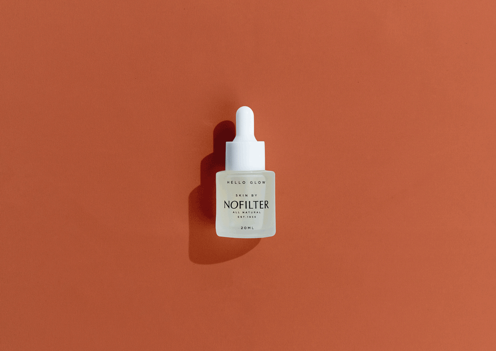
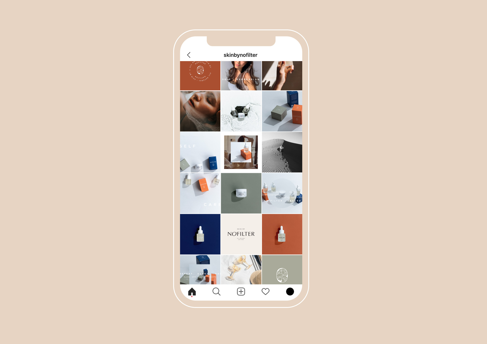
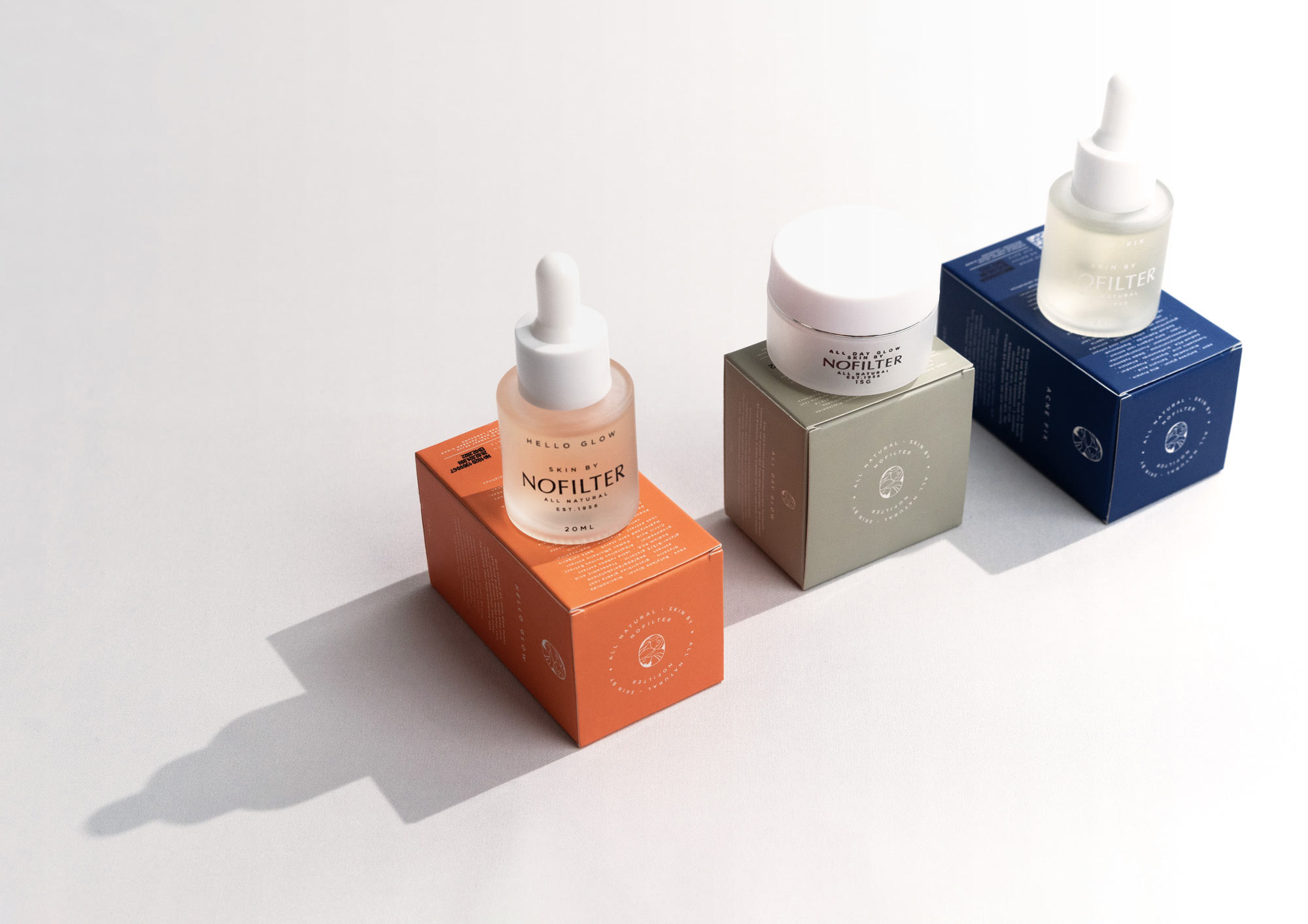
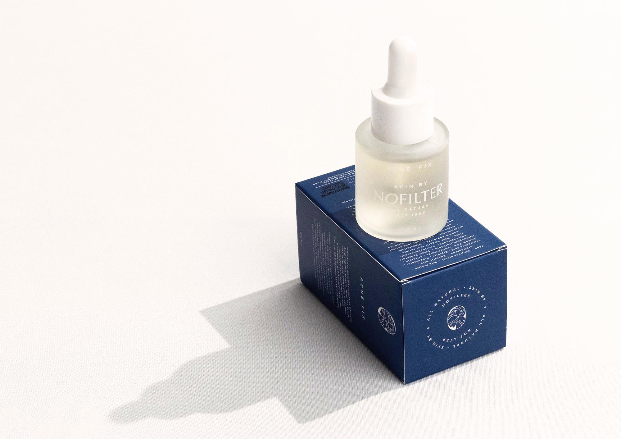
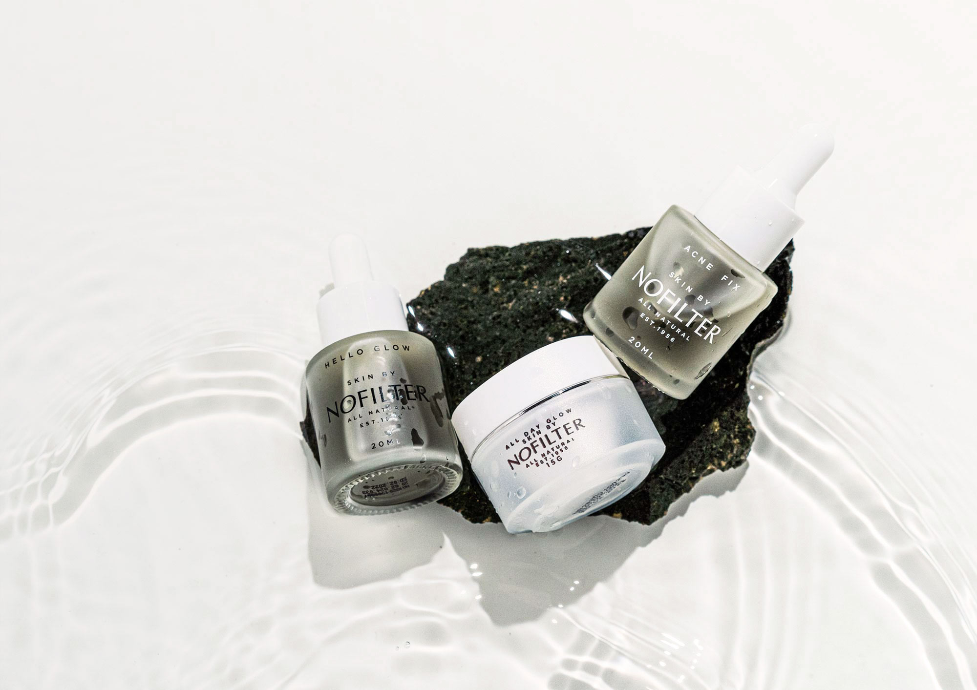
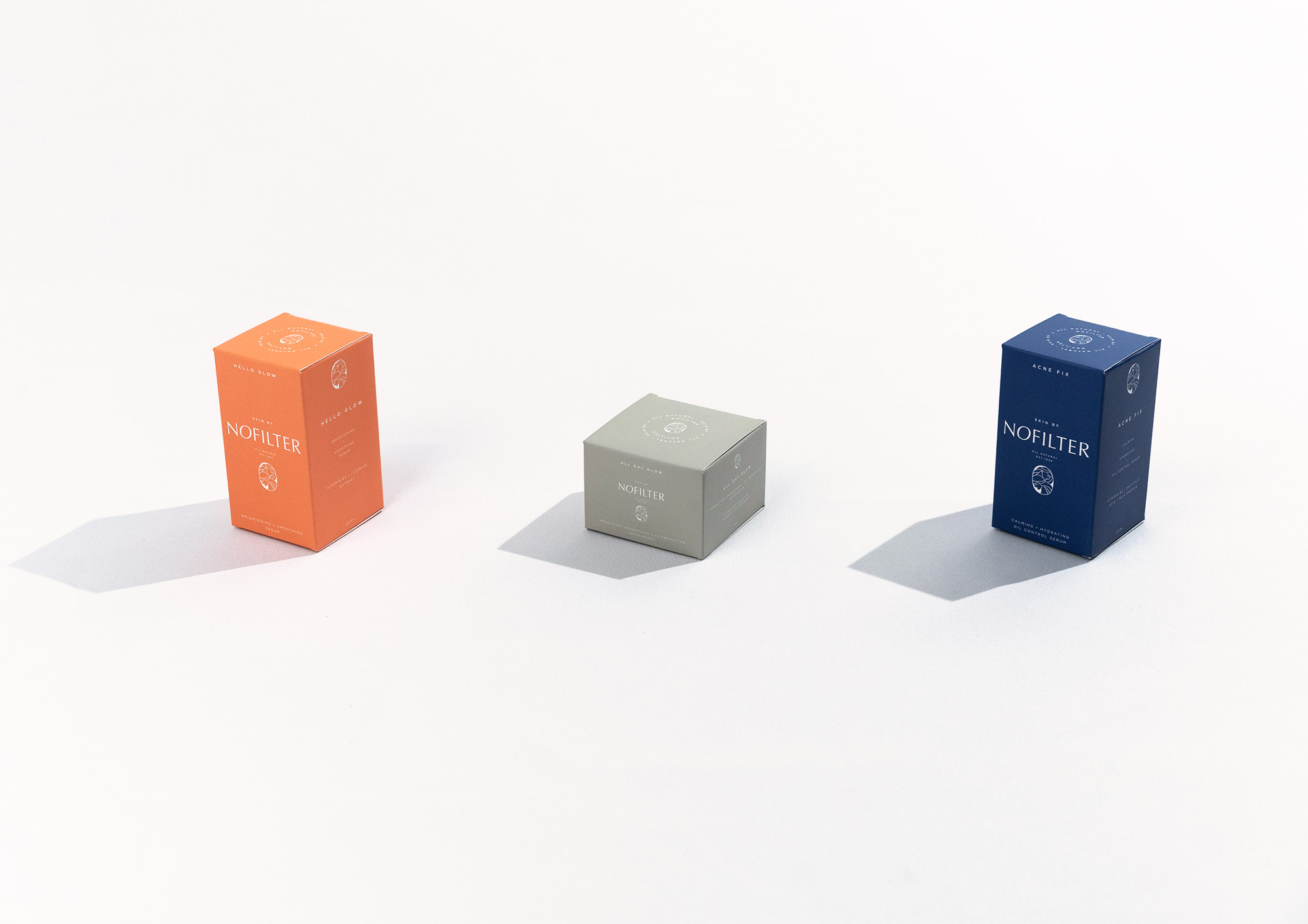
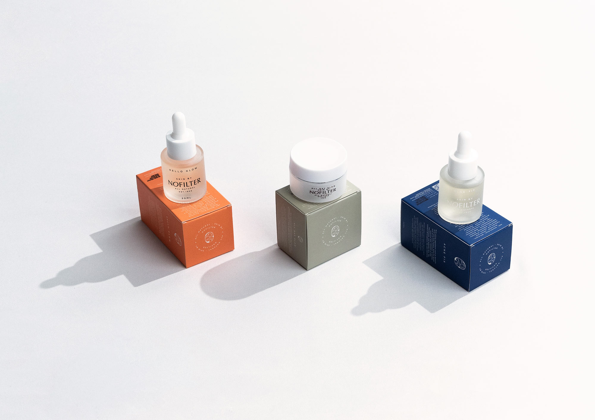
Interesting branding can be paradoxical sometimes and that is the case with Nofilter. With a premium target market and a humble background story. We made down to earth luxury the very essence of the brand.
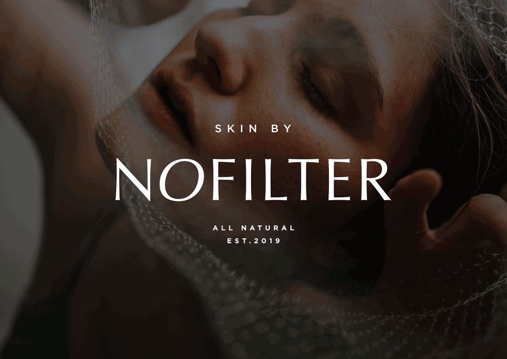
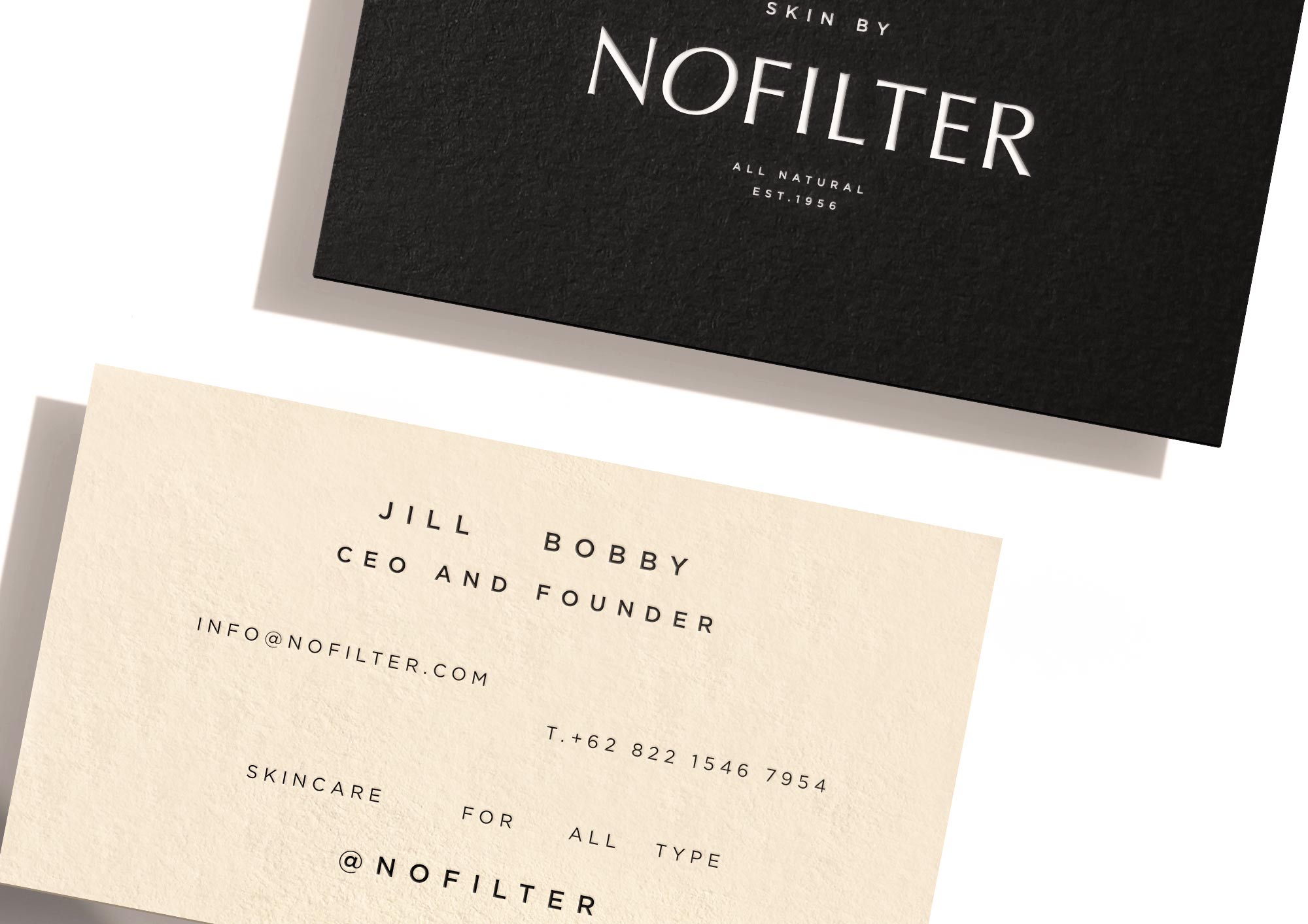
For the logotype, a custom made minimal type with an organic twist to highlight the modern yet natural feel. For the icon, two women representing the mother & grandmother whom inspired the beginnings of the brand and invented the recipes for the natural skincare. It symbolises femininity and elegance, narrating that natural skincare is not just a lifestyle but also a long carried habitual tradition.
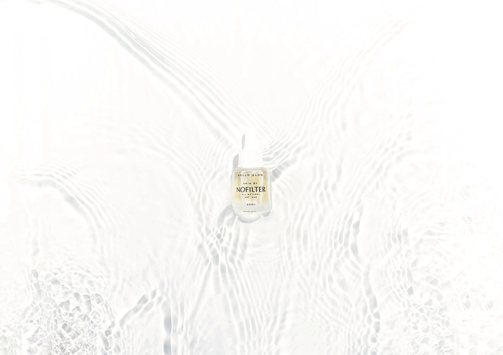
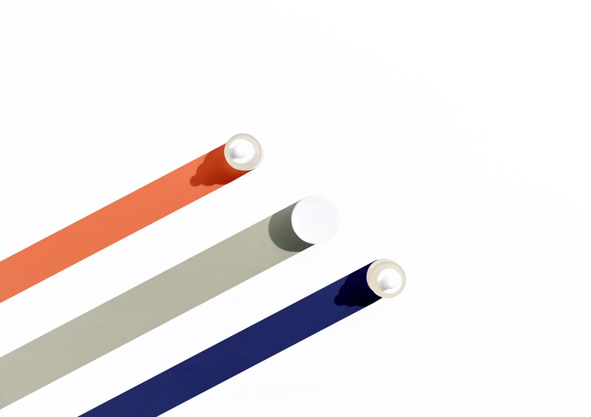
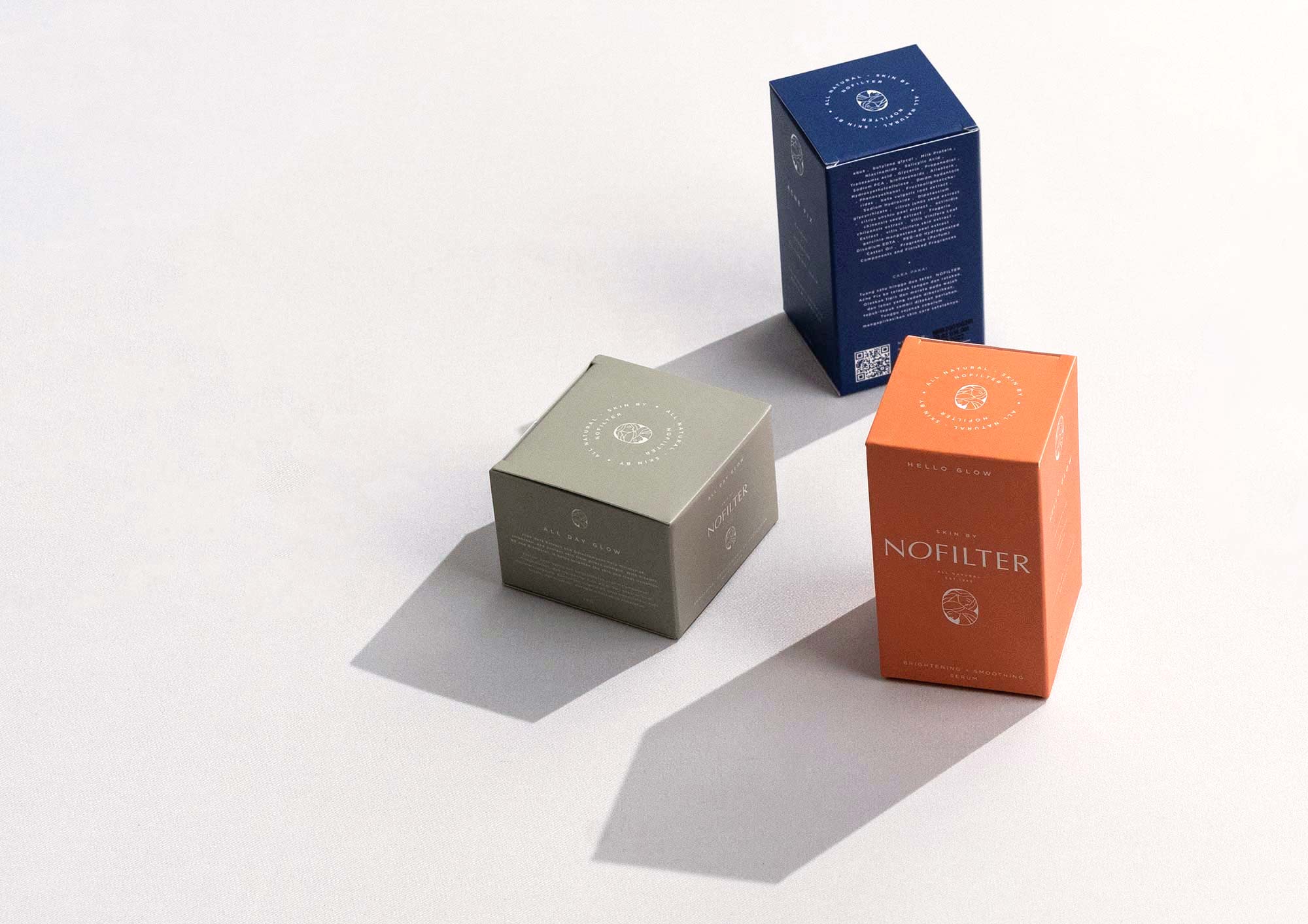
Creamy off-white, pale coral, washed out salmon, and ashy pastel green make up the warm and earthy colour tones.
Combined, they collectively accentuate the modern yet classic, simple yet sophisticated ambience of the brand that work hand in hand with the packaging materials used for the brand essentials.
CREDIT
- Agency/Creative: Merillangie
- Article Title: Merillangie Creates a Down to Earth Luxury Visual Identity for a Natural Skincare Brand
- Organisation/Entity: Freelance, Published Commercial Design
- Project Type: Packaging
- Agency/Creative Country: Indonesia
- Market Region: Asia
- Project Deliverables: Brand Guidelines, Brand Identity, Brand World, Branding, Graphic Design, Identity System, Packaging Design
- Format: Bottle, Box, Jar
- Substrate: Glass Bottle, Glass Jar


