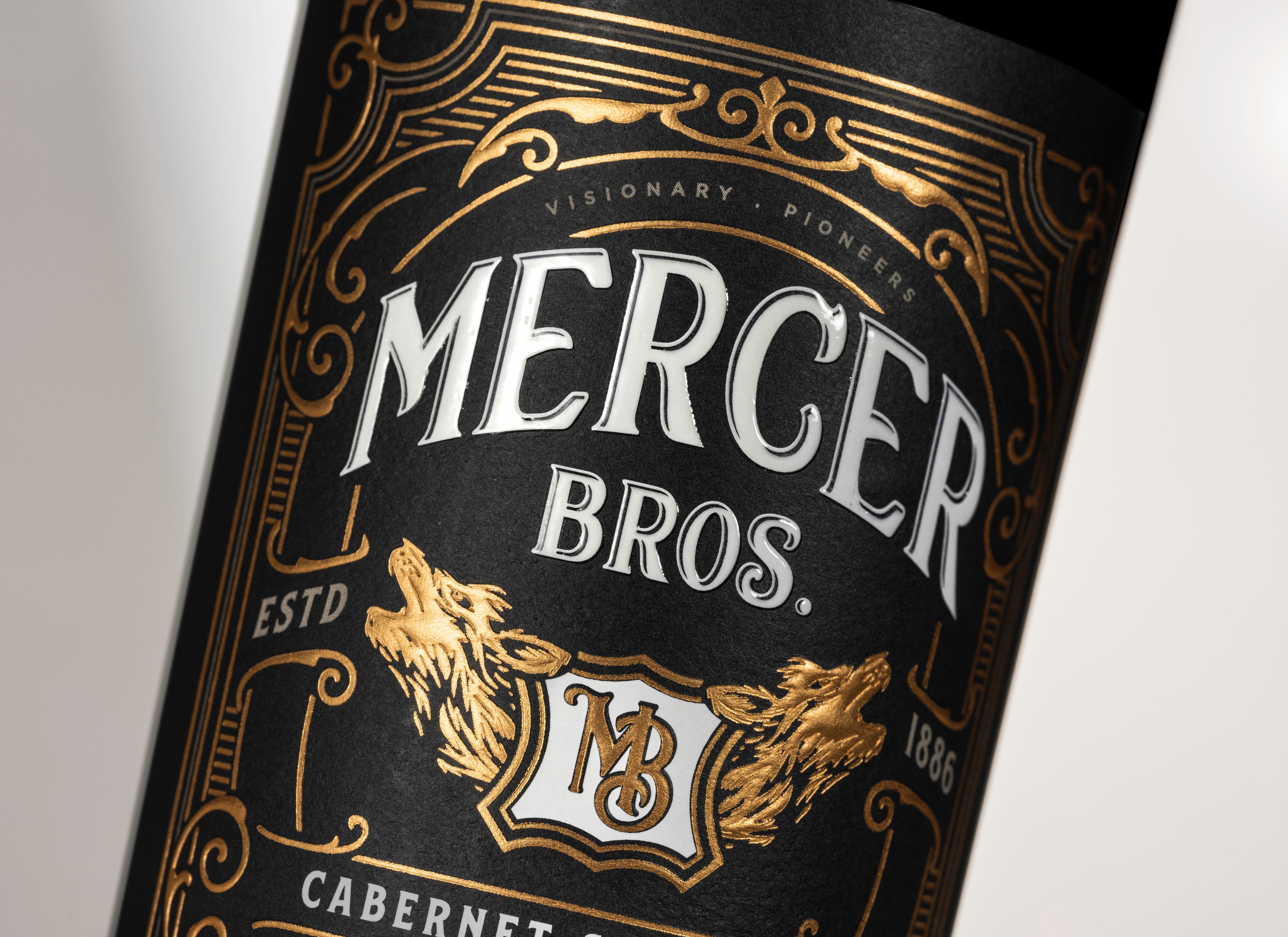
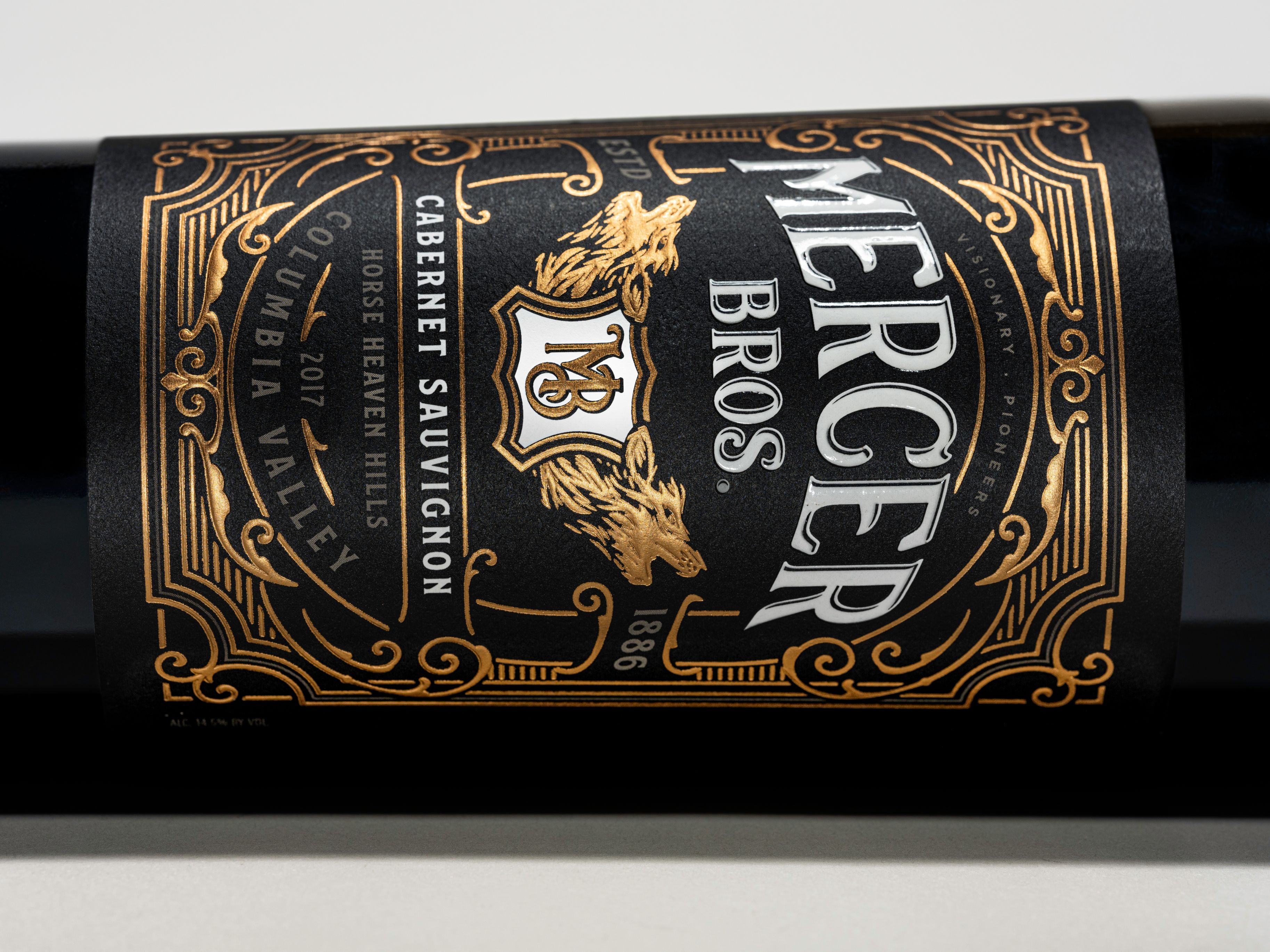
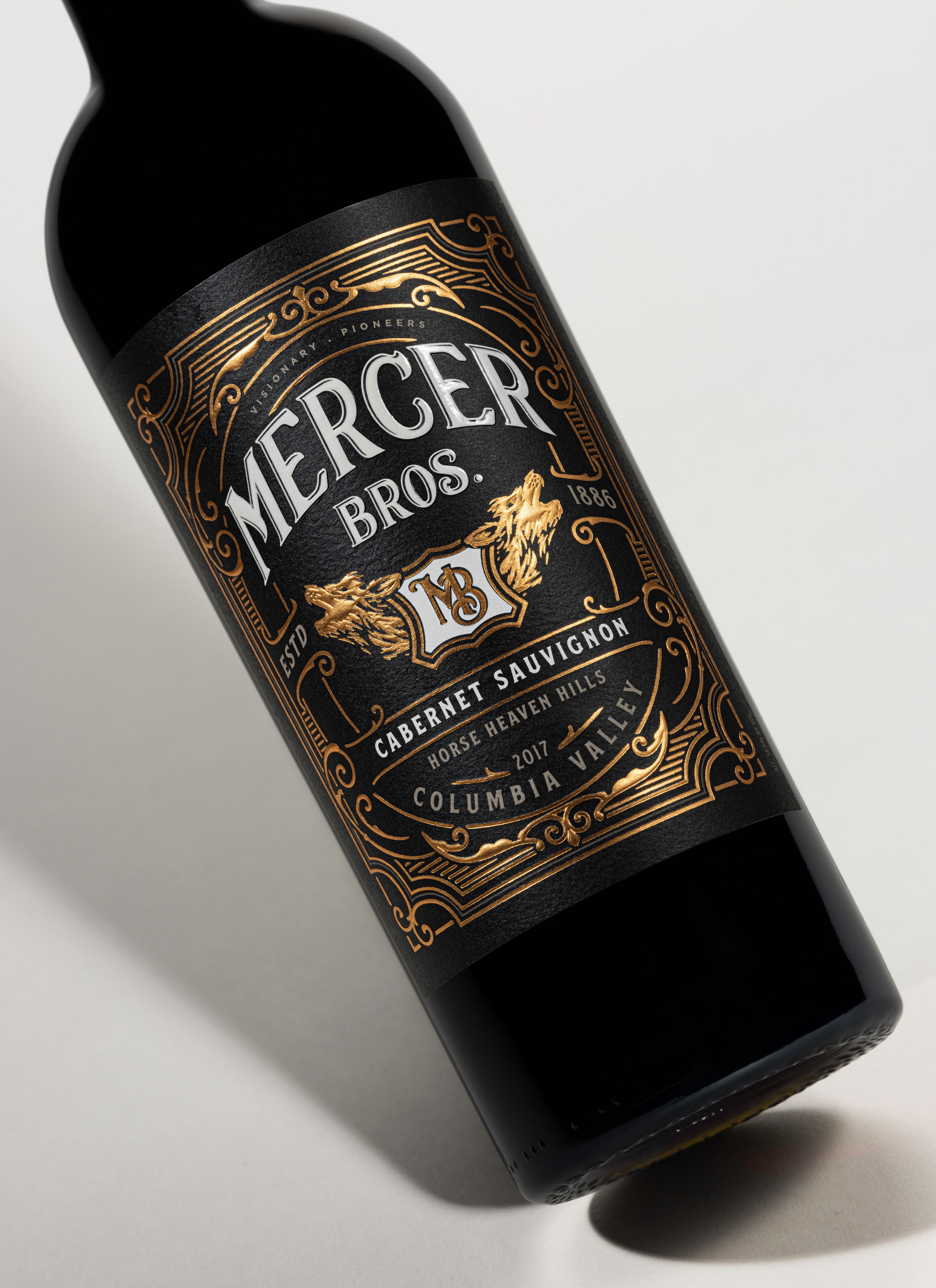
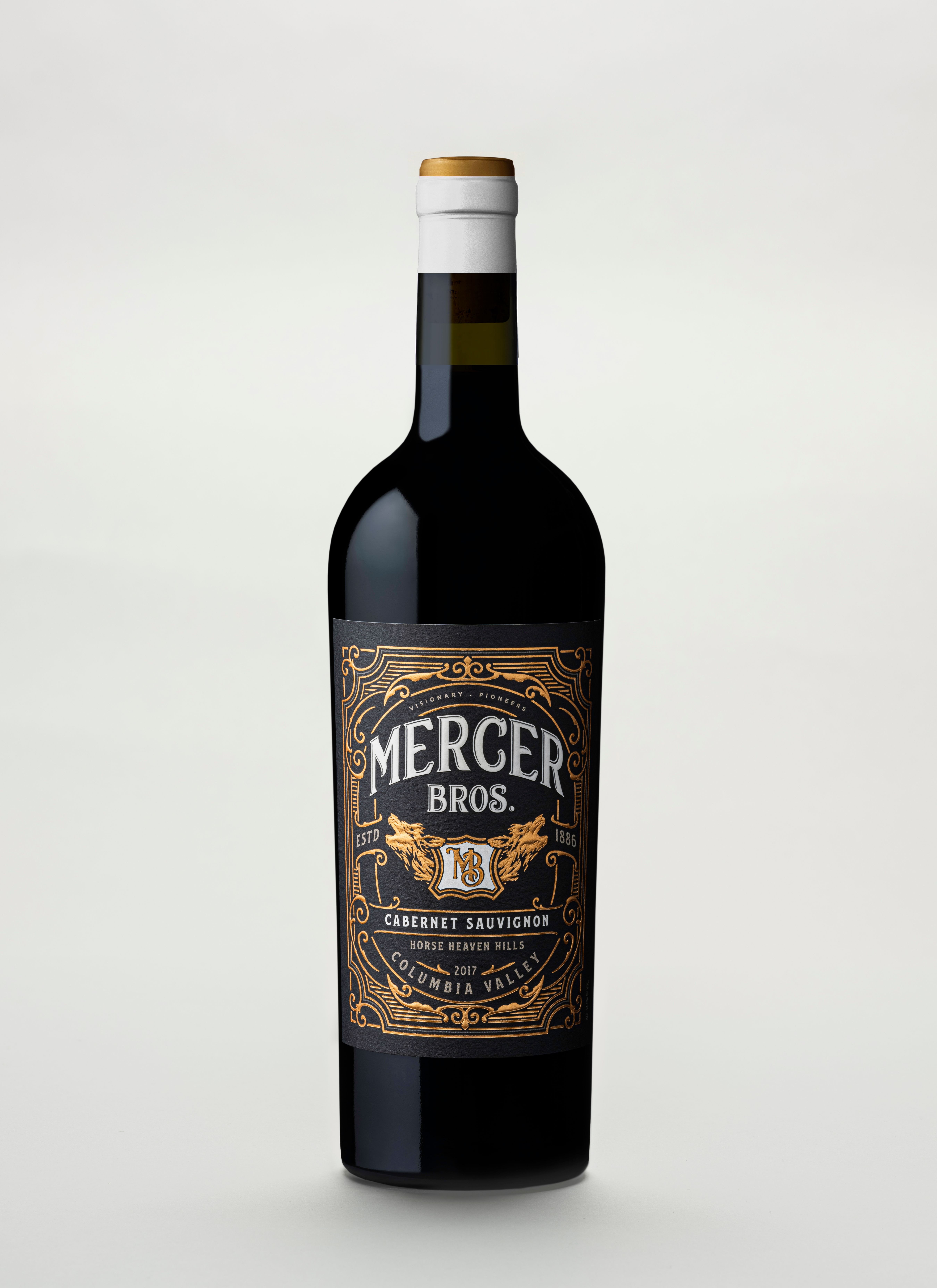
Reimagined with Attitude. Affinity’s redesign of the Mercer Family Vineyards packaging reflects a contemporary interpretation of the next generation of Mercer. Conveying the independent spirit, authenticity, and farm to table quality of this lifestyle-driven Pacific Northwest brand. Timeless and elegant copper foil frames the logo lockup to create an intricately detailed label with two stately wolves flanking a shield. The Mercer Bros. white logo is approachable and bold and works in unison with a new short white capsule.
CREDIT
- Agency/Creative: Affinity Creative Group
- Article Title: Mercer Bros. Wine Packaging Redesign and Reimagined with Attitude by Affinity Creative Group
- Organisation/Entity: Agency, Published Commercial Design
- Project Type: Packaging
- Agency/Creative Country: United States
- Market Region: North America
- Project Deliverables: Brand Identity, Brand Redesign, Brand Rejuvenation, Brand Strategy, Branding, Graphic Design, Packaging Design, Photography, Rebranding, Research
- Format: Bottle
- Substrate: Glass, Pulp Paper
FEEDBACK
Relevance: Solution/idea in relation to brand, product or service
Implementation: Attention, detailing and finishing of final solution
Presentation: Text, visualisation and quality of the presentation


