


Mercent is a corporate fintech brand built to bring structure, clarity, and institutional trust to global finance, empowering serious businesses to move and manage money across borders with confidence, precision, and long-term scalability.
Today’s financial landscape is divided. On one side are traditional banks that are stable, but often rigid and outdated. On the other are vibrant fintech startups that are expressive, fast-moving, yet sometimes lacking depth and long-term credibility.
Mercent needed to occupy a different space, It had to feel structured without being cold. Modern without being loud. Global without being generic.
The challenge was not simply to design a visual identity, but to establish a financial presence that could stand confidently alongside established institutions while remaining digitally fluent and future-ready.
The strategic direction focused on positioning Mercent as a financial backbone rather than a flashy solution. Instead of competing on energy or disruption, the brand competes on confidence and discipline.
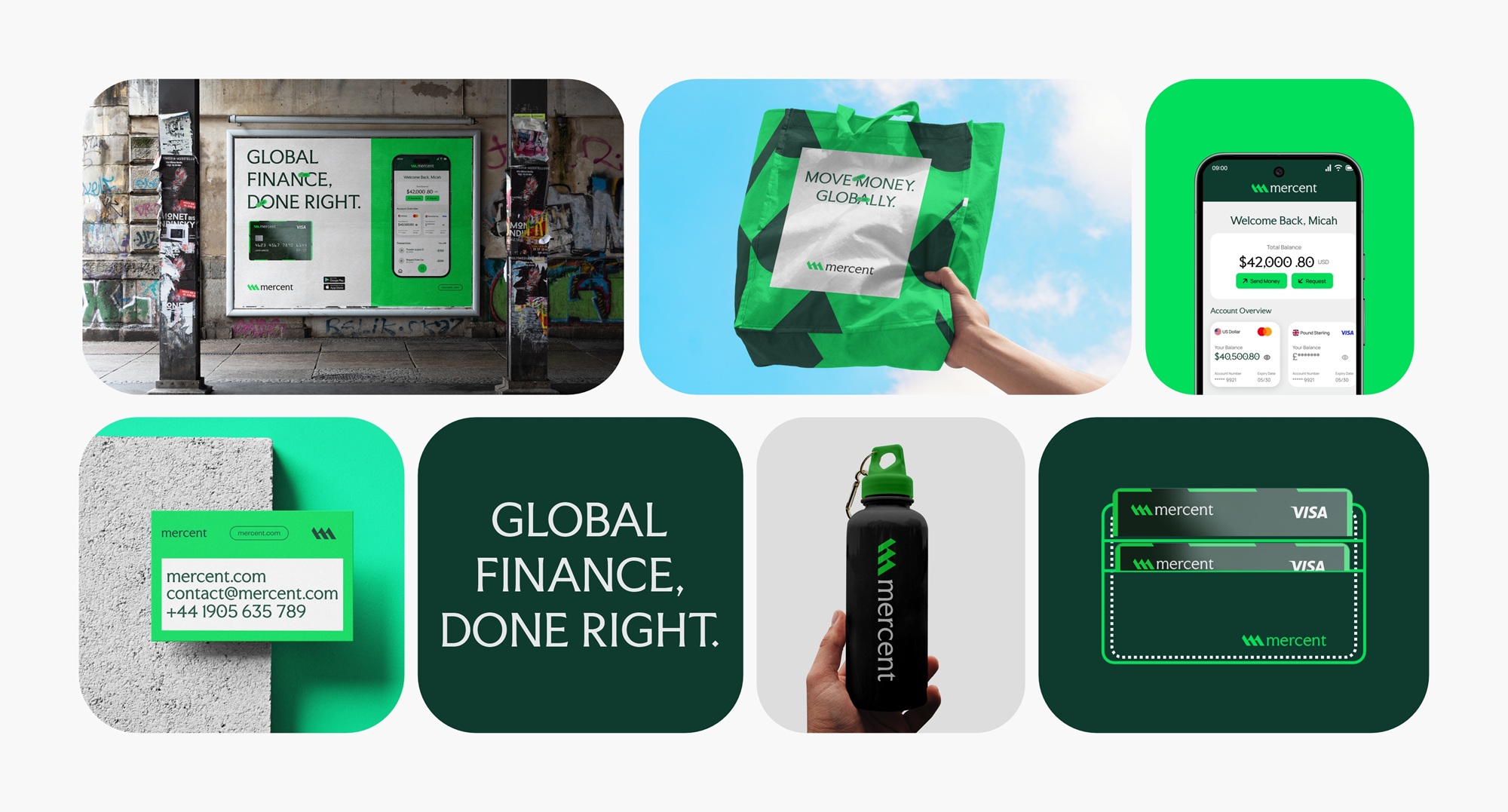
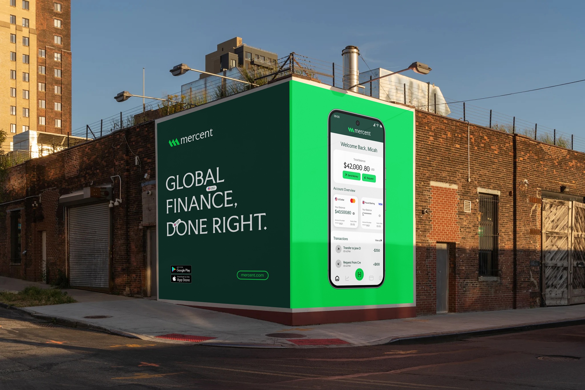
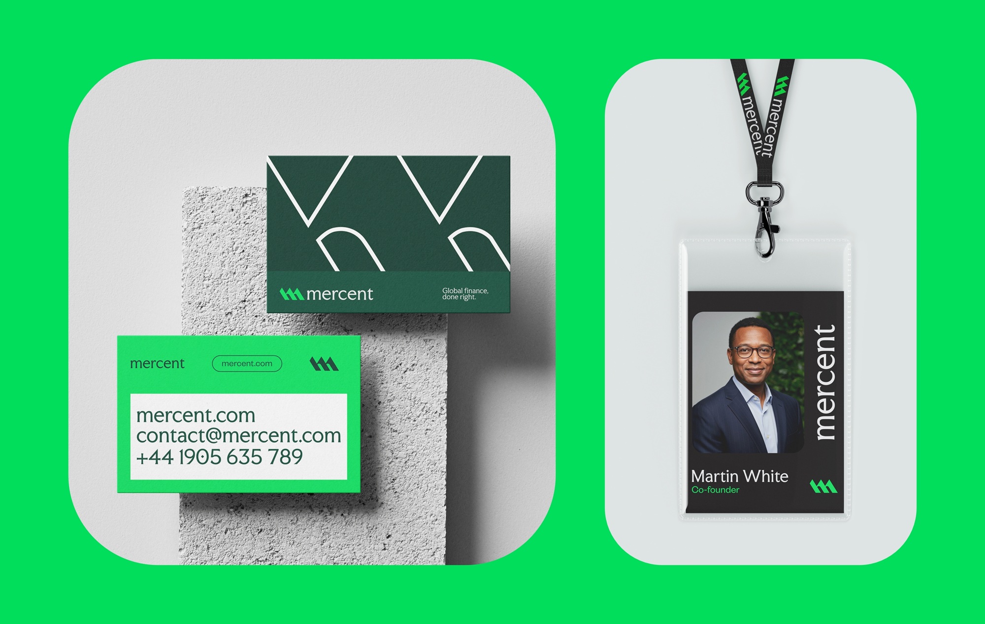
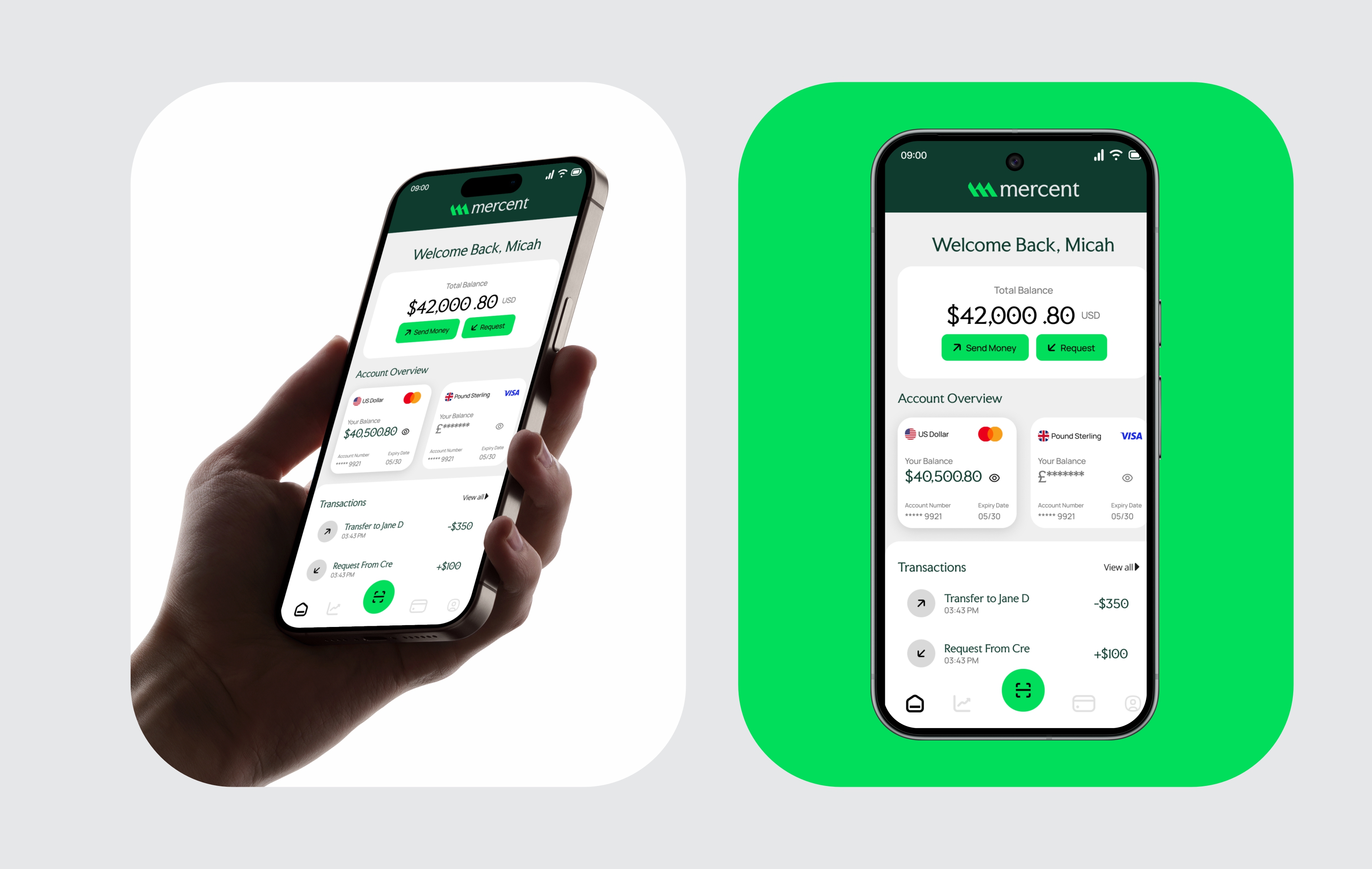
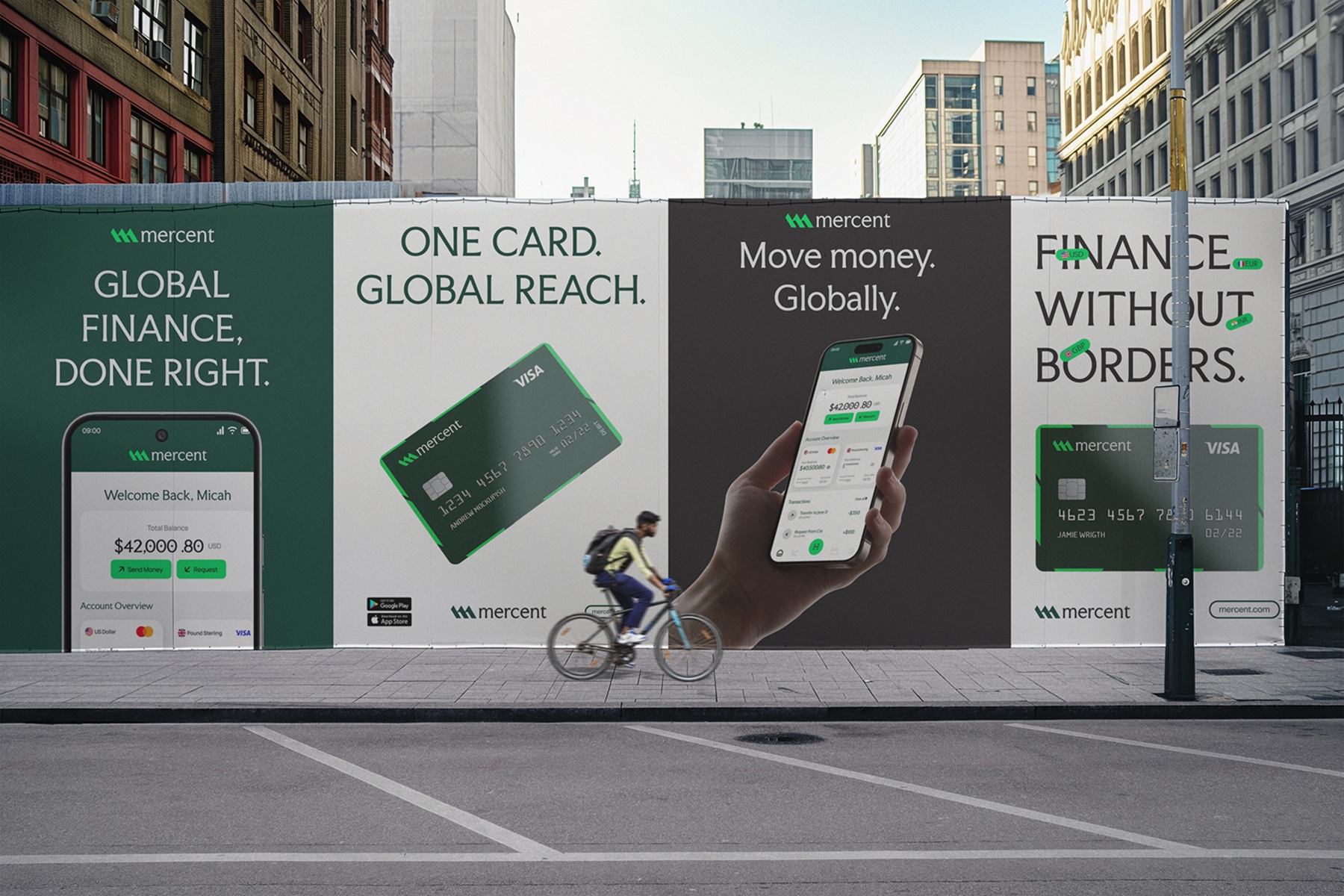
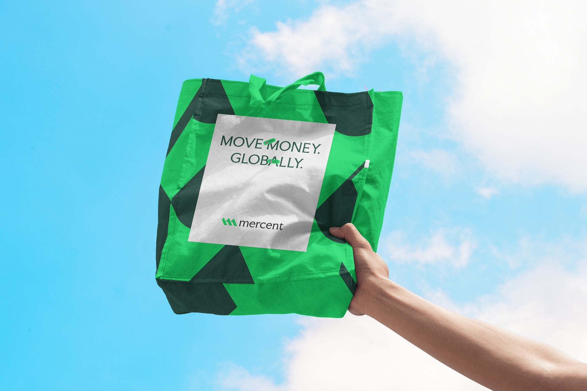
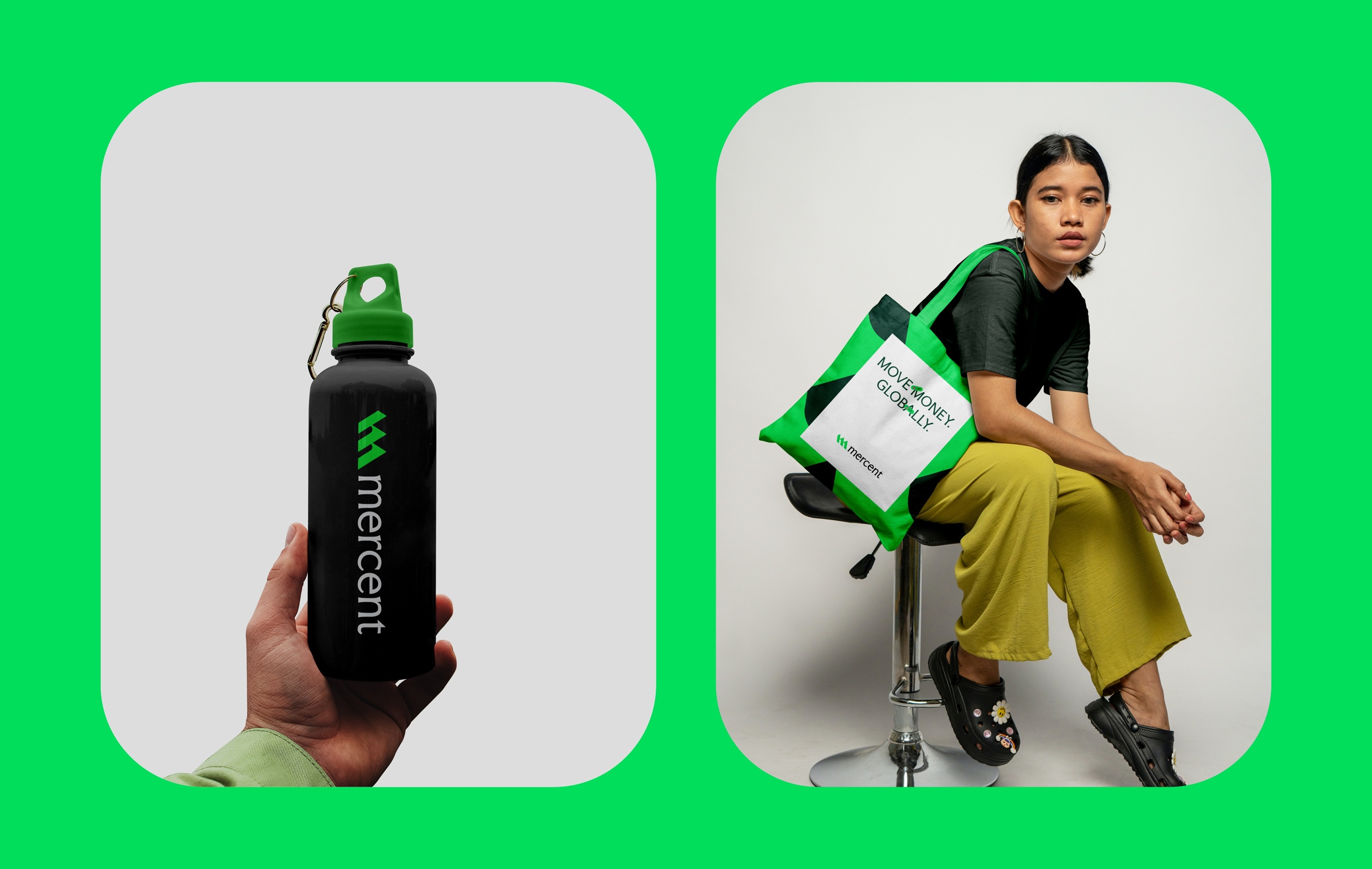
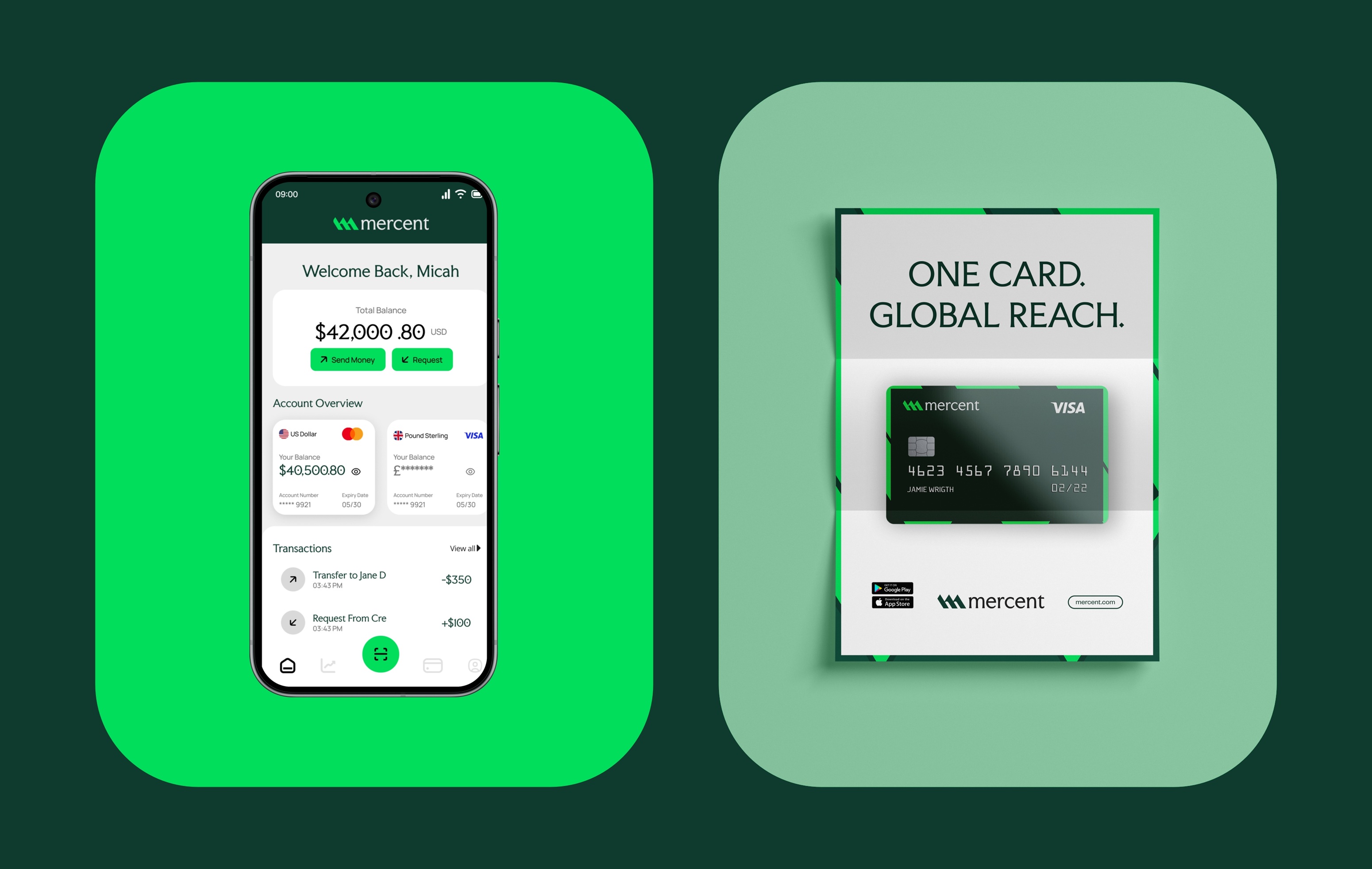
Every decision from typography to color to layout was guided by one principle: authority through restraint. The deep institutional green reinforces financial credibility and long-term growth. The structured typography system bridges heritage trust with modern digital precision.
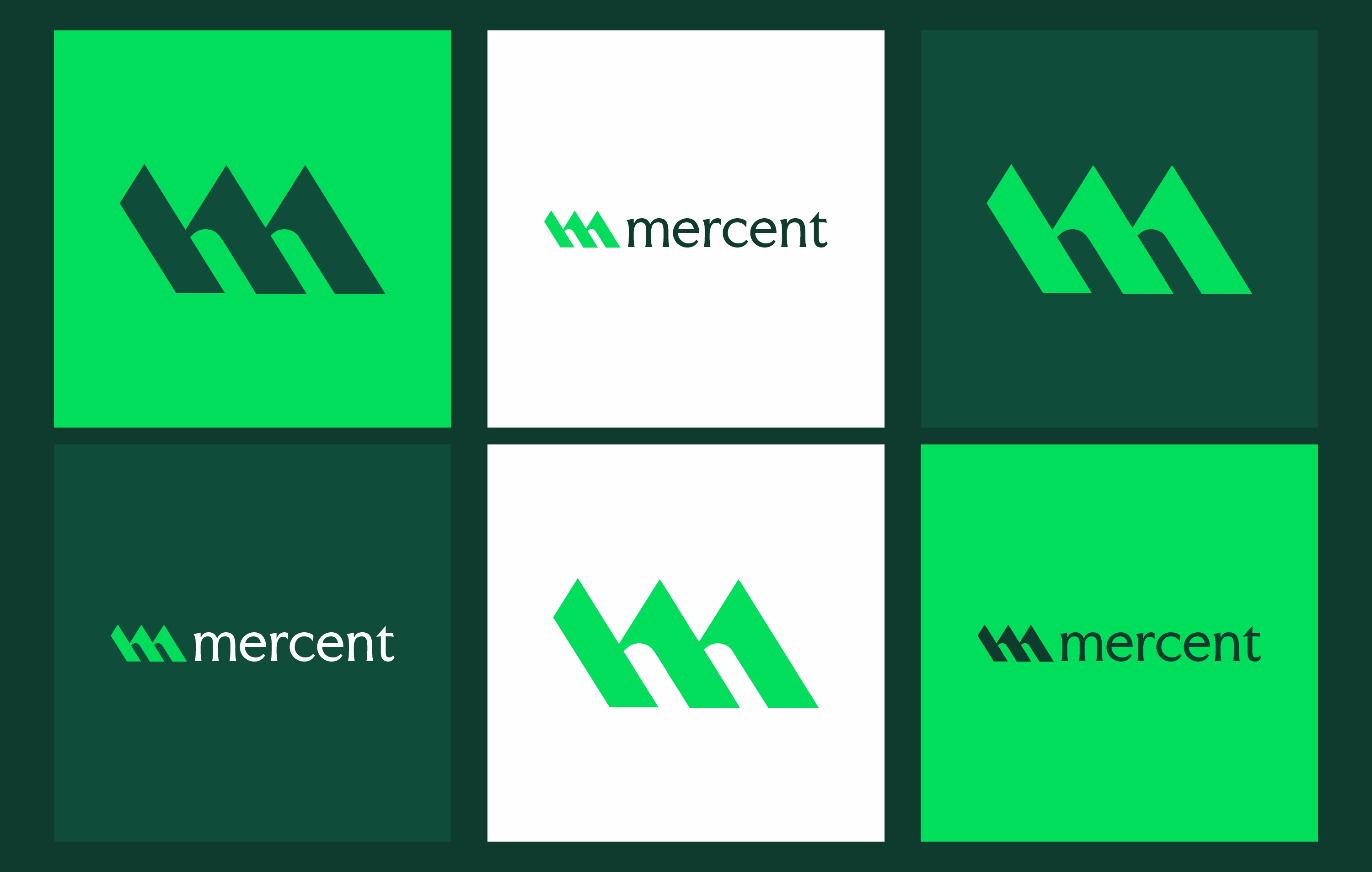
The geometric logo mark suggests upward movement and engineered stability. Nothing feels decorative. Everything feels deliberate. Mercent does not promise revolution. It promises reliability at scale.
The result is a brand identity that feels permanent, confident, and globally competent. The visual system is calm yet powerful. Heavy negative space creates clarity. Structured compositions reinforce order. The logo communicates stability before a single word is read.
In a market filled with visual noise, Mercent stands apart through composure, it does not chase attention, it earns trust. The identity allows Mercent to sit comfortably alongside traditional financial institutions while maintaining the clarity and precision expected from a modern fintech platform.
Global finance, done right.
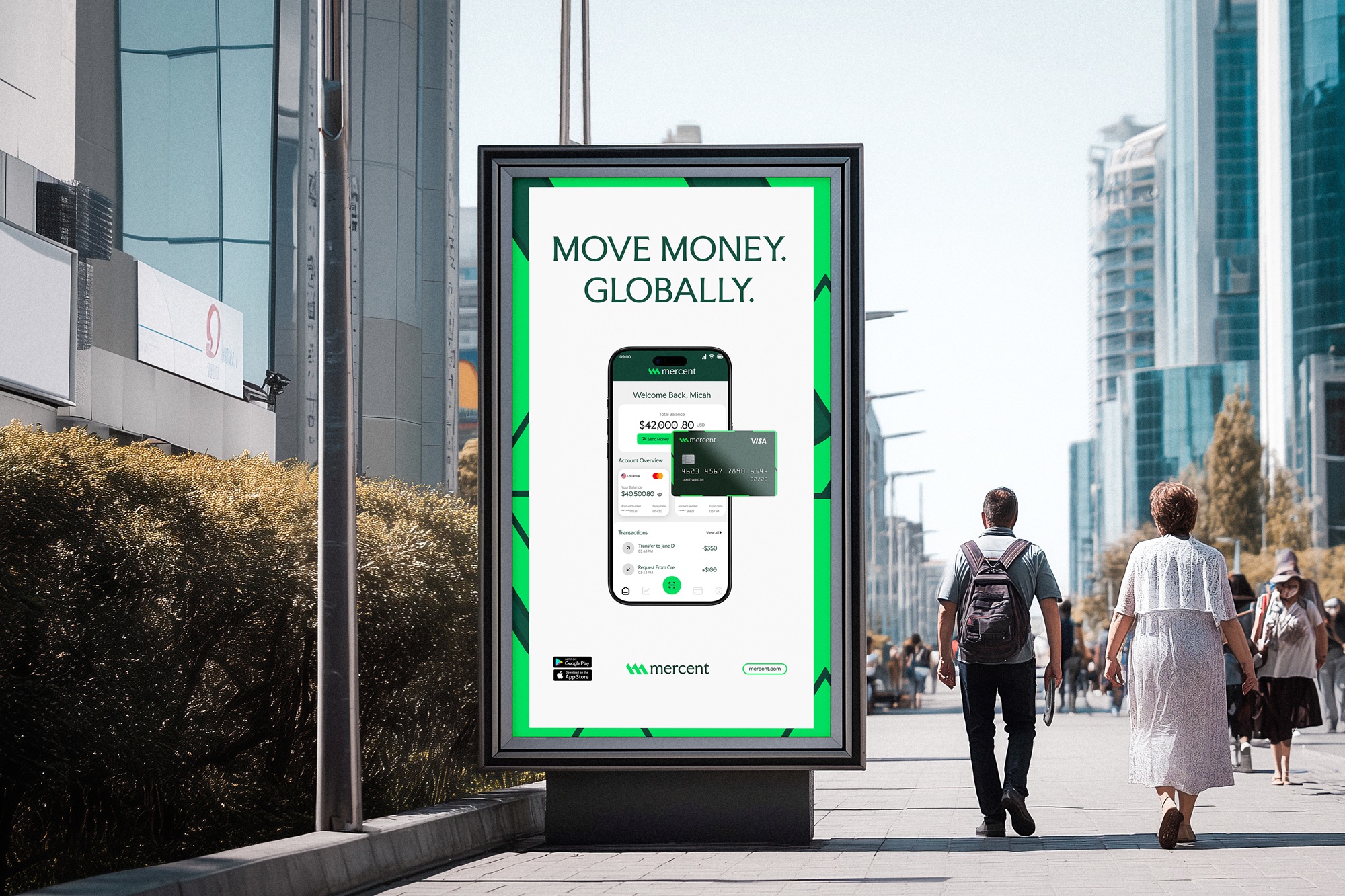
Mercent feels like it belongs on a global stage, It does not introduce itself as a startup, It presents itself as infrastructure. The identity was built to scale across markets, industries, and time.
Because global finance does not need more noise, It needs systems that work.
CREDIT
- Agency/Creative: Blocwise
- Article Title: Mercent Brand Identity by Blocwise
- Organisation/Entity: Agency
- Project Type: Identity
- Project Status: Published
- Agency/Creative Country: Nigeria
- Agency/Creative City: Lagos
- Market Region: Global
- Project Deliverables: App Design, Brand Design, Brand Guidelines, Brand Identity, Brand Mark, Brand Naming, Logo Design, Motion Graphics
- Industry: Financial
- Keywords: Corporate Branding, Corporate Finance branding, Branding, Fintech Branding, Fintech brand identity, Finance branding
-
Credits:
Lead Designer: Bamidele Segun


