Embrace the support you deserve on your quest for renewed vitality and fulfillment. When life poses delicate obstacles to our sexual well-being, Megadom stands by your side, offering guidance and companionship, empowering you to embark on a journey of rediscovery and holistic men’s health. More than just a men’s health center, Megadom is your reliable partner, dedicated to supporting gentlemen through the complexities of sexual well-being. Megadom aims to bring happiness and quality to your marital life by committing to alleviate all concerns regarding sexual health. With the combined expertise of experienced medical professionals and modern approaches, Megadom ensures that you receive professional consultation and treatment, while always being served with utmost comfort and respect.
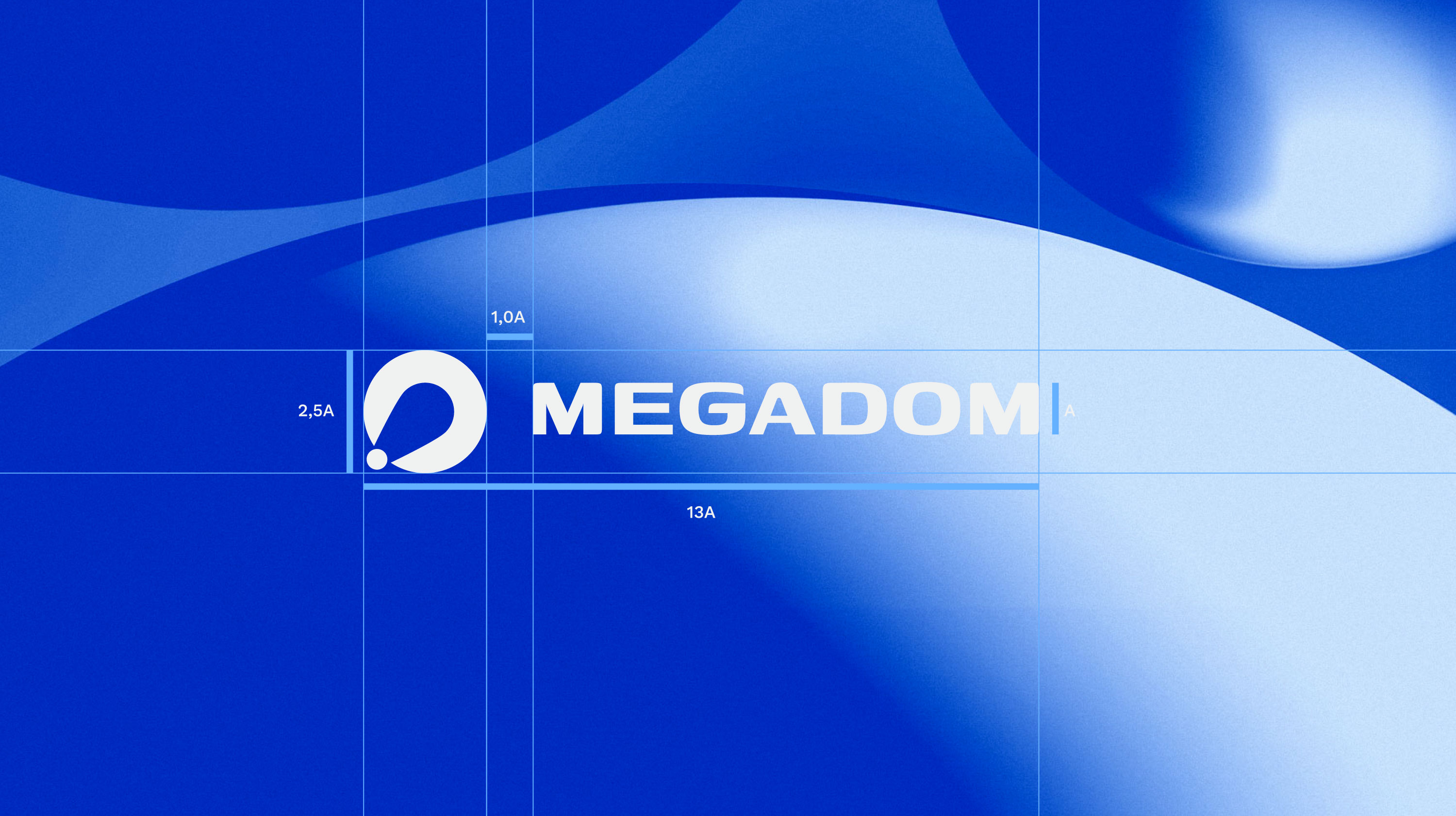
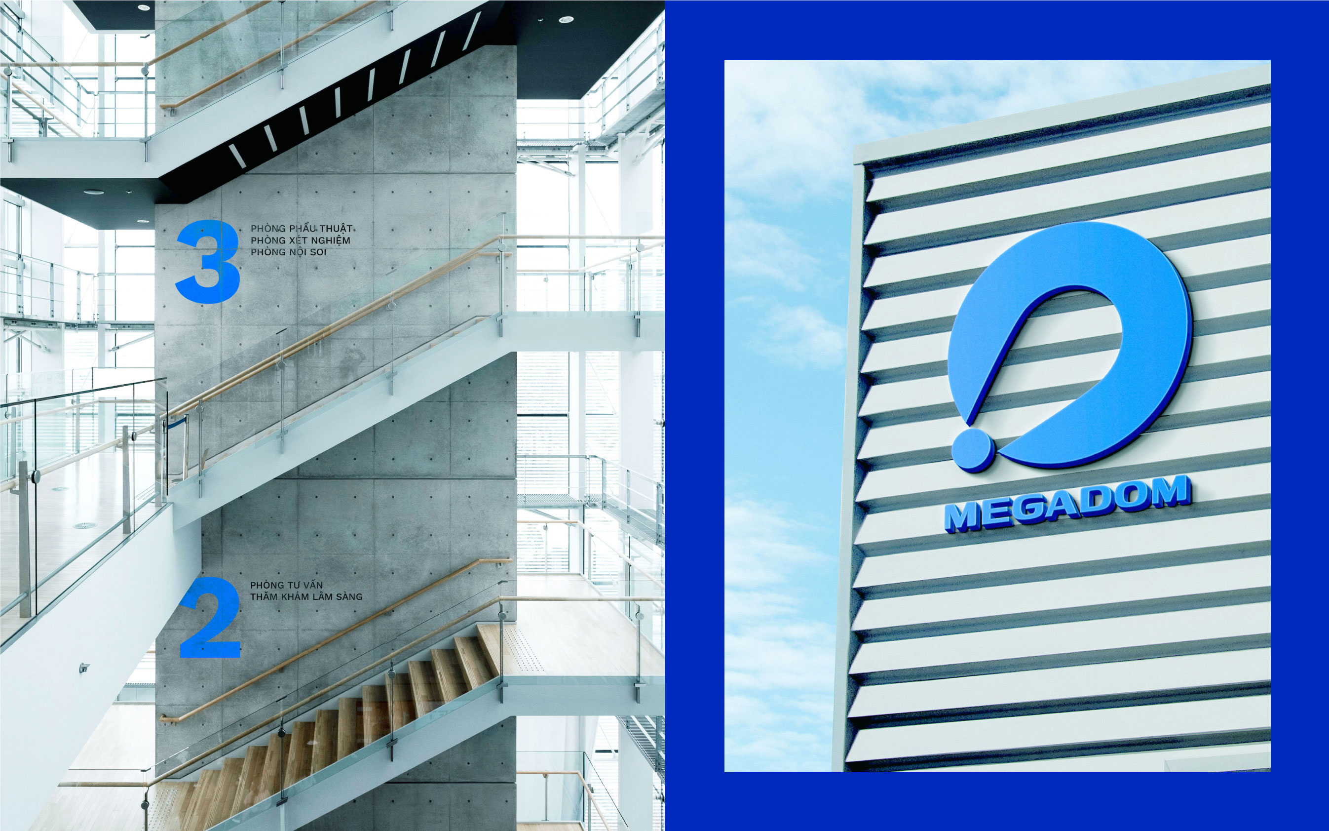
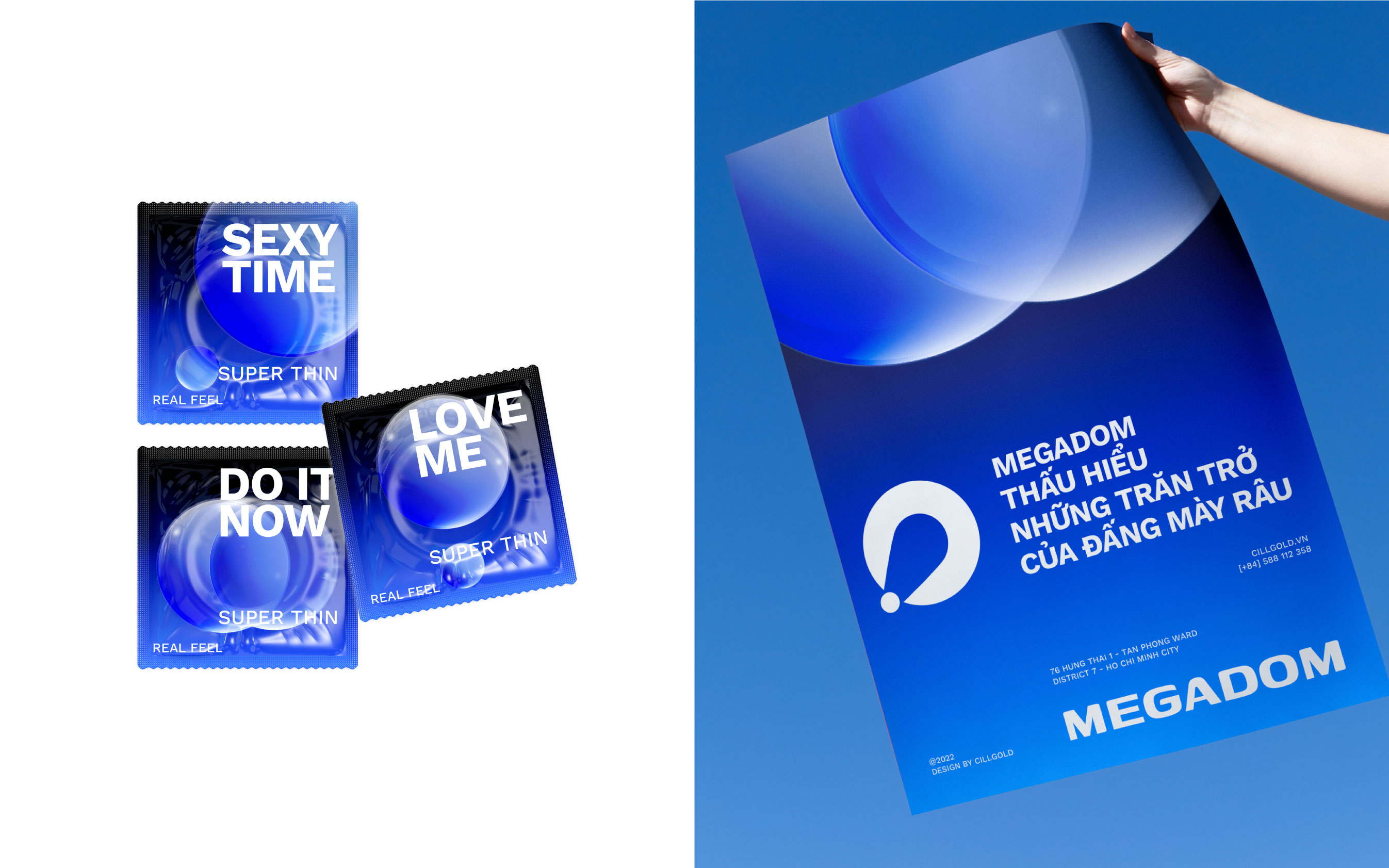
The Megadom logo embodies a distinctive abstract style, creating a unique interaction between two circles, one large and one small. This creates an intriguing reality – a fusion of the desire for innovation and the development of issues related to men’s health.
Within the logo, you can easily perceive the subtle message: “Amplifying the small things.” This honors the small yet significant improvements in life and personal well-being. The Megadom logo truly represents dedication and professionalism while forging a strong connection with the aspiration to make sexual life and men’s health more beautiful.
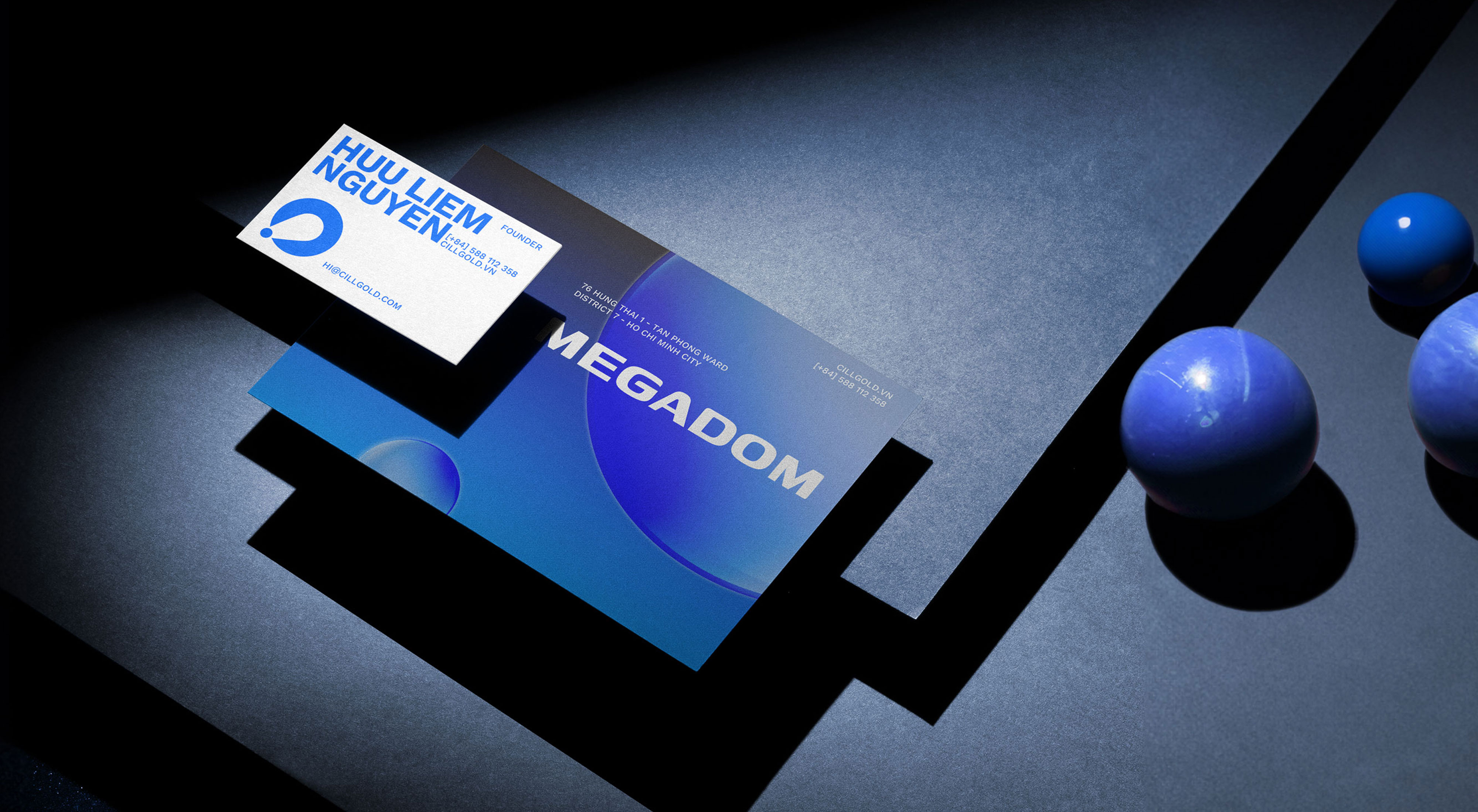
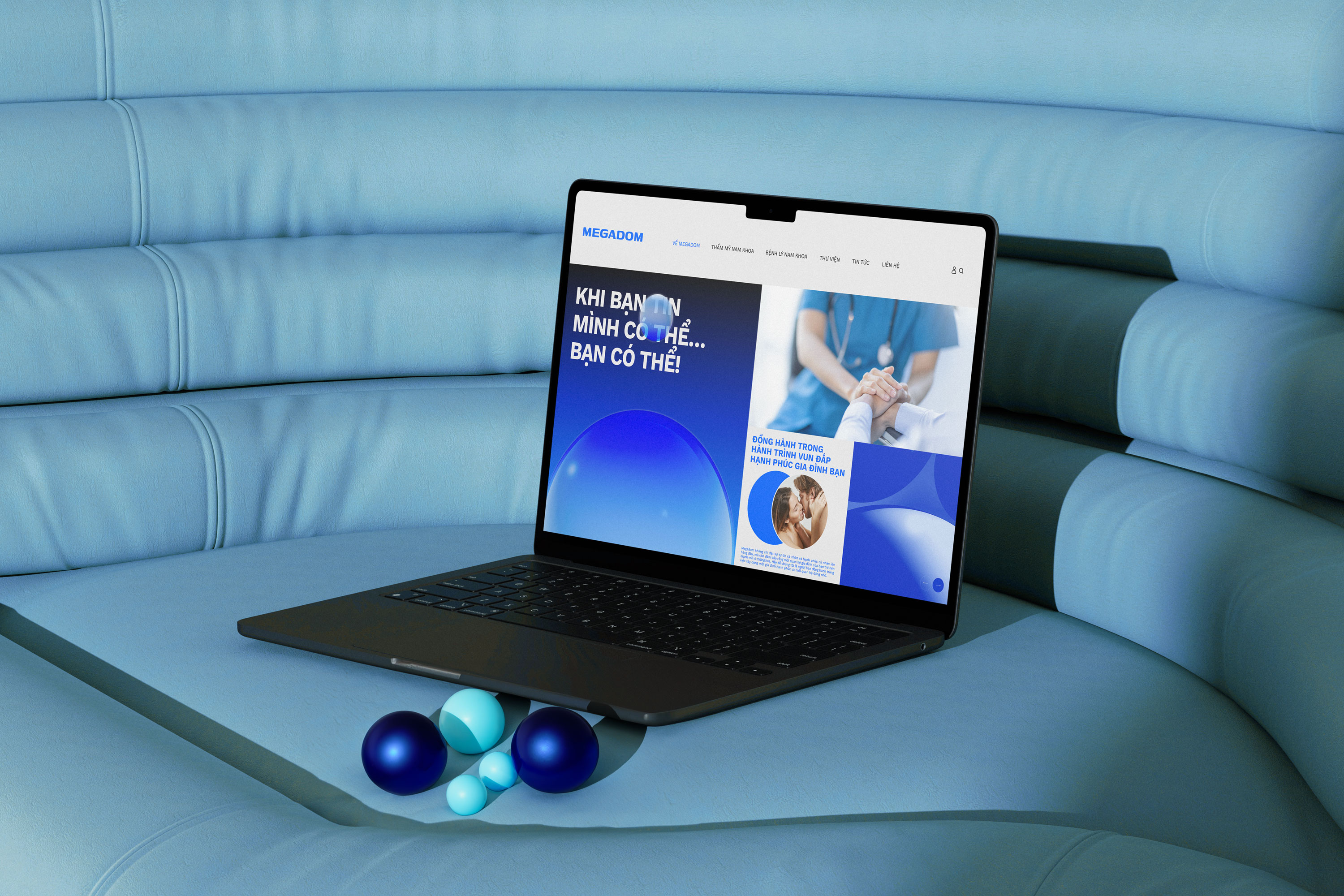
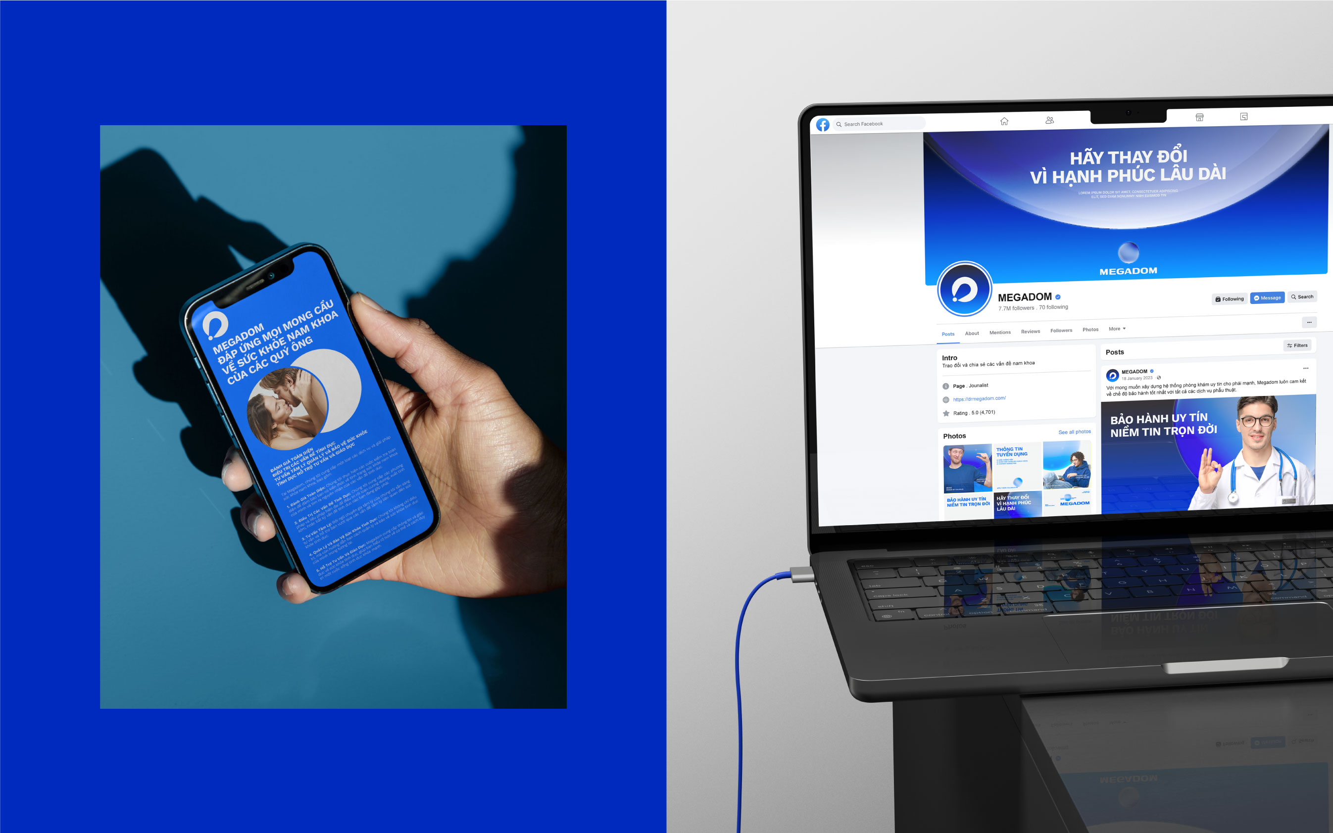
The color scheme of Megadom, predominantly featuring shades of blue, is not just a choice of colors but also a representation of trust, credibility, and hope in the journey of self-transformation, marking a beautiful new beginning. This color also symbolizes the future and hope, connecting with the significance of change for the better, while reflecting growth and progress. That’s why this color is highly suitable for expressing Megadom’s aspirations for the journey of creating health and happy family life, promising a bright and exciting future.
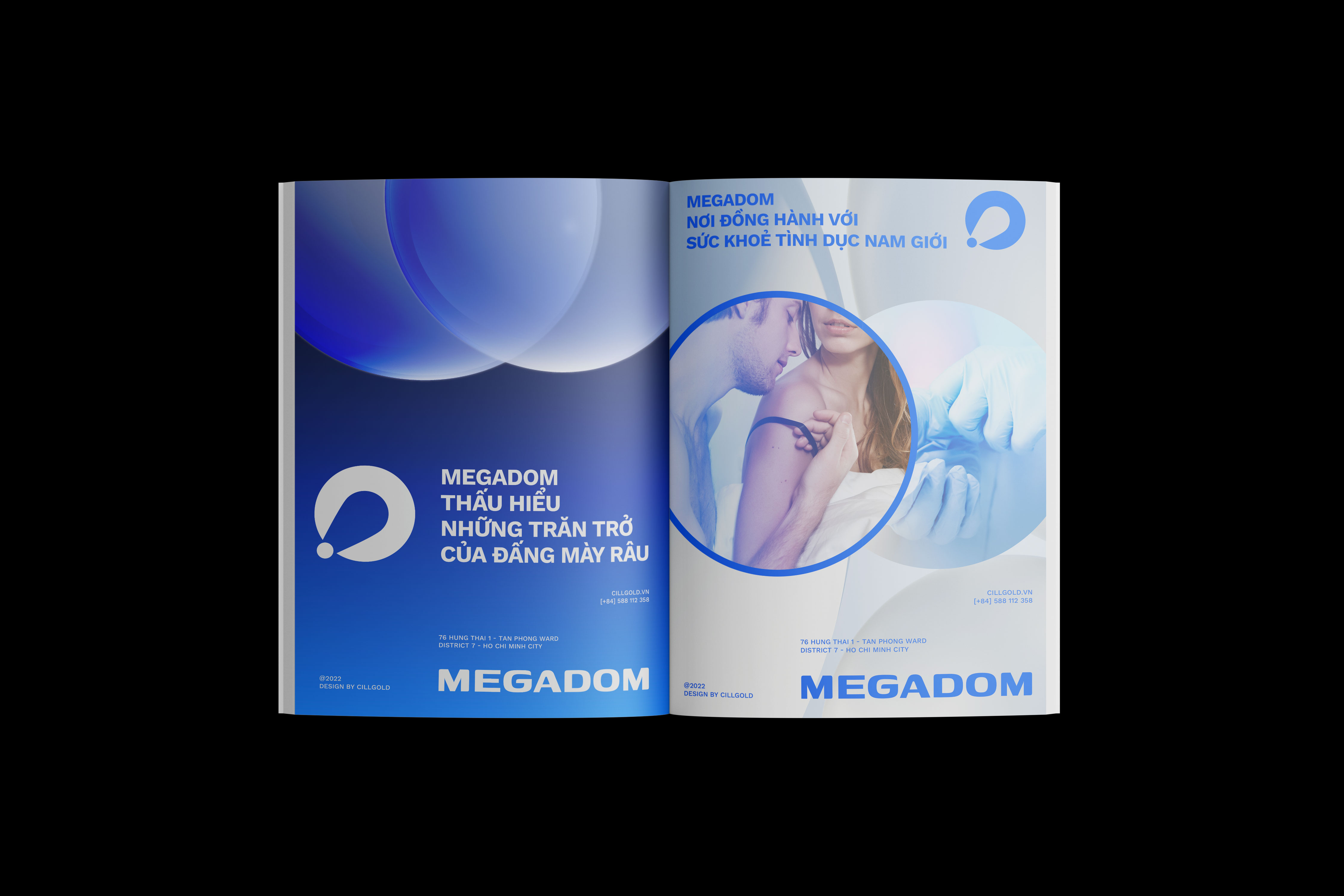
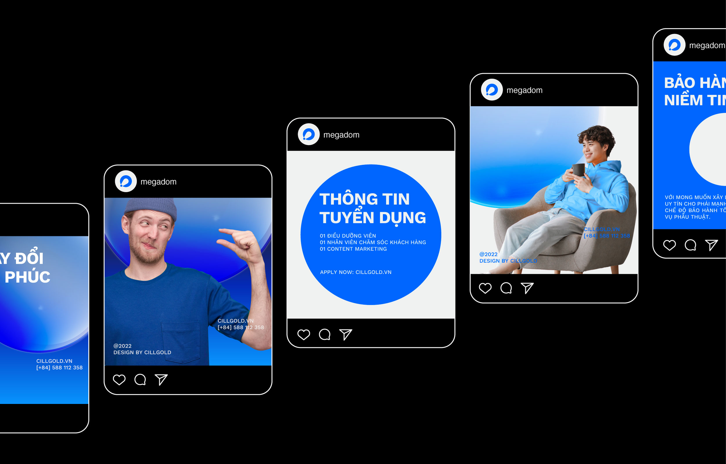
The Key Visual system of Megadom is where circles play the most powerful storytellers in the brand narrative. These circles not only symbolize the desire for innovation and personal growth but also represent unity, forming a strong and cohesive community. Each circle represents an individual, and regardless of their “size,” they all carry desires and aspirations for men’s health. They signify diversity and respect for everyone, with the ultimate goal of creating a happy family life.
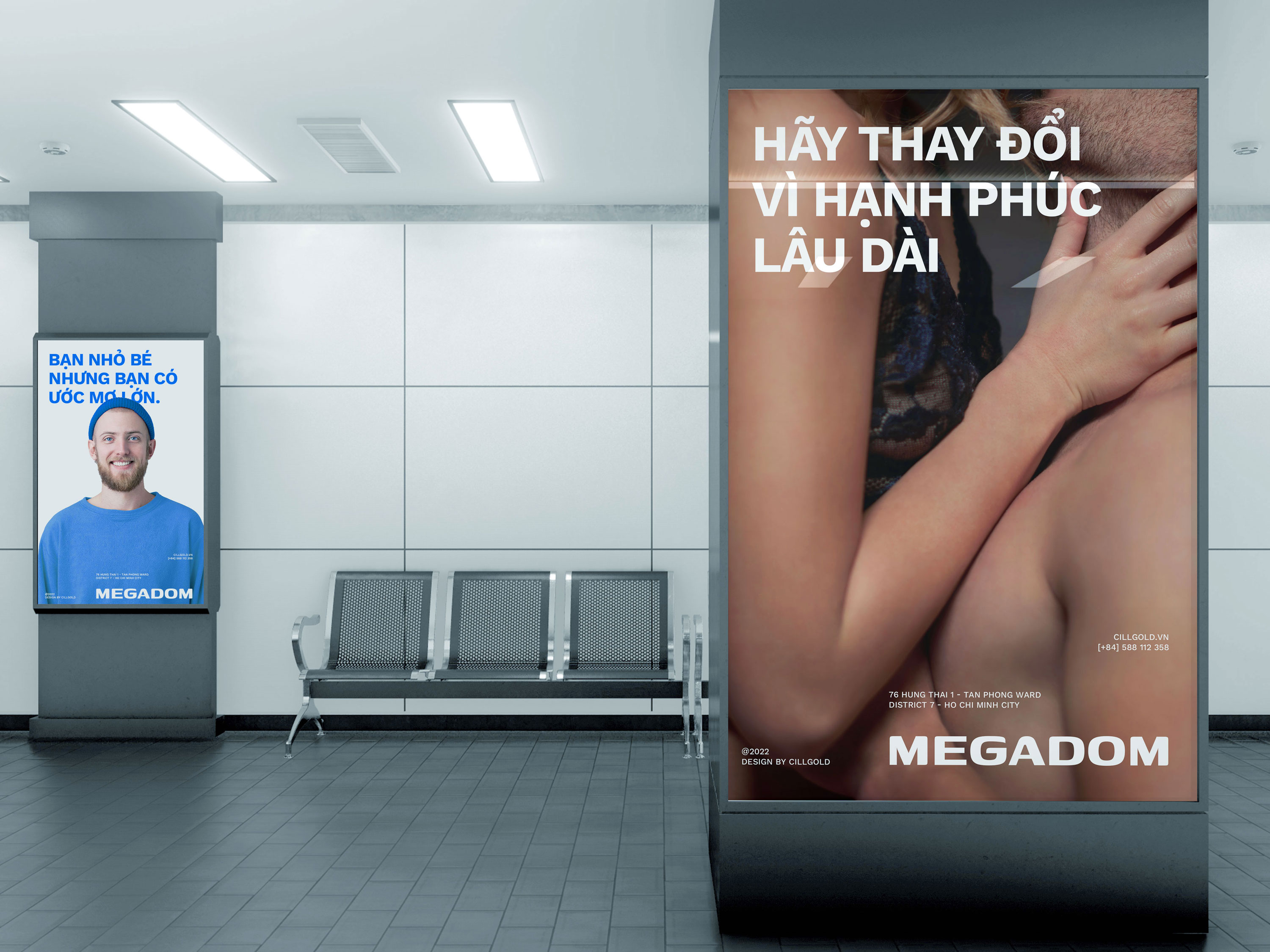
The text layout system is simple and left-aligned, arranging the text blocks like steps, clearly reflecting the desire for progress and development. This demonstrates overcoming challenges to achieve personal goals. Combined with a sans-serif font, the brand identity system becomes modern and approachable to customers.

CREDIT
- Agency/Creative: Cillgold
- Article Title: Megadom – Men’s Health Designed by Cillgold
- Organisation/Entity: Agency
- Project Type: Identity
- Project Status: Published
- Agency/Creative Country: Vietnam
- Agency/Creative City: HCMC
- Market Region: Asia
- Project Deliverables: 2D Design, Art Direction, Brand Identity, Design, Graphic Design, Logo Design
- Industry: Health Care
- Keywords: LOGO, BRANDING IDENTITY, HEALTH, VIETNAM, CILLGOLD
-
Credits:
Agency: Cillgold


