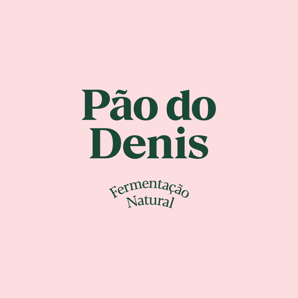
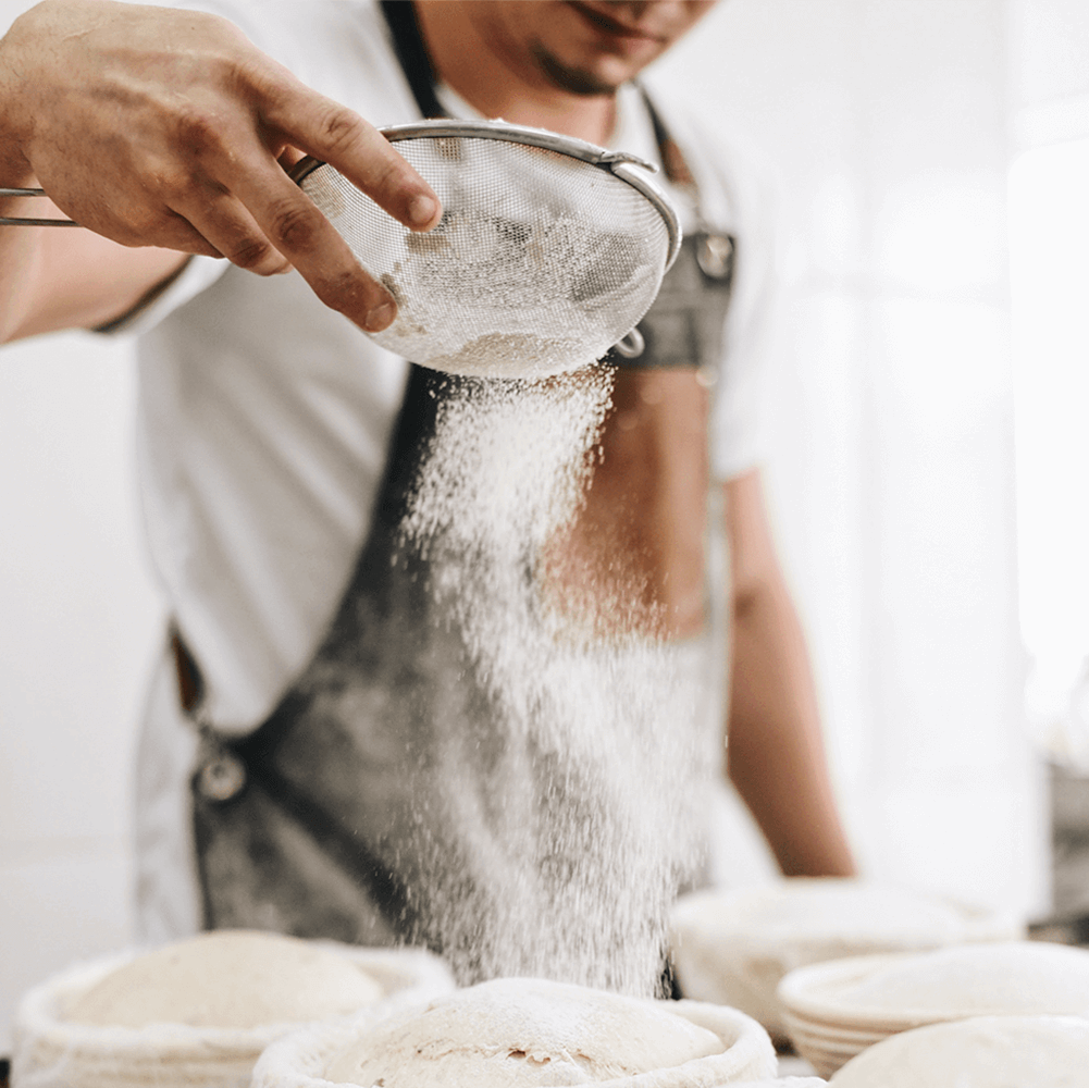
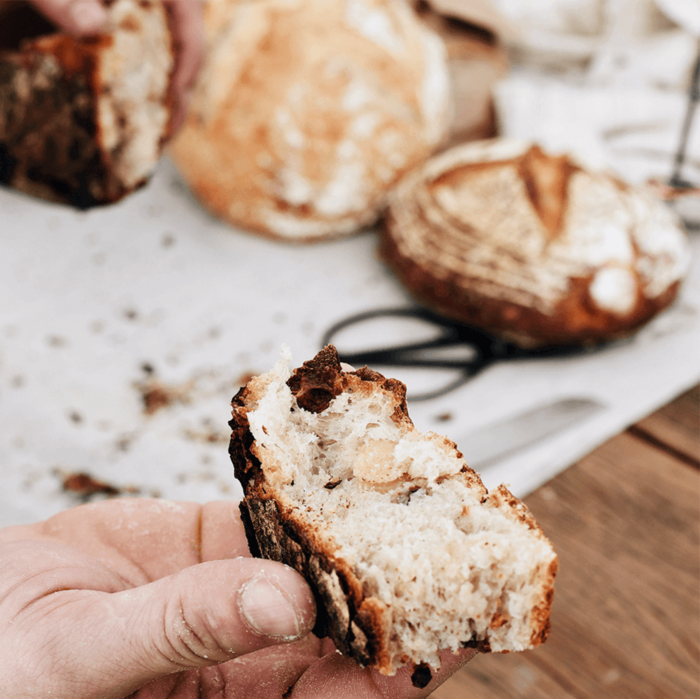
In Portuguese language, “Pão do Denis” means “Denis’s Bread”. Denis is a young baker, who researched and studied ancient Italian recipes for naturally fermented bread and decided to open his own business.
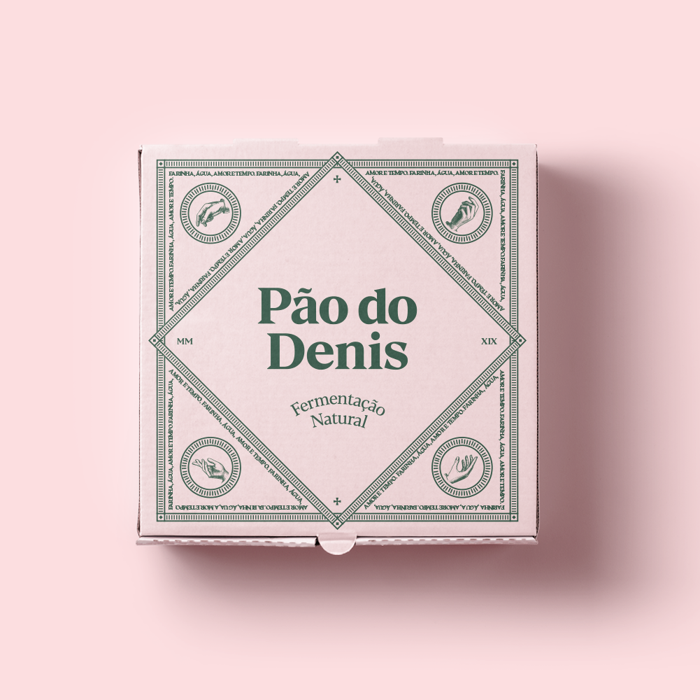
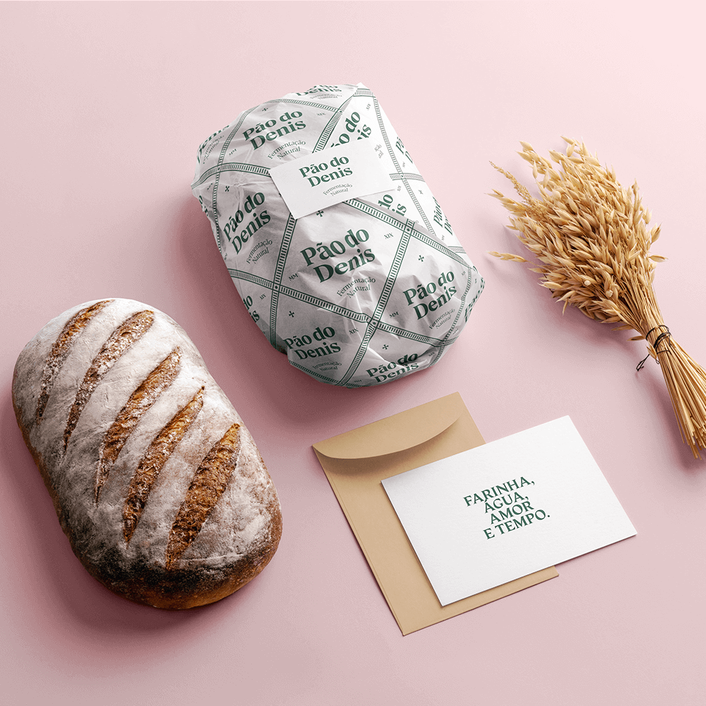
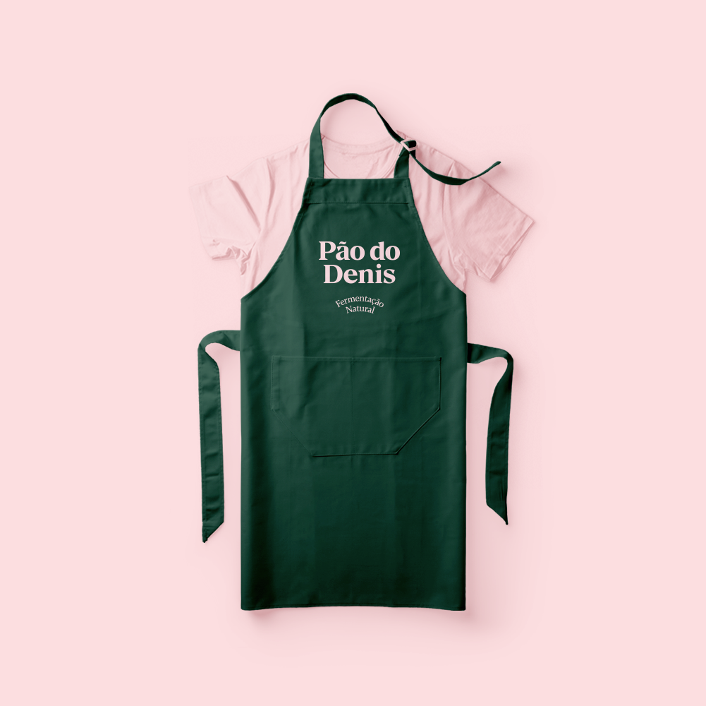
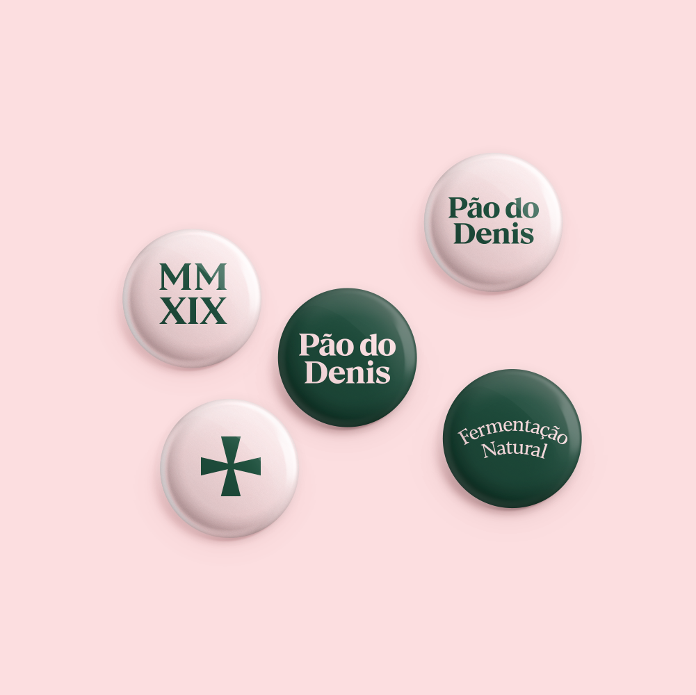
The identity was inspired by the paintings of the old Italian villages, known for their light pink walls and dark green details. In addition, decals and symbols from the Roman era, such as the cross and Roman numerals, were used. All the material was created using only two colors and based mainly on the chosen typology.


CREDIT
- Agency/Creative: vbiasi
- Article Title: Meet Pão do Denis Small Bakery – Old Recipes – New Brand
- Organisation/Entity: Agency, Published Commercial Design
- Project Type: Identity
- Agency/Creative Country: Brazil
- Market Region: South America
- Project Deliverables: Brand Identity, Brand World, Branding, Graphic Design, Identity System, Illustration, Packaging Design, Research
- Industry: Food/Beverage
- Keywords: Bakery, Baker, Bread, Pizza, Italy, Natural Fermentation, Roman
FEEDBACK
Relevance: Solution/idea in relation to brand, product or service
Implementation: Attention, detailing and finishing of final solution
Presentation: Text, visualisation and quality of the presentation


