Life sciences is an academic, research-based industry. Within that, the space of clinical research is even more complex.
After multiple failed attempts at branding and rebranding, we were presented with the opportunity to bring the Medable brand to life and establish ourselves as a trailblazer in the technology space, winning mind and market share while creating a strong community aligned with our mission.
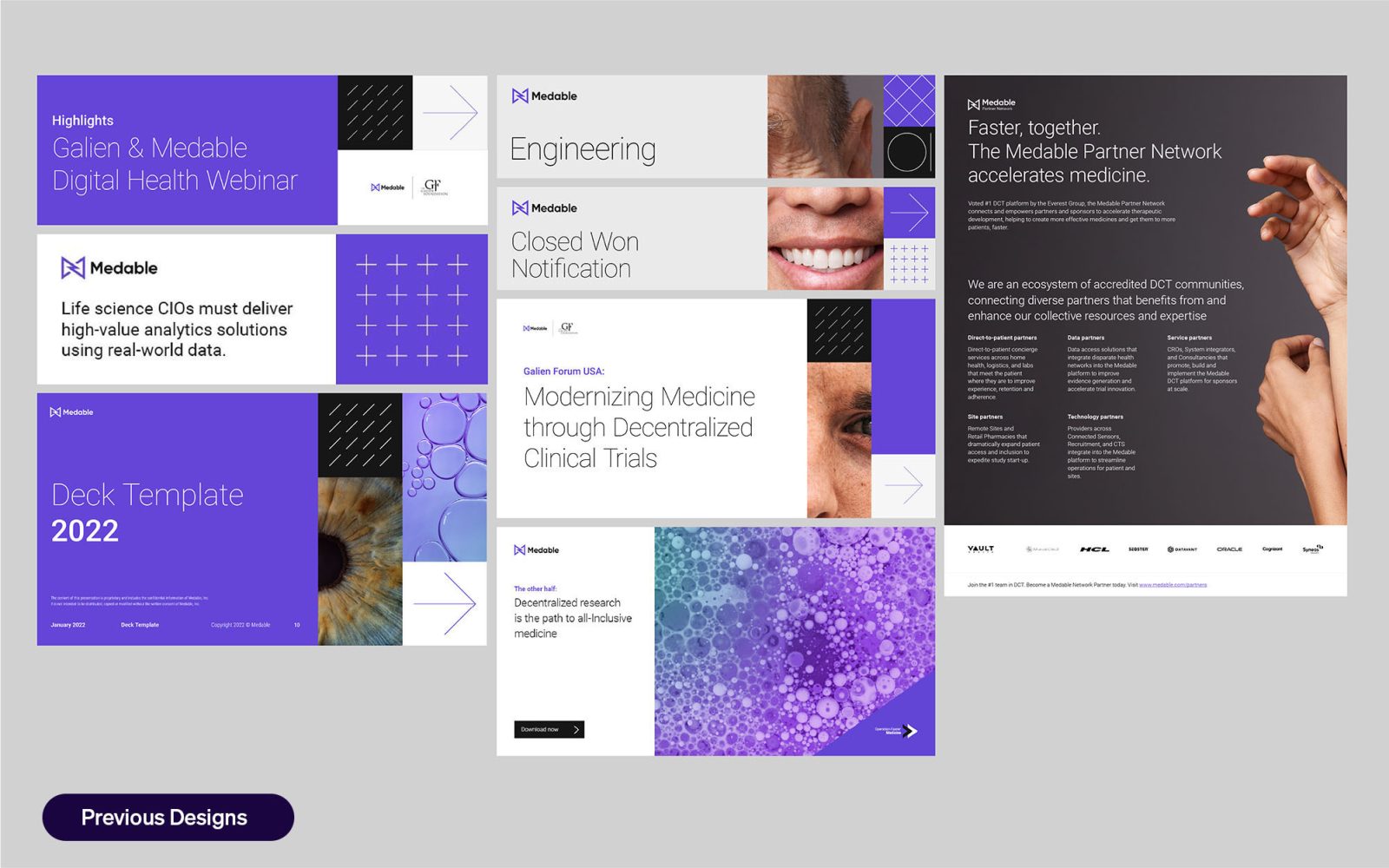
Our previous design toolkit was both limiting and fundamentally miscommunicated our product and offer. Naturally, this lead to misdirection and confusion. The toolkit involved a complex grid system, and assets that didn’t translate across digital, print, and in-person landscapes. The framework was high-effort, low-reward for our internal design team and external partners.
We needed to take a design system that wasn’t robust, conceptual, or strategic enough and align it with the Medable vision and trailblazer positioning.
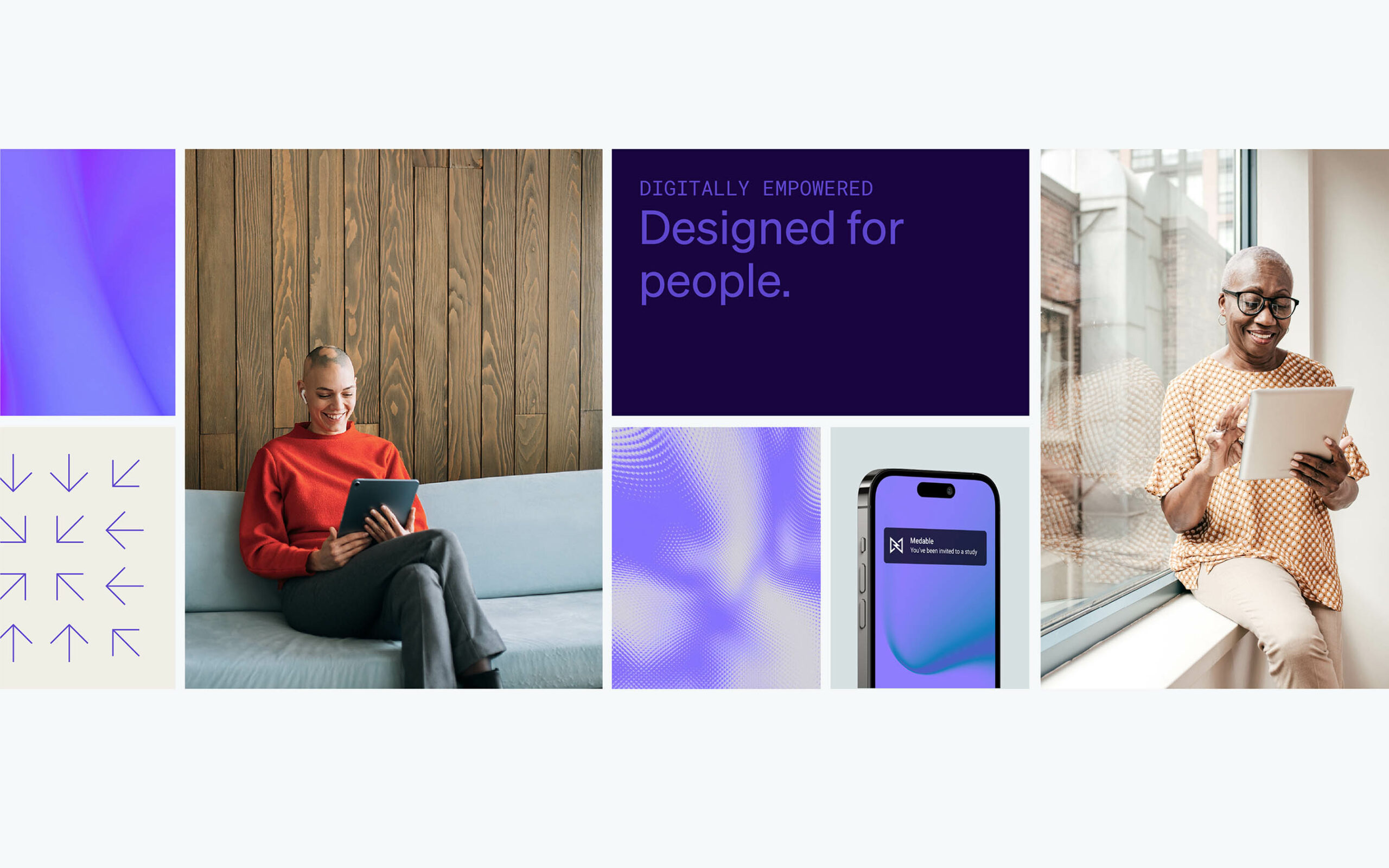
With our creative Northstar in mind – to blend the worlds of elegance, human touch, and technology – we created an eye-catching, modular, and scalable design system with range.
Taking best practices from leading household brands such as Apple and Beats by Dre and cues from standout startups in traditionally stagnant industries like Rimowa, we created a premium design experience anchored in lifestyle.
We iterated and optimized using fast feedback from social media to test our boundaries across every design element. Designers were challenged to break the design system to expose inefficiencies and weaknesses, then find elegant and functional solutions.
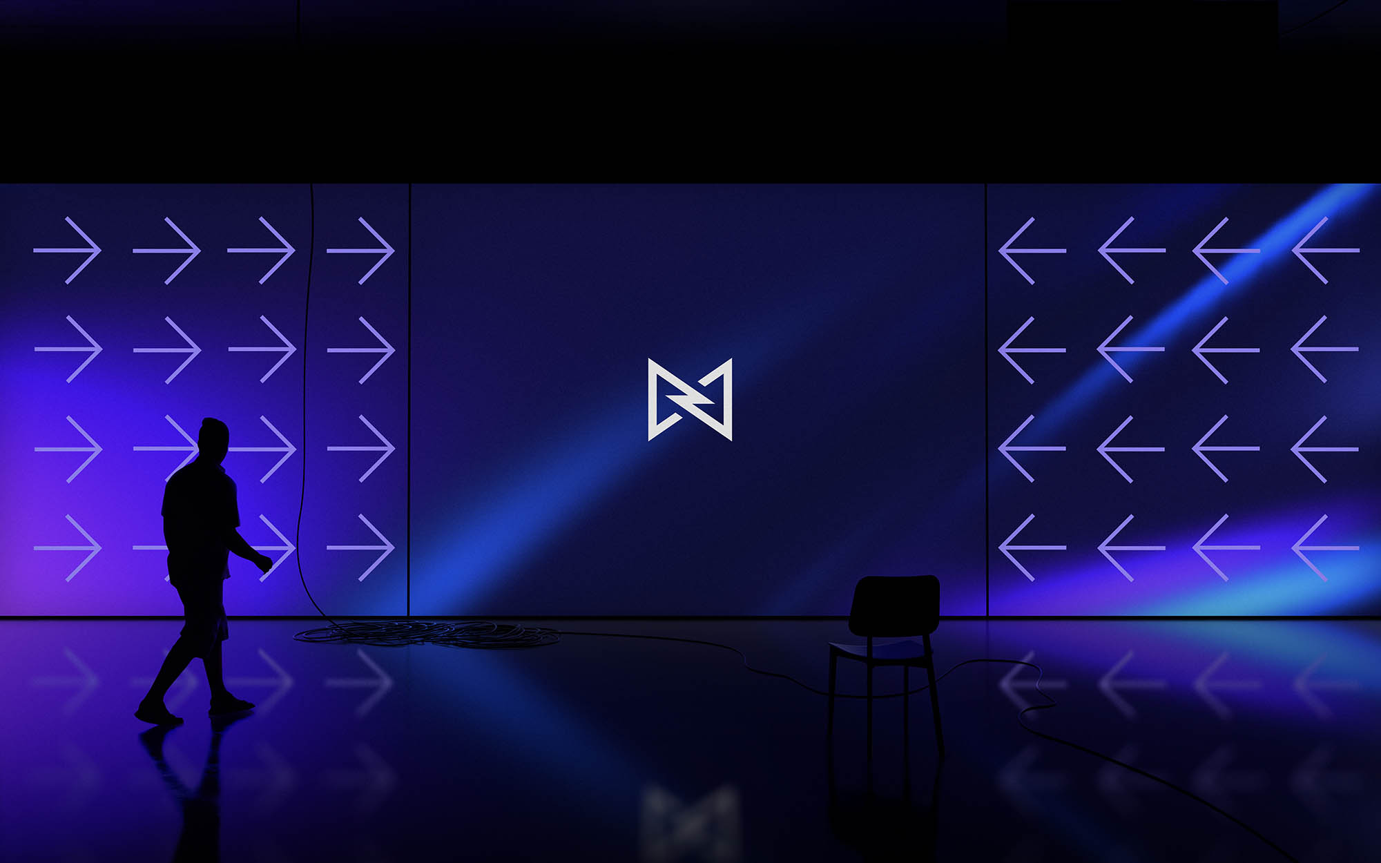
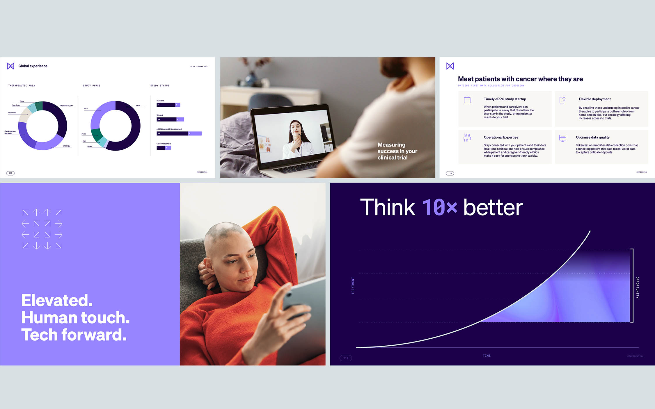
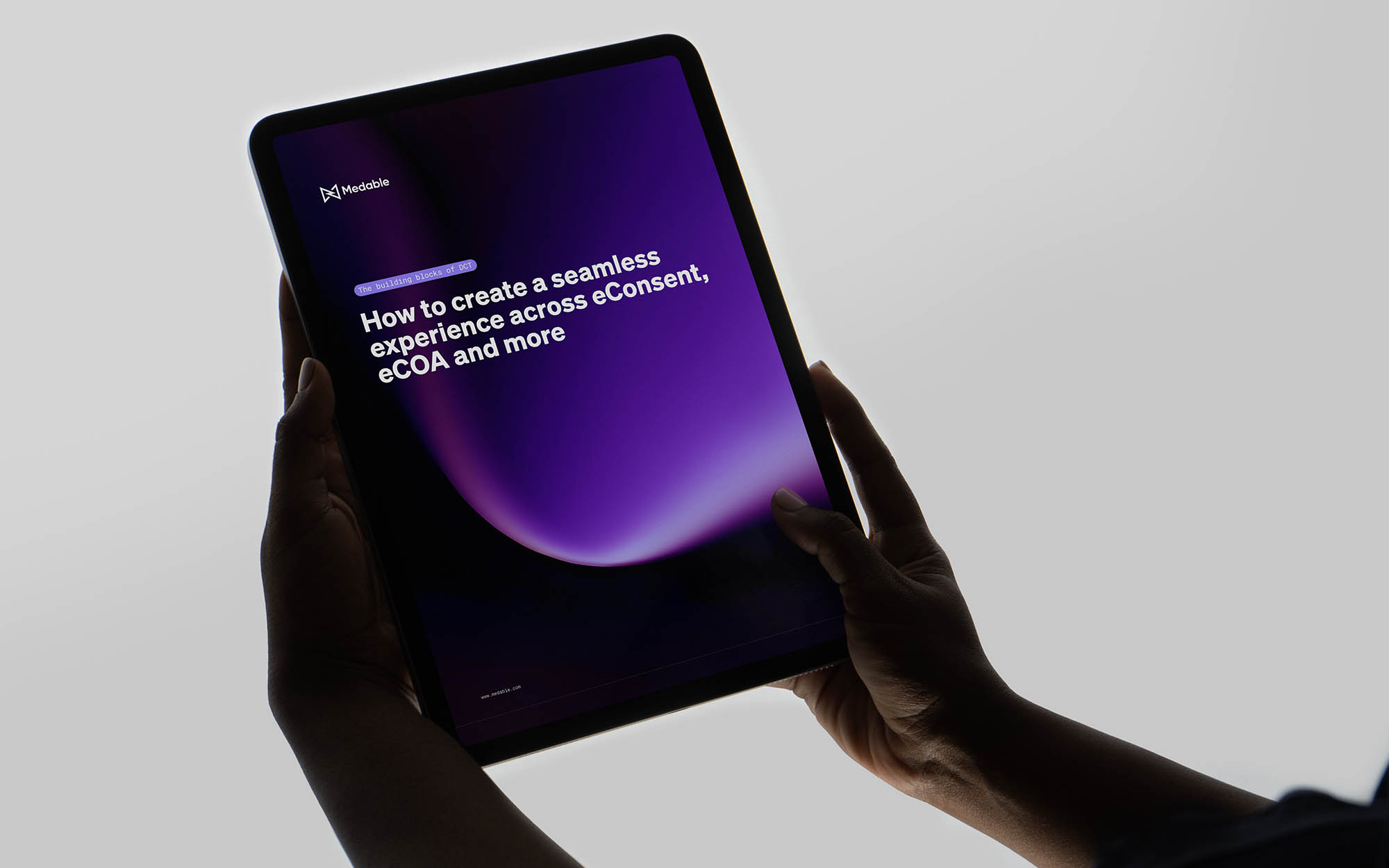
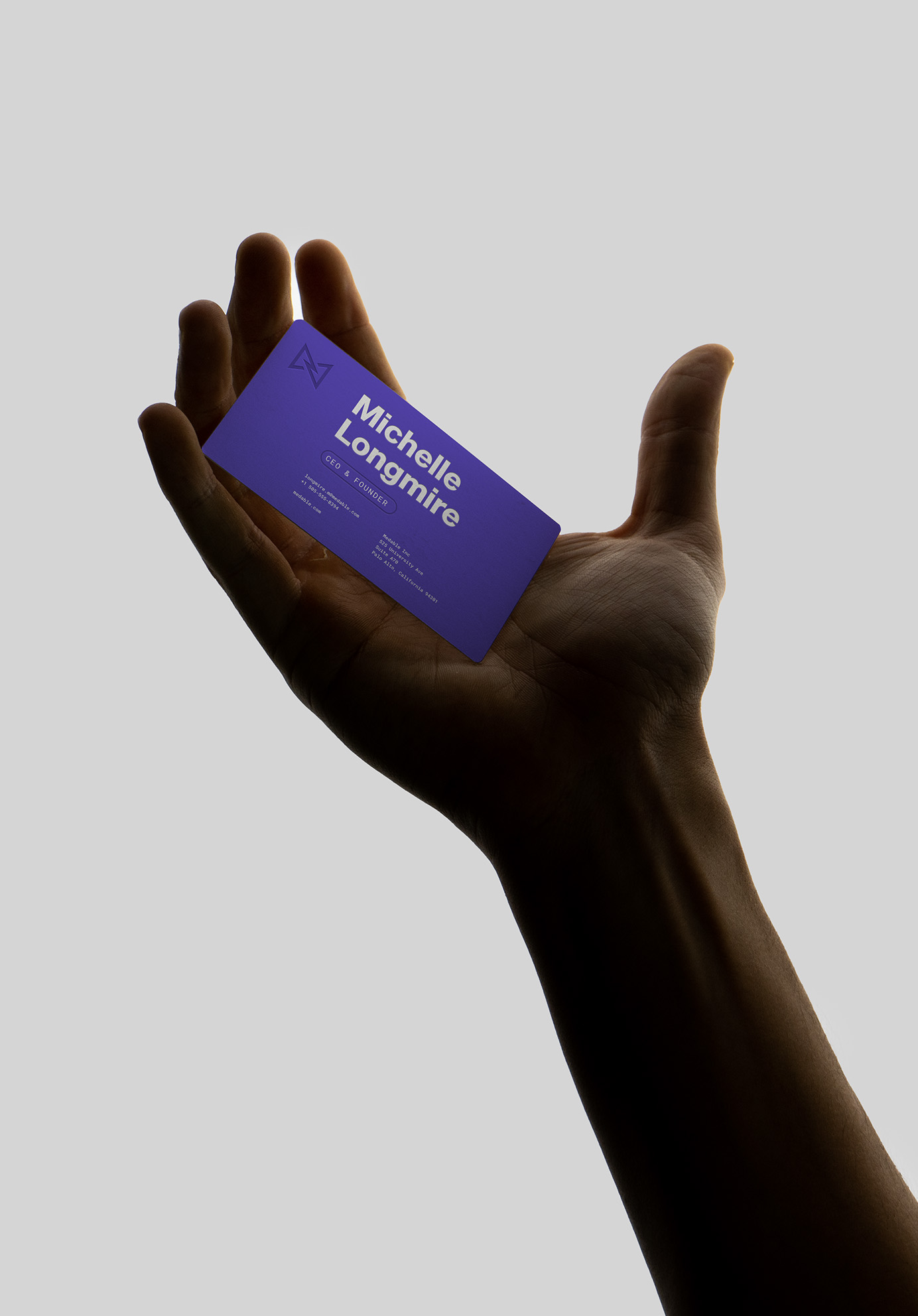
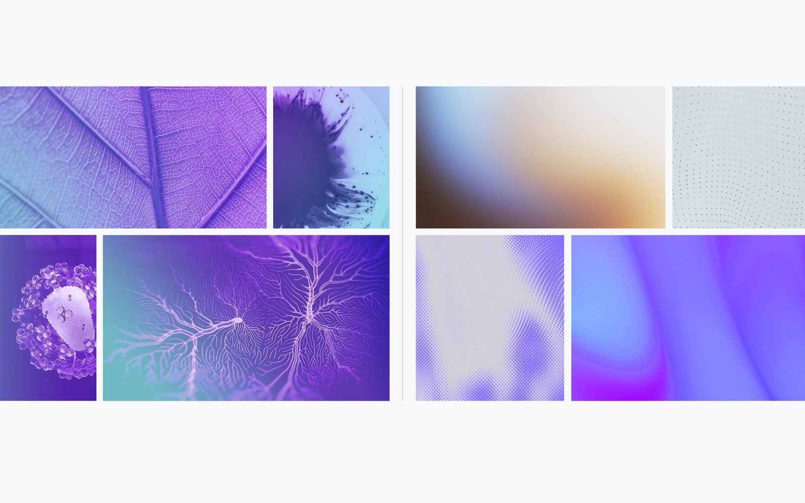
After 6 months of intense and rigorous iteration and testing, we had thoroughly refreshed every area of design. The hyper-flexible and hyper-robust new system includes a refreshed color palette, graphic motifs, static and motion backgrounds, cinematic UI elements, motion graphics, and an updated font system that enable any and every designer to execute brilliantly from creating bold statements to long-form educational content and everything in between.
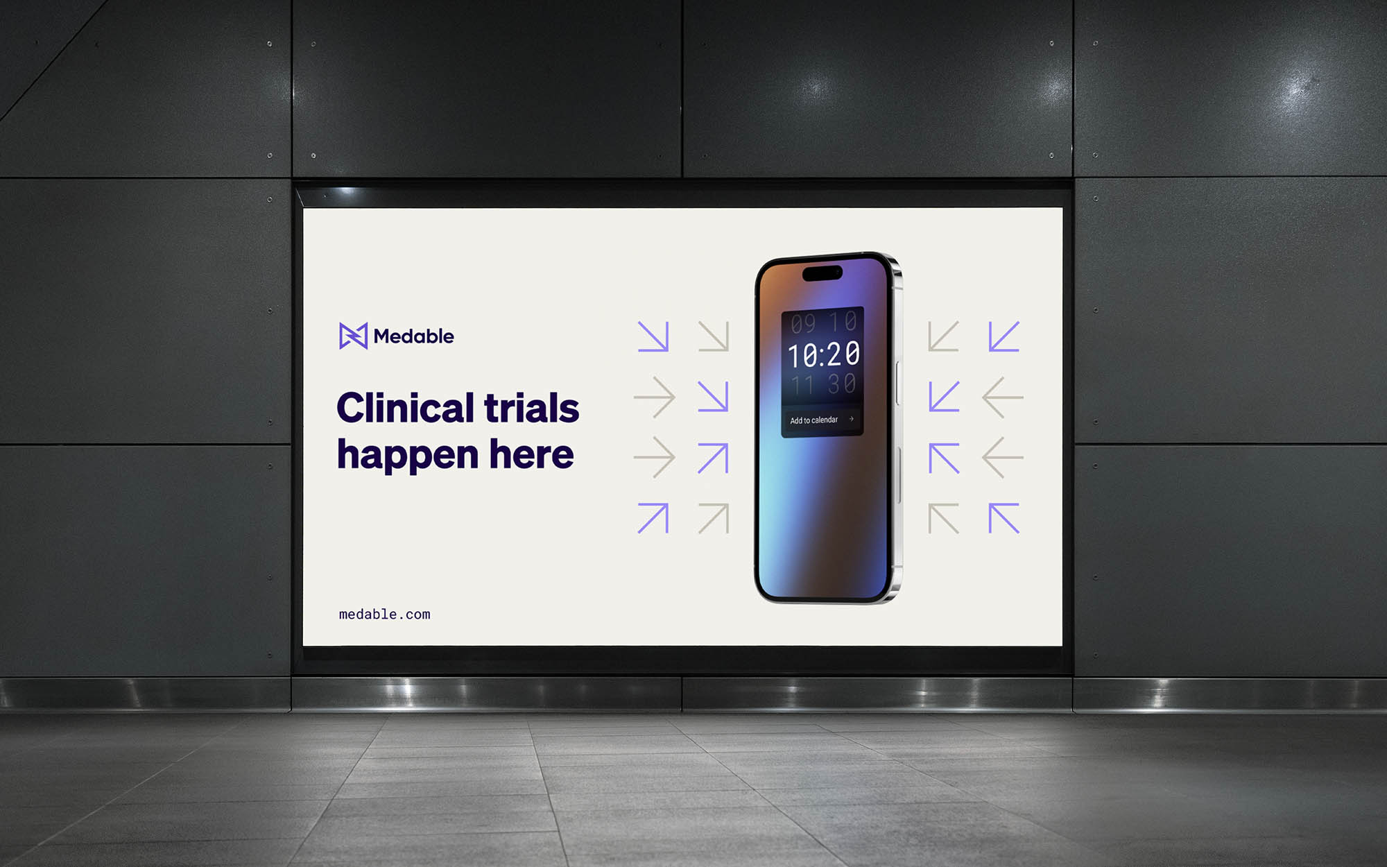
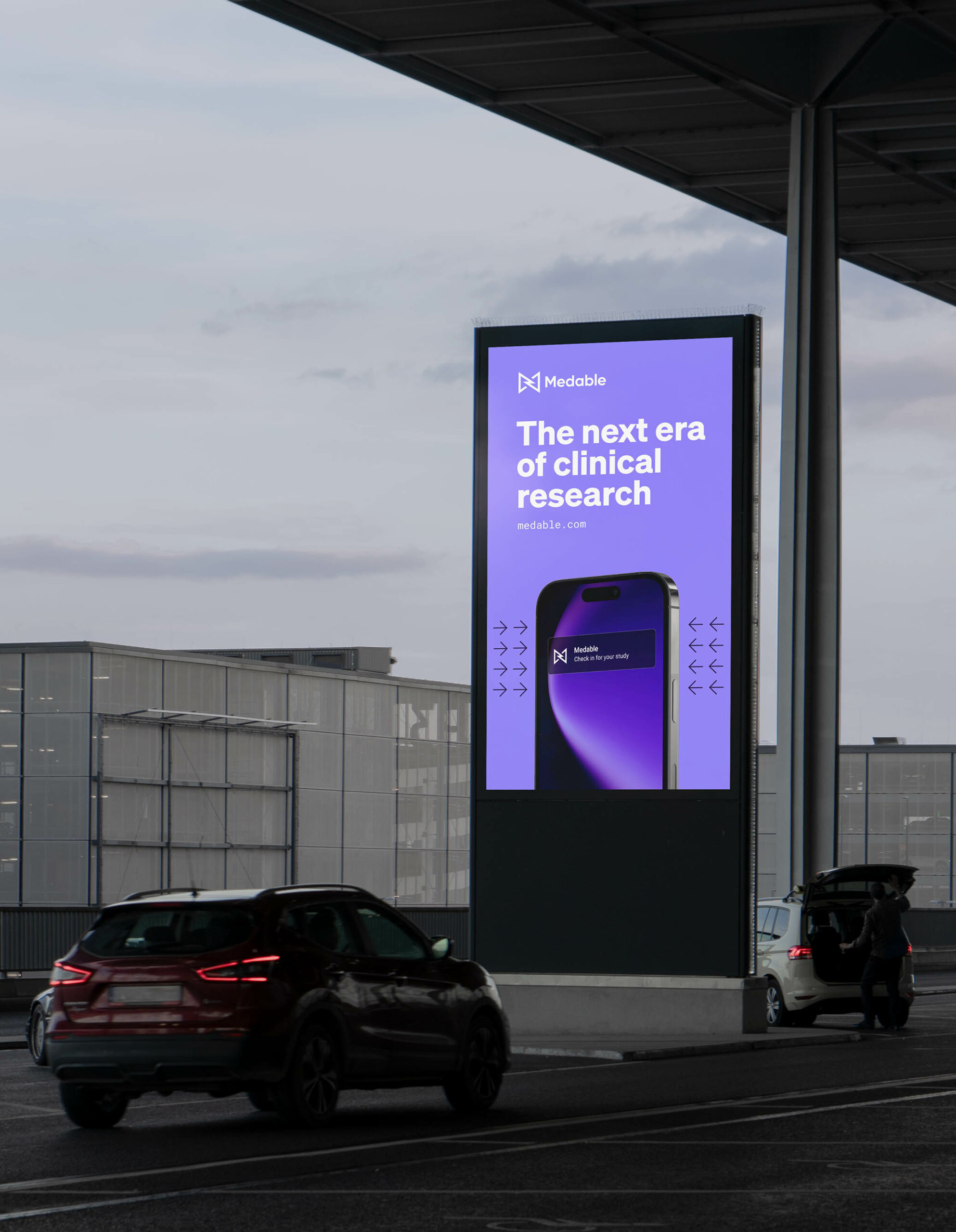
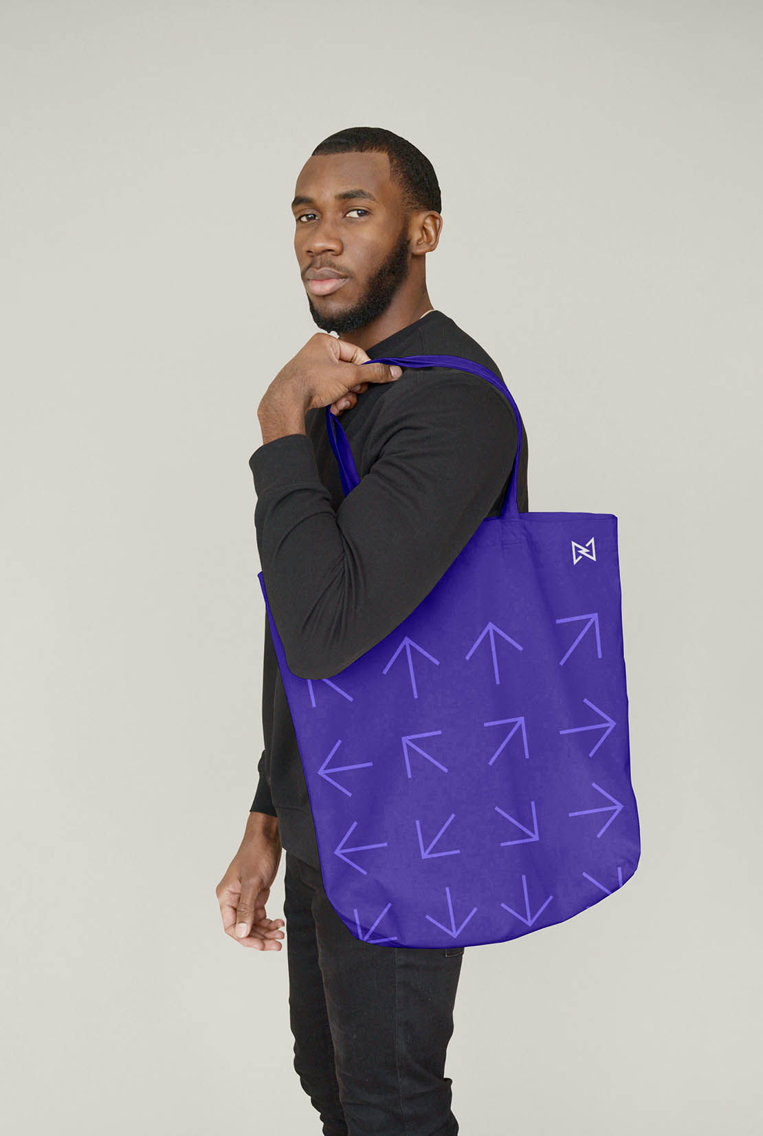
A renewed color palette enables us to be both refined and pioneering as needed. We used graphic symbols to capture complicated product concepts such as decentralization, data points, patient-centeredness, progress, and unification. We introduced cinematic UI elements to showcase proprietary features without exposing confidential product elements. We brought our brand into the world of tech using abstract imagery inspired by fiberglass, light, and energy, rather than previous images from biological sciences like moss or cell cultures.
By thoughtfully incorporating engineering practices into our design, we have effectively demonstrated how our product stands out as an elegant and user-friendly solution in a world of over-complicated processes. And for our marketing and internal teams, we have created a modular, adaptable, and deep resource that allows for incredible range while keeping the Medable spirit.
After many years of unsuccessful branding efforts, design team has finally captured and visually expressed the attitude and vision of the company successfully. Our final product beautifully portrays Medable’s category leading, trail blazing spirit in a functional, inspiring, and beautiful design system, complete with articulate guide to help a variety of users execute flawlessly.
One of the biggest achievements is the design team driven internal cultural shift that has taken place. In the wake of economic shifts, we have infused a sense of pride and excitement across all Medable teams by showcasing our brand far beyond status quo in our industry and on par with B2C branding greats.
IMPACT WHERE IT MATTERS
As a B2B company, with the largest pharma as key customers, We’ve seen increased confidence and momentum as a direct result of our improved branding. Inspiring confidence in our SaaS product, we’ve secured $50M in bookings from our larger enterprise clients like GSK and Syneos after continued touch points ranging from ads, presentation decks, and experiential marketing.
INSPIRING THE INDUSTRY
At our biggest trade show of the year we had key competitors taking photos of our booth activation admitting they will be using it for inspiration.
“Everyone (including our competitors) were very jealous of our booth and design! “ – Aadhar Shah VP, New Markets Medable
ENGAGEMENT
As a B2B company, Linkedin is by far one of our most powerful channel. Recently reaching 100K followers, behind only Veeva, a much larger competitor, Medable has seen a significant and inspiring increase in engagement with our content.
32.4% increase in total engagements YoY despite fewer posts
23.3% increase in engagement rate YoY
483.6% increases in video views YoY
ALL AROUND EFFICIENCY:
In addition to efficiency in our paid media, our internal marketing team has reduced churn and delay by 50%. This is realized through less rounds and briefing through the design team due to usable and beautiful templates, less conceptual churn, and faster design rounds.
PAID AD RESULTS
28.7% increase in CTR.
Cost reduction 60.6% of per click
Cost reduction 72.1% of per download
Cost reduction of 41% per MQL.
Previously our highest engagement rate for any individual paid LinkedIn ad was around 1.5%, now our highest engagement rate for an individual is is 3%+.
= 100%+ improvement. (It sounds small, but this is literally hundreds of clicks more).


CREDIT
- Agency/Creative: Otherness
- Article Title: Medable 3.0: A Robust Design System For A Visionary Clinical Trials Platform
- Organisation/Entity: Freelance
- Project Type: Identity
- Project Status: Published
- Agency/Creative Country: Netherlands
- Agency/Creative City: Rotterdam
- Market Region: North America
- Project Deliverables: Brand Identity
- Industry: Health Care
- Keywords: WBDS Creative Design Awards 2023/24
- Keywords: Identity, Brand Design Refinement
-
Credits:
Visual Designer: Aishah Mulkey
Sr Designer: Harris Hatzimpaloglou
Sr Designer: Luu00eds Sousa Teixeira
Sr Designer: Michael Nelson
Sr Designer: Nicole Archuleta
SVP Marketing: Nora Volger
Visual Designer: Raza Khan
Design Operations Manager: Rhea Handy
VP of Brand: Stephanie Young
Sr. Motion Designer: Gabriel Lindsay
Creative Director - Otherness: Joel Derksen


