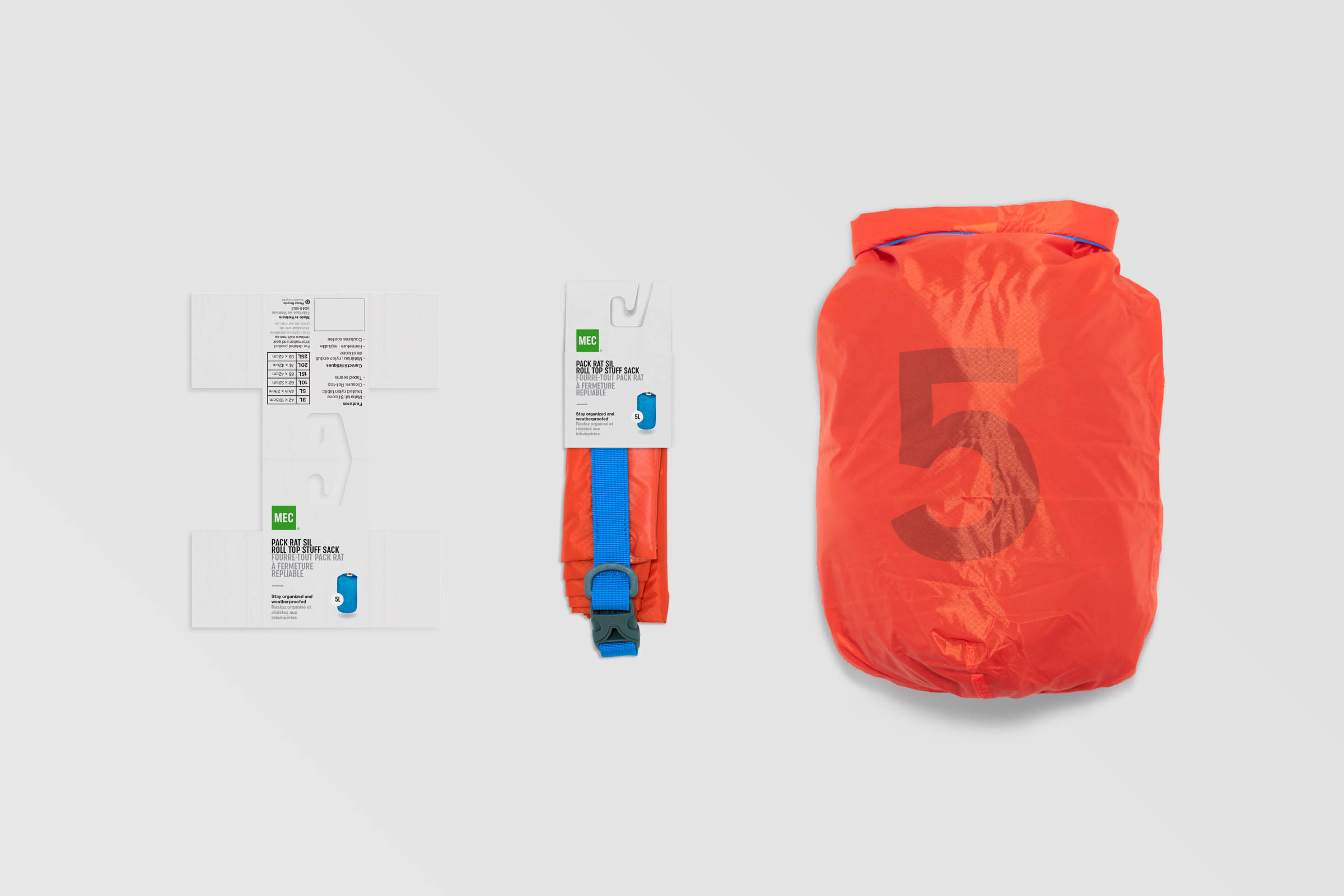
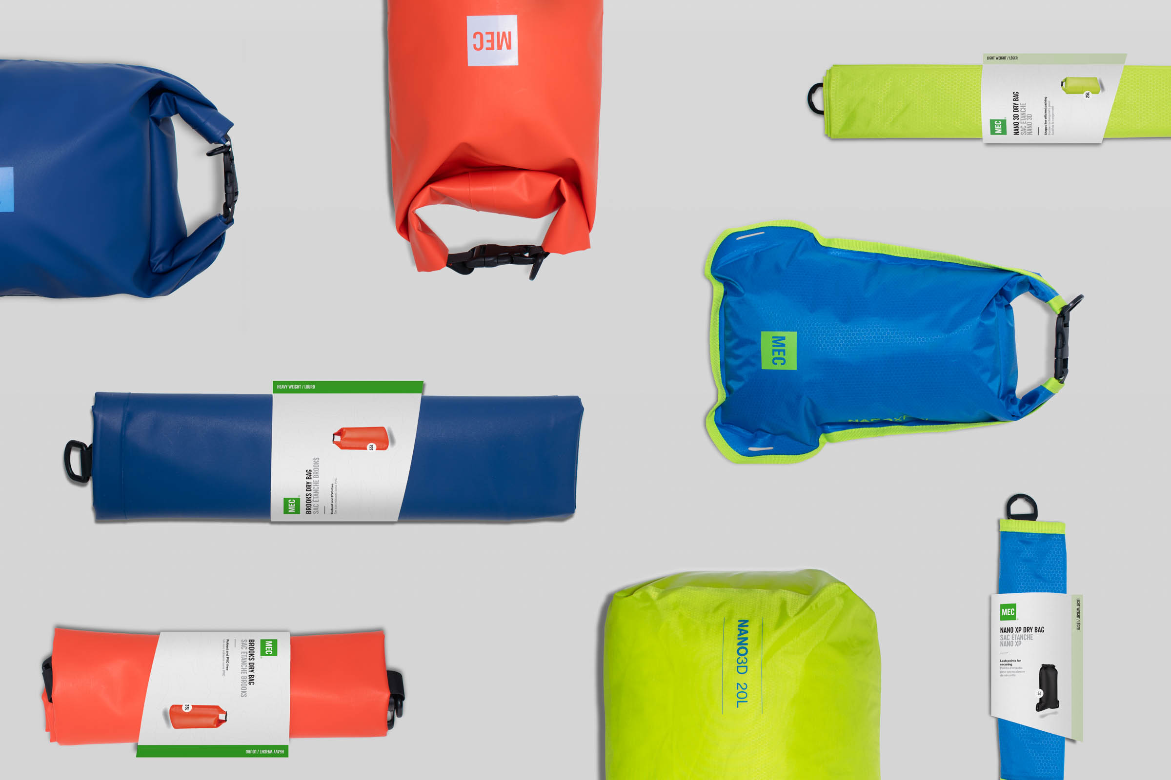
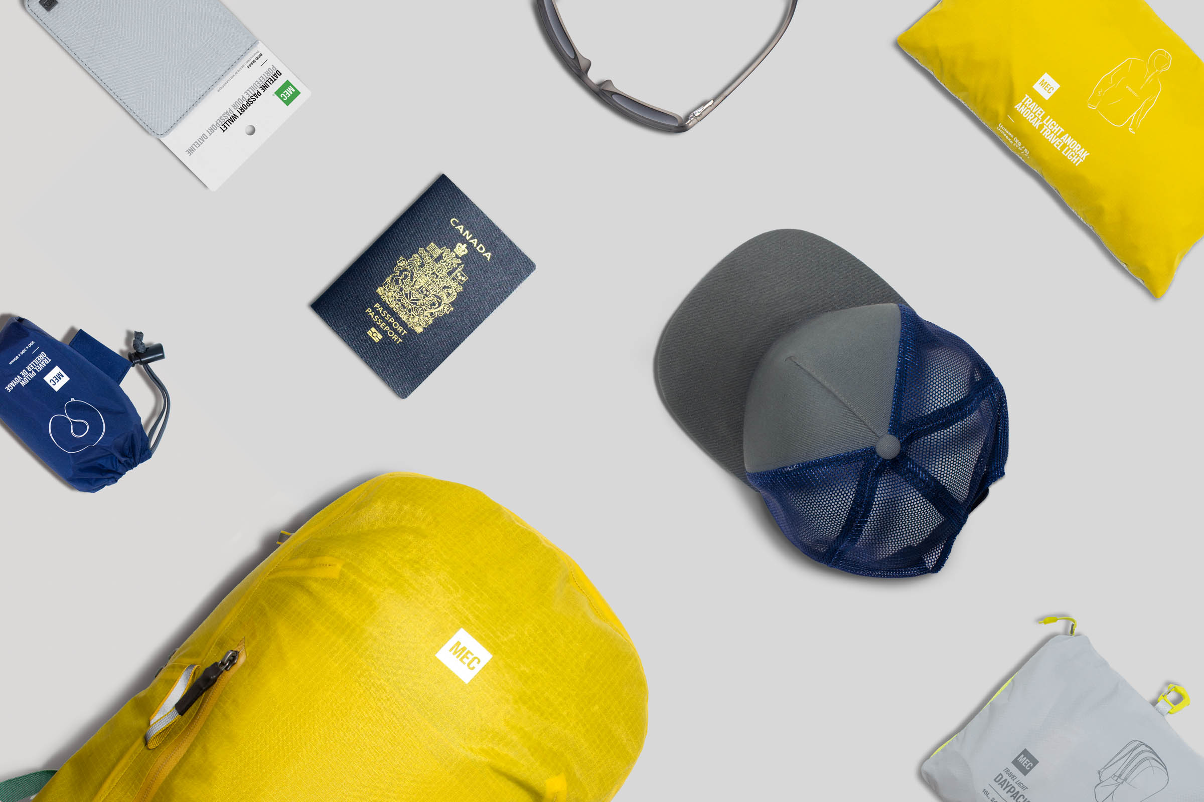
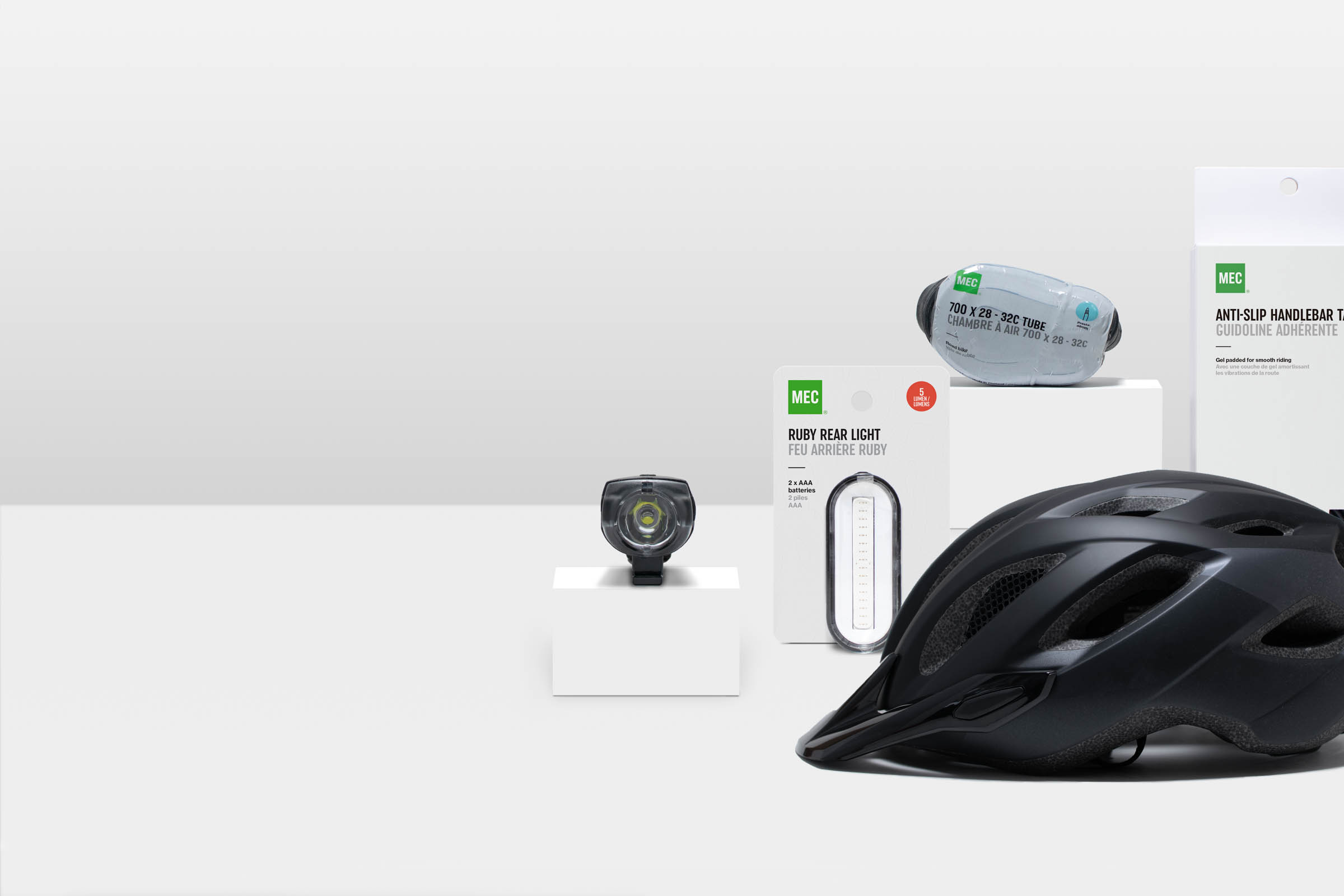
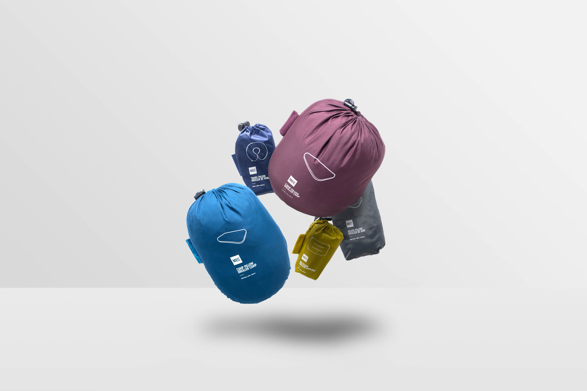
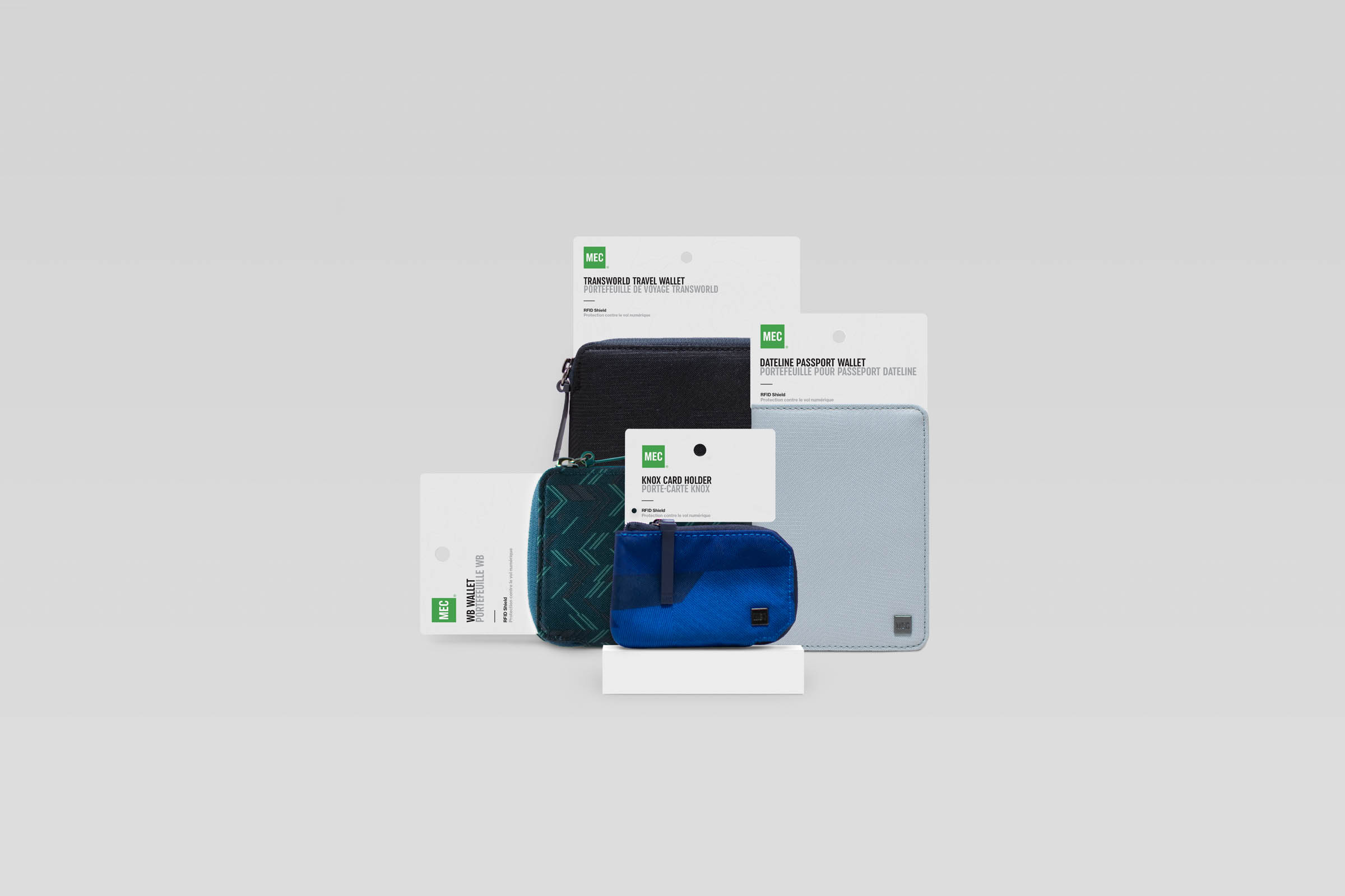
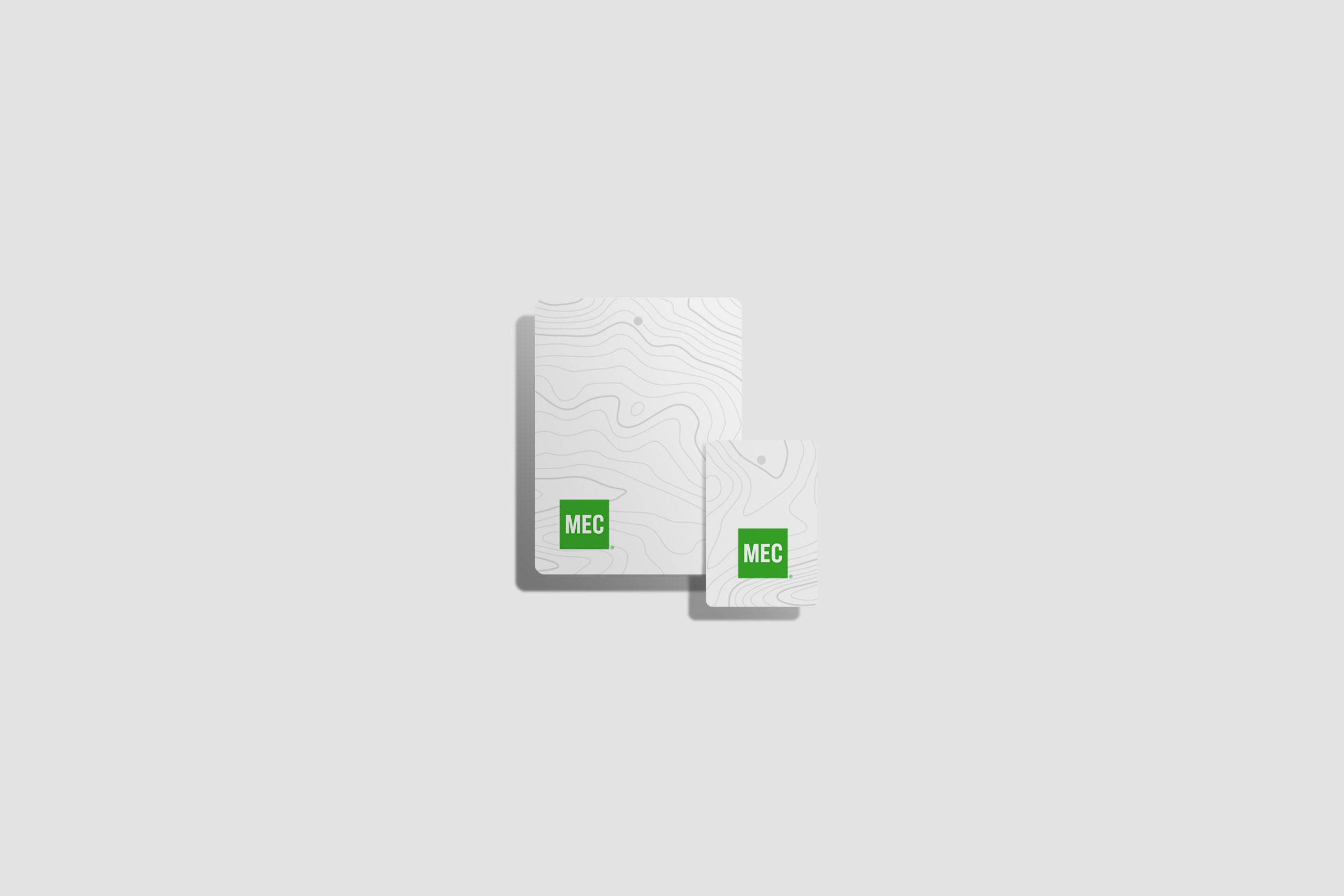
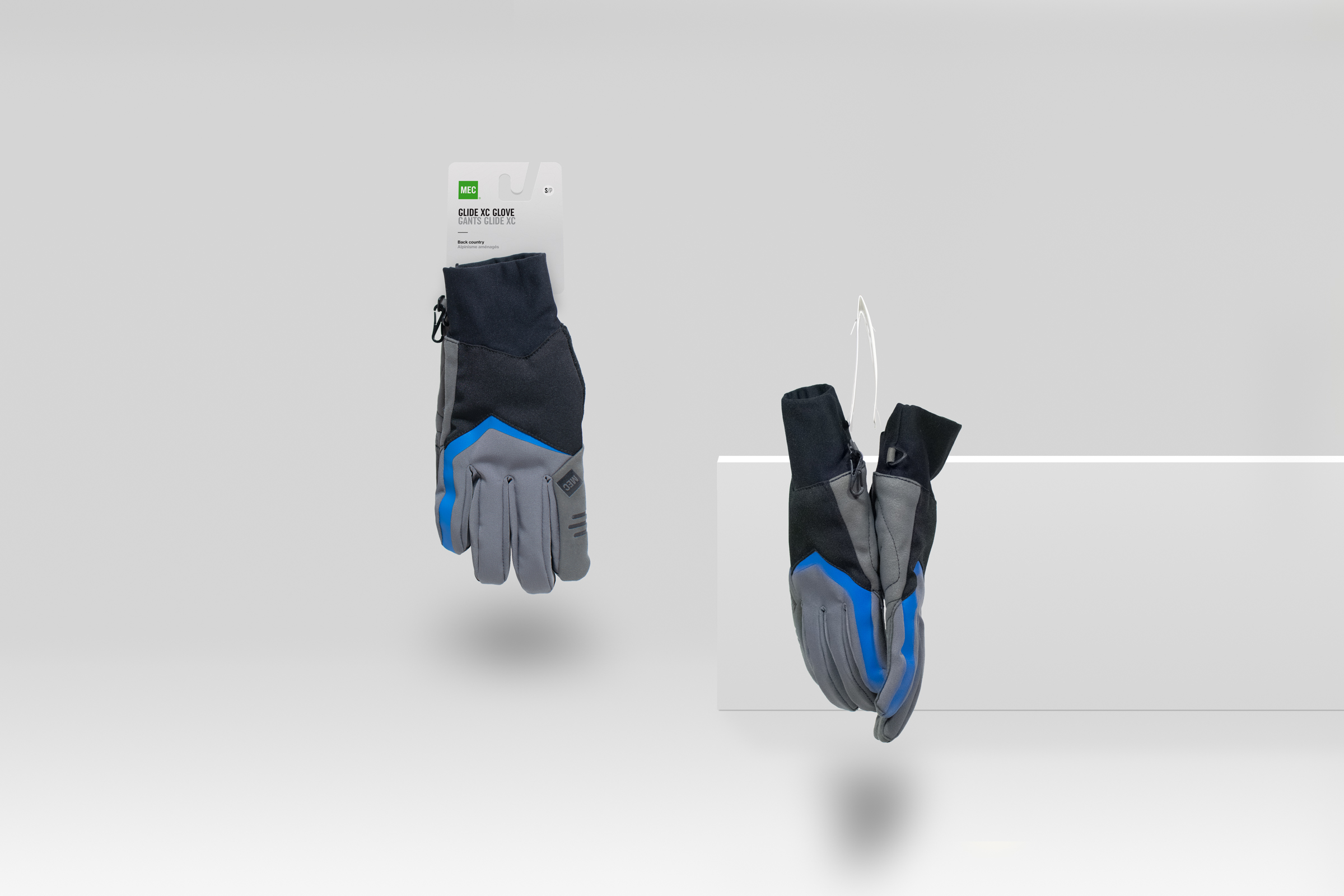
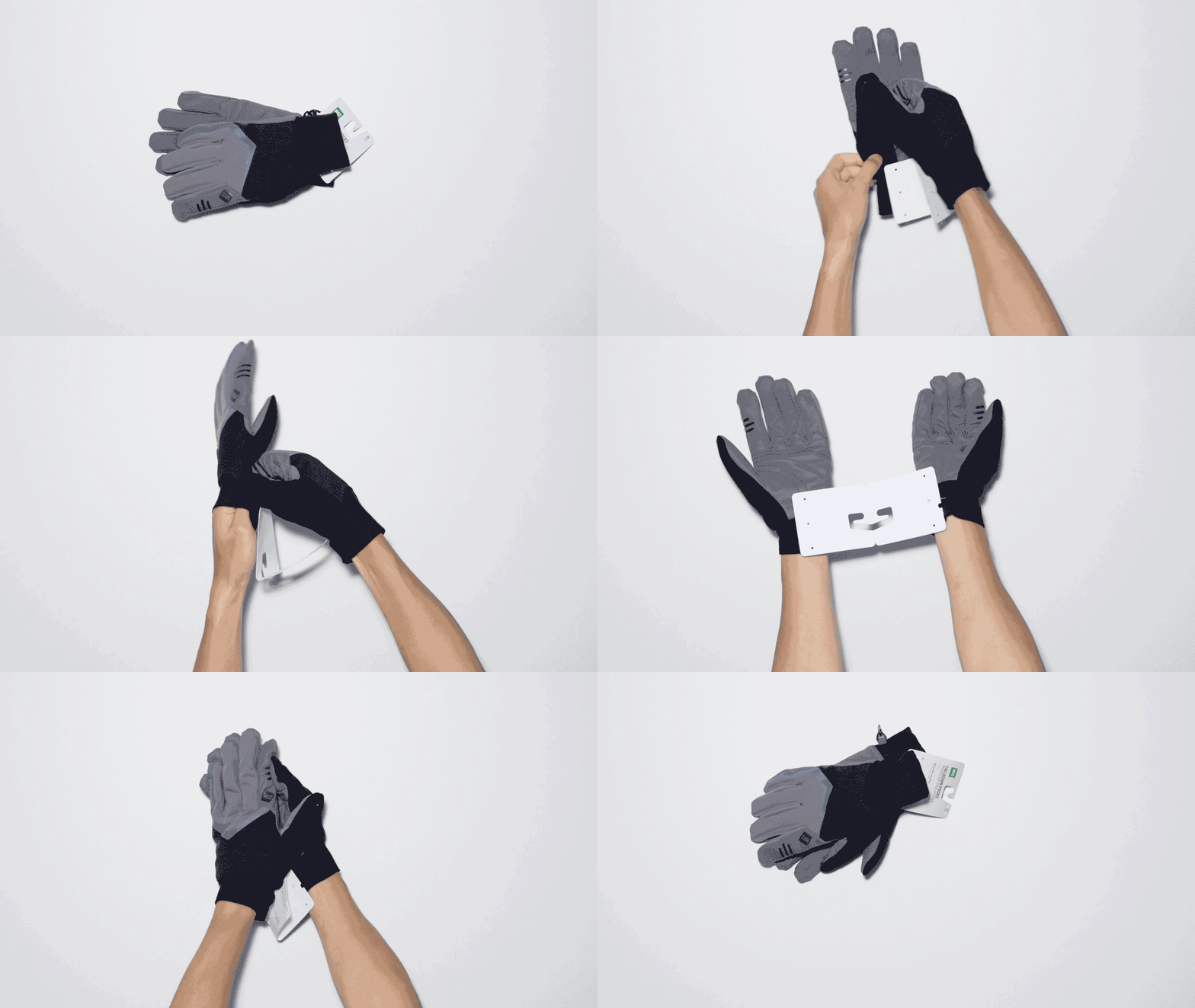
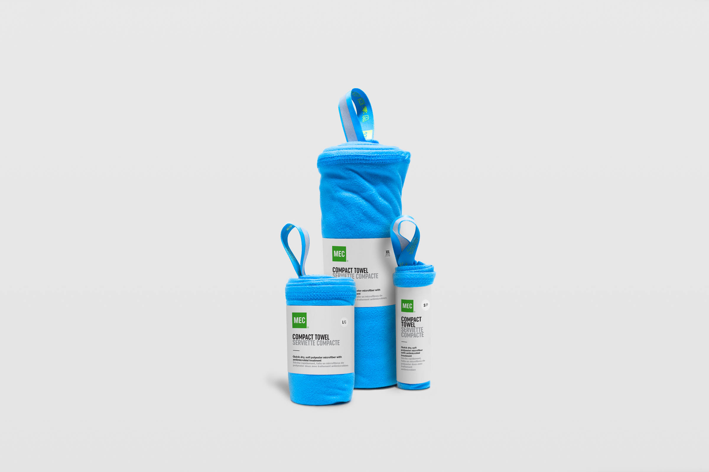
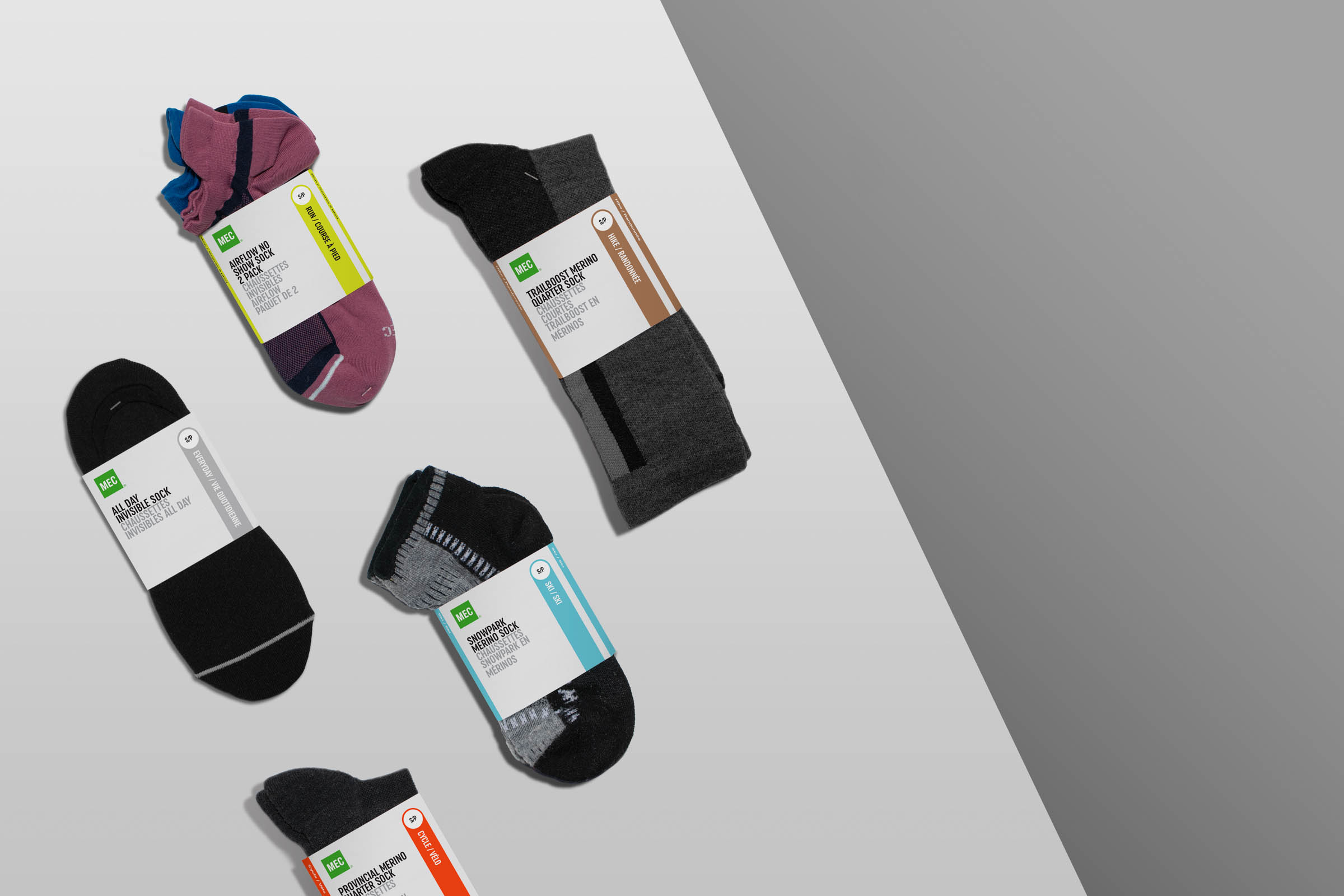
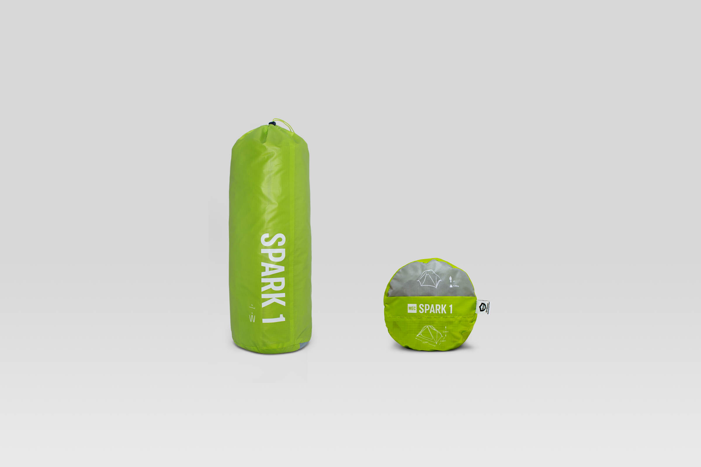
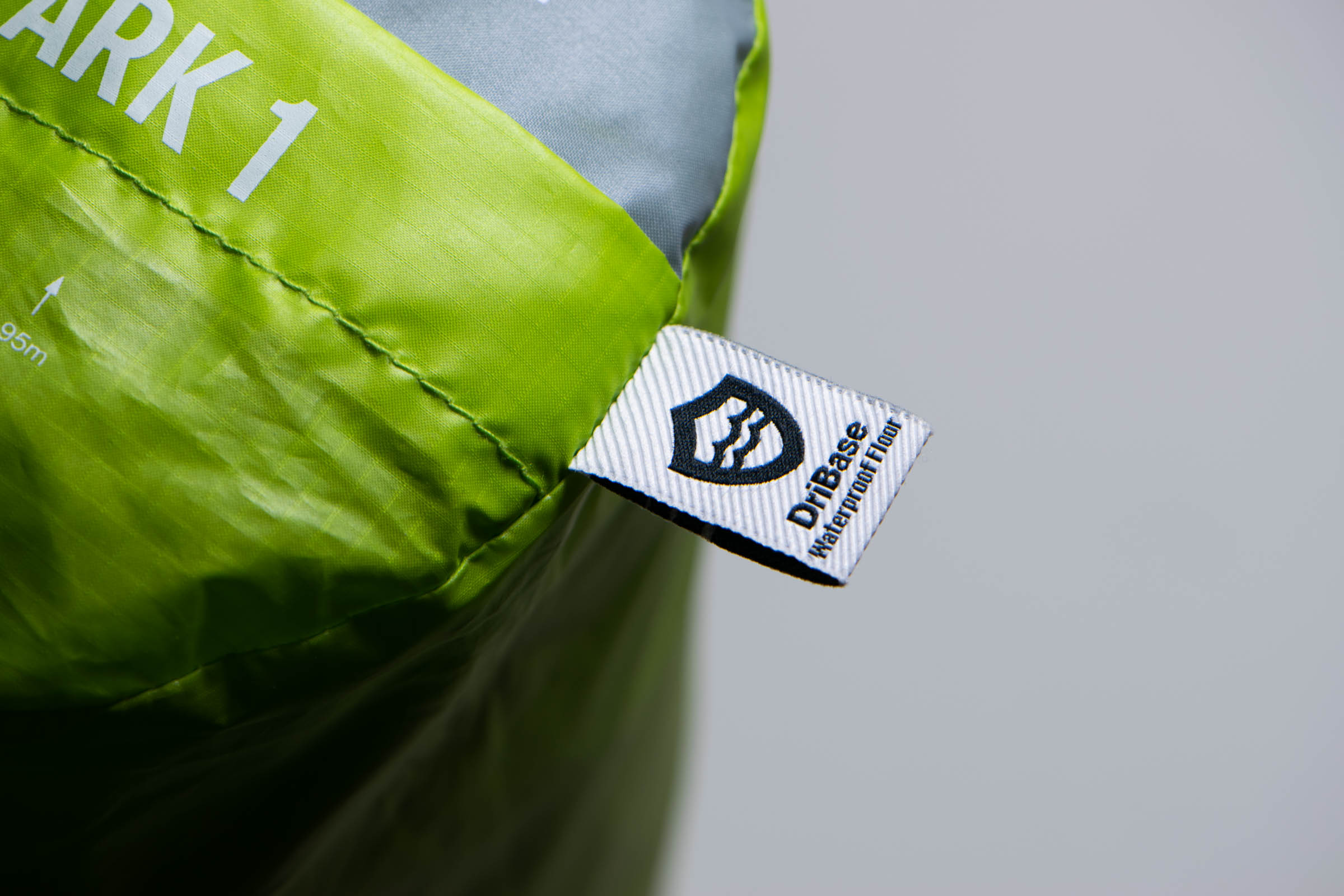
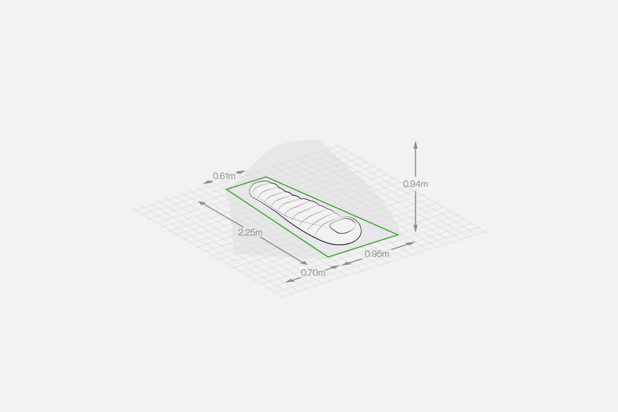
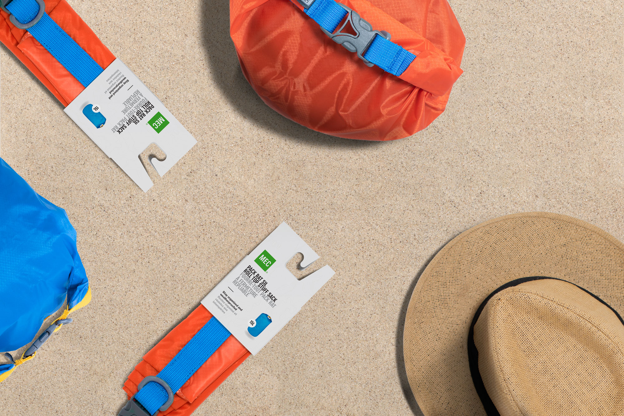
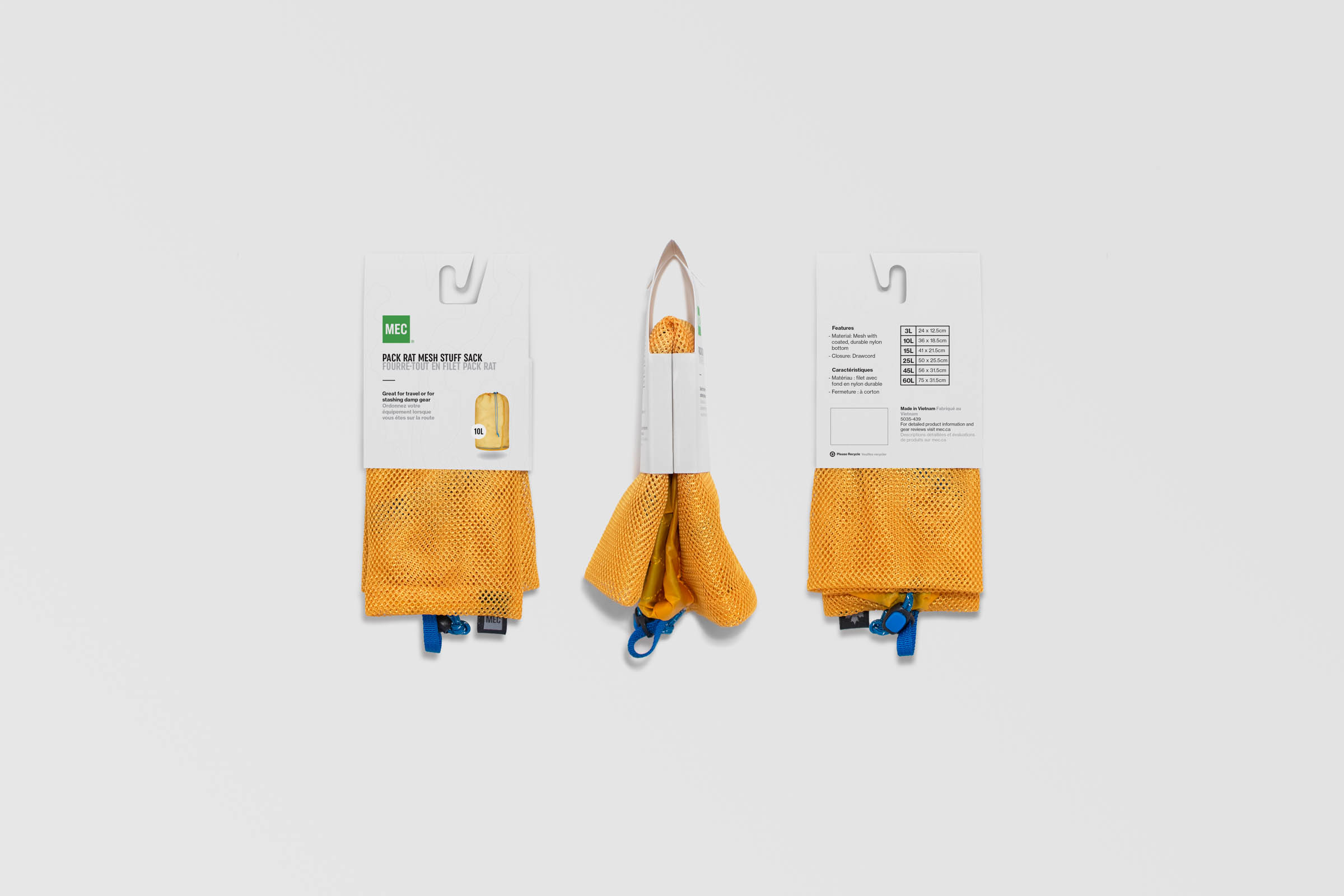
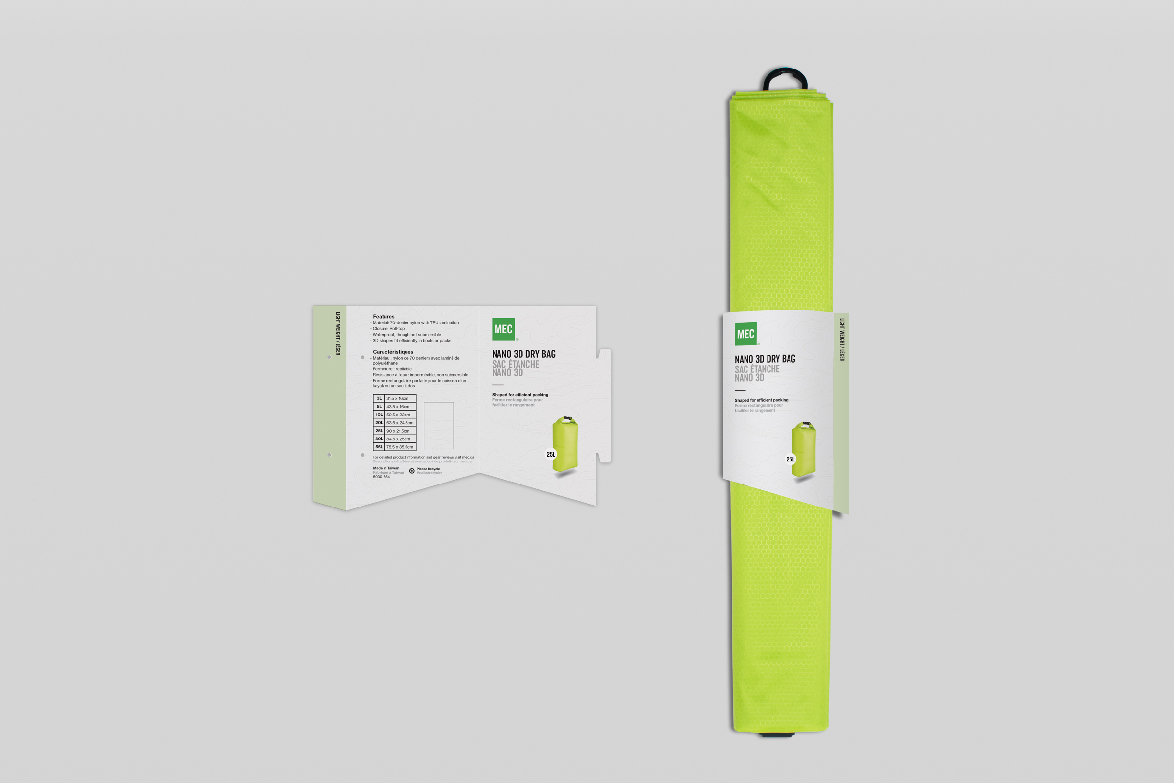
The MEC private label packaging revamp launched in the late spring of 2019 with 25+ categories and countless packaging updated. Unlike the usual brand refresh that focuses on a visual overhaul, the revamp paid close attention to the format of the packaging. The goal of the revamp was not to increase brand awareness; it was to improve the shopping experience by helping members find the right item as soon as possible. The update achieved this by unifying all packaging layouts. Primary information are now front and centered and secondary information are moved to the back of the packaging to reduce information overload for the shopper. New accent colours were also introduced to help shoppers differentiate within product categories. Structurally, the redesign limited the number of packaging SKUs across various product sizes to reduce cost. One of the biggest challenges in the structural design was to ensure that the packaging can withstand shoppers’ interaction. Many of the packaging was designed to allow the user to try the product without damaging the package. The update also has a big push for sustainability. Much of the work focused on a reduction of material, especially plastic.








CREDIT
- Agency/Creative: Andrew Zo
- Article Title: MEC Packaging Revamp 2019
- Organisation/Entity: Freelance, Published Commercial Design
- Project Type: Packaging
- Agency/Creative Country: Canada
- Market Region: North America
- Project Deliverables: Brand Guidelines, Graphic Design, Illustration, Packaging Design, Rebranding, Research, Structural Design
- Format: Sleeve, Tag
- Substrate: Pulp Paper


