


The Collaborators – Struik Mealsoups
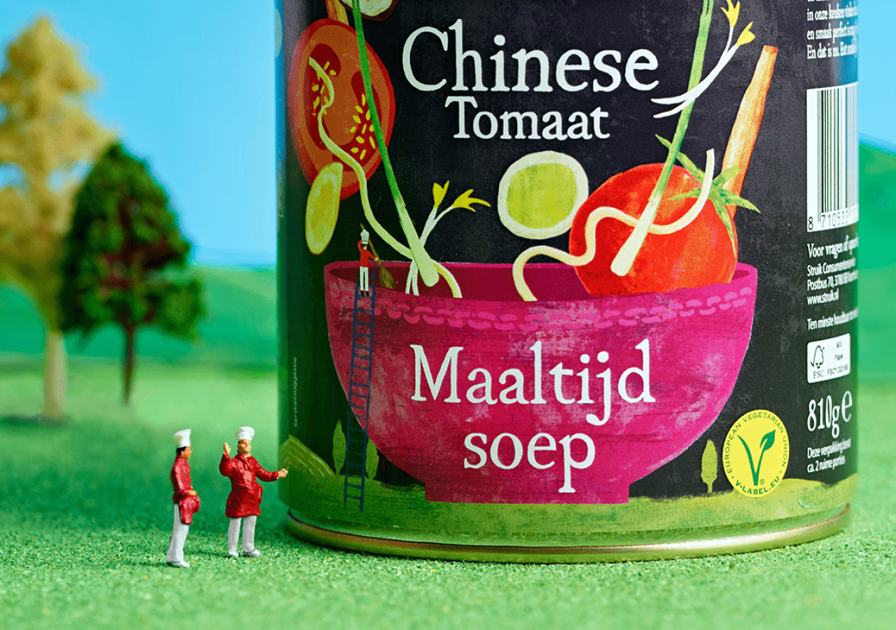
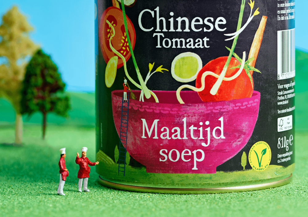
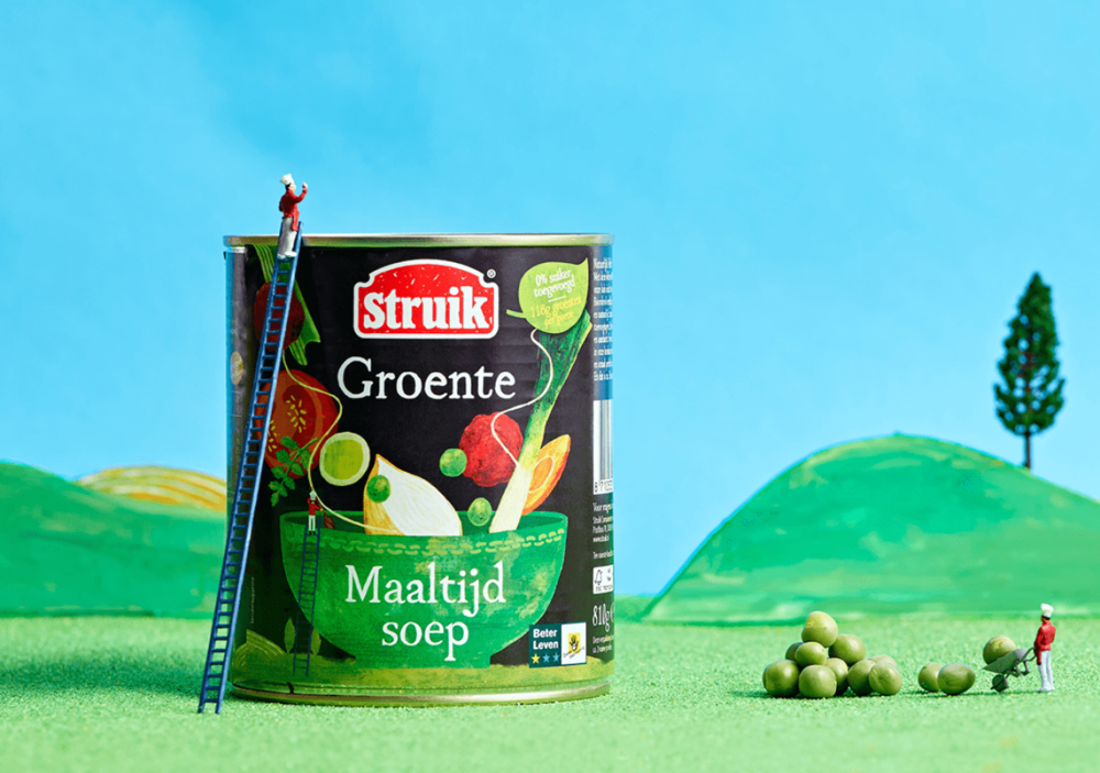
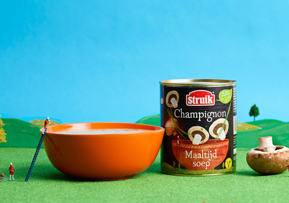
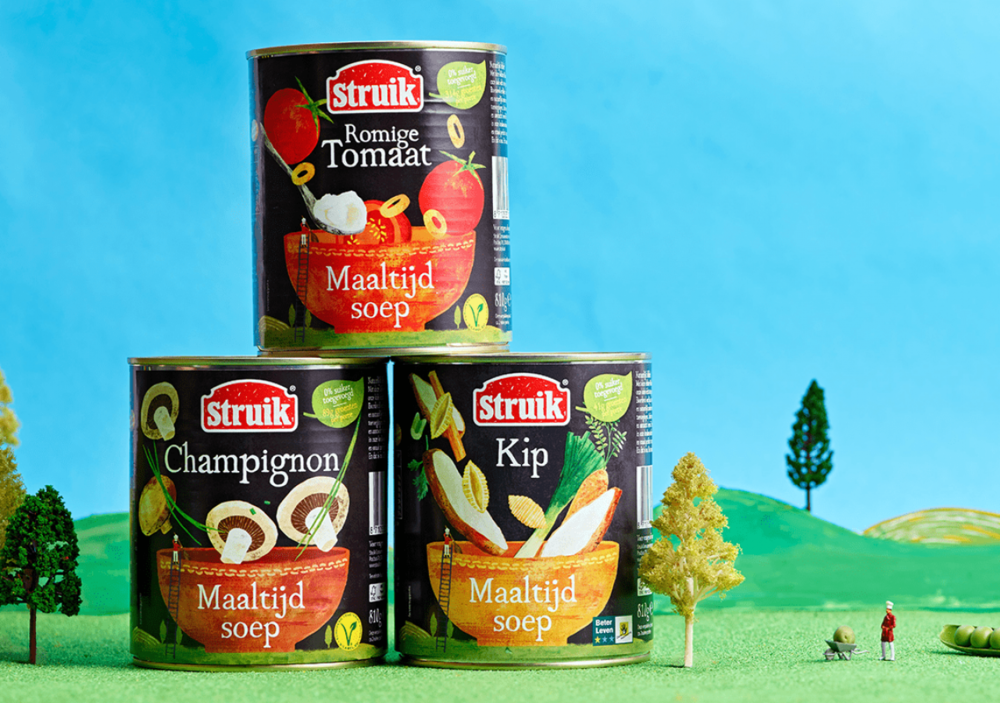
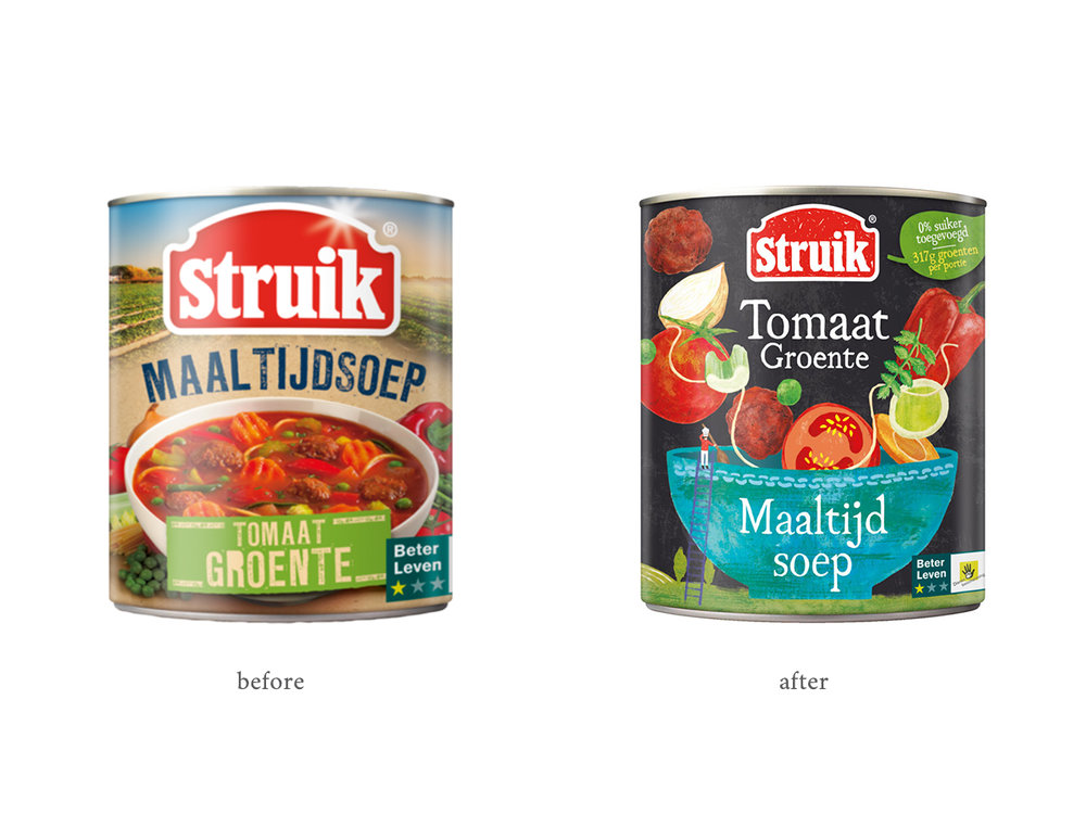
“ Struik Mealsoups, Size Matters…Struik were looking to take their Mealsoup brand in a new direction, dialling up their use of natural ingredients and showing the real chefs and people who make their soup. Their Mealsoups are designed to be a filling, hearty meal for the whole family. Trouble was, even though they did contain bigger pieces of veg, they looked just the same as every other chunky soup on the shelf. So, we created a concept all around size. With tiny chefs, creating finely crafted delicious meals out of giant vegetables. This contrast of big and small accentuated the feeling that the veg was generously packed in huge chunks. Using our in-house team of artists, we hand drew all the illustrations for a more natural feel. We even re-drew the Struik logo in this rougher style so that it fitted in with the new position.The result was a style with charm and standout. Most soups on the shelves in the Netherlands use photography to show ingredients on pack, so our approach was unique. We also took the bold move to use black as the key label colour. It set off our illustrations beautifully and gave added impact to their on-shelf presence.”
CREDIT
- Agency/Creative: The Collaborators
- Article Title: Mealsoup New Direction, Repositioning and Rebranding
- Organisation/Entity: Agency Commercial / Published
- Project Type: Packaging
- Agency/Creative Country: United Kingdom
- Market Region: Europe
- Format: Tin
- Substrate: Metal


