


The Young Eyes: Festival of Innovation was designed for young entrepreneurs, as a hybrid between a conference and a festival, offering workshops, keynote speakers, networking opportunities, and a fun atmosphere that encourages creativity and collaboration.
The Festival of Innovation is a platform for these young entrepreneurs to showcase their ideas and projects, receive feedback from industry professionals, and connect with like-minded individuals. There are pitch competitions, panel discussions, and hands-on activities designed to inspire and educate the attendees.
The Founder, Carmen Rudd, was looking to create an identity and brand that ignited a sense of excitement and reflected this passion for creativity and big thinking among primary and high school students.
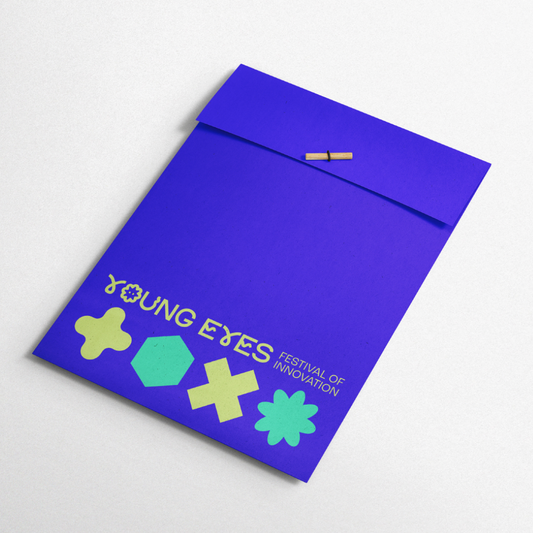
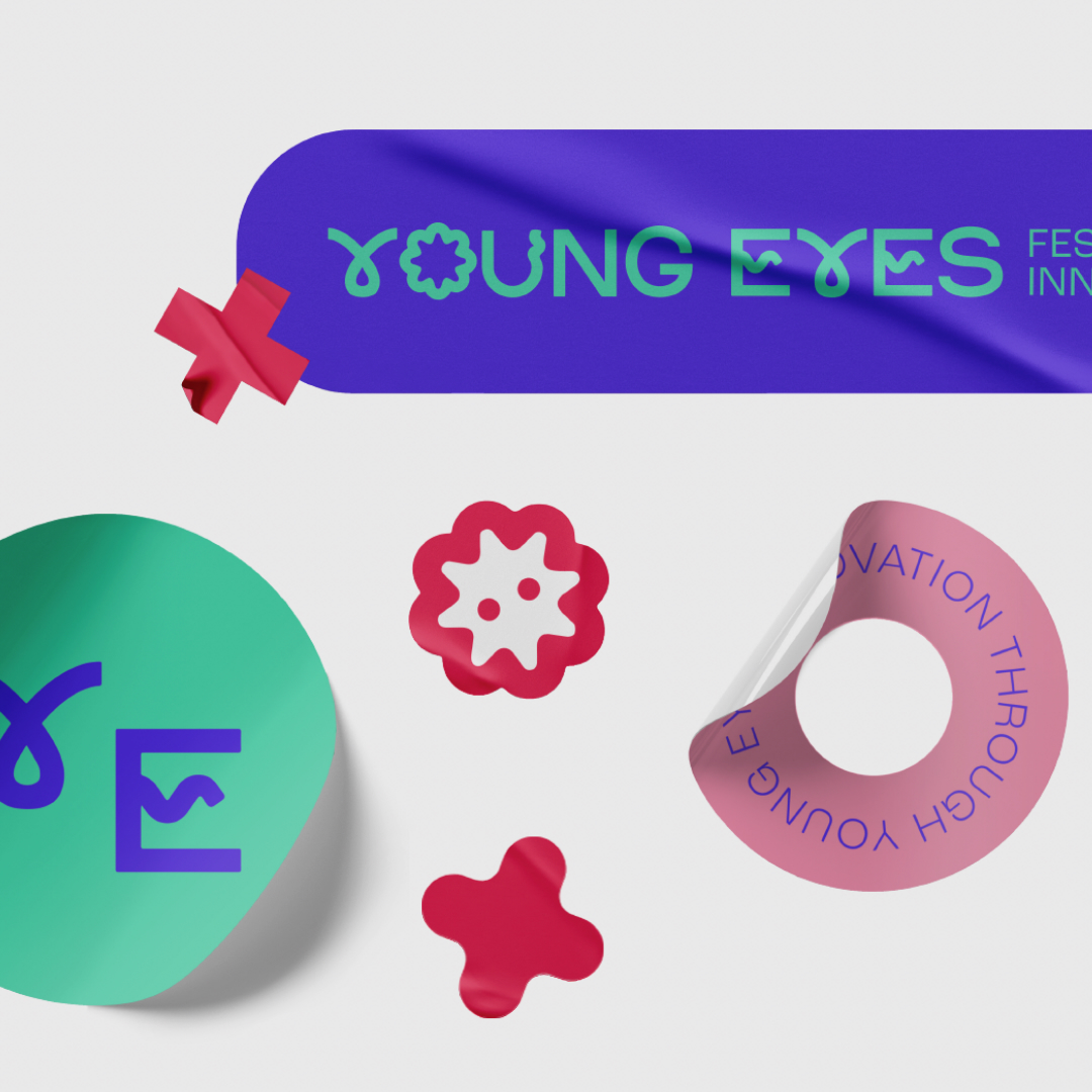
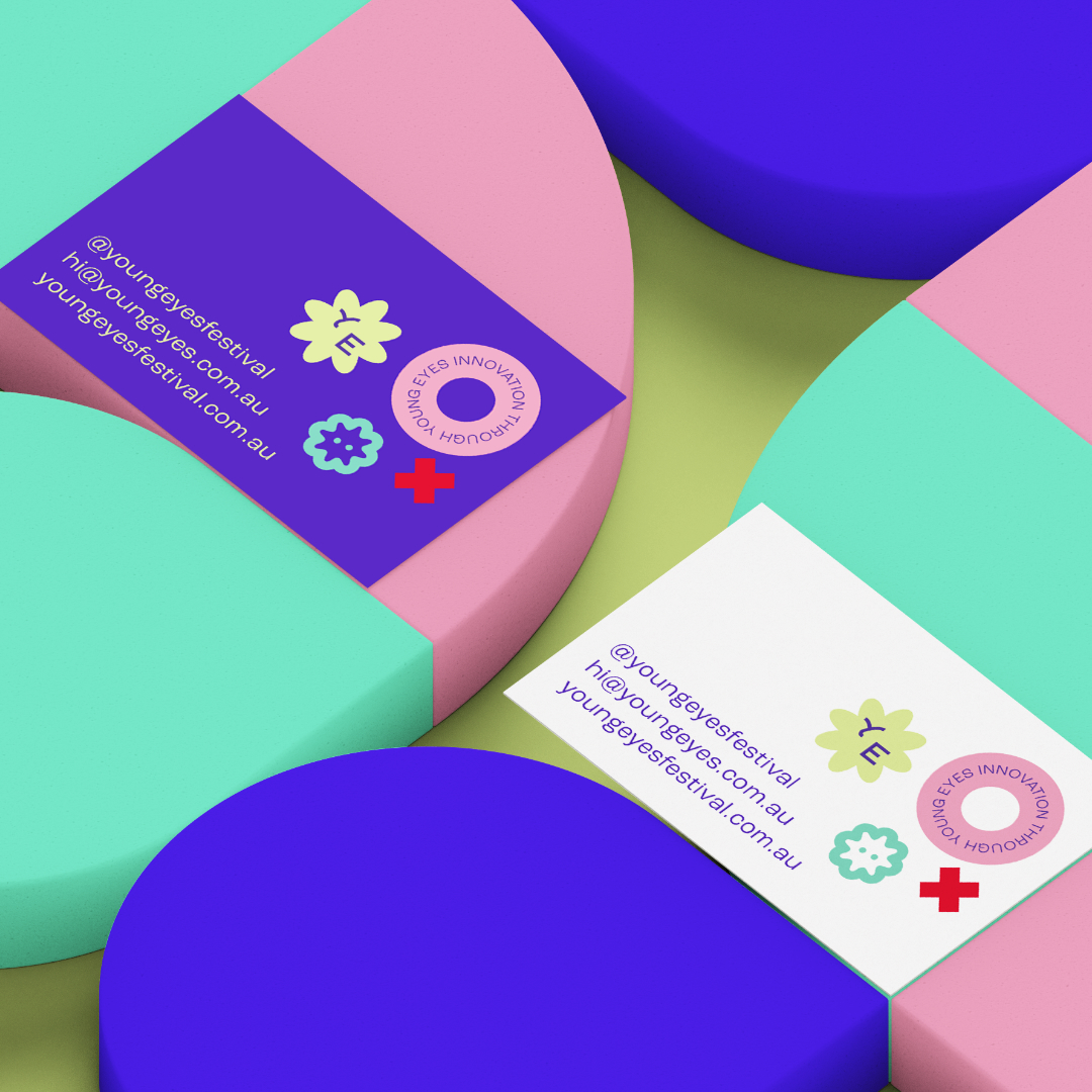
At the heart of the visual identity of the Young Eyes: Festival of Innovation is a vibrant colour palette that symbolises the energy and excitement of youth. Bold and eye-catching colours such as bright blues, vivid yellows, and vibrant greens are used to create a dynamic and engaging visual experience that resonates with the festival’s target audience. These colours are carefully chosen to evoke a sense of creativity, imagination, and innovation, setting the tone for the festival as a platform for young minds to shine.
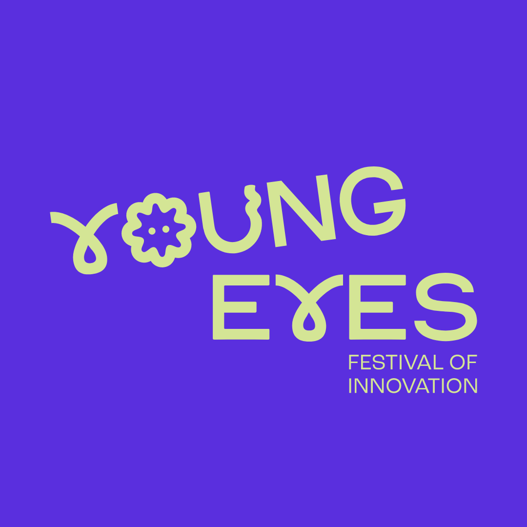
In addition to the vibrant colour palette, experimental typography is another key element of the festival’s visual identity. Playful, unconventional, and dynamic fonts are used to convey a sense of creativity and youthfulness. The typography is often used in innovative ways, such as overlapping, layering, and combining different styles to create visually stimulating and memorable designs. This experimental approach to typography reflects the festival’s commitment to pushing boundaries, thinking outside the box, and exploring new possibilities.
To further enhance the visual identity of the Young Eyes: Festival of Innovation, playful visual devices are incorporated into the design elements. These visual devices, which include illustrations, icons, and patterns, add depth, dimension, and personality to the overall aesthetic. They are used to create a sense of whimsy, fun, and intrigue, drawing the audience in and inviting them to explore and engage with the identity.
Overall, the visual identity of the Young Eyes: Festival of Innovation is a powerful and compelling representation of the creativity, innovation, and imagination that defines the event. Through a vibrant colour palette, experimental typography, and playful visual devices, the festival’s visual identity effectively captures the spirit of youth and the essence of innovation. It sets the stage for a dynamic and inspiring experience that celebrates the boundless potential of young minds and the endless possibilities of creativity.
CREDIT
- Agency/Creative: Maxwell The Studio
- Article Title: Maxwell The Studio Creates Identity for Young Eyes, Festival of Innovation
- Organisation/Entity: Agency
- Project Type: Identity
- Project Status: Published
- Agency/Creative Country: Australia
- Agency/Creative City: Wollongong
- Market Region: Oceania
- Project Deliverables: Brand Creation, Brand Design, Brand Identity
- Industry: Education
- Keywords: Brand Education Design
-
Credits:
Project Management: Lauren Kerr


