


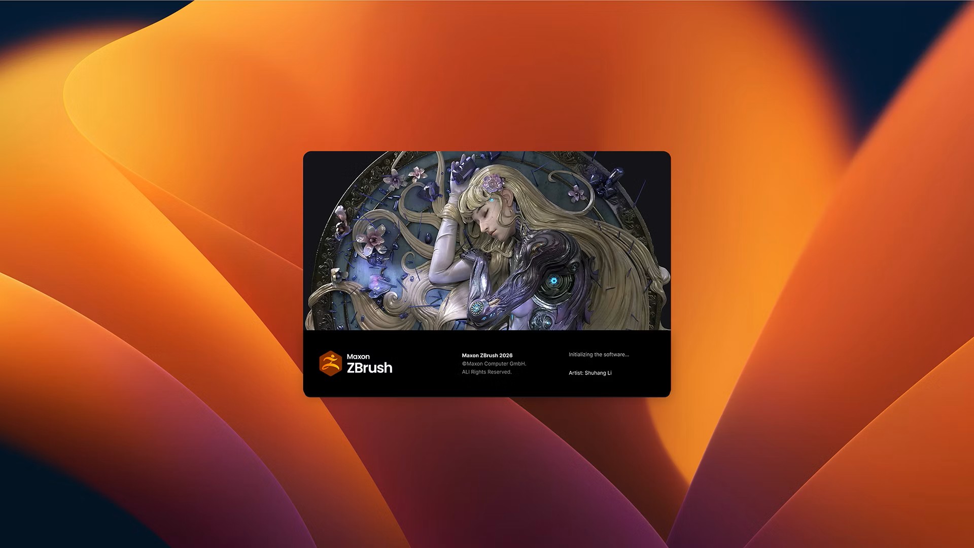
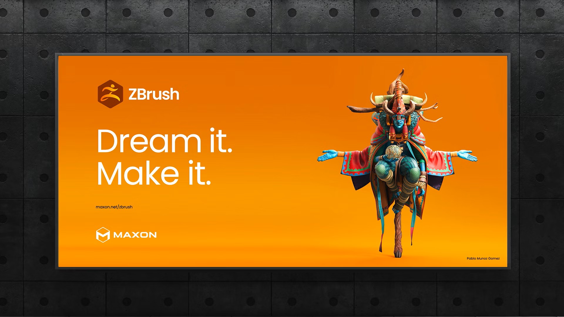
Maxon, maker of powerful, approachable software solutions for creators working in 2D and 3D design, motion graphics, visual effects, and more, today announced a fresh unified product logo system designed to visually connect its suite of creative tools – Maxon One, Cinema 4D, Red Giant, ZBrush, Redshift, Universe, Capsules, Cinebench, Cineware, and Moves – within a cohesive ecosystem. This redesign introduces a modular, consistent, and connected visual identity, underscoring Maxon’s commitment to fostering clarity, creativity, and connection for its growing family of tools.
Maxon’s new product identities were designed to fit seamlessly with the existing Maxon logo mark, mimicking the look and feel of a honeycomb and mirroring the philosophy behind Maxon One: individual tools, distinct in purpose, but unified in workflow and stronger together. Each logo adopts a simplified geometric design and vibrant accent color, ensuring instant recognition while fitting seamlessly into the broader brand architecture.
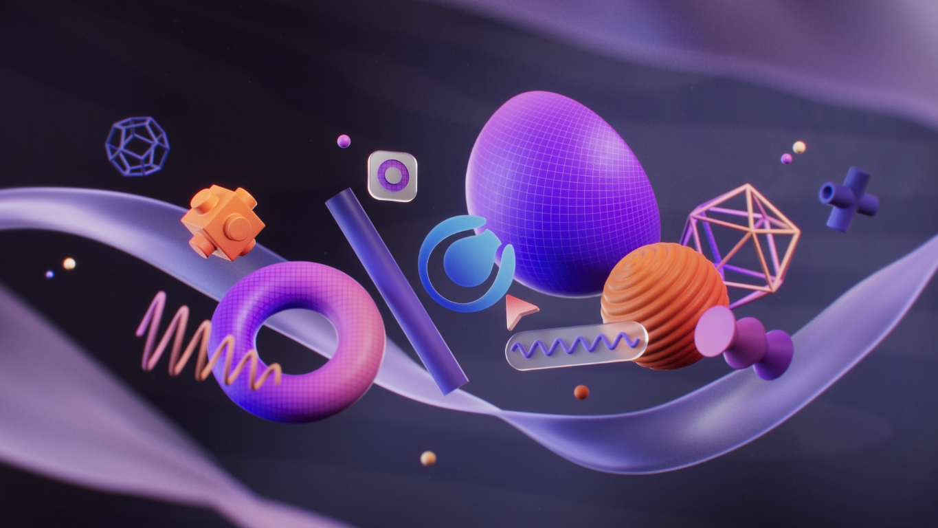
These new product logos extend the brand identity into every corner of Maxon One, providing a clear, connected look that captures the unique spirit of each tool in the Maxon lineup while maintaining the coherence of a single family of professional products.
“Redesigning a logo system is more than aesthetics; it’s an opportunity to celebrate and empower the community we serve,” said David McGavran, CEO of Maxon. “Maxon’s mission is to remove friction and give artists freedom to create without limits, and this refreshed design reflects that mission in its unified ecosystem of tools designed for intuitive workflows, technical precision, and boundless creativity. It showcases our legacy, highlights our advancements, and sets the stage for an exciting future built around the needs of our users.”
The modular framework ensures logos retain clarity even at smaller sizes and across digital platforms. A reimagined typography structure introduces hierarchy and balance across the system. “Our goal was to create a visual identity that feels inherently Maxon while highlighting the distinctive attributes of each tool,” said Leo Hageman, Director of Brand and Creative, who oversaw the transformation of the Maxon One logo system.


CREDIT
- Agency/Creative: Maxon Computer
- Article Title: Maxon Unveils a Brand New Look for Its Growing Family of Professional Tools
- Organisation/Entity: In-House
- Project Type: Identity
- Project Status: Published
- Agency/Creative Country: United States
- Agency/Creative City: Los Angeles
- Market Region: Global
- Project Deliverables: 2D Design, 3D Design, 3D Motion, Brand Design, Logo Design
- Industry: Technology
- Keywords: Rebrand, Logo, 3D, 2D, Brand Identity
-
Credits:
Designer: Leo Hageman
Designer: Ricardo Kim
Designer/Animator: Xinyue Gu


