


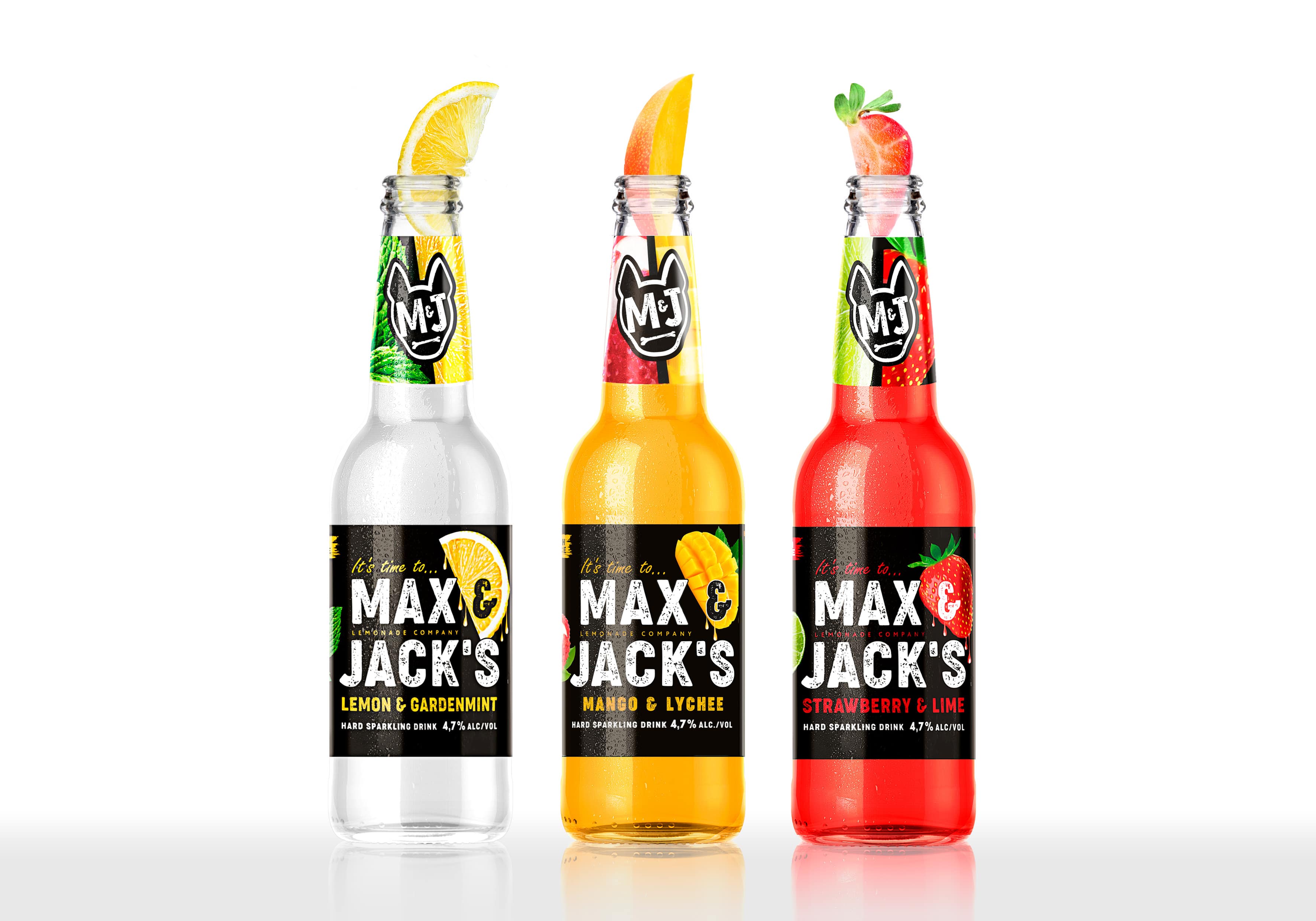
Step into a world where flavour and design fuse in an awe-inspiring crescendo – an introduction to the mesmerizing realm of Max & Jack’s captivating hard lemonade.
Picture a canvas that ignites with a kaleidoscope of vibrant hues – every stroke, every shade, a symphony of taste waiting to explode on your palate. We aspired to create packaging transcending the ordinary; it’s a genuine embodiment of the flavour journey unfolding within.
Against a backdrop as deep as the night sky, we let the colours burst forth like fireworks, almost as if the fruits themselves had come to life. The timeless lemon, a burst of bold yellows capturing its invigorating tang; the luscious mango and strawberry, a dance of radiant oranges and succulent reds, embody the essence of sun-soaked summers.
Every single detail was meticulously handpicked to craft a narrative that extends beyond the realm of taste. From the opulent darkness of the canvas to the vividness of the fruit-inspired hues, it’s a tale that unfurls sip by sip, a journey of both the senses and the soul.
So, as you savour the layers of richness, the sweetness that enchants, and the depth of flavour that lingers, remember that you’re not merely sipping a hard lemonade – you’re embarking on an extraordinary escapade where the synergy of taste and design evokes an exquisite symphony of emotions.
Step into a world where flavor and packaging design harmonize in an awe-inspiring crescendo – an introduction to the mesmerizing realm of Max&Jack’s captivating hard lemonade.
Imagine a canvas that ignites with a kaleidoscope of vibrant hues – every stroke, every shade, a symphony of taste waiting to explode on your palate. We aspired to create packaging that transcends the ordinary; it’s a genuine embodiment of the flavor journey unfolding within.
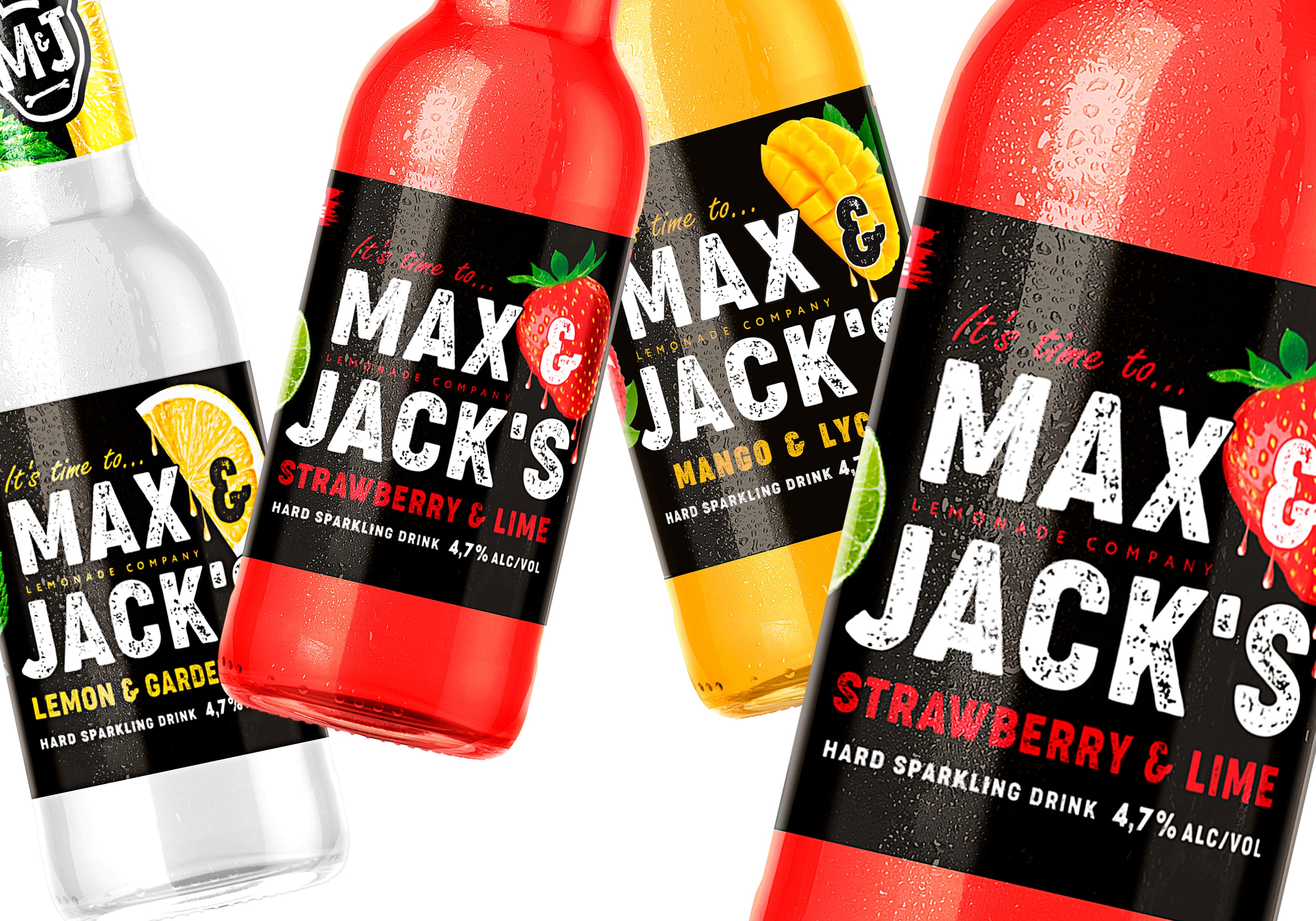
Our packaging design isn’t just an afterthought; it’s an integral part of the Max&Jack experience. We understand that what meets the eye is just as important as what meets the taste buds. That’s why we poured our creativity into every aspect of our packaging.
Against a backdrop as deep as the night sky, we let the colors burst forth like fireworks, almost as if the fruits themselves had come to life. The timeless lemon, a burst of bold yellows capturing its invigorating tang; the luscious mango and strawberry, a dance of radiant oranges and succulent reds, embody the essence of sun-soaked summers.
But it’s not just about color; it’s about texture too. The tactile sensation as you run your fingers over the embossed designs, feeling the contours of each fruit, it’s all part of the experience. We didn’t just want you to taste our hard lemonade; we wanted you to feel it in your hands.
Every single detail was meticulously handpicked to craft a narrative that extends beyond the realm of taste. From the opulent darkness of the canvas to the vividness of the fruit-inspired hues, it’s a tale that unfurls sip by sip, a journey of both the senses and the soul.
But we didn’t stop there. We wanted to create packaging that’s not only visually stunning but also environmentally conscious. Our commitment to sustainability is reflected in every aspect of our design, from the choice of materials to the manufacturing process.
So, as you savour the layers of richness, the sweetness that enchants, and the depth of flavour that lingers, remember that you’re not merely holding a hard lemonade – you’re grasping an extraordinary packaging masterpiece where the synergy of taste and design evokes an exquisite symphony of emotions. Experience Max & Jack’s hard lemonade like never before.


CREDIT
- Agency/Creative: DDH Brandin Consultancy
- Article Title: Max&Jack’s Hard Lemonade Branding and Packaging Design
- Organisation/Entity: Agency
- Project Type: Packaging
- Project Status: Published
- Agency/Creative Country: Netherlands
- Agency/Creative City: Amsterdam
- Market Region: Europe
- Project Deliverables: Brand Creation, Brand Identity, Brand Strategy, Design, Packaging Design, Packaging Guidelines, Typography
- Format: Bottle
- Industry: Food/Beverage
- Keywords: packaging design, brand design, new brand creation, packaging ideas, beverages, hard cocktail, refreshment, fruitiness
-
Credits:
Branding Agency: DDH Branding Consultancy


