


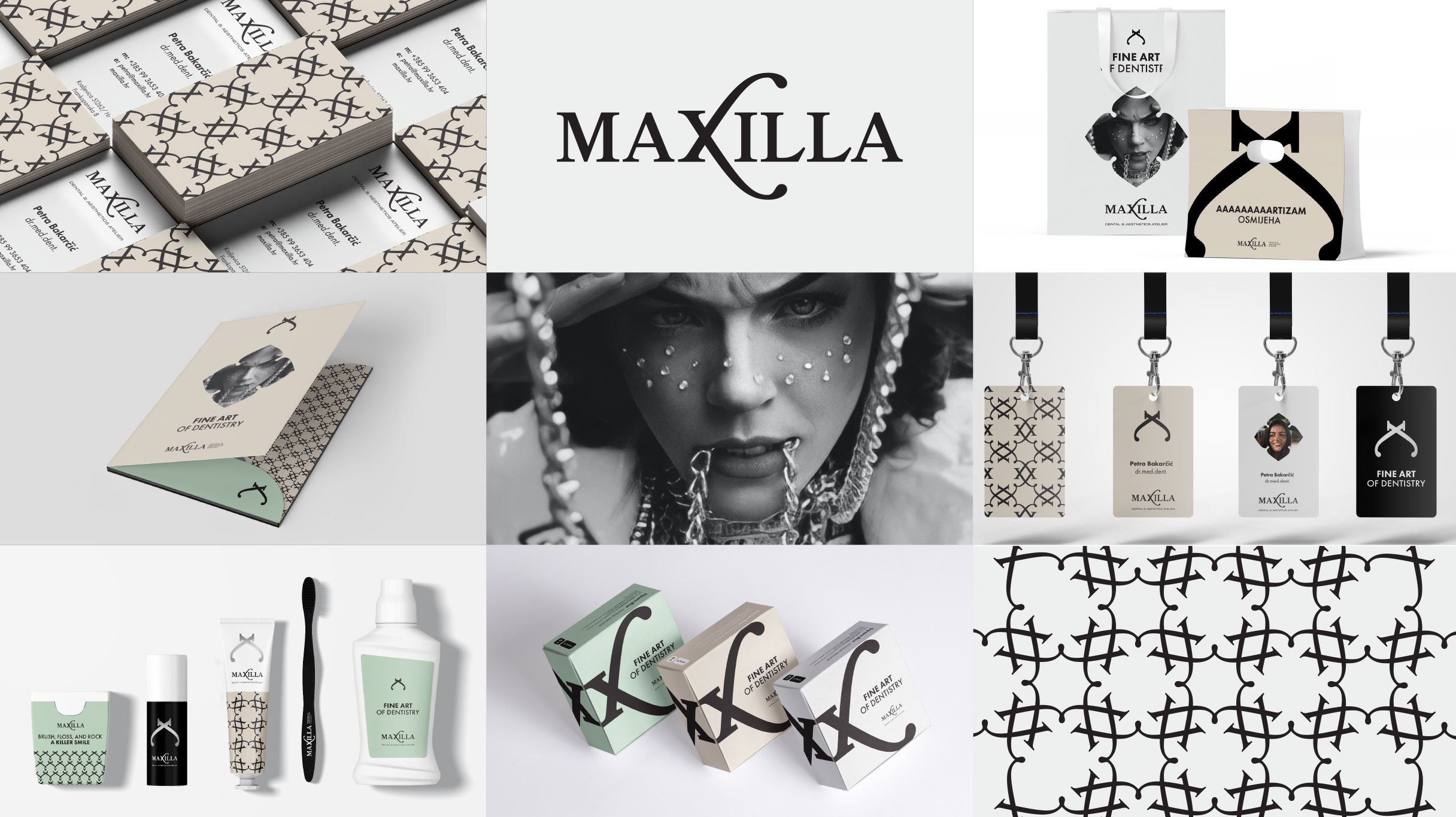
Upon the request of the client, we created a verbal and visual identity of the dental office that stands out from the usual identities in dentistry. The wishes of the client were something different, modern and striking, but with a touch of elegance.
While creating a verbal identity, our desire was to move away from the usual coinages of the word dent in order to create differentiation with the competition.
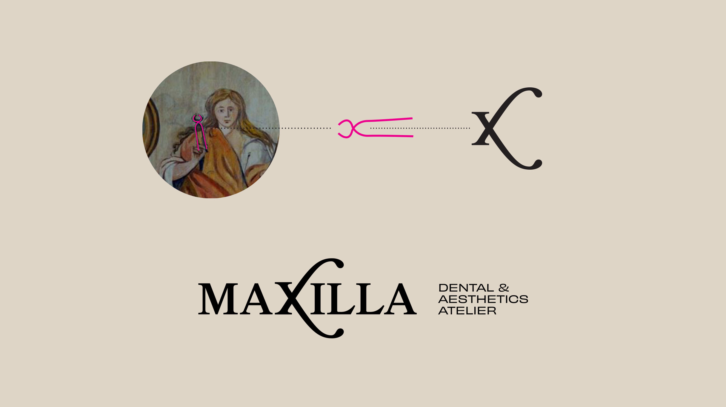
Maxilla, besides sounding like a truly unique brand, is the Latin name for the upper jaw.
Unlike the lower jaw, which is movable, the upper jaw stays firmly in place – just like the brand itself. The name also contains the word maxi, which gives the brand promise: maximum quality of service. We added the Dental & Aesthetics Atelier brand signature to the name in order to specify the brand’s activities and the uniqueness and creativity of the performance, which we summed up in the word atelier.
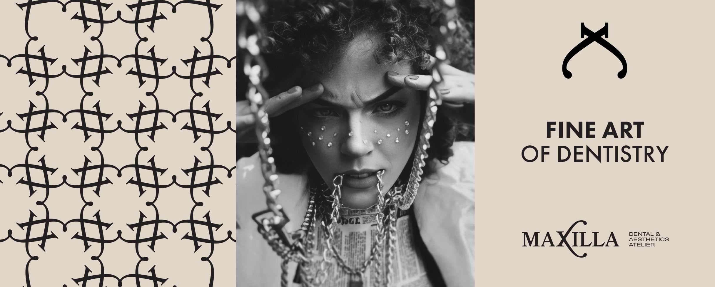
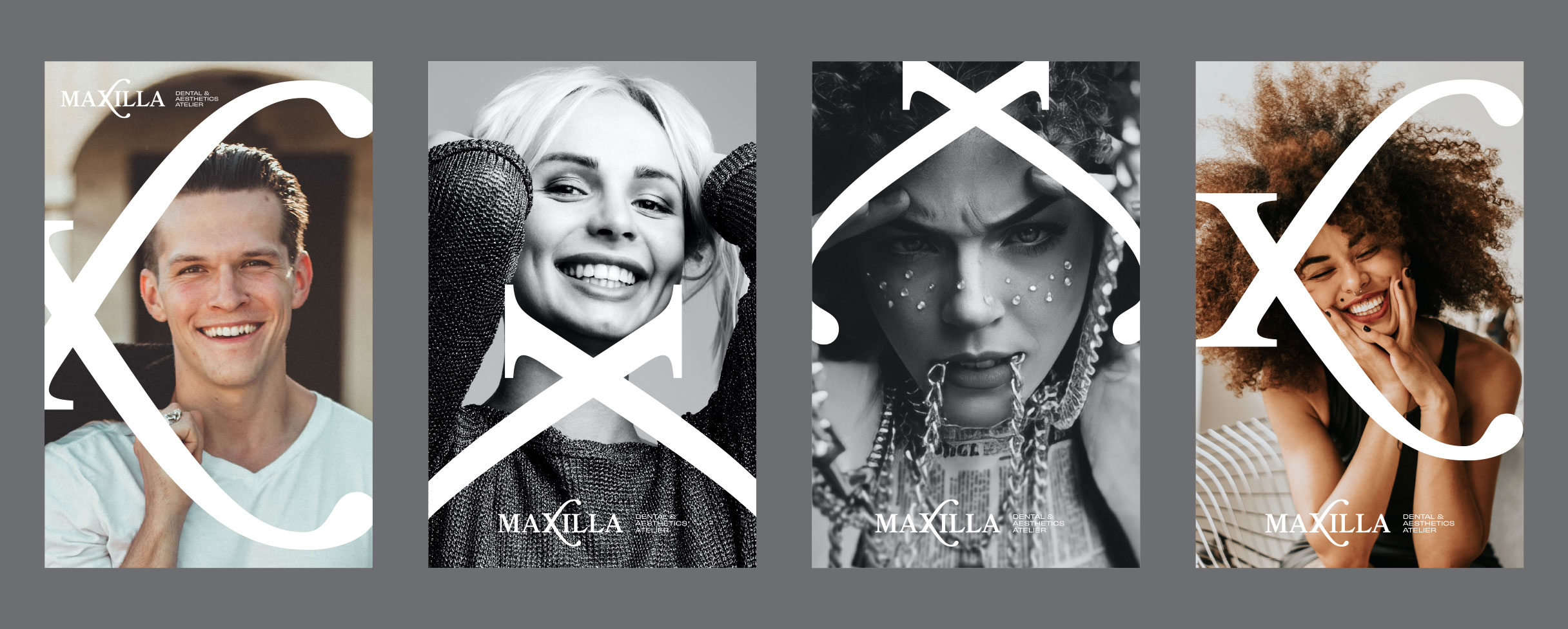
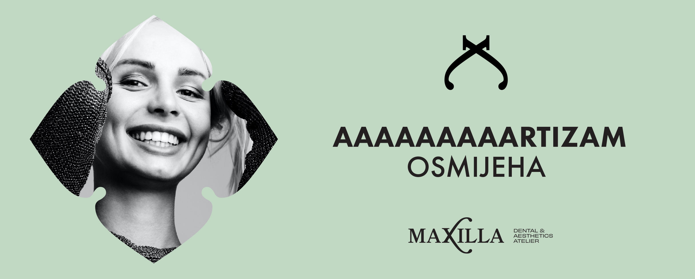
We supplemented the verbal identity with the messages AAAAAAArtism of the smile, which associates the familiar phrase when visiting the dentist (Say AAAAAAAAAA) and Fine art of dentistry in order to emphasise craftsmanship and professional performance. The maximum precision of performance emphasises the brand promise and plays with the word maxi, which is contained in the brand name.
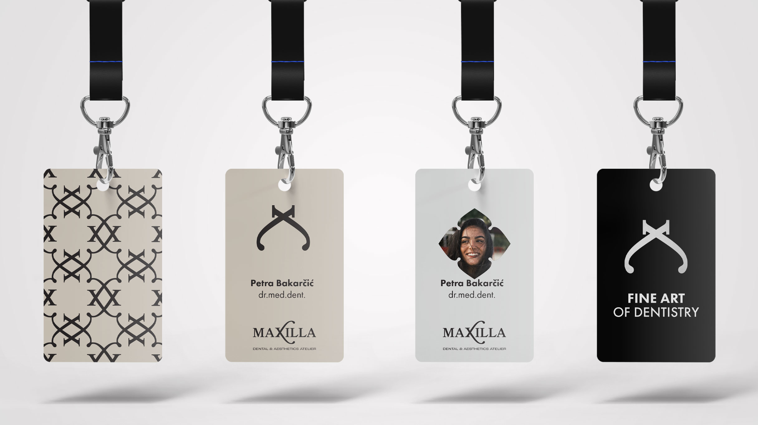
The visual identity includes the typographical solution of the logo which contains the sign. The letter X inside the word has been transformed into pliers, which are an indispensable instrument of every surgery and are also found in the depiction of St. Apolonia – the patroness of dentists.
Serina typography was chosen, giving the brand a dose of elegance, sophistication, tradition and trust.
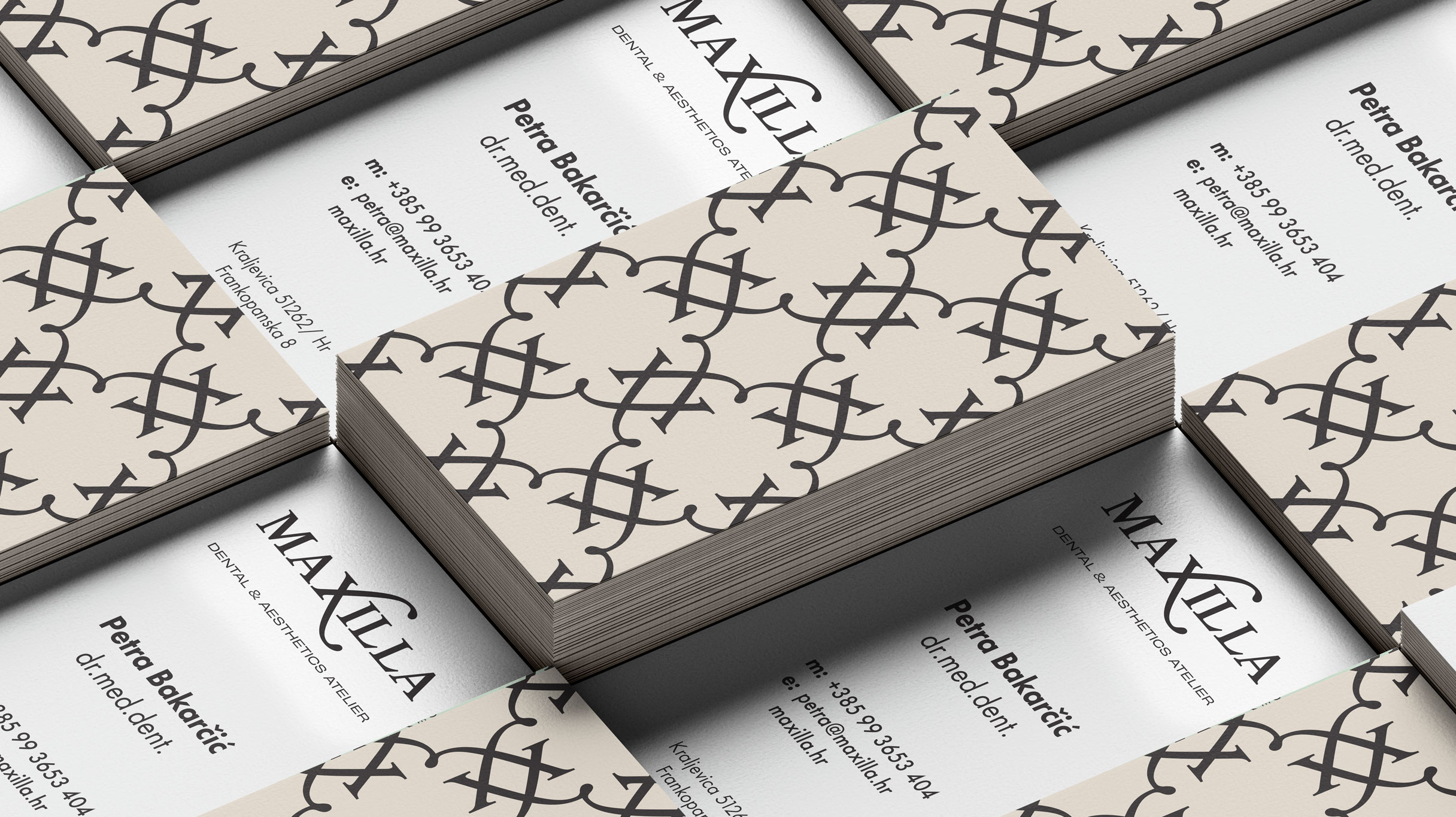
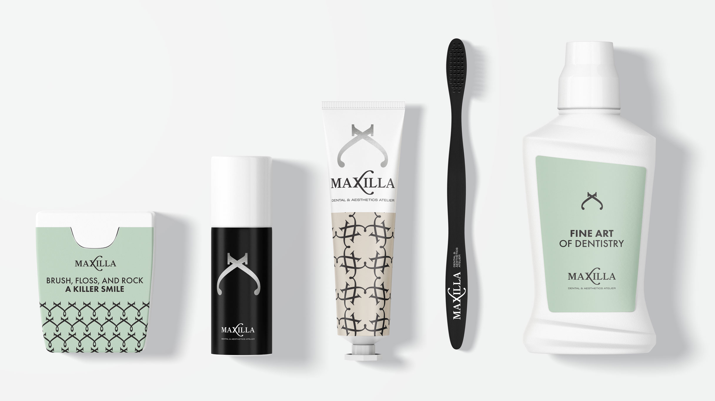
The chosen colours are reminiscent of succulents, plants that have meaning for the client. They are a symbol of endurance and strength. Because we associate it with nature, the color green is described as positive, refreshing, peaceful and calming. It represents growth, health, safety, happiness and harmony of life. Green relieves anxiety, nervousness and stress and promotes better concentration and motivation. We joined green with a neutral beige shade, which evokes a feeling of peace, purity and harmony. It is a symbol of elegance and sophistication, and with its brightness it creates an additional feeling of space and openness.
CREDIT
- Agency/Creative: Fabula design and marketing agency
- Article Title: Maxilla – A Different Kind of Dental Naming and Branding
- Organisation/Entity: Agency
- Project Type: Identity
- Project Status: Published
- Agency/Creative Country: Croatia
- Agency/Creative City: Rijeka
- Market Region: Europe
- Project Deliverables: Brand Creation, Brand Design, Brand Identity, Brand Naming, Logo Design
- Industry: Health Care
- Keywords: Dental office, dentistry, health, doctors
-
Credits:
Creative director: Marko Perozic
Copywriter & Creative strategist: Tena Ruzic


