Maxicarne is a 100% Mexican company dedicated to the sale of animal protein, such as pork, beef and chicken. They have more than 480 branches throughout the country and are characterized for being a quality option that provides satisfaction and welfare to their customers.
Maxicarne has the largest assortment of products with which families can prepare any meal, so it needed to transmit variety as its main factor.
Also, with this campaign, we wanted to bring the brand closer to the consumer, in order to increase the sense of belonging to the brand as a local brand.
To solve this, we created a campaign that invites to enjoy the products by living different experiences, transmitting the freedom that customers can have by living different experiences to share with their loved ones and enjoy every moment.
Likewise, we selected typographies, colors and textures of urban style, bringing the brand closer to the users and making it feel closer to them.
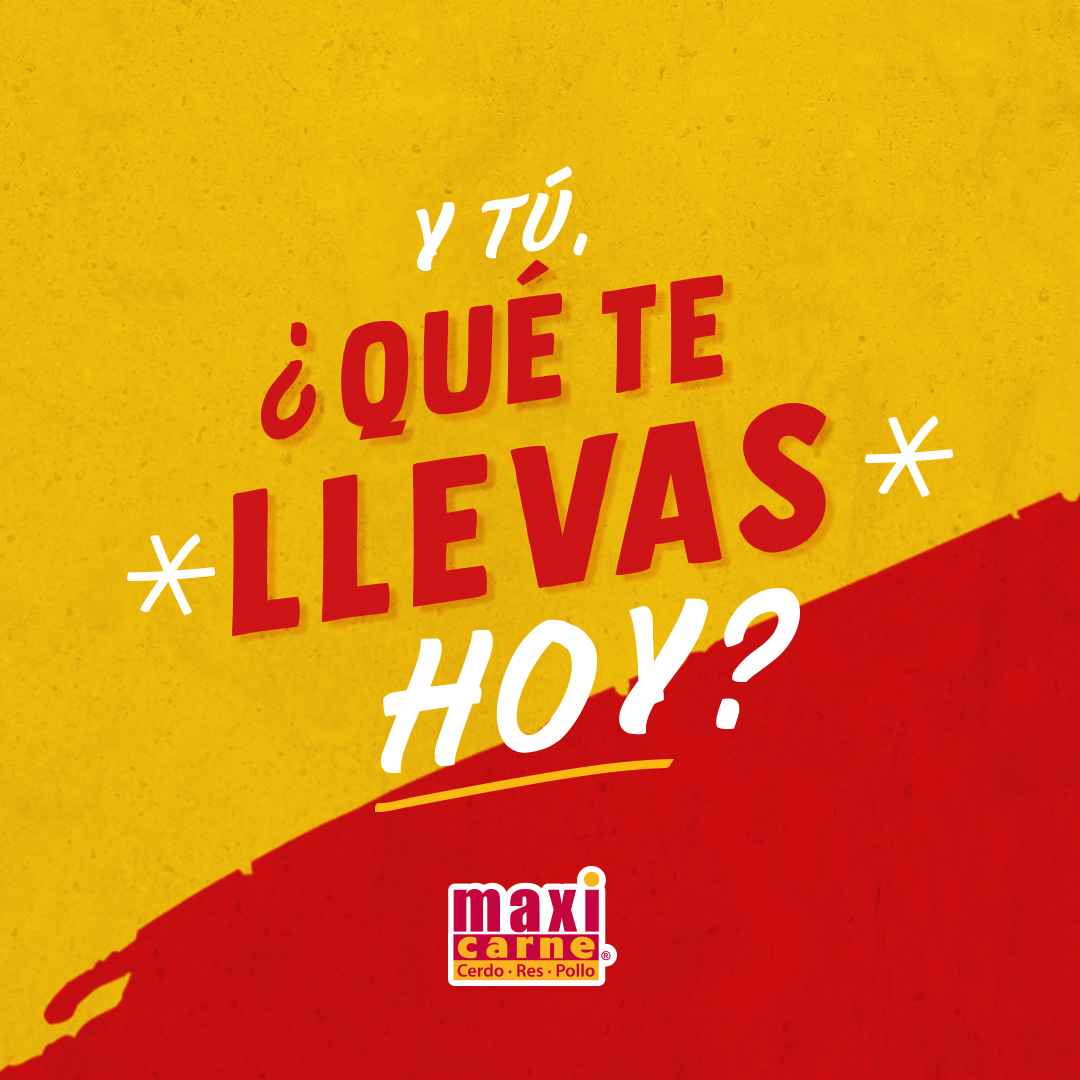
We built a campaign that reflects variety and ease in choosing products, showing the everyday side of life and presenting maxicarne as an optimal, fast and safe option. Under the slogan: “And you, what are you taking with you today?”, we seek to show moments to enjoy with family, friends, and ourselves, because every day is a new opportunity to have a memorable experience.
We created a strategic campaign to portray a close and accessible atmosphere, where customers can have good times thanks to the variety of Maxicarne products.
Taking Mexican design as a reference and inspired by urban lettering, we enhanced the campaign phrase with a typography that evokes closeness and dynamism. We used a cheerful, warm, and fresh style, accompanied by images that conveyed a variety of products and moments to share with their loved ones.
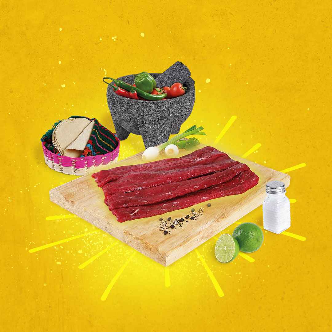
A photoshoot was carried out, following the line of the close and urban style with the public, to highlight the meat as the main element of the brand.
Textures, compositions, graphics, and lighting were used to give it movement and dynamism; highlighting the products in the foreground thanks to the effect of the yellow glow that surrounds it. We sought to portray the different ways and scenarios in which it can be consumed, and how doing so, gives the user a complete experience that satisfies their palates.
Similarly, we conducted a sub-campaign that emerged during the pandemic period, which has the same guidelines and graphic line, but focused on a new message:”Always be on time”.
We sought to expand the main campaign, maintaining the closeness, quality, and friendly style that characterizes Maxicarne, providing security and satisfaction to customers so that their products are always on time in their homes.


CREDIT
- Agency/Creative: Mantra
- Article Title: Maxicarne Brand Design
- Organisation/Entity: Agency
- Project Type: Campaign
- Project Status: Published
- Agency/Creative Country: Mexico
- Agency/Creative City: Merida
- Market Region: North America
- Project Deliverables: Advertising, Advertising Photography, Brand Identity
- Industry: Food/Beverage
- Keywords: #advertisingcampaign #mantra
-
Credits:
Photography: Elias Colli
Photography: Elias Avilez
Copywriting: Verónica Garibay
Graphic Design: Braulio Campos


