


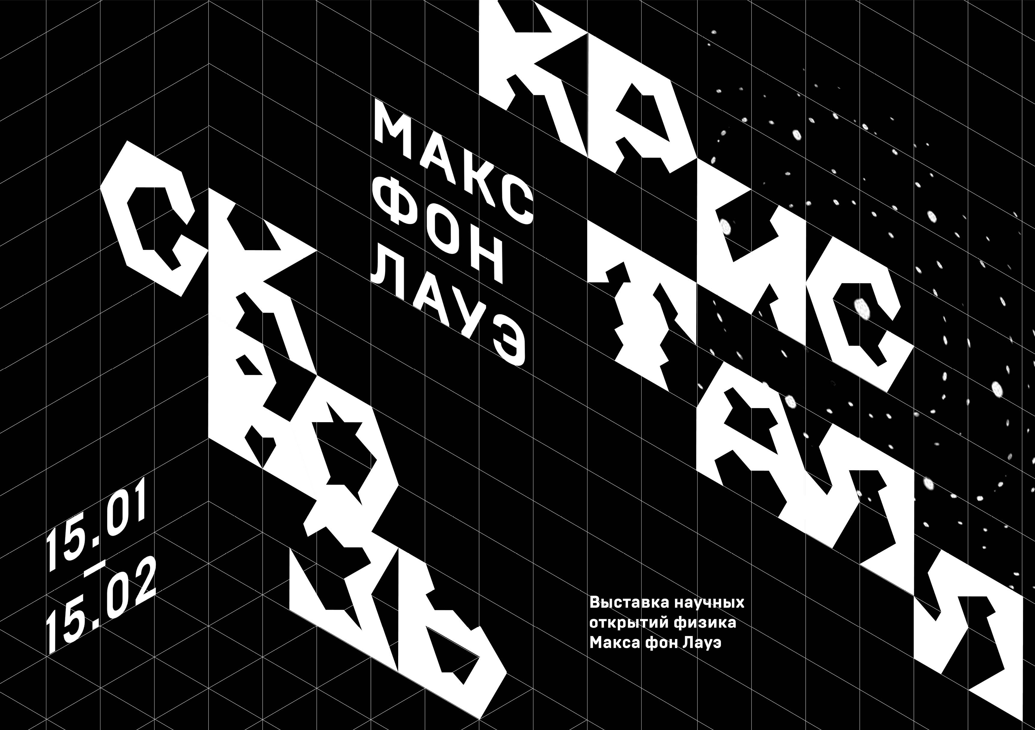
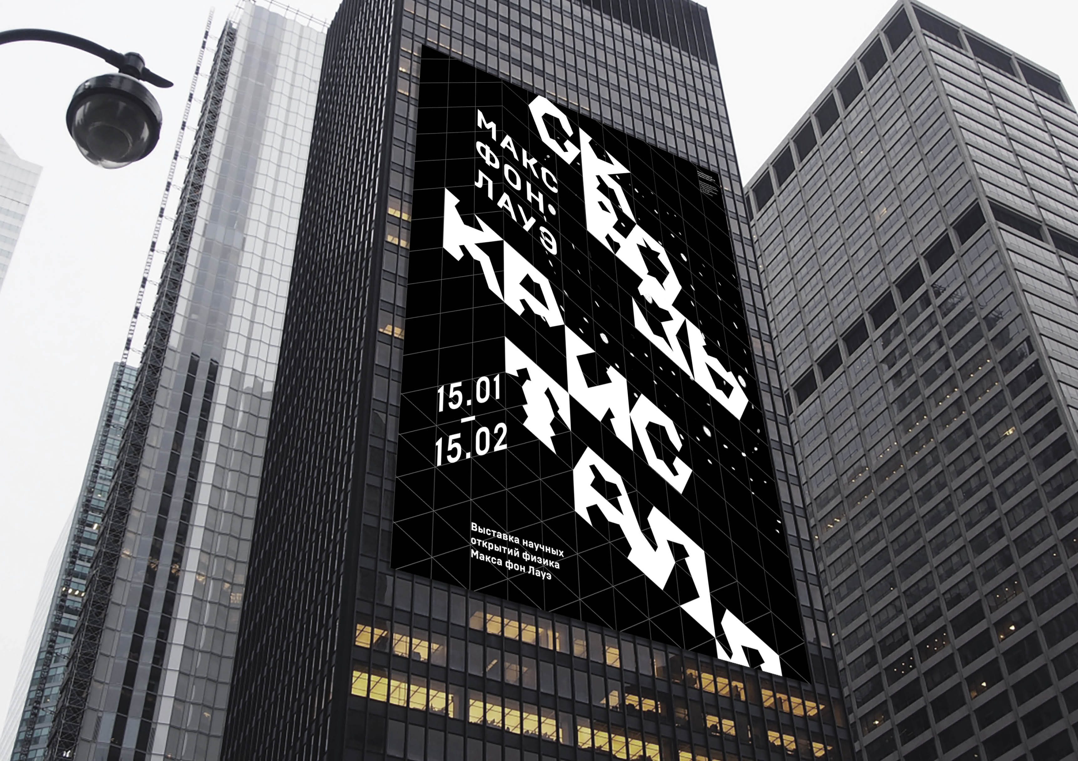
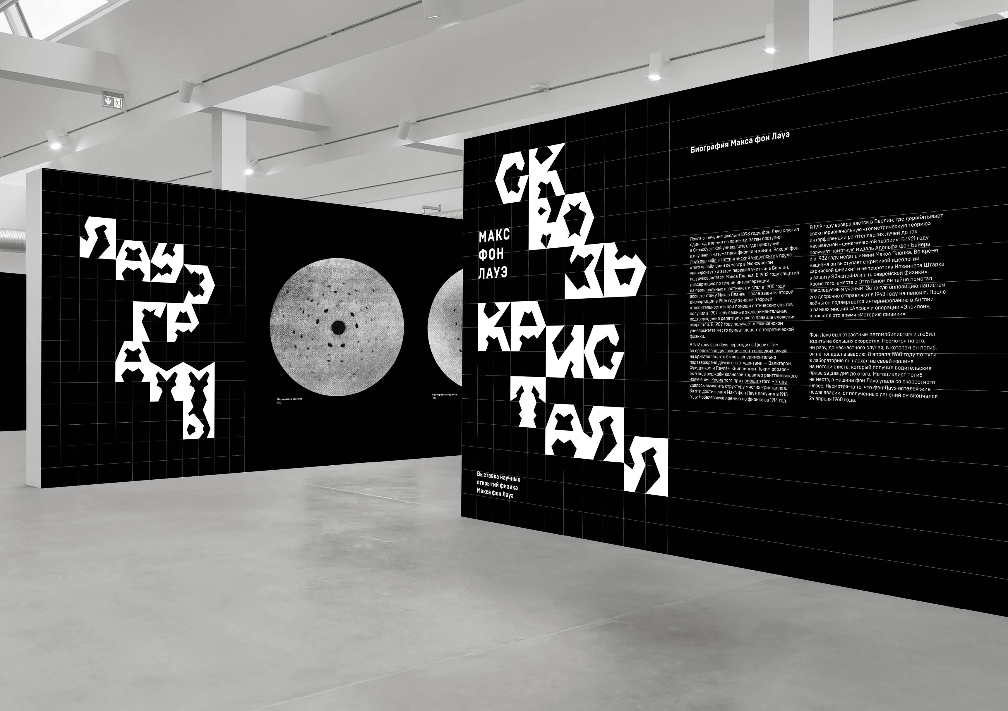
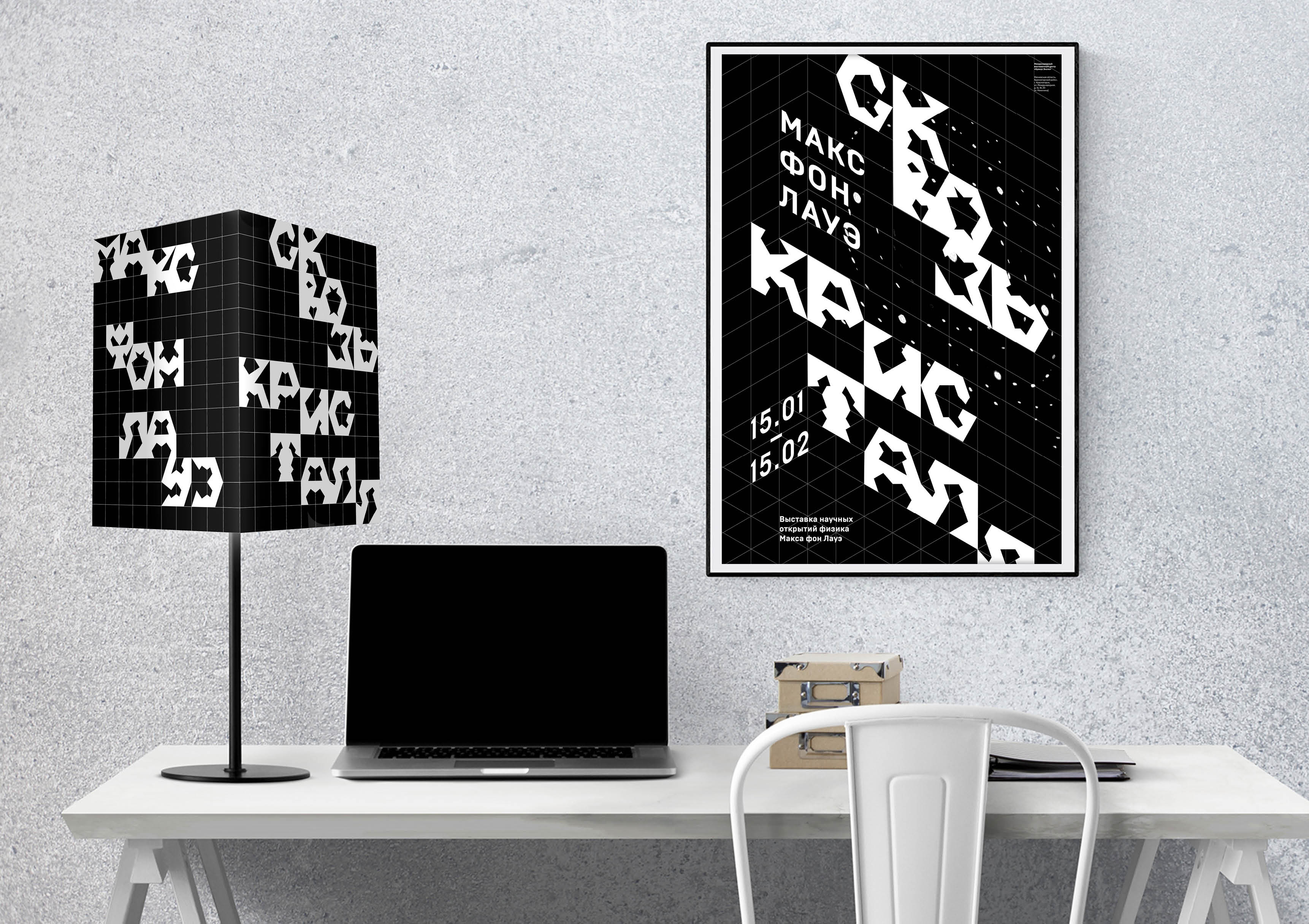
The exhibition “Through the Crystal” is dedicated to the German physicist Max von Laue. He developed a method for studying the crystal structure by projecting X-rays.
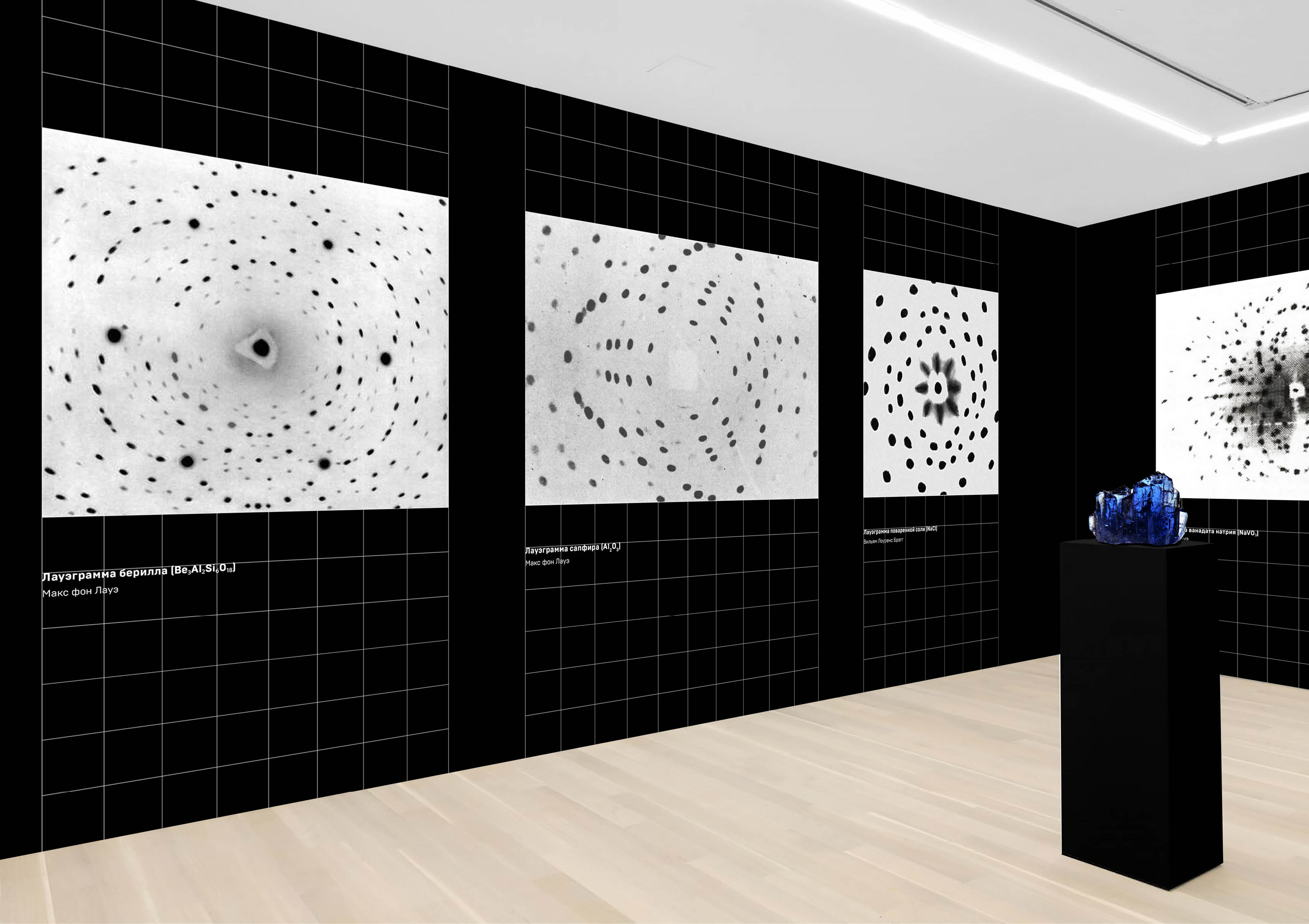
Laue did his “Nobel” work in Zurich. He decided to try to deal with the discovery that the first Nobel laureate made — X-ray radiation. Until 1912, it was unclear whether it was still a stream of some particles or electromagnetic radiation of very high frequency. The theme of Laue’s very first work was diffraction. And he came up with a wonderful idea to use a simple crystal as a diffraction grating. Together with his colleagues, he managed to direct a narrow beam of X-rays onto a blue-green crystal of copper sulfate and fix the radiation scattered on the crystal on a photographic plate. The result was a diffraction pattern of dark dots, which they saw when they developed the plate.
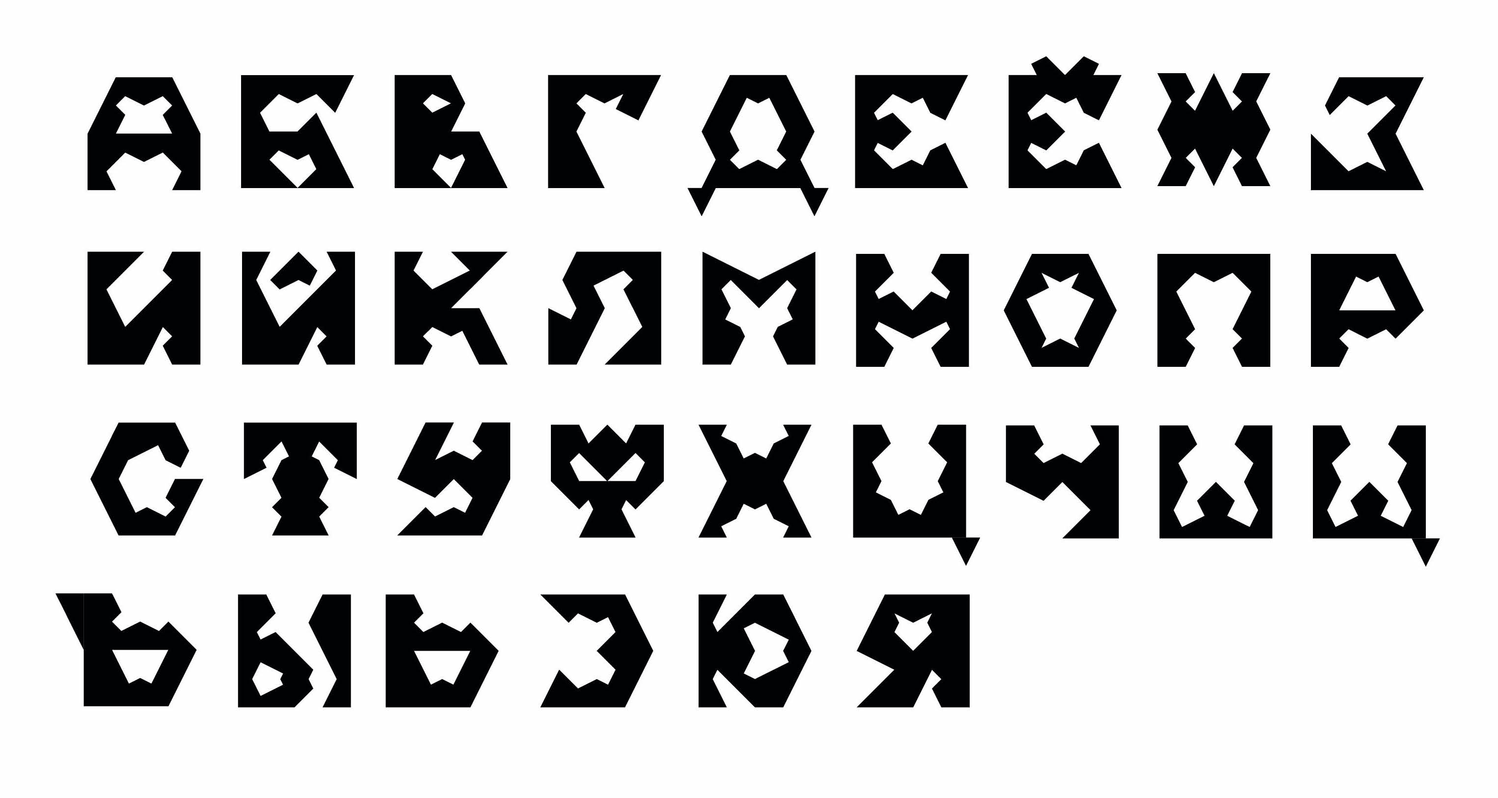
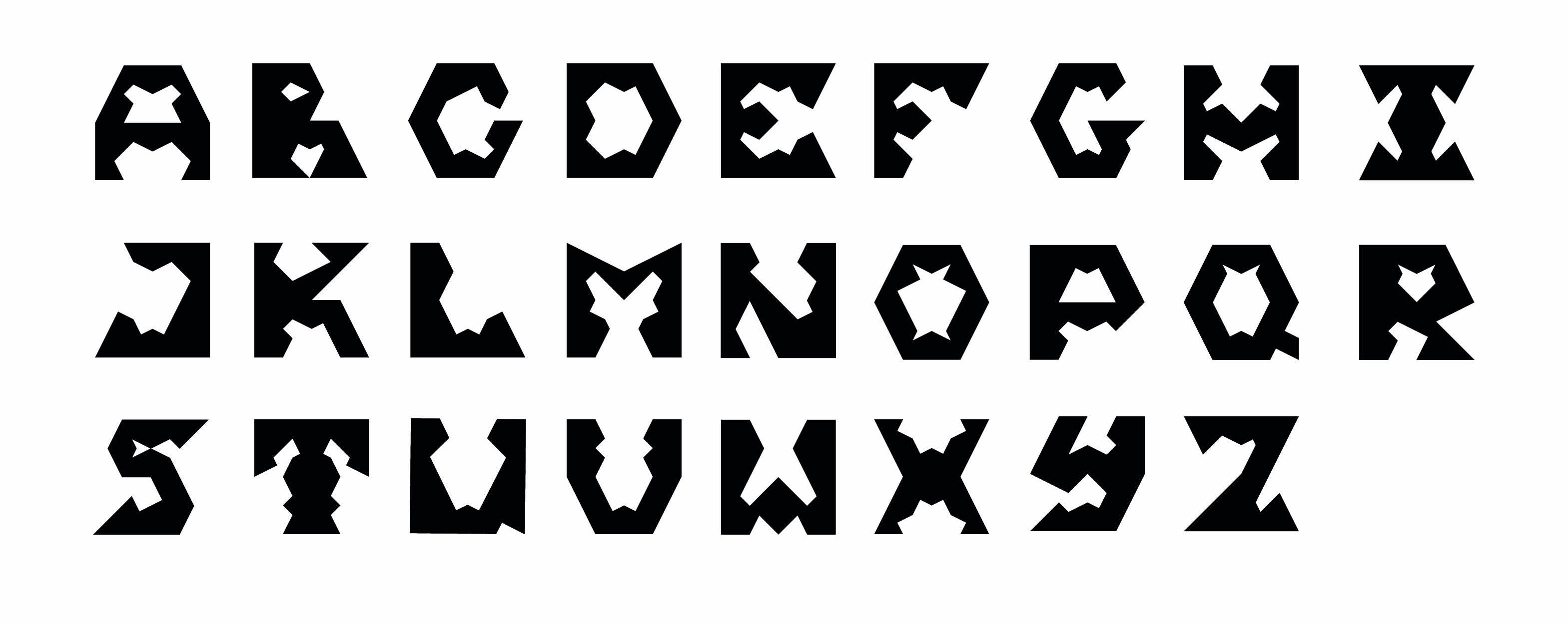
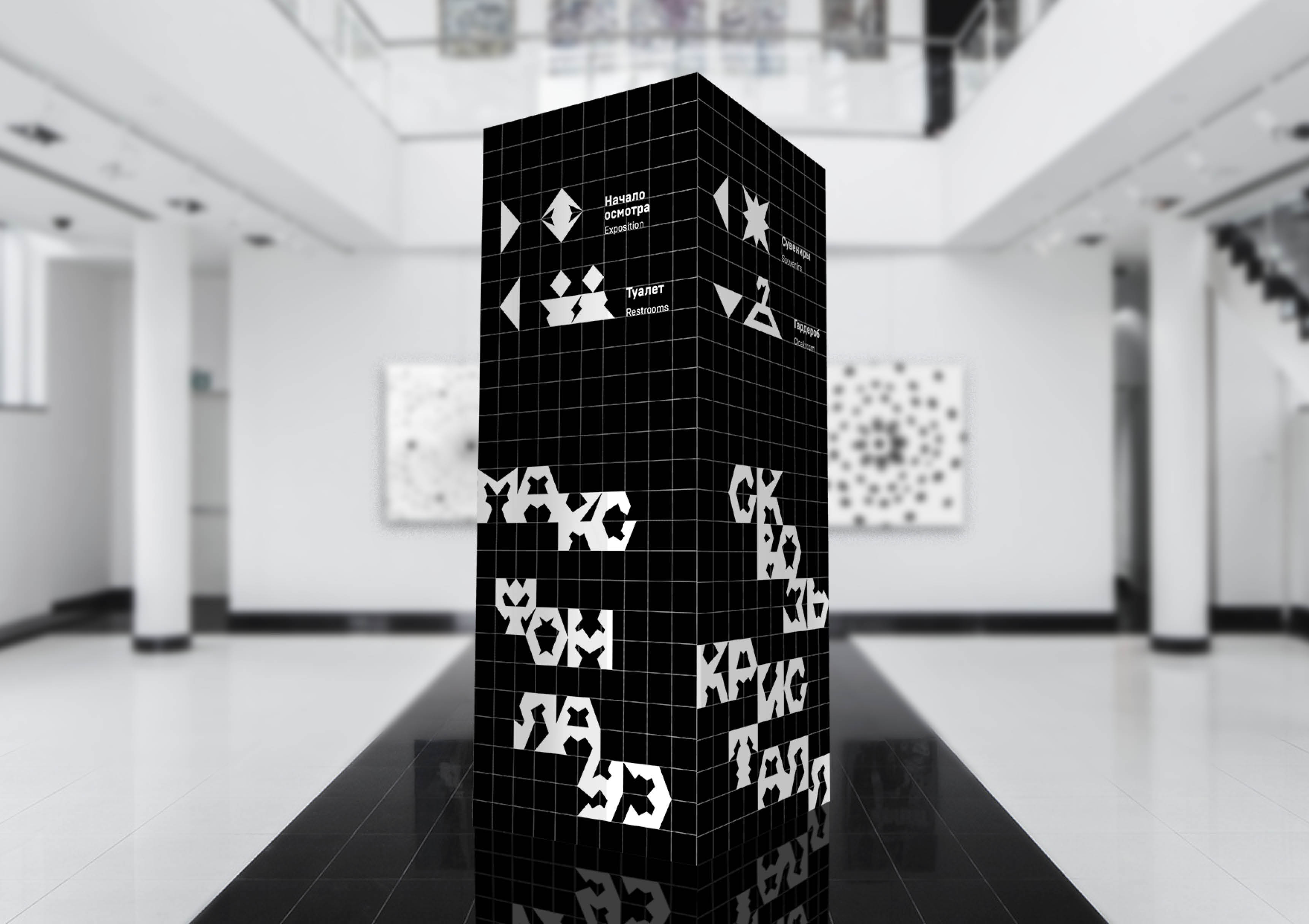
Developing the font for the exhibition “Through the Crystal”, many different searches were done based on different associations with Laue’s works. For example, it was a a font with a projection effect and a font similar to lauegrams. The final accidental font for the exhibition was built on the basis of a grid that looks like both projection rays and crystal faces. It resembles crystals because of its angular and stable nature.
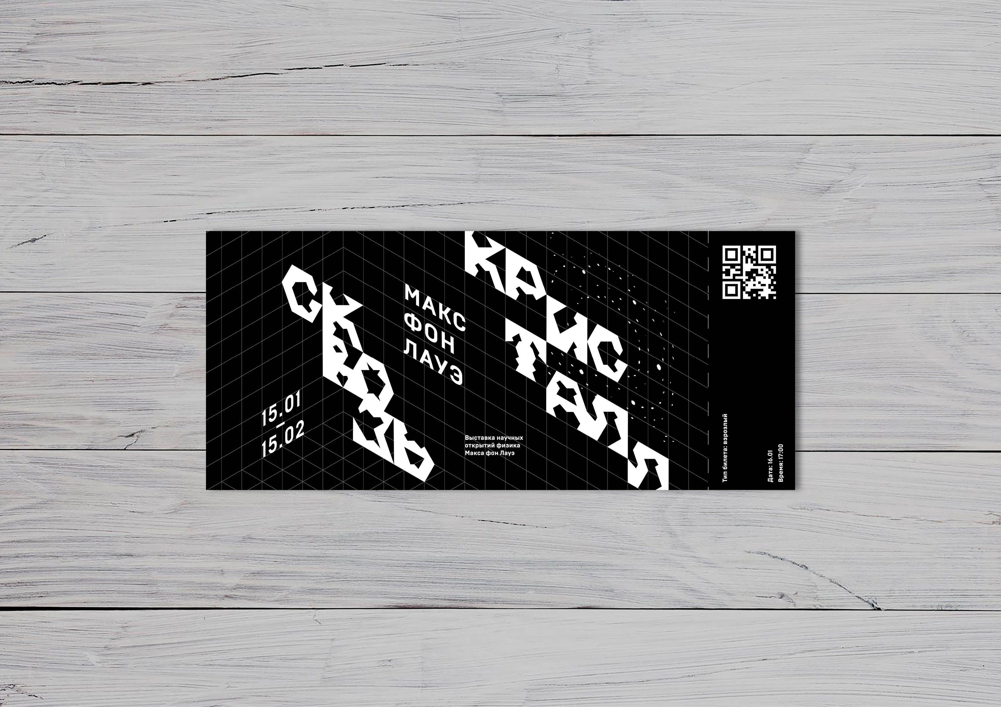
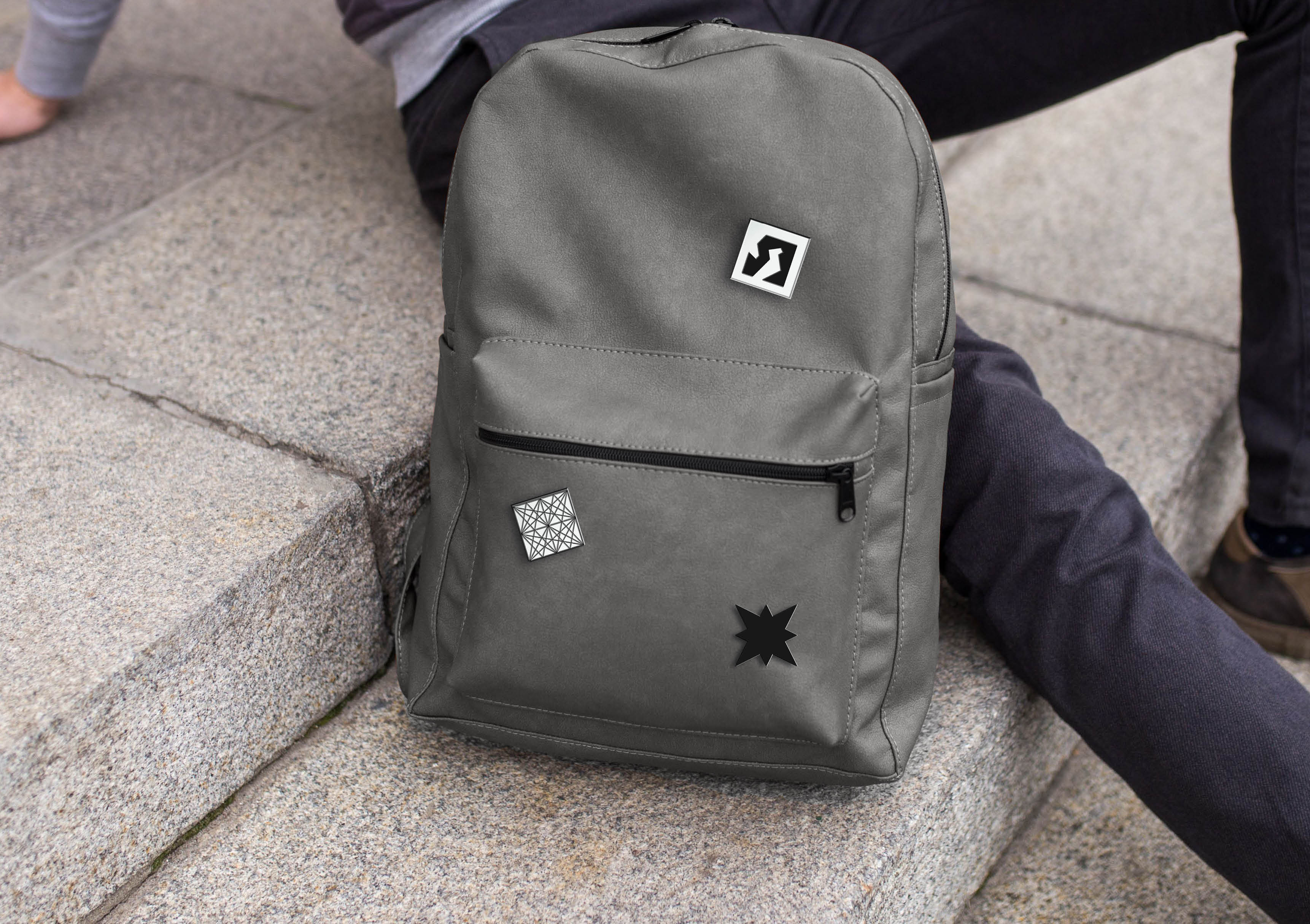
The identity of the exhibition “Through the Crystal” was built on an isometric grid, according to which the name of the exhibition is written in accidental font and various information about the exhibition. Different media were developed for the exhibition. For example, a series of posters, space design, navigation, souvenirs. I also made an animated poster that conveys the effect of space found in identity.
CREDIT
- Agency/Creative: Daria Marfina
- Article Title: Max von Laue Font and Exhibition Identity
- Organisation/Entity: Student
- Project Type: Identity
- Project Status: Published
- Agency/Creative Country: Russia
- Agency/Creative City: Moscow
- Market Region: Europe
- Project Deliverables: Animation, Brand Creation, Brand Design, Brand Identity, Exhibition Design, Identity System, Type Design, Visualisation
- Industry: Education
- Keywords: science, crystal, identity, font, exhibition, typeface
-
Credits:
Designer: Daria Marfina
University: HSE Art And Design School
Tutor: Ivan Vetrov


