


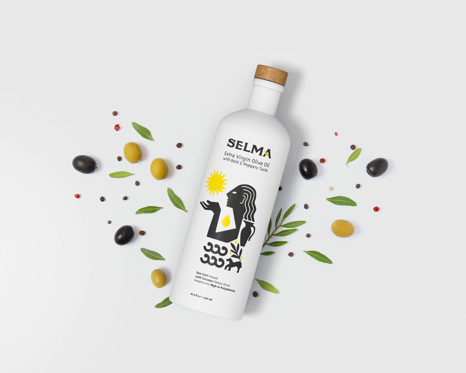
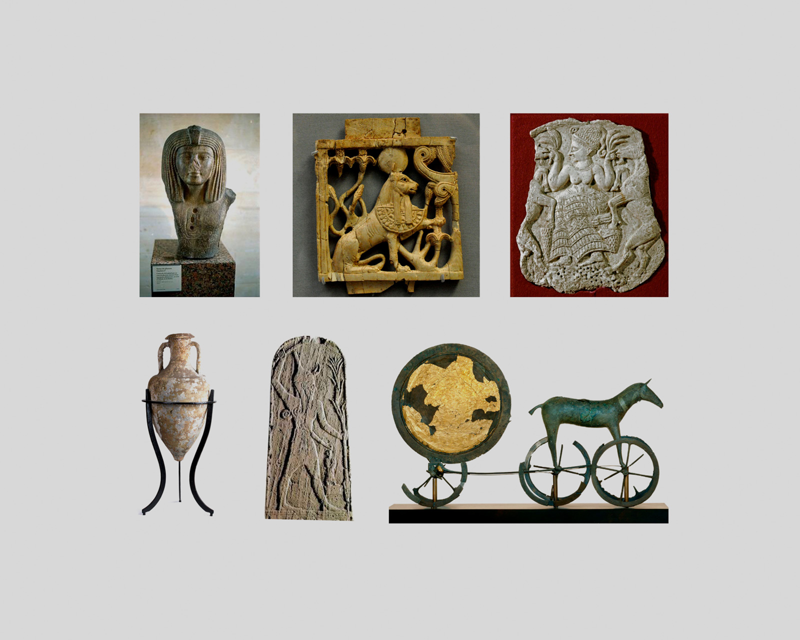
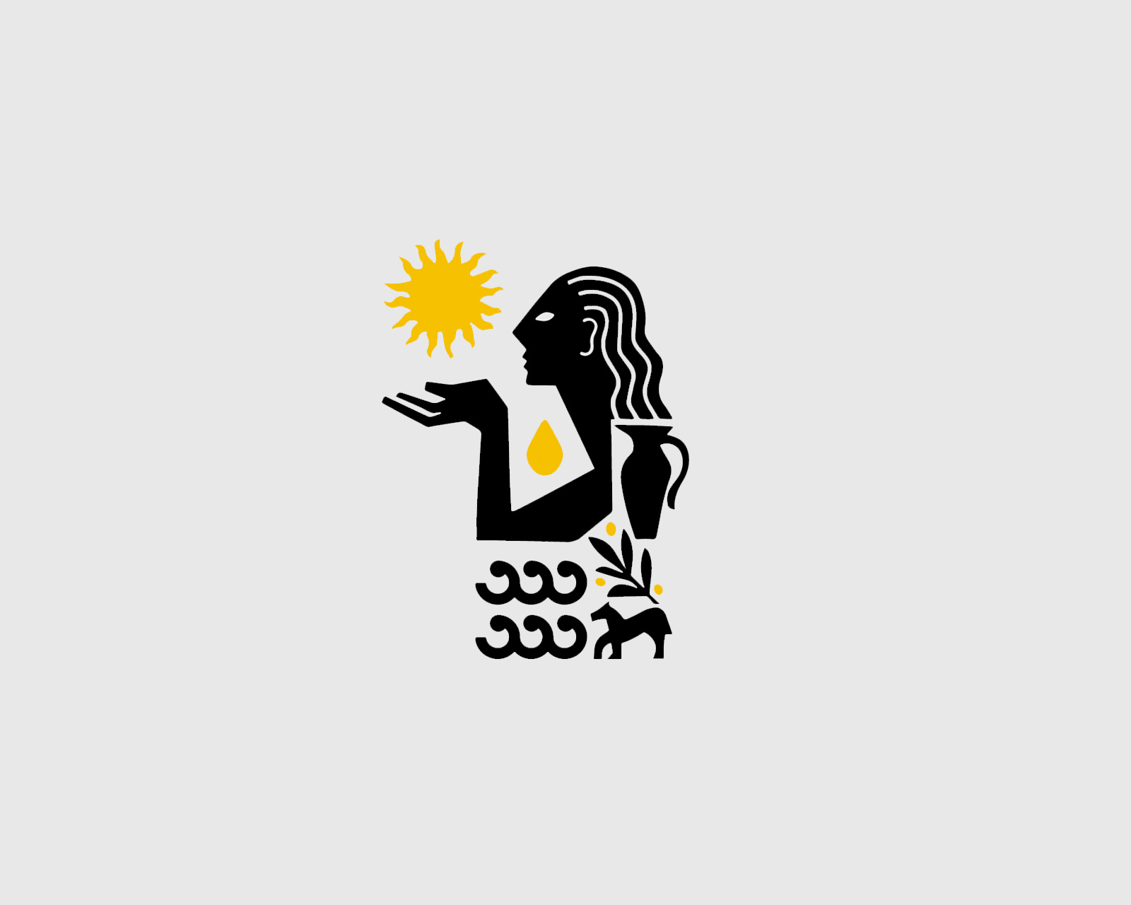
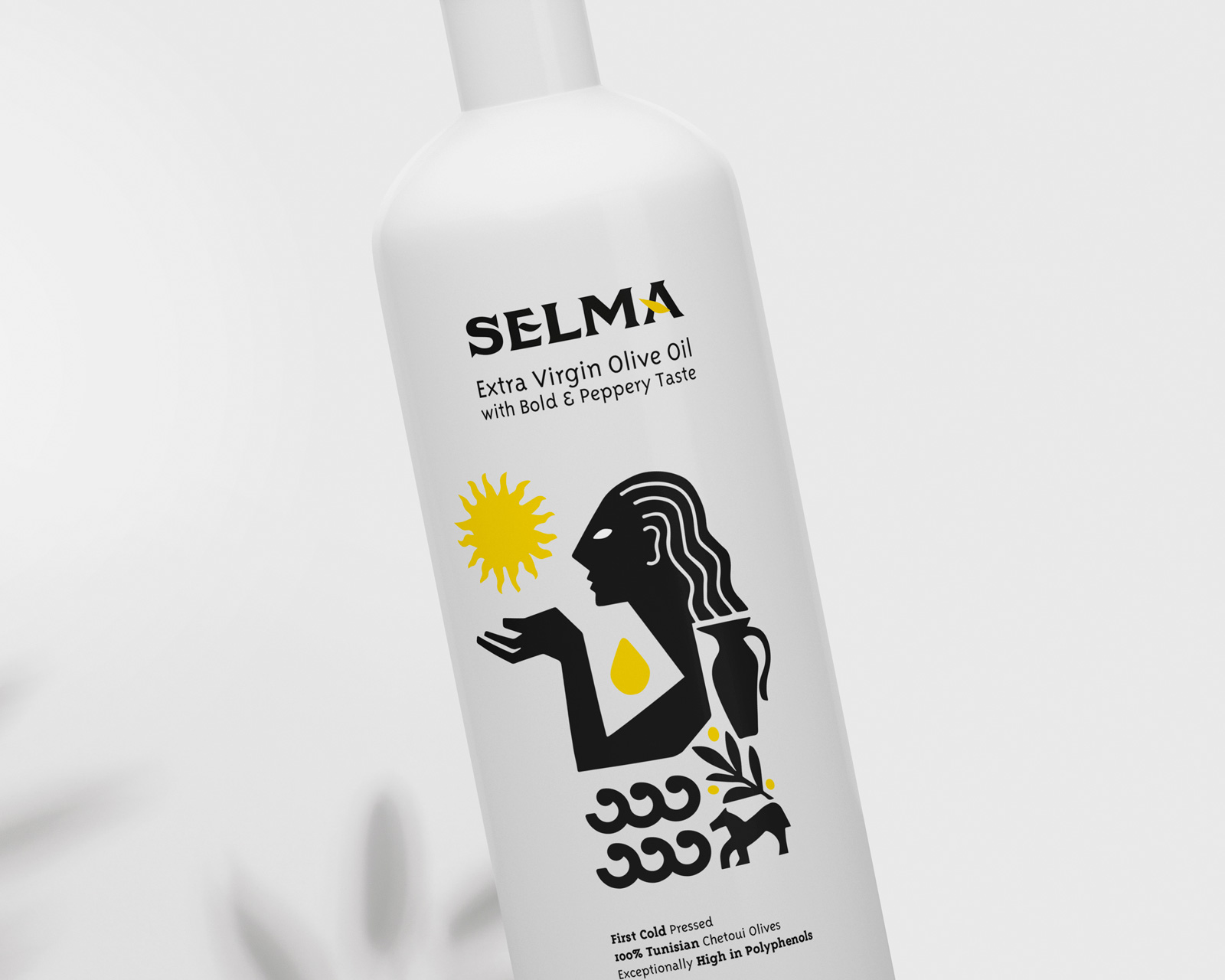
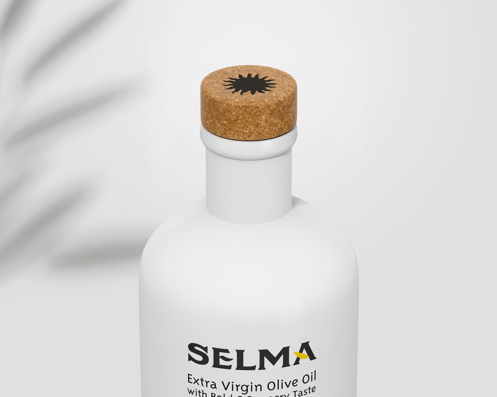
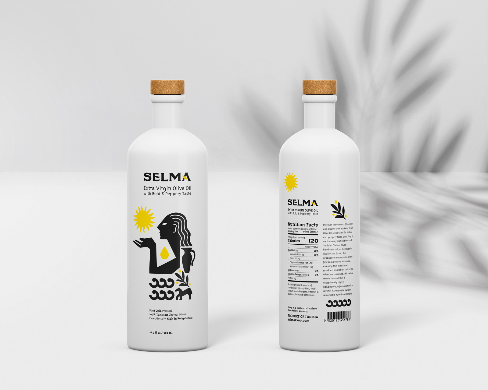
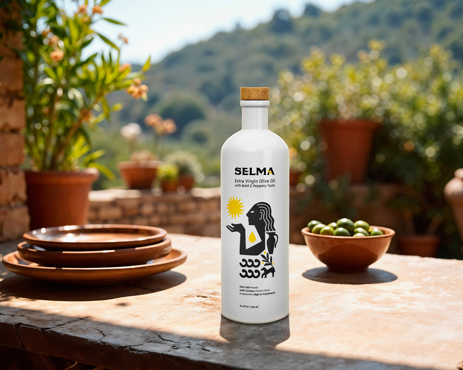
The label and logo for the company Selma were inspired by its rich Mediterranean heritage, deeply connected to thousands of years of history, culture, and artistic tradition. The design concept draws on Phoenician and Carthaginian influences, two civilizations that left a profound mark on Tunisia and the wider Mediterranean. At the center stands a stylized figure in profile, a symbolic homage to ancient depictions of sun worship. The sun here is not only a spiritual element, but also a metaphor for the vital energy that nourishes olive trees and makes possible the production of oil, a product considered sacred since antiquity.
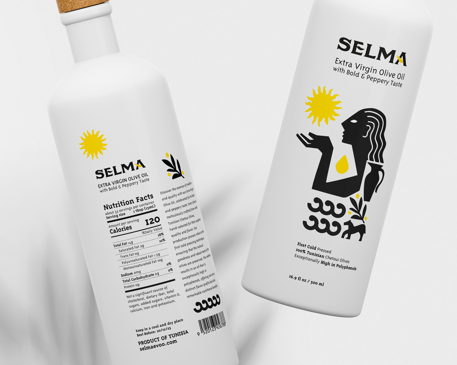
Around the central icon, complementary symbols enrich the narrative: flowing waves recall the Mediterranean Sea, an eternal source of exchange, travel, and trade; while the presence of an agricultural animal underlines the importance of the land and rural life. Together, these elements create a visual balance between sea and earth, perfectly reflecting the dual nature of Tunisia, where maritime openness and agricultural tradition have coexisted for centuries.
From a stylistic point of view, Selma’s identity is built on bold, minimalist shapes that combine simplicity with strength. This essential approach is softened by refined typography, chosen to express elegance and exclusivity, values that mirror the limited production of Selma’s pure Tunisian olive oil. The black-and-white palette ensures clarity and timelessness, while yellow accents evoke the golden tones of olive oil and add vitality to the composition. The result is a design that feels modern yet deeply rooted in history, allowing the brand to stand out in global markets.
Selma’s label and logo thus tell more than a story of quality; they embody an entire cultural heritage. By merging symbols of antiquity with contemporary aesthetics, the brand speaks to discerning consumers who seek authenticity, tradition, and sophistication in what they buy. Each bottle becomes a small ambassador of Tunisia’s Mediterranean identity, carrying with it the values of resilience, elegance, and timeless connection between land, sea, and sun.
CREDIT
- Agency/Creative: Max Lippolis
- Article Title: Max Lippolis Designs Selma Olive Oil Identity Rooted in Mediterranean Heritage
- Organisation/Entity: Freelance
- Project Type: Packaging
- Project Status: Published
- Agency/Creative Country: Italy
- Agency/Creative City: Salerno
- Market Region: North America
- Project Deliverables: Art Direction, Illustration, Label Design, Logo Design
- Format: Bottle
- Industry: Food/Beverage
- Keywords: Bottle, Label, Packaging design, Branding, Olive Oil, Logo design, Logotype, Design, Sun, Food, Tunisia, Mediterranean
-
Credits:
Art Direction / Graphic Design: Max Lippolis


