


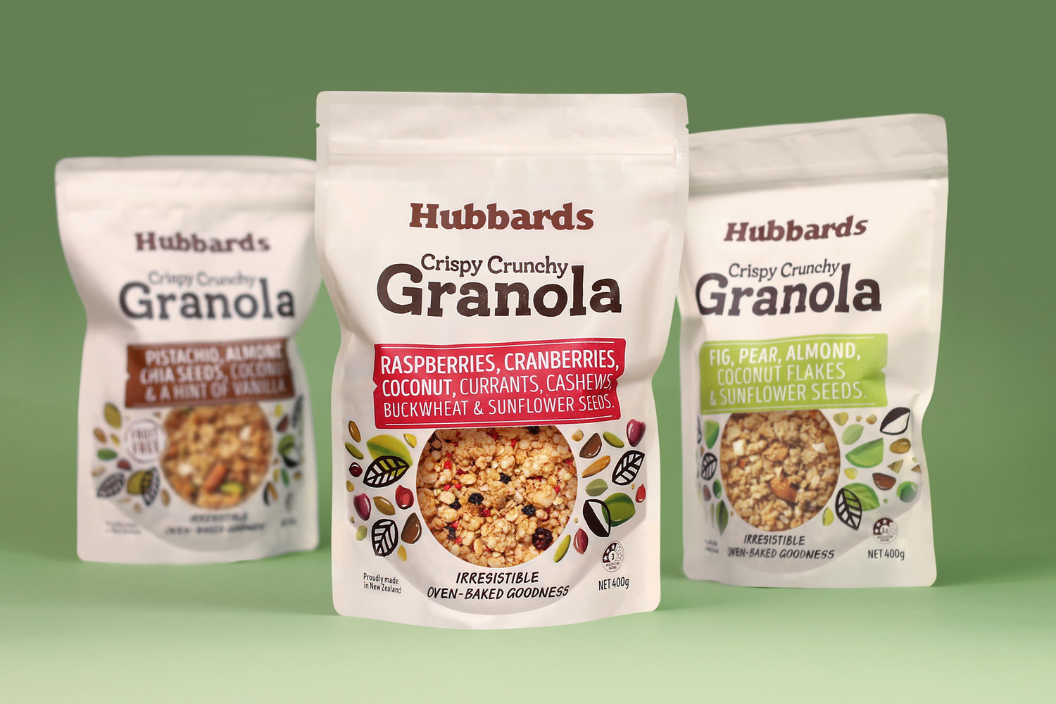
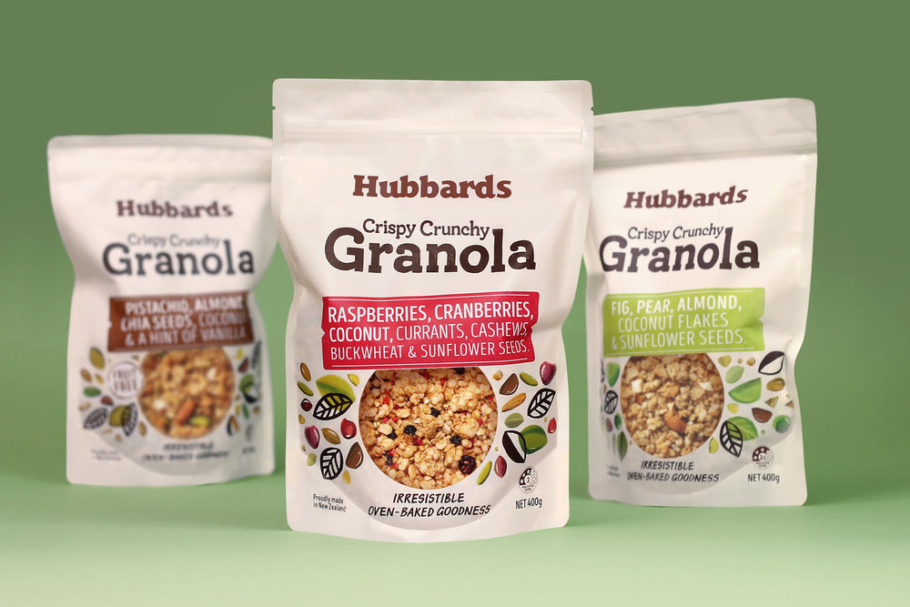
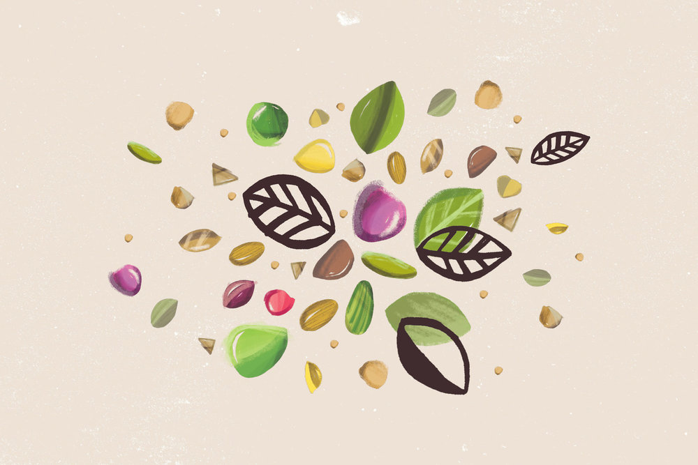
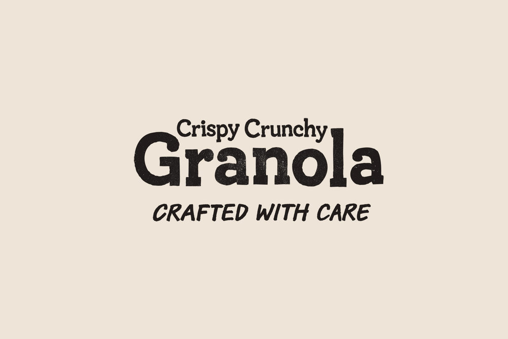
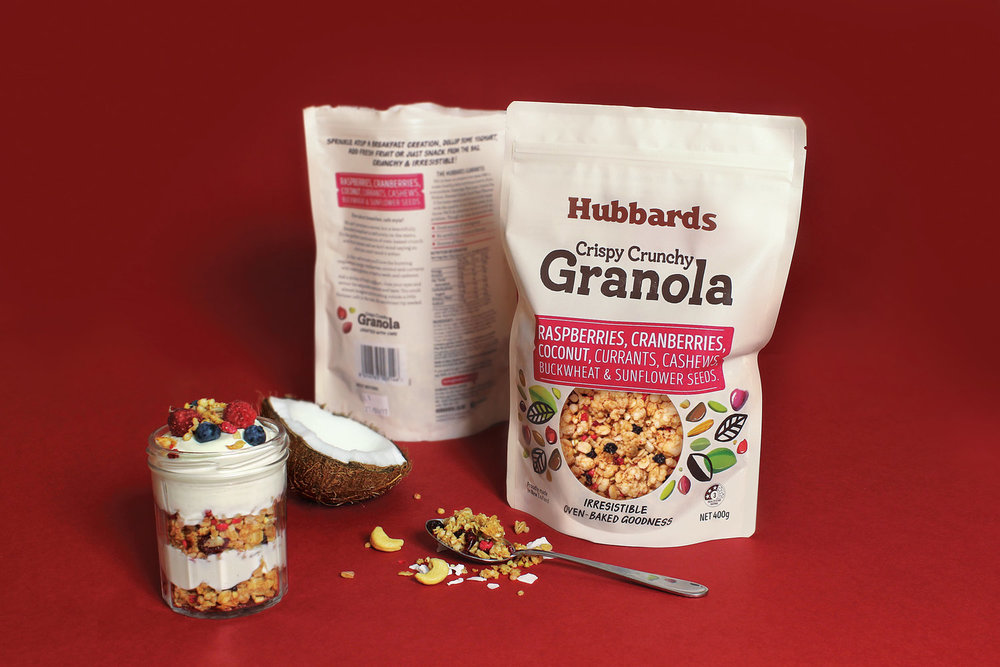
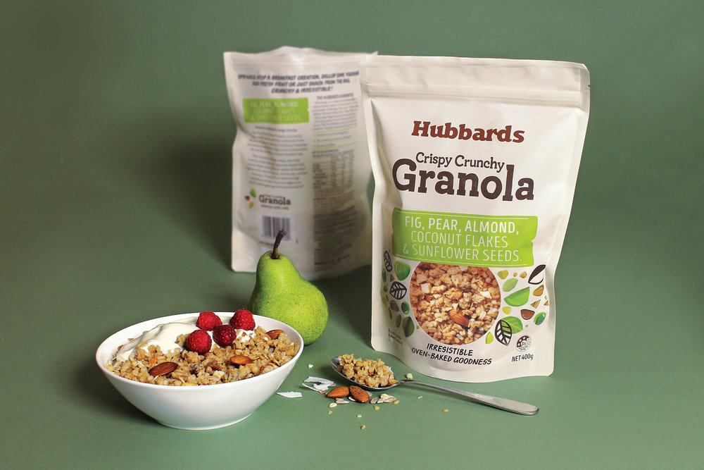
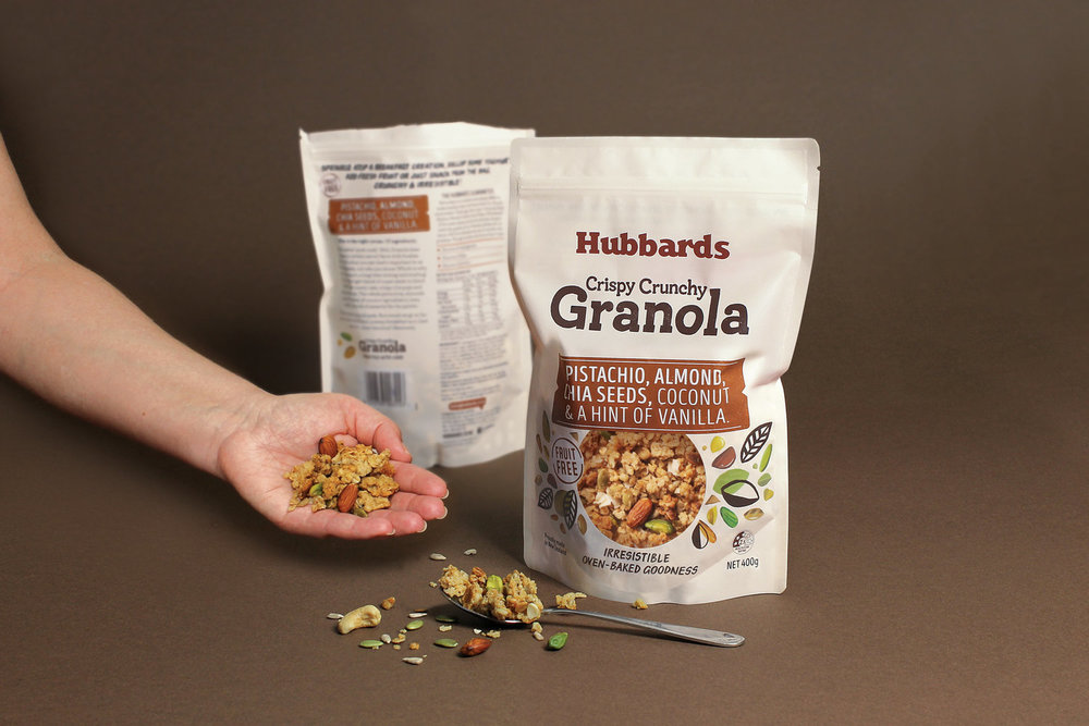
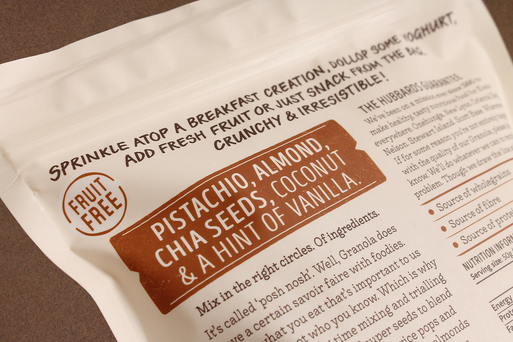
” BackgroundA relative newcomer to New Zealand, granola’s indulgent flavours, ingredients and crunchy textures are a different proposition to mueslis and cereals. Existing options were premium, high priced, café style offerings. This created an opportunity for Hubbards to leverage their position within the cereal aisle and develop a premium mainstream range of granolas in line with the rest of their core products.SolutionThe existing high end premium granola brands already defined the category pack format – the stand up pouch with product window. By adopting this category convention, Hubbards could leverage the artisan properties of the competition and allow the ingredients to be the hero of the pack.The off white substrate is a crisp, modern backdrop for a simple pack hierarchy, using bold pops of colour for the navigation tags. The yum factor of the product window is enhanced with bursts of whimsical, earthy and abstract ingredient illustrations.Pack copy centres around ‘Crafted with Care’, to highlight the café inspired flavours and ingredients crafted in the Hubbards kitchen. A compelling story and premise that has been used in store and social media to create an artisan, foodie buzz.”
CREDIT
- Agency/Creative: Matt Grantham Studio & Coats Design
- Article Title: Matt Grantham Studio & Coats Design – Hubbards Granola
- Project Type: Packaging
- Format: Bag
- Substrate: Plastic


