


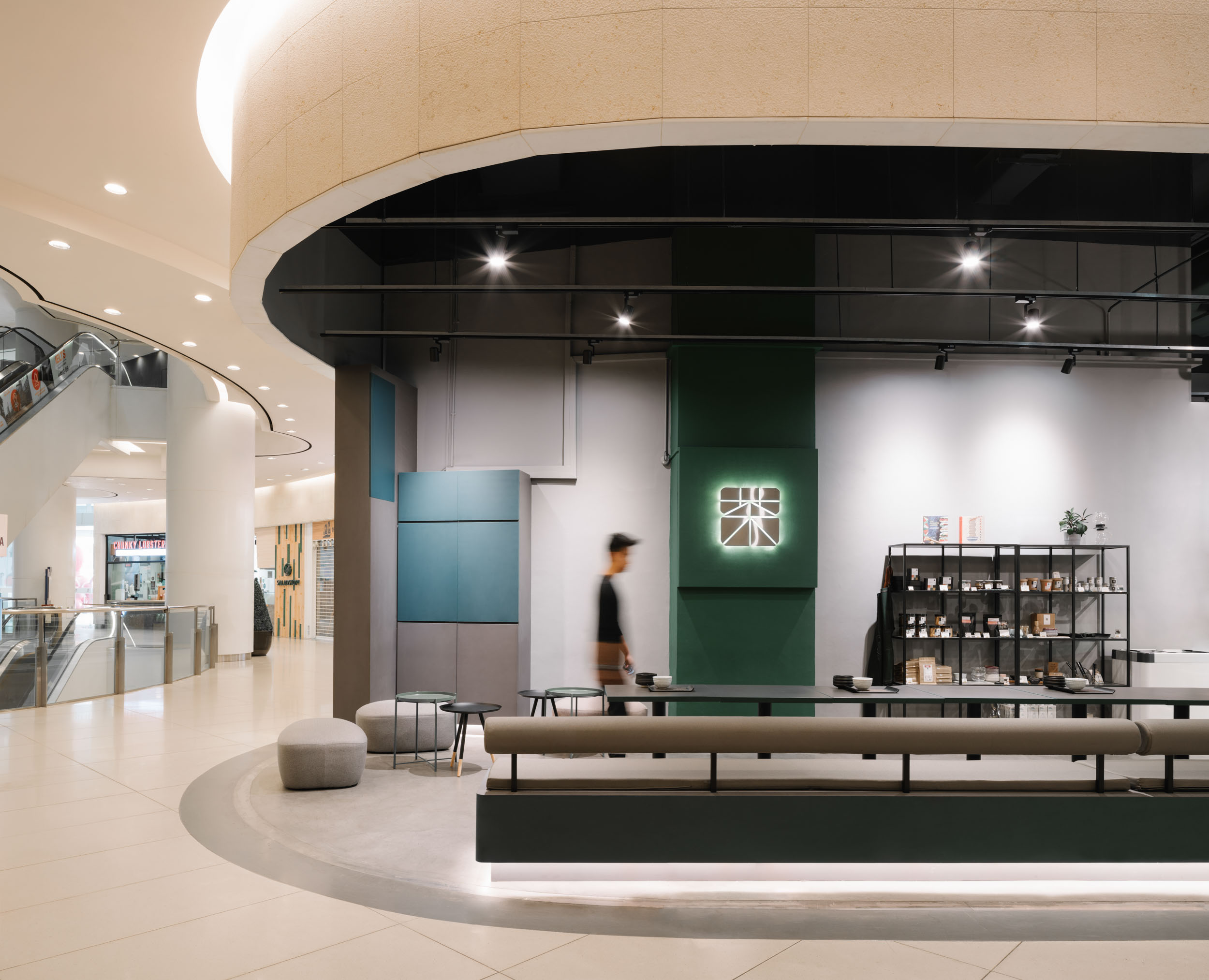
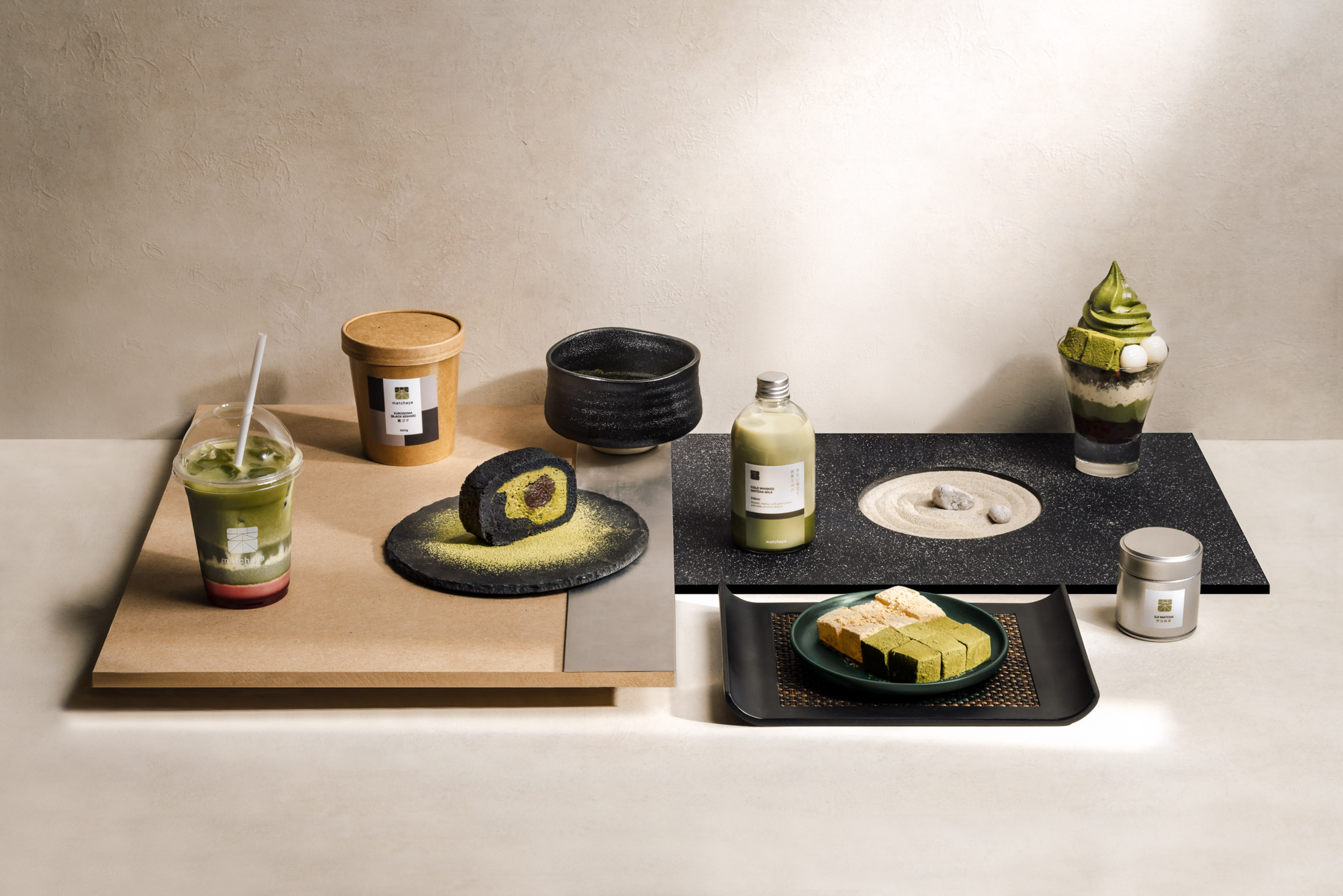
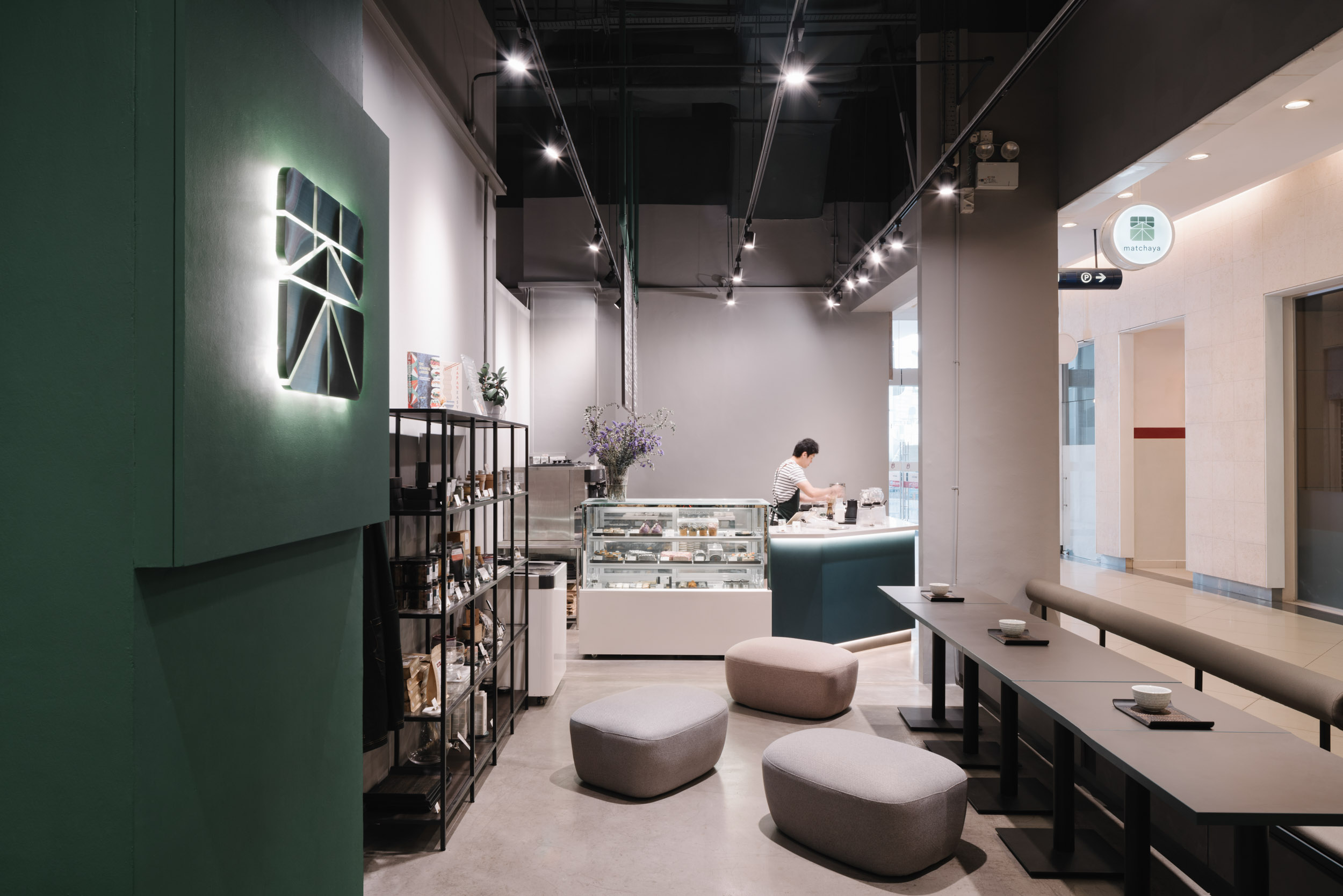
At the end of 2018, we were approached to rebrand Matchaya. The intent was to consolidate all operations in both booths into a large concept store. The space would be almost three times the original size, serving up hot food and a wider range of items from a newly-expanded menu that stemmed from years of R&D.
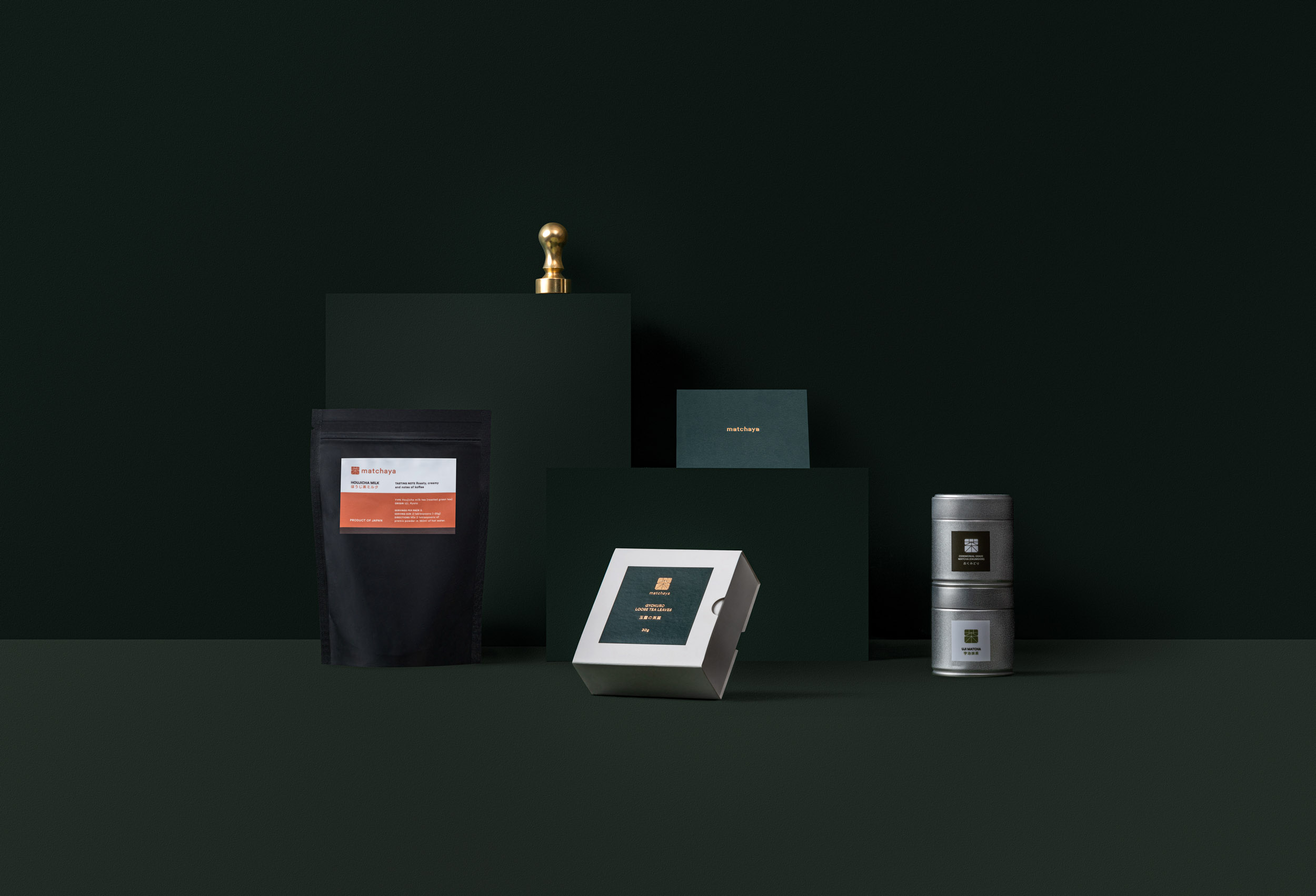
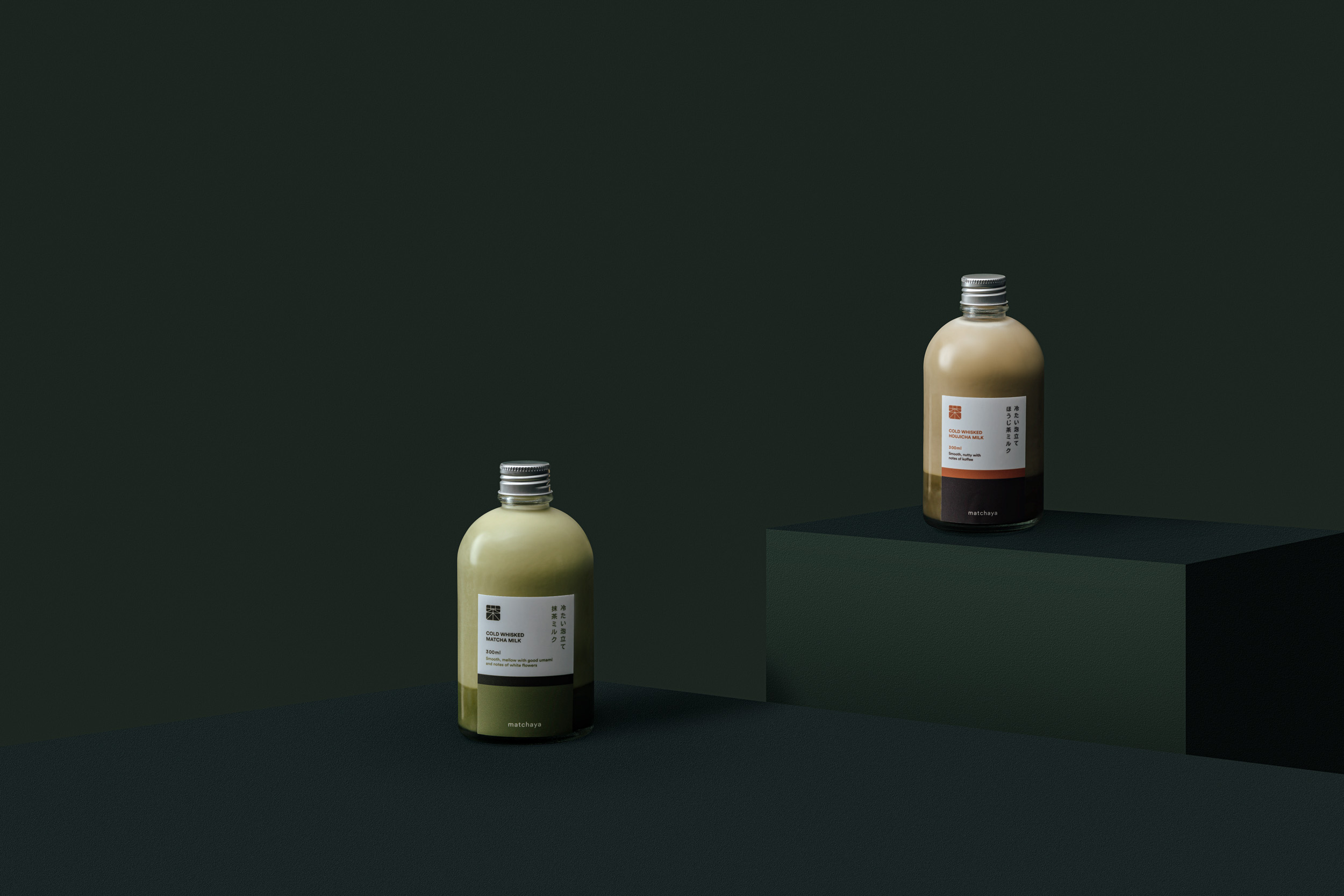
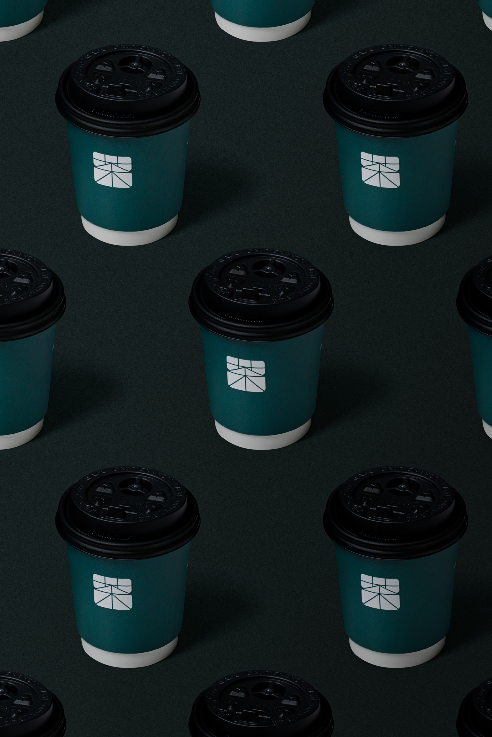
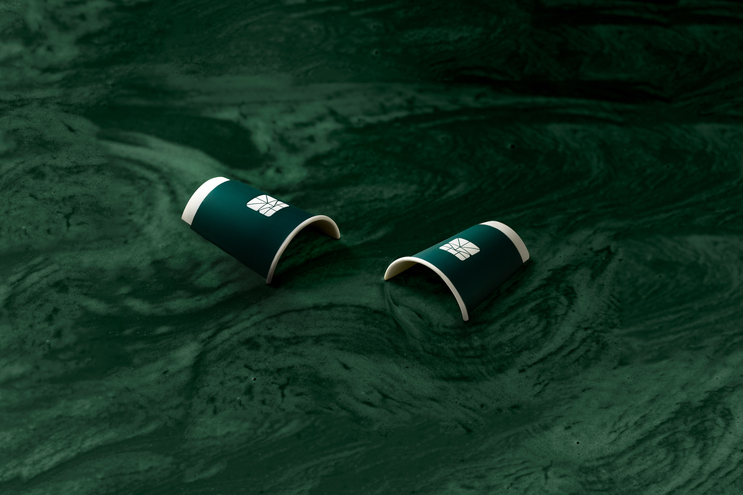
The new identity for Matchaya takes inspiration from the notion of a Japanese monshō (紋章), a decorative and identity for Japanese individuals or families. Embedded within the key monshō of Matchaya, is the word “茶” (tea), synonymous with Matchaya’s Japanese name “抹茶屋” (House of Tea).

CREDIT
- Agency/Creative: Fable
- Article Title: Matchaya Branding by Fable Design Studio
- Organisation/Entity: Agency, Published Commercial Design
- Project Type: Identity
- Agency/Creative Country: Singapore
- Market Region: Asia
- Project Deliverables: Brand Architecture, Brand Design, Brand Guidelines, Brand Identity, Branding, Graphic Design, Identity System, Packaging Design, Product Architecture, Research, Tone of Voice
- Industry: Food/Beverage
FEEDBACK
Relevance: Solution/idea in relation to brand, product or service
Implementation: Attention, detailing and finishing of final solution
Presentation: Text, visualisation and quality of the presentation


