


Brief: Kingsland Drinks had recently found an exciting new vineyard on the West coast’s Washington State. Due to appear on Waitrose shelves in early 2020, we were tasked with creating a premium label that would stand out on a shelf.
Solution: Awash with a sea of white labels, we wanted to create something more refined and based on a poem created by one of the team at Kingsland, we created a label that balanced simplicity with premium cues.
Between the Vines you’ll find, secrets revealed and wines divine.
Stories of nurture, love and care, if you read, you’ll discover, and be honoured to share.
A work of art, people may say, to find those hidden gems, off the beaten track they lay.
Read Between the Vines, what do you see?… A vision of craftsmanship, passion, after a sip, you’ll agree.
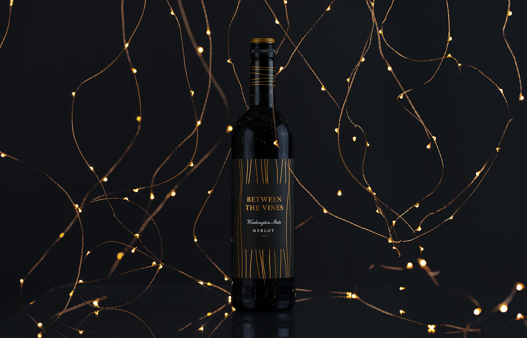
As a product refresh for Kingsland to be exclusively sold in Waitrose, Between the Vines needed a new positioning and packaging design with a difference.
As its place of origin, Washington State is a premium wine-producing region located in the northwest corner of the United States. Although a relatively young wine industry, it is the nation’s second-largest wine producer and is ranked among the world’s top wine regions. Most of its Merlot wine is produced in the hot desert-like eastern area, which boasts longer hours of sunlight and beautiful copper sunsets.
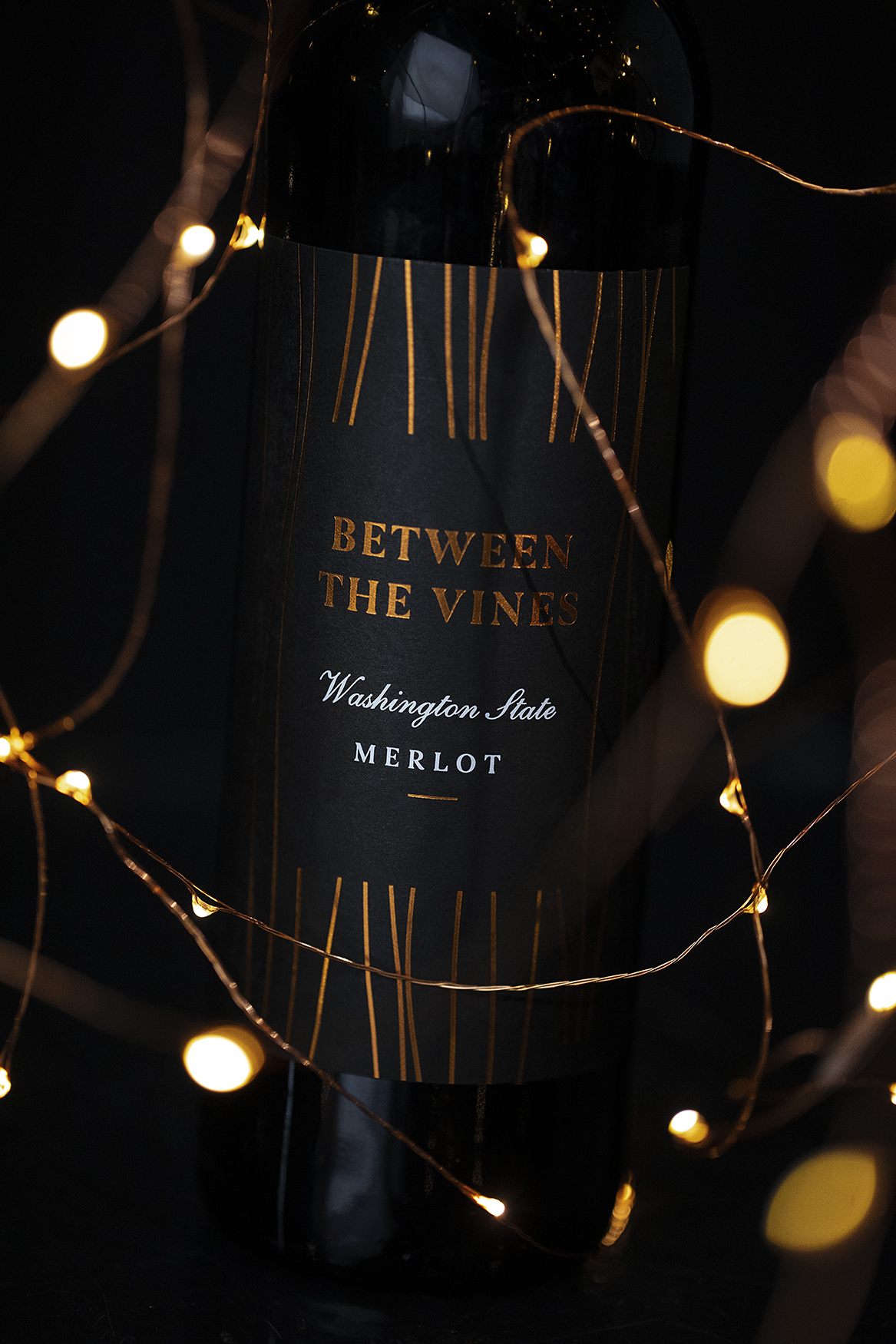
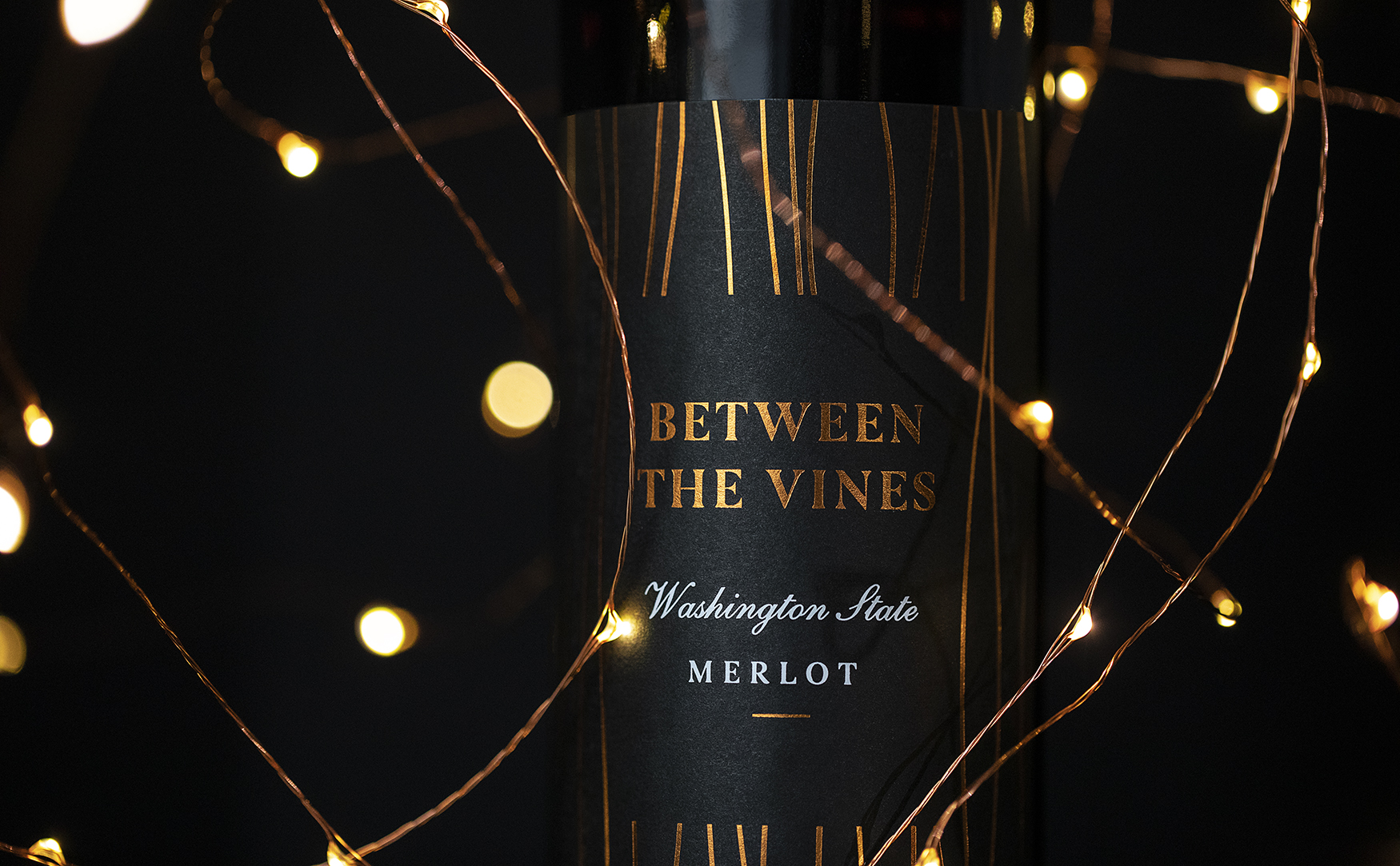
Like the Waitrose brand, this product had to be seen as a premium. To reflect this, we created a design that was not only simple but effortlessly elegant. Achieved by using vertical lines, this illusion added grandeur as well as making the bottle appear taller and thinner. The lines encapsulate the ‘Between the Vines’ in the centre and are finished with a premium copper foil, which illuminates from the jet-black label.
CREDIT
- Agency/Creative: Masters of Brands
- Article Title: Masters of Brands Design a Simple Yet Elegant Merlot Wine for Waitrose
- Organisation/Entity: Agency, Published Commercial Design
- Project Type: Packaging
- Agency/Creative Country: United Kingdom
- Market Region: Europe
- Project Deliverables: Brand Strategy, Graphic Design, Packaging Design, Photography, Research, Retail Brand Design
- Format: Bottle
- Substrate: Glass Bottle


