Depot – Master Brilliant
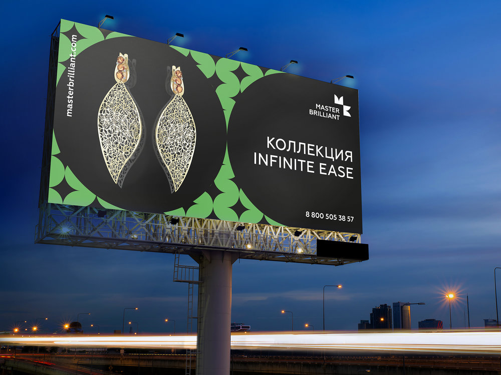
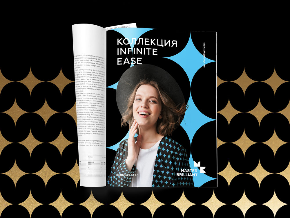
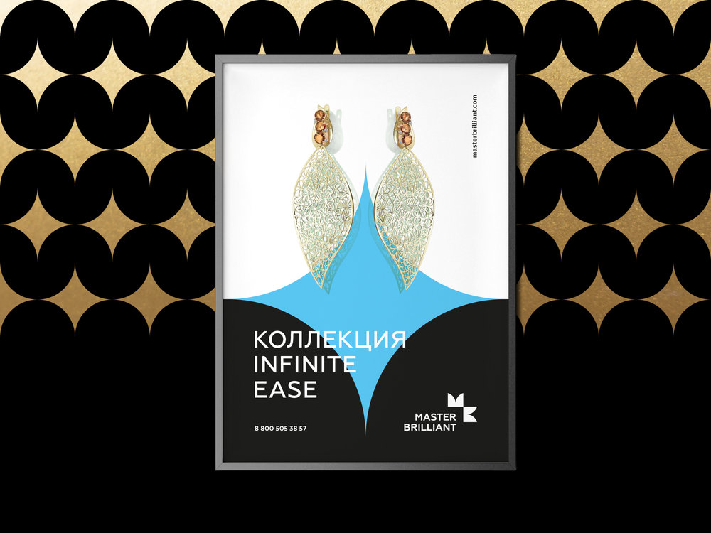
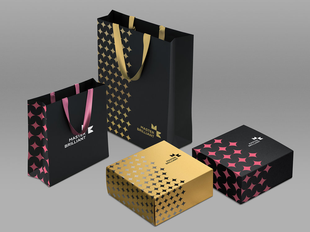
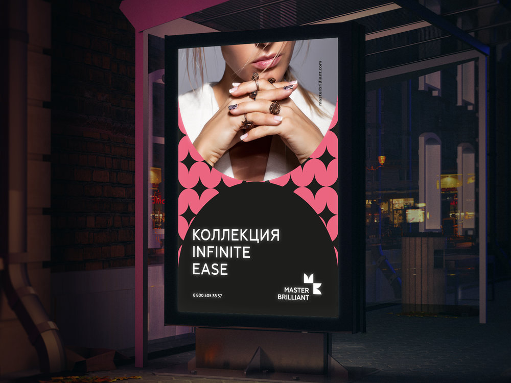
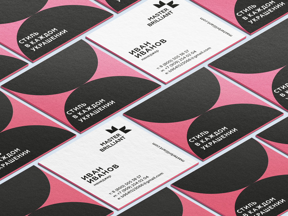
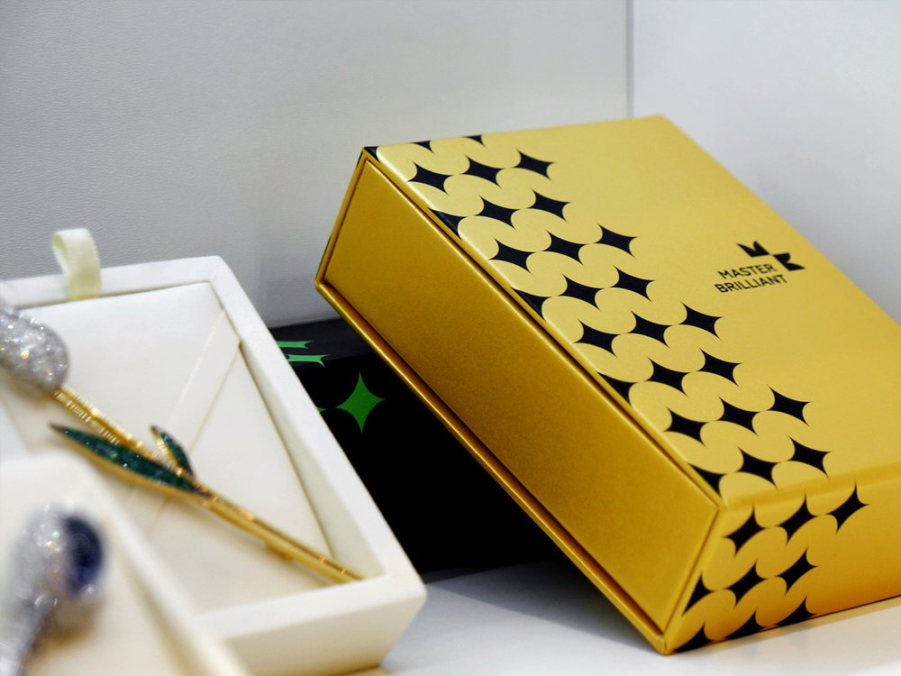
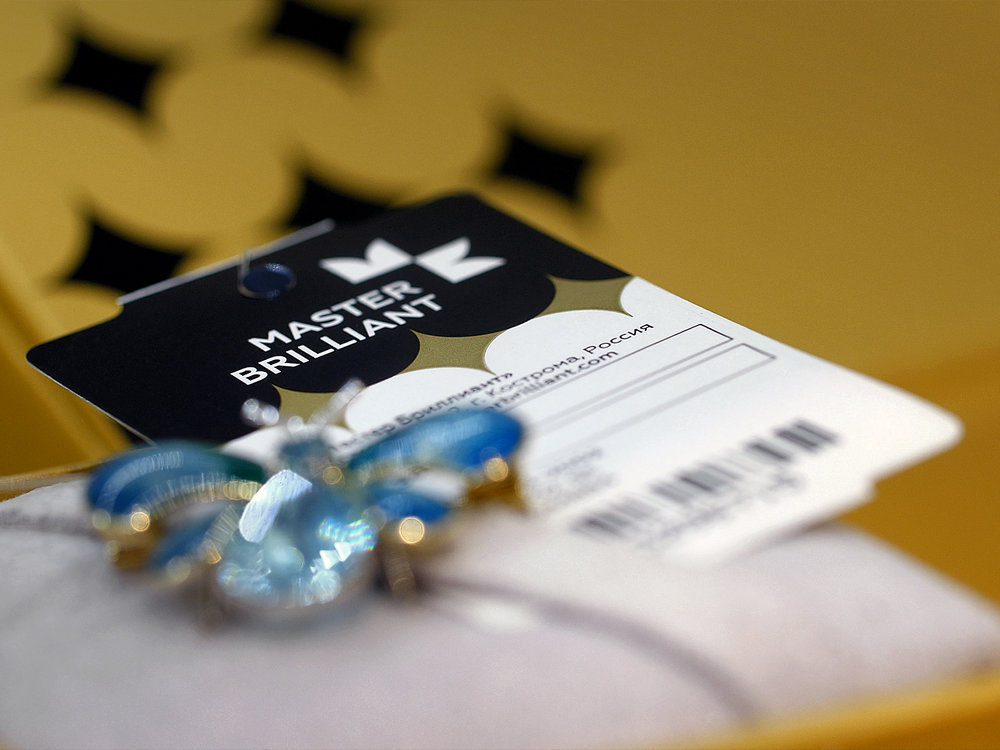
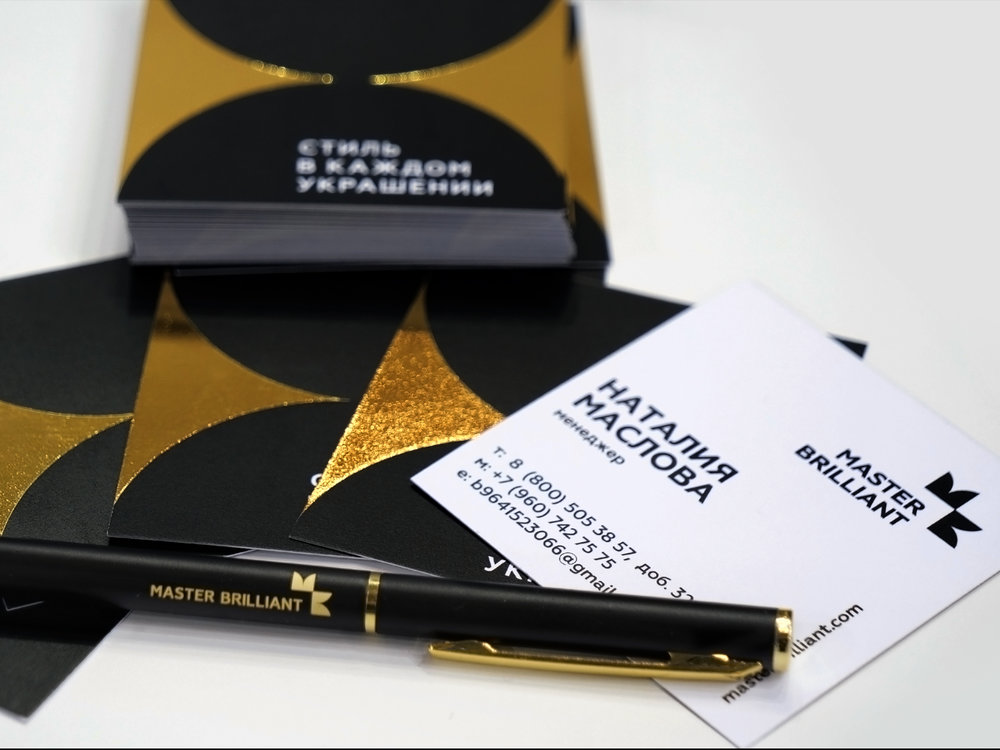
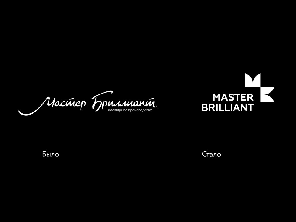
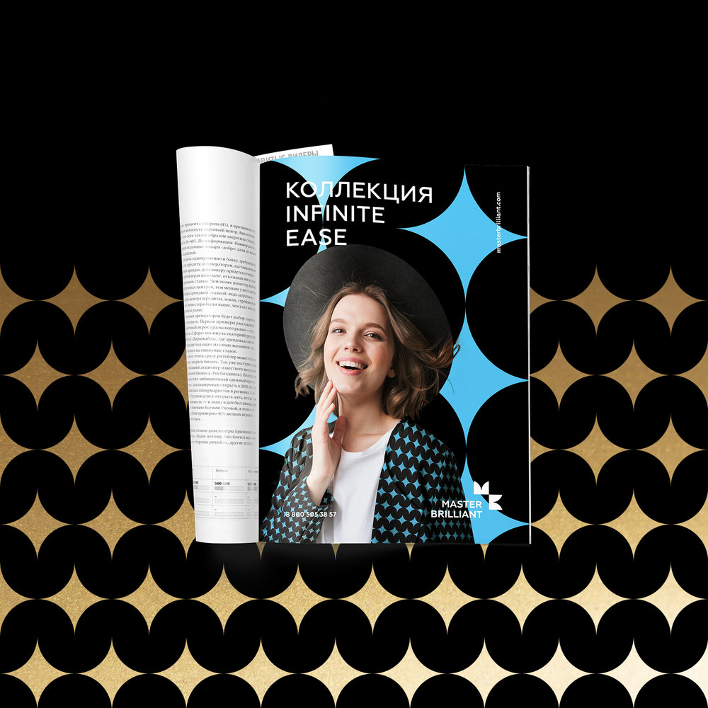
Depot team has updated Master Brilliant jewelry brand identity.The desire to remain relevant pushes brands to look for ways to develop, to adapt to the changing economic environment and to respond to audience needs as accurately as possible. Master Brilliant brand has been successfully developing in the Russian and CIS jewelry markets for 15 years. The brand decided to change its visual concept to become closer, more understandable to consumers and to bring tangible emotion into communication.Depot faced with the task of rethinking the existing visual concept, developing a new logo and creating a memorable, understandable, but at the same time flexible corporate identity. In addition, the updated design had to respond to changes in the company’s strategy: plans for an active brand in retail sales.– We wanted a new image – a lighter and visually simpler one, – Evgeny Petrov, Master Brilliant CEO describes. – We wanted to change the packaging perception. The goal was to stand out from the market and create a new distinguishing style.The new style is based on a simple but at the same time semantically rich sign — a minimalistic image of the reflection from the gem stone. On the one hand, the shape of the figure is associated with the sharp edges of the jewels, and on the other hand, with the smooth lines of already cut stones. The company logo also encrypts the first letters of the brand name, and in the counter form you can see the main system-forming element – the reflection.In the developed identity a rather narrow color spectrum is used. It underlines the conciseness of the approach and the ease of the corporate style usage. The basis consists of pink, blue and green colors, as well as the shade of gold – for the design of premium lines.– We managed to create a simple design system with the possibility of almost endless development, – Daria Ivanova, Depot designer shares. – The style is easily scaled, convenient and user friendly. Despite the minimalism – it looks premium. Moreover, it is clearly recognizable among competitors and can not be confused with competitors.
