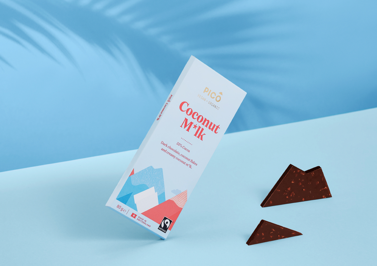
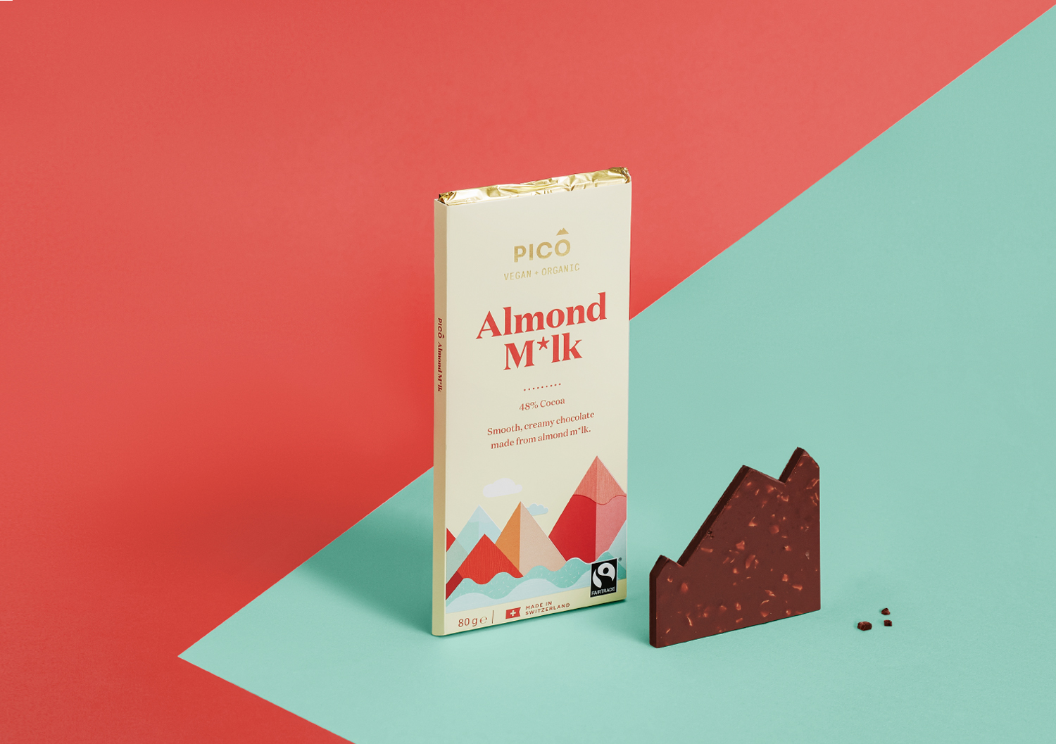
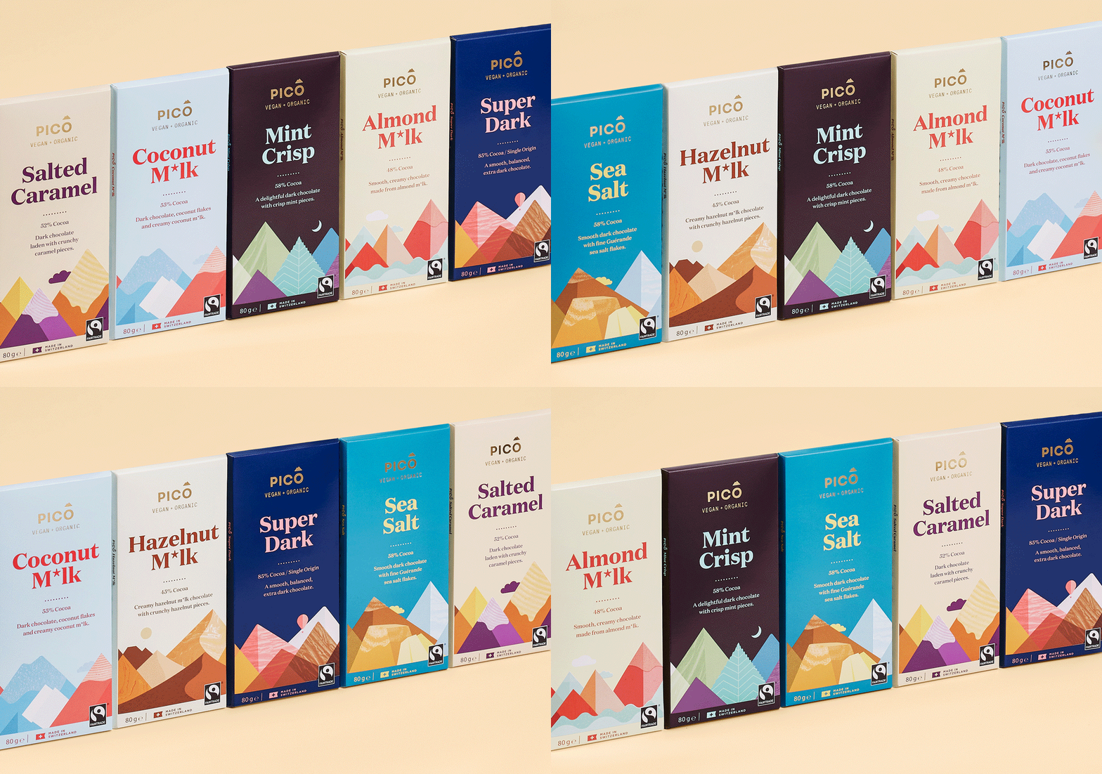
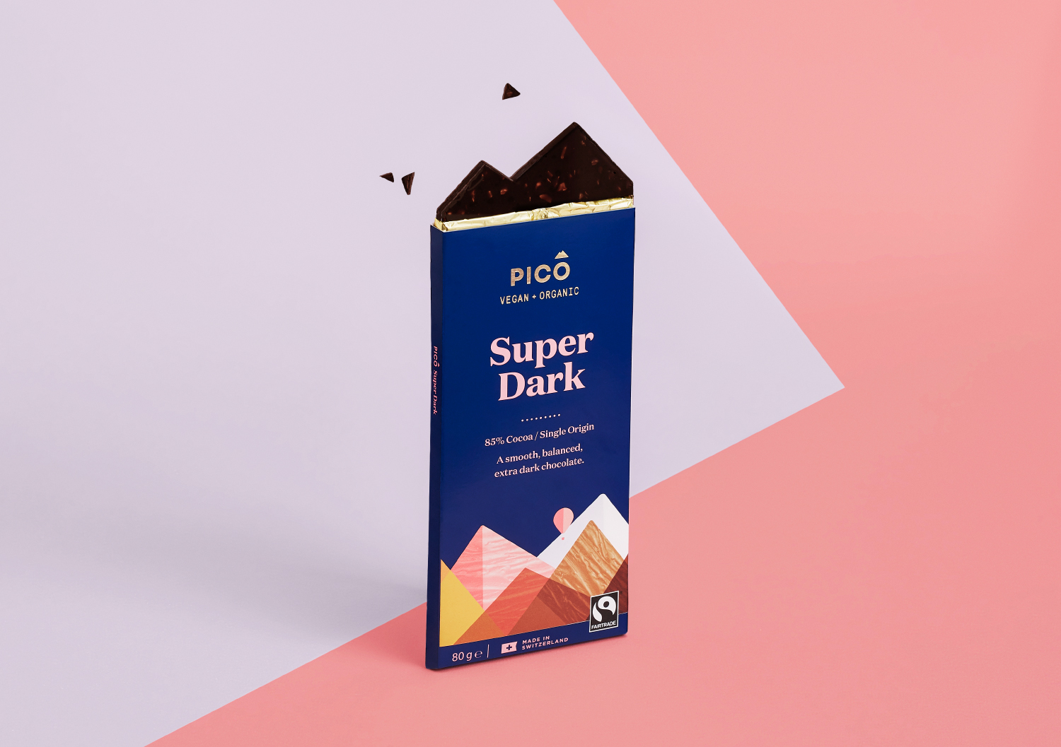
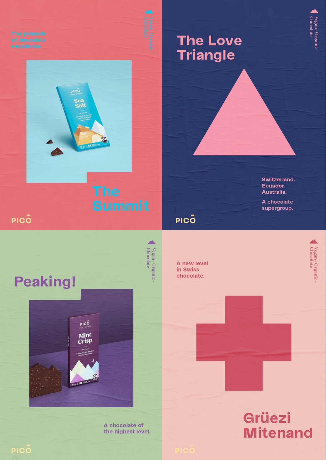
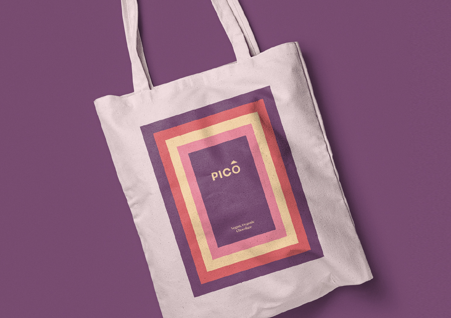
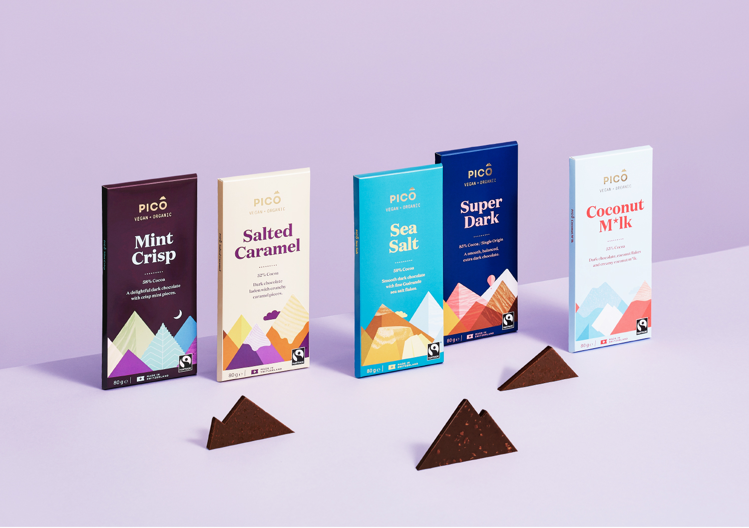
Pico Chocolate – Brand refresh, Pico is the Spanish word for ‘Peak’, meaning at the very highest level. The name was the guiding promise as the founders journeyed across the world to find the ultimate organic & vegan gourmet chocolate experience. The taste of Pico Chocolate is a delicate balancing act, and the Swiss Master Chocolatiers have it down to perfection. Launched in 2016, Pico’s share was being eroded by new competitors flocking to the category. An evolution was required for the brand to work harder on shelf and to elevate the premium product inside. Our aim was to retain the equity of the current brand and take existing customers with us. A new colour palette lifts the tastiness of the distinct flavour combinations. Bold typography ensures stand out on shelf and reflects the quality of the chocolate. Supported with a poster campaign, the new packaging looks to restore Pico back to its number 1 position. The initial packaging design was created by Swear Words
CREDIT
- Agency/Creative: marx design
- Article Title: Marx Design Create Brand Evolution for Pico Vegan Chocolate
- Organisation/Entity: Agency, Published Commercial Design
- Project Type: Packaging
- Agency/Creative Country: Australia
- Market Region: Oceania
- Project Deliverables: Brand Advertising, Brand Architecture, Brand Design, Brand Experience, Brand Guidelines, Brand Refinement, Brand Strategy, Branding, Graphic Design, Identity System, Packaging Design, Photography, Product Architecture, Product Naming, Rebranding, Research, Tone of Voice
- Format: Box, Sachet, Wrap
- Substrate: Pulp Carton, Pulp Paper


