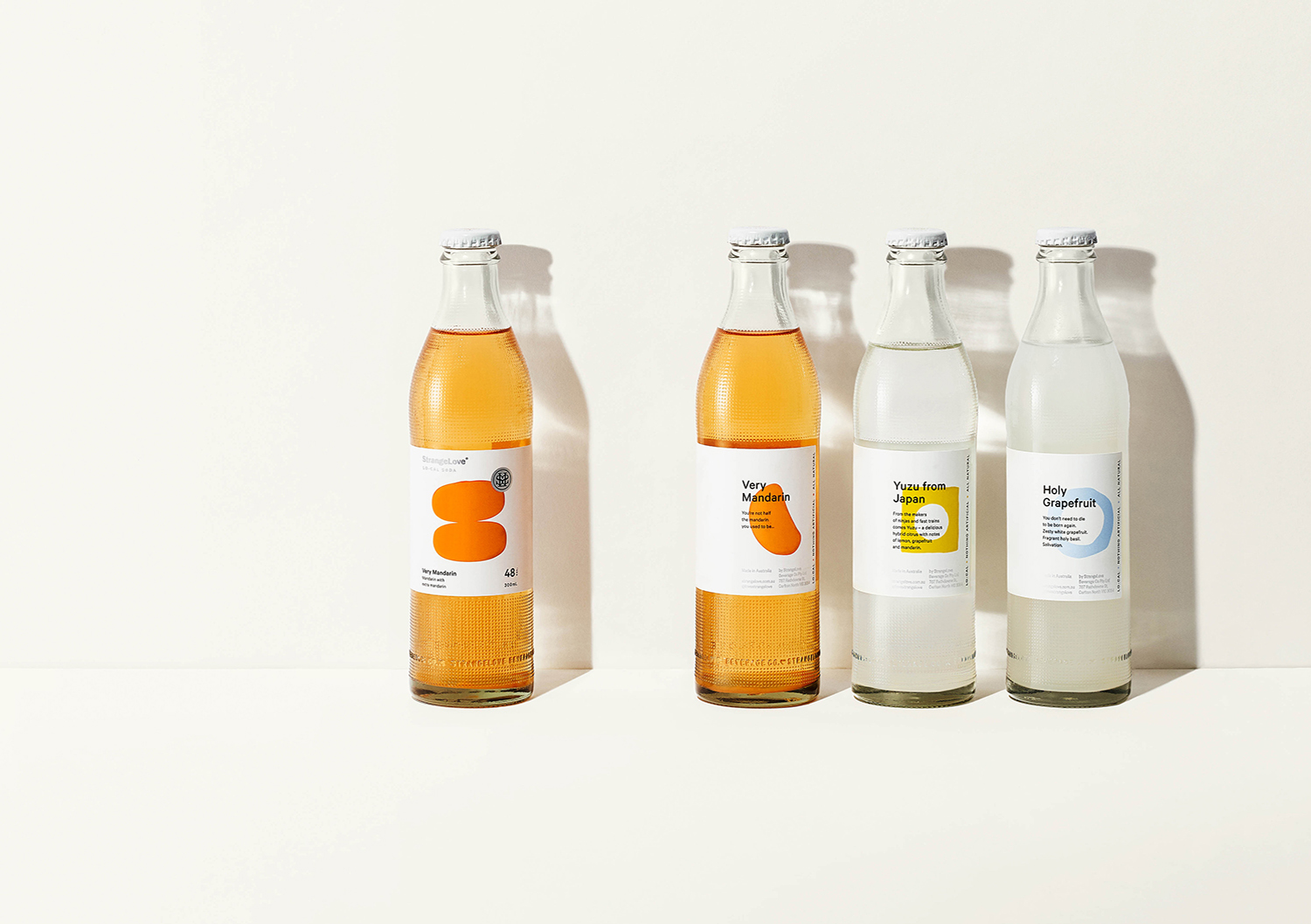
Melbourne-based StrangeLove is an unconventional drinks company. While the market for kombucha and kefir was soaring, the soda market was saturated by sameness (and sugar). There was an opportunity to disrupt. The packaging had to do a lot of work to help communicate the brand’s difference. Low in sugar, high in flavour (think cloudy pear, yuzu and smoked cola) this range needed to maintain StrangeLove’s challenger spirit, yet the audience was more adult and sophisticated.
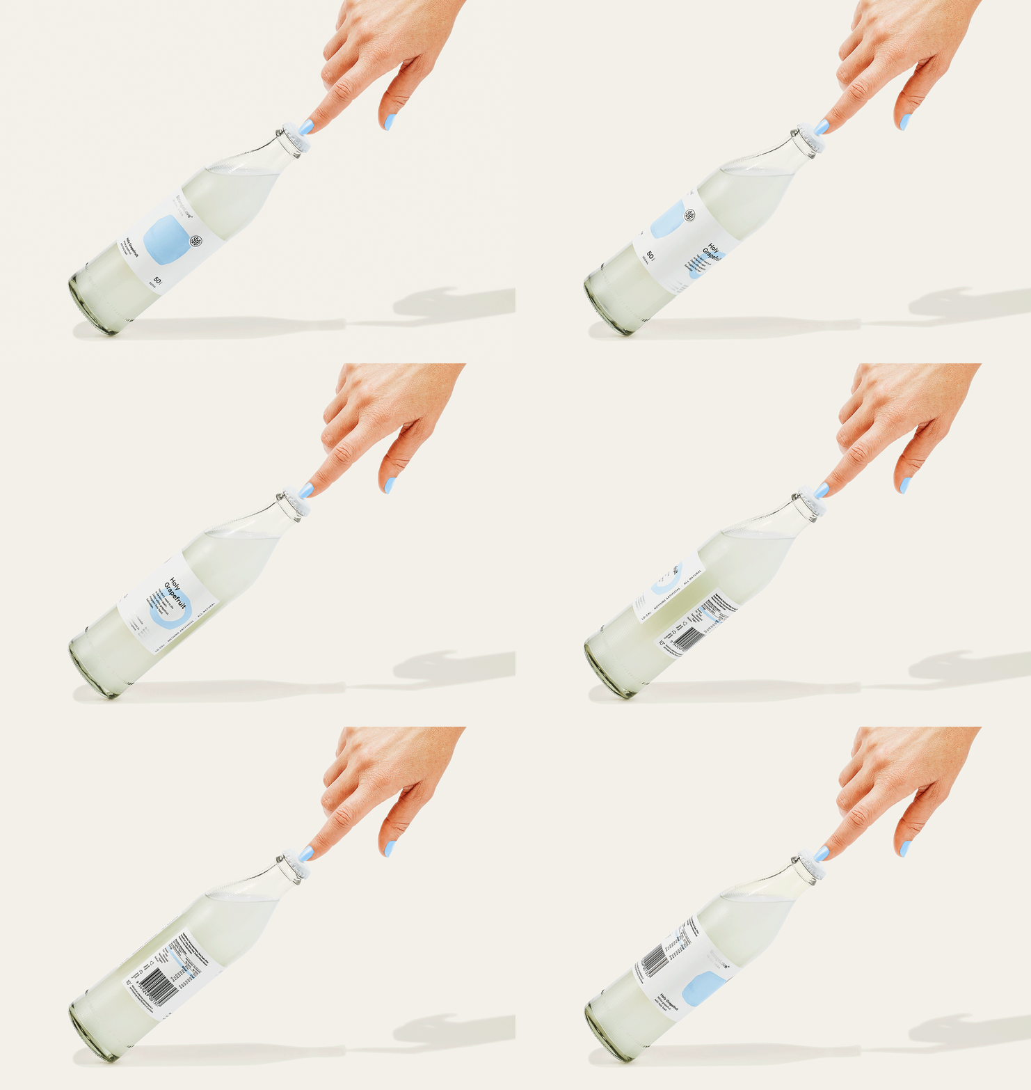
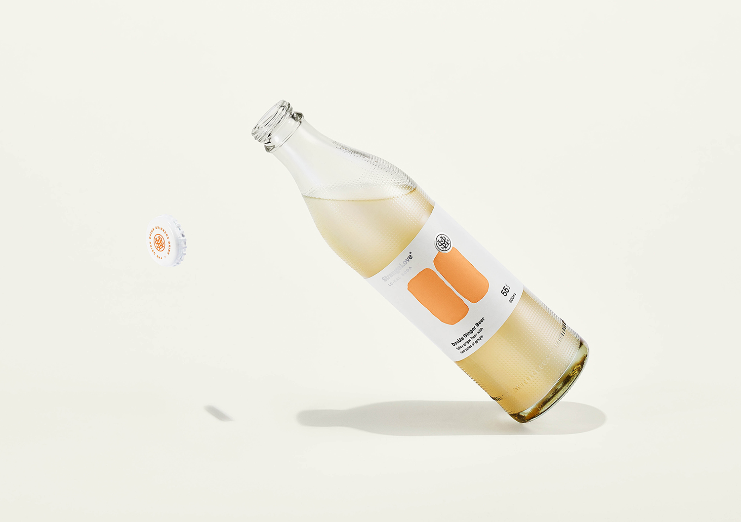
Exploration took us back to the origin of sodas. Historically small-batch brewed in apothecaries, we embraced cues from the glory days of 1960s, 70s and 80s. We focussed on the idea of ‘craft soda’ — refreshment, flavour and effervescence – with a touch of nostalgia. We landed on a concept we termed ‘premium abstraction’– paired back design with a custom, ownable form supported by a singular graphic motif. The bespoke bottle borrows traditional cues of the past yet is modernised for the future. Made of glass (for both its feel and recyclability), the form was influenced by minimalist masterpieces from Braun. The dot pattern is a key asset of the brand, brought to life in brand communications as a minimalist, graphic interpretation of soda.

CREDIT
- Agency/Creative: Marx Design
- Article Title: Marx Design Create Brand and Packaging Design for StrangeLove Local Soda
- Organisation/Entity: Agency, Published Commercial Design
- Project Type: Packaging
- Agency/Creative Country: New Zealand
- Market Region: Global
- Project Deliverables: Brand Advertising, Brand Architecture, Brand Guidelines, Brand Identity, Brand Refinement, Brand Strategy, Packaging Design, Photography, Product Architecture, Rebranding, Structural Design
- Format: Bottle
- Substrate: Glass Bottle


