Kilwo – Visual identity Rhythm combined with mystery – sounds blend with numbers to create a soft yet strong harmony, A graphic language that combines the rigor of line with color and personal character
Kilwo is a place that researches musical instruments for each individual, including a group of people who understand that individual and their desires for their musical instrument. Kilwo’s purpose is to determine the exact needs of customers, as a musical instrument research and development system.
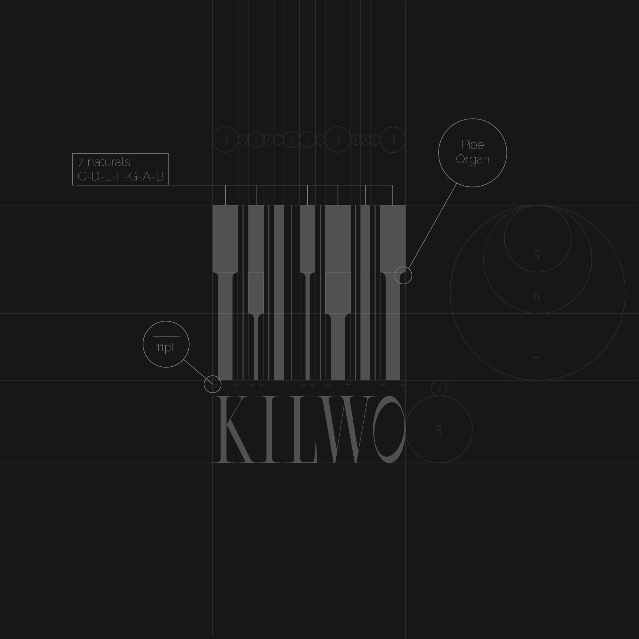
The Kilwo symbol is created from the elements “Barcode-Fret-Strings-Pipe Organ”. The overall logo is different lines that outline the unique paths and characteristics of individuals. Typo Kilwo uses bold, thin and thick lines that combine harmoniously with the logo
Kilwo research and development unit for musical instruments like pianos, demographic research based on each individual’s habits and behavior
Kilwo assisted individuals in creating its visual identity. The main goal was to create a symbol that represents both the user approach regarding the large amount of data collected on an individual. At the same time, it must reflect the unique characteristics suitable for that individual during use
Logo Use it to fine-tune the balance and proportions of your logo, but allowing for adjustments can enhance the readability and impact of your design. Applying the golden ratio to logo design is a combination of science and intuition.
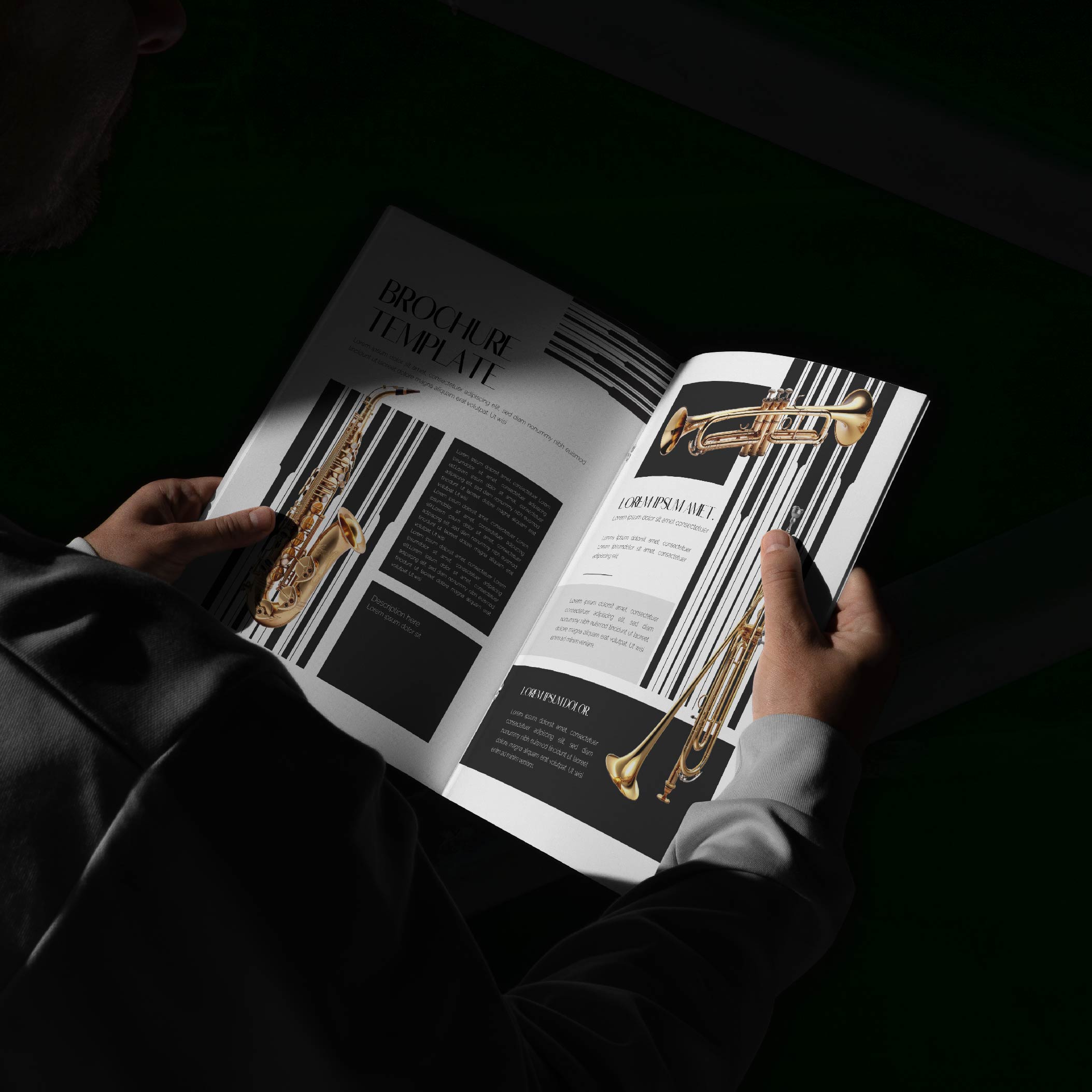
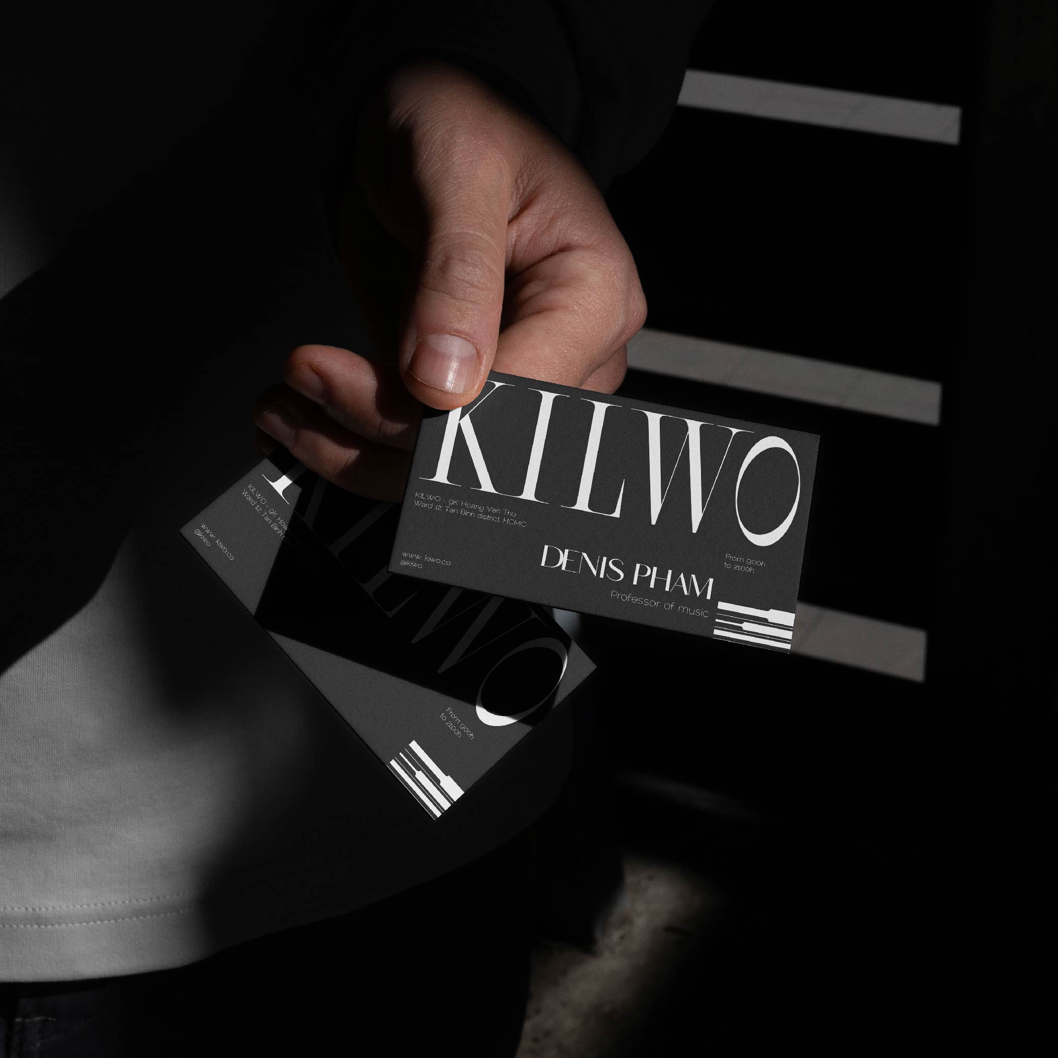
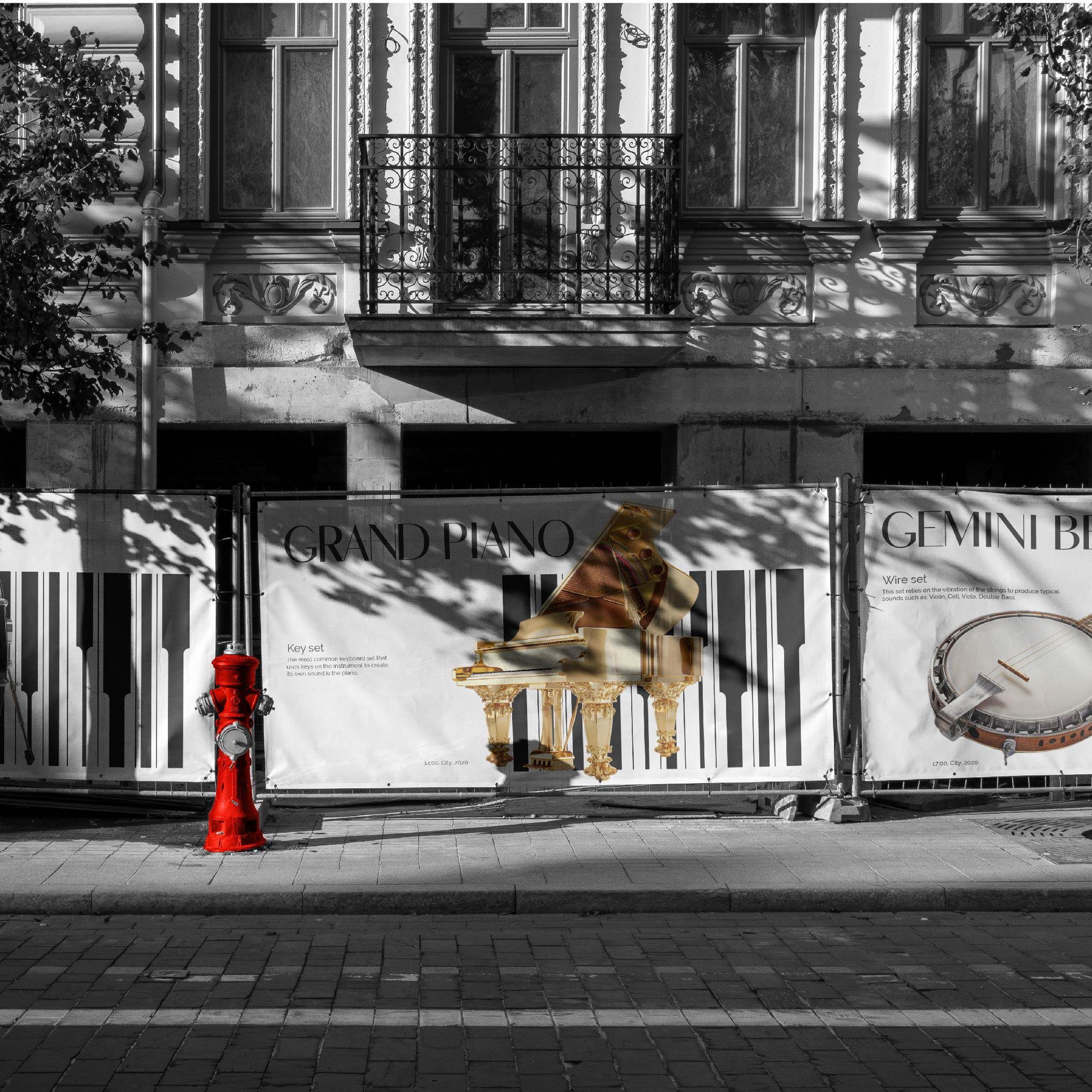
The “Kilwo bold clean lines” symbol, used as a cross-cutting element with the company’s logo, ties together the various elements of the graphic identity. It represents the diversity of icon sources and color ranges defined for image recognition. Fleck is a serif typeface that delves into the realm of exaggeration and drama. True to its name, Fleck is defined by extended features that culminate in small points and spots, adding a touch of eccentricity and elegance to each character. The rules of professional rigor in each client’s data collection and analysis are combined with each client’s demonstration of support for participants. All of these aesthetic considerations contribute to defining graphic principles and brand product imagery that are consistent with the goals of working for that customer’s benefit.





CREDIT
- Agency/Creative: Marvis Nguyen
- Article Title: Marvis Nguyen’s Branding for Kilwo Fuses Musical Precision with Unique Identity
- Organisation/Entity: Agency
- Project Type: Identity
- Project Status: Published
- Agency/Creative Country: Vietnam
- Agency/Creative City: Hồ Chí Minh
- Market Region: Asia
- Project Deliverables: Brand Identity
- Industry: Manufacturing
- Keywords: KILWO - Visual identity
-
Credits:
Designer: Marvis Nguyen


