


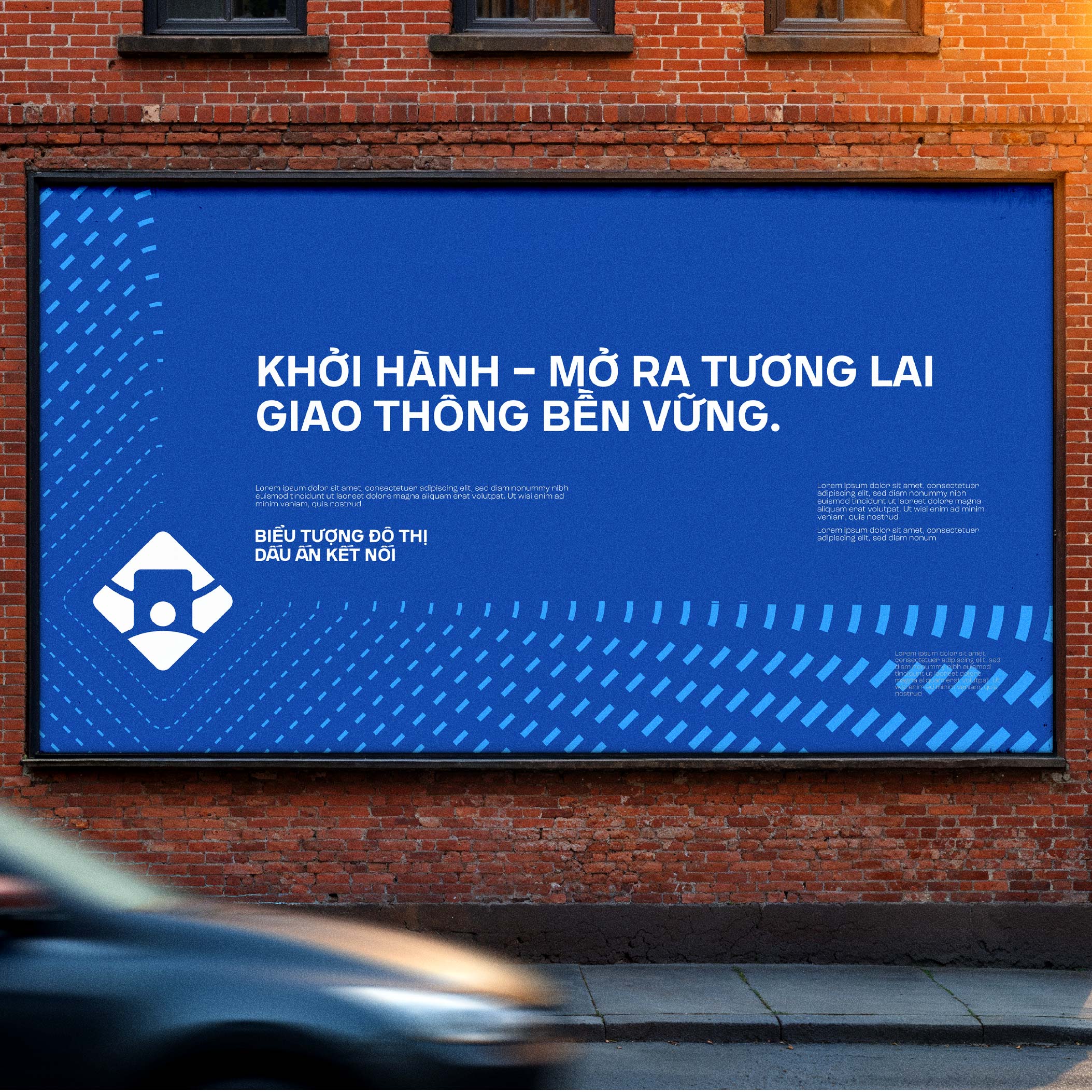
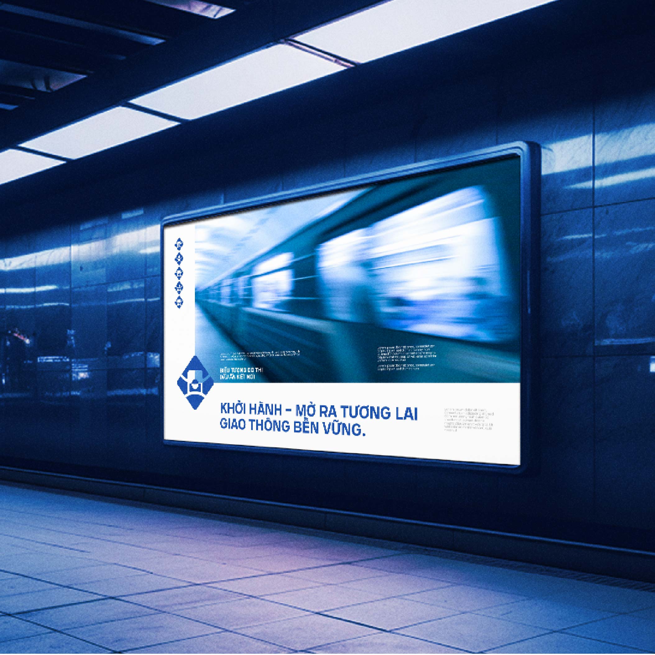
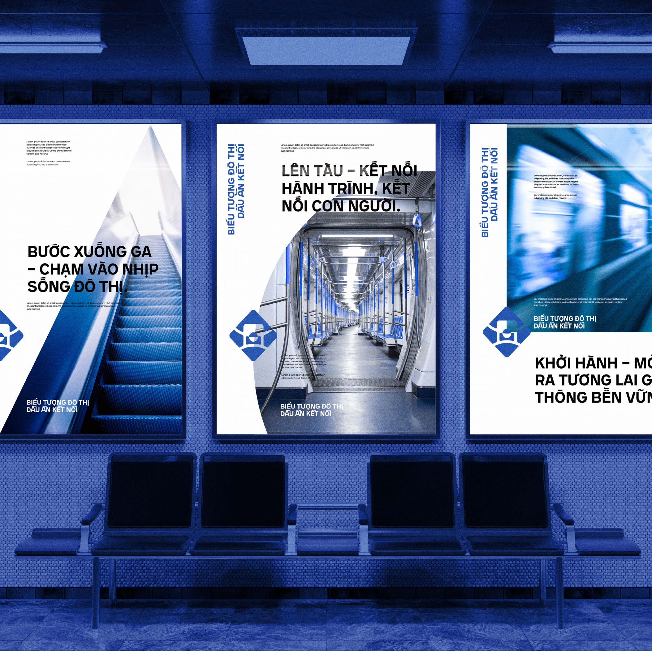
Biểu Tượng Đô Thị – Dấu Ấn Kết Nối™ Visual identity
Introduction: Mark of Connection
At Urban Symbol – Mark of Connection, we believe that public transportation is not only a means of travel but also the thread that connects people with the city. Connection shortens distances and allows us to share every moment of urban life. It bridges modernity and tradition, individuals and communities, and drives the development of a civilized city where every journey becomes a meaningful and sustainable experience.
Synchronization – The Spirit of a Connected City
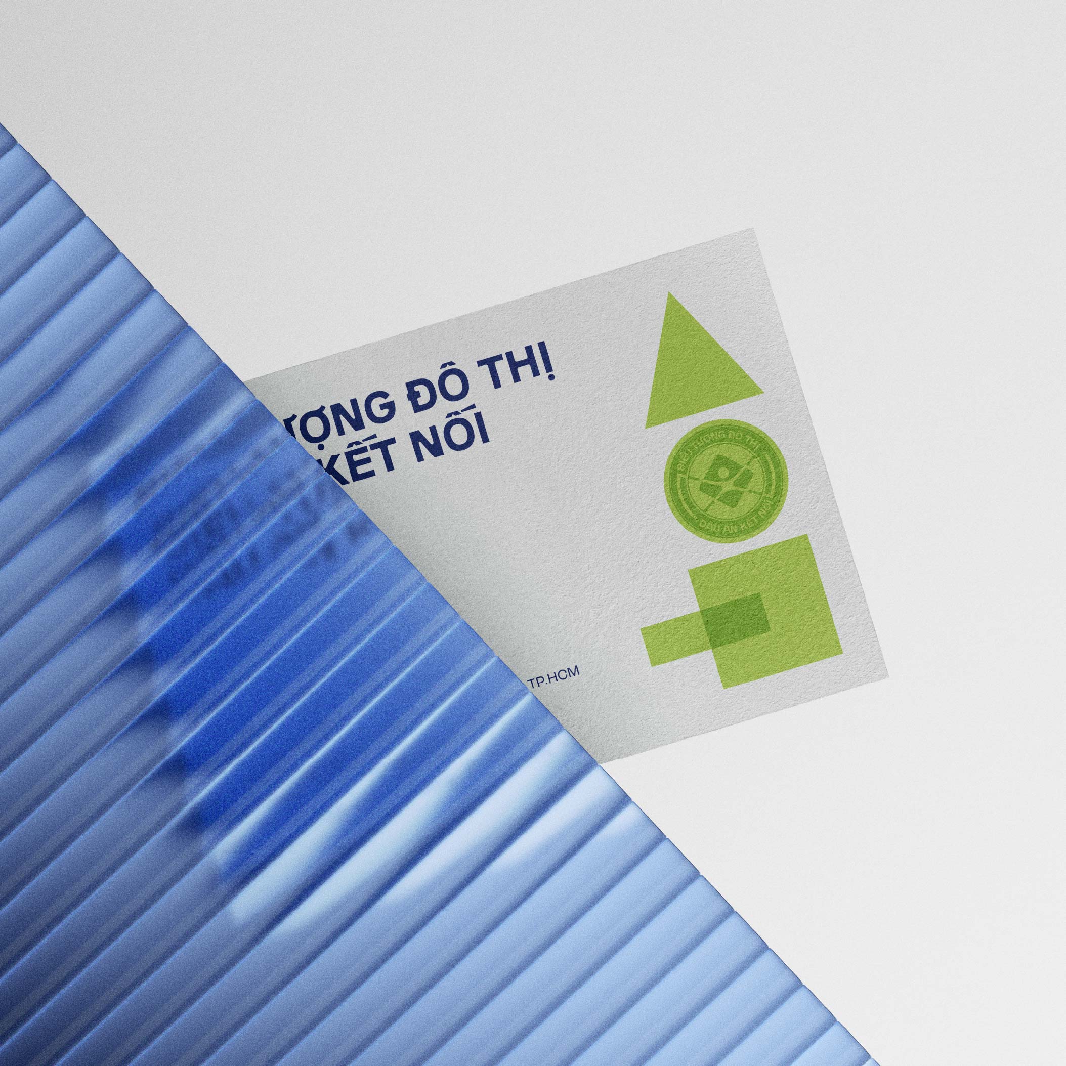
The logo originates from three basic geometric forms — circle, square, and triangle — each representing an essential principle of urban development: system, order, and synchronization. The circle conveys continuous motion and infinite connection, the square evokes stability and foundation, while the triangle expresses upward direction, progress, and growth. Green was chosen to reflect sustainable, eco-friendly transportation, while blue represents technology, modernity, and connectivity. Together, these forms and colors turn the logo into more than a visual mark; it becomes a message of synchronization, user-friendliness, and integration into every citizen’s journey.
Personal Creativity – Forms and Colors
The design takes a minimalist approach, using geometry as its foundation. At its center, the intersecting shapes form the figure of a human with open arms, symbolizing the principle of “people at the center” in urban strategy. The outer embracing curve represents the network of roads, bus lines, and metro routes that gradually weave the city together. Green signifies life and the environment, while blue communicates trust and technology. The harmony of these two colors reinforces a vision of a city that is green, sustainable, and modern. The logo is not merely an identity mark but also a personal creative expression of a city where public transportation is a bridge between people and their urban environment.
Community-Oriented Identity
The logo is grounded in the idea of a “connection mark,” visualized through a surrounding circle that symbolizes endless urban circulation. At its center stands the human figure with open arms, which simultaneously represents the convergence of transportation routes. Soft curves within a geometric framework balance approachability with solidity, while the green–blue palette highlights a city that is eco-friendly, smart, and human-centered. Through this, the symbol conveys that public transportation is both a mode of travel and a social bond that connects communities, shaping a sustainable future for Ho Chi Minh City.
Distinctiveness, Aesthetics, Abstraction, Applicability
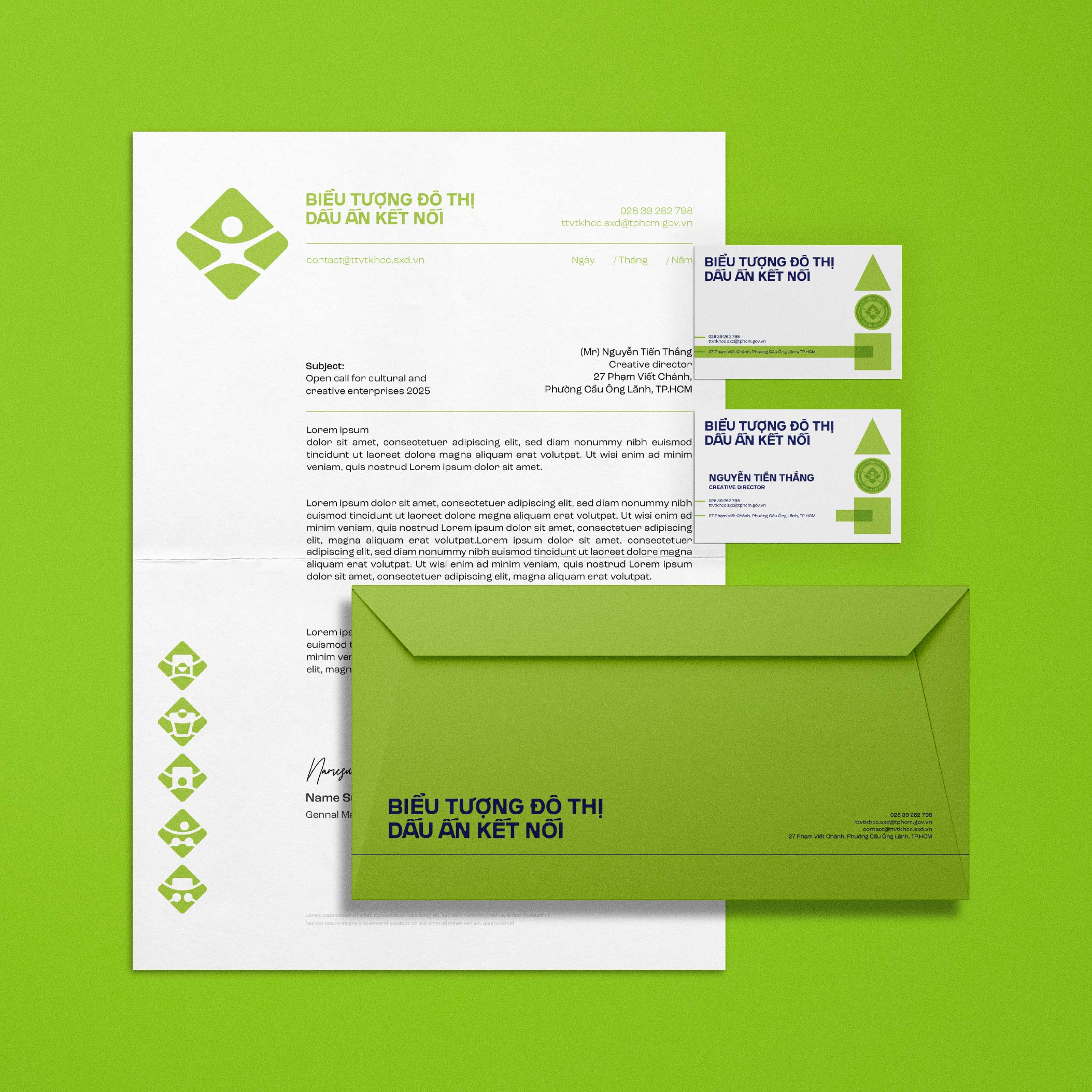
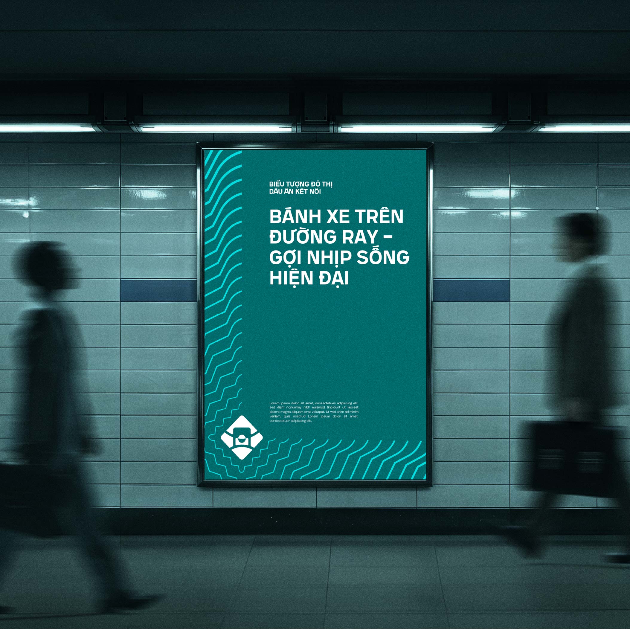
The design reflects the unique identity of Ho Chi Minh City’s transportation system through its infinite circle of connection and central human figure. It symbolizes modernity, connectivity, and community engagement, aligned with the city’s dynamic spirit. The combination of geometric shapes with clean lines and a green–blue palette creates a strong yet approachable aesthetic, inspiring positivity and resonating especially with younger generations. The composition is compact, clear, and memorable, conveying the values of connection, sustainability, and community service without unnecessary complexity. Its simplicity allows for versatile application across buses, bus stops, tickets, uniforms, digital platforms, and media, while also supporting a broader identity system including stickers, mascots, and icons.
Abstract Symbolism and Geometric Forms
Curved lines, grid structures, and locator shapes create a sense of movement and direction. The square symbolizes stability and infrastructure, representing depots, stations, and architectural blocks that ground the system in sustainable planning. The circle reflects community, continuity, and people at the heart of mobility, while also suggesting wheels, cycles, and urban flows. The stylized triangle embodies forward motion and progress, its green segments evoking pathways and routes that expand the network. Together, square, circle, and triangle combine into a unified whole, symbolizing that transportation is not only about infrastructure but also about centering people and striving for sustainable growth.
Infinity Symbol
The infinite curve reinforces the concept of endless connection, embodying the tireless flow of public transportation and its role in uniting all areas of the city. It symbolizes sustainability and permanence, reflecting Ho Chi Minh City’s long-term vision of green, eco-friendly development. With its blue and green palette, the infinity form suggests environmental stewardship while also evoking digital transformation, innovation, and modernity. It speaks of harmony, balance, and community while emphasizing the importance of a unified system.
Steering Wheel Symbol
Another visual inspiration is the steering wheel, a mark of unified navigation. Formed by symmetrical curves, it conveys rhythm, motion, and orientation. At its center lies the metaphorical “urban core” where all routes, vehicles, and people converge. Accent strokes suggest rhythm and synchronization, while neon green details emphasize technology, sustainability, and eco-friendly development. More than a tool for control, the steering wheel becomes a symbol of coordinated connection, reflecting a city in smooth operation where public transportation draws people closer together toward a progressive future.
Rounded Corners and Curved Paths
Rounded corners mirror the turns, roundabouts, and pathways of the city, embodying the very breath of urban mobility. They express continuity and seamless flow, eliminating breaks that might disrupt the experience of travel. Their softness conveys safety, comfort, and accessibility, while also signaling friendliness and approachability. In combination with geometric blocks that reference signage and traffic symbols, these forms balance systematic order with the adaptability and flexibility of a modern urban environment.
Color System
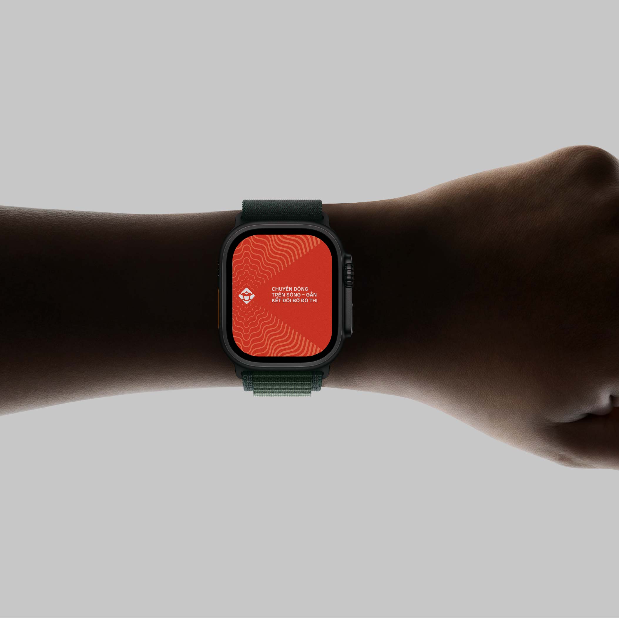
The palette communicates values of modernity, trust, sustainability, and vitality. White symbolizes transparency, fairness, and digital transformation, while navy blue conveys trust, safety, and technology. Green emphasizes sustainability, urban greenery, and eco-friendly energy, while teal introduces dynamism, innovation, and a youthful spirit. Applied to different transport modes, the palette becomes functional as well as symbolic: aqua green for buses reflects friendliness and connection, deep blue for metro services conveys reliability, urban green for trams highlights sustainability, river orange for water transport suggests energy and movement, and bright yellow for bicycles encourages an active, healthy lifestyle.
Conclusion
The Urban Symbol – Mark of Connection is more than a logo; it is a visual identity that represents a city’s aspirations. By combining geometry, symbolism, and a carefully curated palette, the design speaks to sustainability, modernity, and human-centered growth. It is a mark that captures the continuous circulation of the city, the role of people at its center, and the vision of a future where public transportation becomes the true bridge between communities and the urban environment.
CREDIT
- Agency/Creative: Marvis Nguyen
- Article Title: Marvis Nguyen Shapes A Sustainable And Modern Identity For Biểu Tượng Đô Thị – Dấu Ấn Kết Nối
- Organisation/Entity: Freelance
- Project Type: Identity
- Project Status: Published
- Agency/Creative Country: Vietnam
- Agency/Creative City: Ho Chi Minh city
- Market Region: Asia
- Project Deliverables: Brand Identity
- Industry: Public Utility
- Keywords: Biểu Tượng Đô Thị - Dấu Ấn Kết Nối
-
Credits:
Graphic Design: Marvis Nguyen


