


Huế Times Square™ Visual Identity
Huế Times Square is a new symbol of harmony between the imperial heritage and modern lifestyle, envisioned as a leading dynamic complex at the heart of Hue City. Inspired by the deep cultural and thousand-year historical richness of the ancient capital, Hue Times Square is not merely a multifunctional commercial and entertainment center — it is a space of cultural convergence, where traditional values are revived and elevated through a contemporary lens.
With the mission of becoming a new cultural touchpoint in Hue, Hue Times Square continuously affirms its role as a modern urban icon — connecting the local community with international visitors through shopping, cuisine, arts, and lifestyle experiences deeply rooted in the spirit of “Hue,” yet refreshed with a youthful, vibrant, and modern identity.
Hue Times Square is more than just a place — it is where the past and future meet, where heritage continues to live and shine in a new era, contributing to the elevation of Hue’s cultural values and promoting the city’s sustainable development.
Designing the logo for Huế Times Square posed a unique and challenging creative task — one that required delicacy and balance between two seemingly opposing elements: the modern and the traditional. How can a symbol evoke the profound cultural legacy of Huế’s ancient capital while still conveying the youthful, dynamic, and refreshing spirit of a contemporary commercial–cultural complex? That was the central challenge at the heart of this design brief.
Beyond aesthetics, the logo needed to carry symbolic weight — deep enough to honor the essence of Huế, yet minimal and flexible enough to be adaptable across both traditional and digital media platforms, from outdoor signage to interactive digital applications. It was a balancing act between the “stillness” of heritage and the “motion” of modern commerce.
A timeless symbol must not only be beautiful in the present but also resilient — capable of adapting to future market changes without losing its original meaning. Thus, designing the logo for Huế Times Square was never merely about crafting an image; it was about creating a visual memory — one that connects historical depth with future aspirations and encapsulates Huế’s identity in the form of a globally ambitious urban brand.
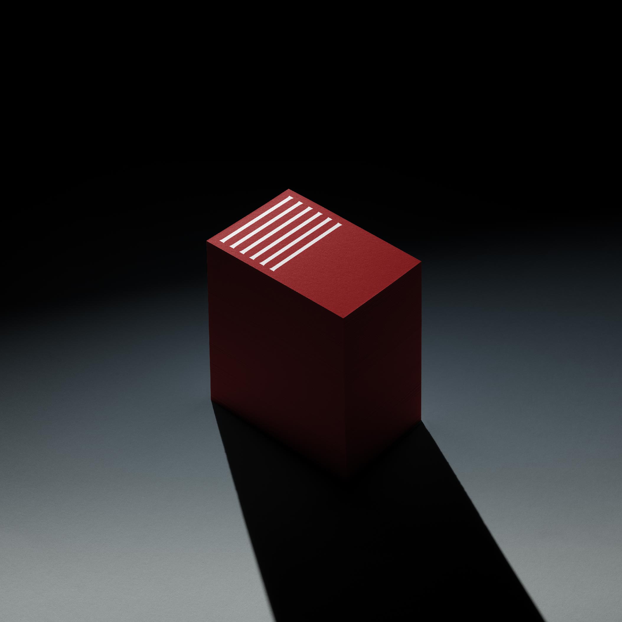
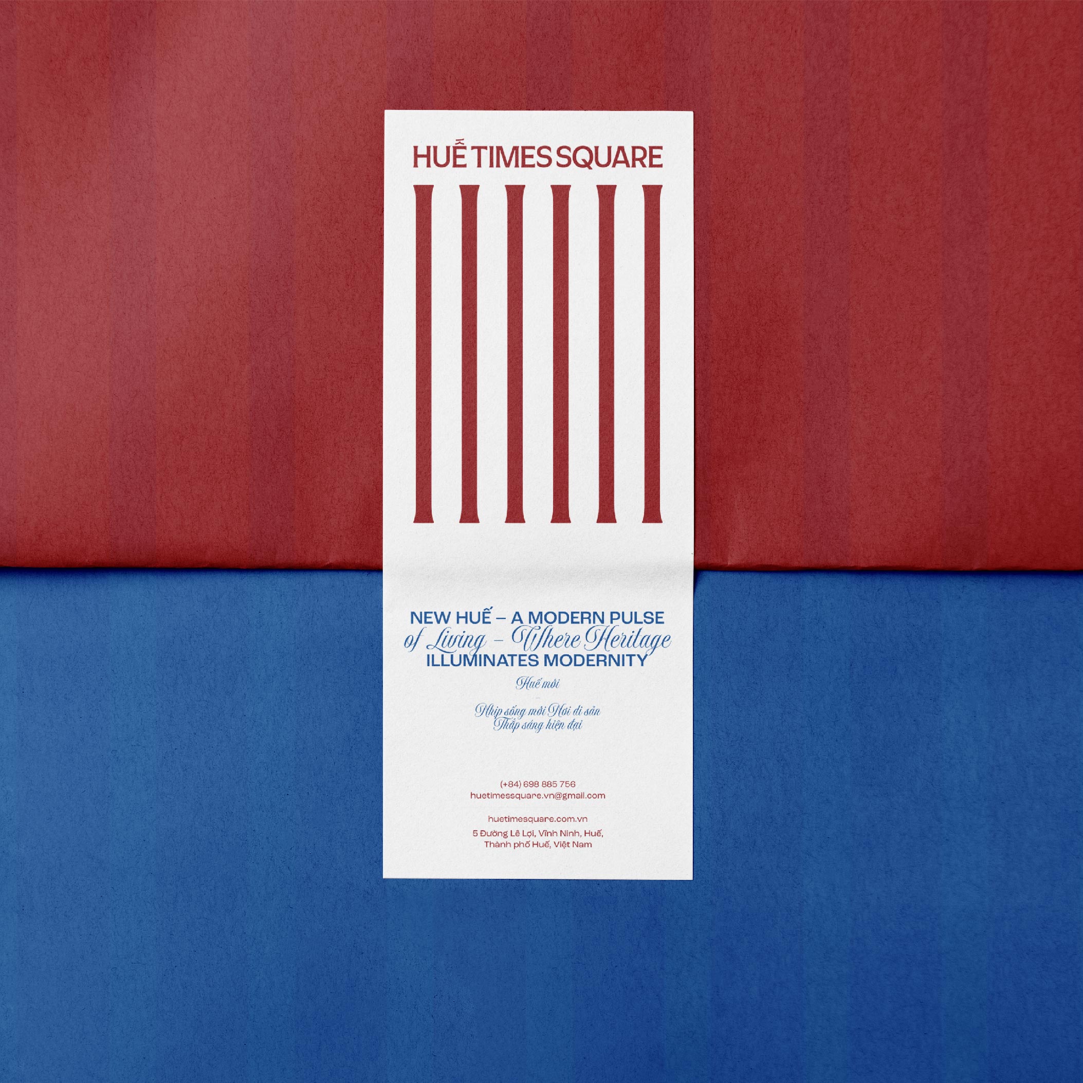
Given these demanding requirements and rigorous criteria, the design team shaped the Huế Times Square logo as a complete response to the challenge of harmonizing tradition and modernity. The logo is more than an identity mark — it is a distillation of the spirit of the imperial city: solid and profound — represented by a stylized column motif inspired by Huế’s traditional architecture. The spaces between the columns symbolize the passage of time and the rhythm of a new life — where heritage is not forgotten but illuminated by the freshness of the present age.
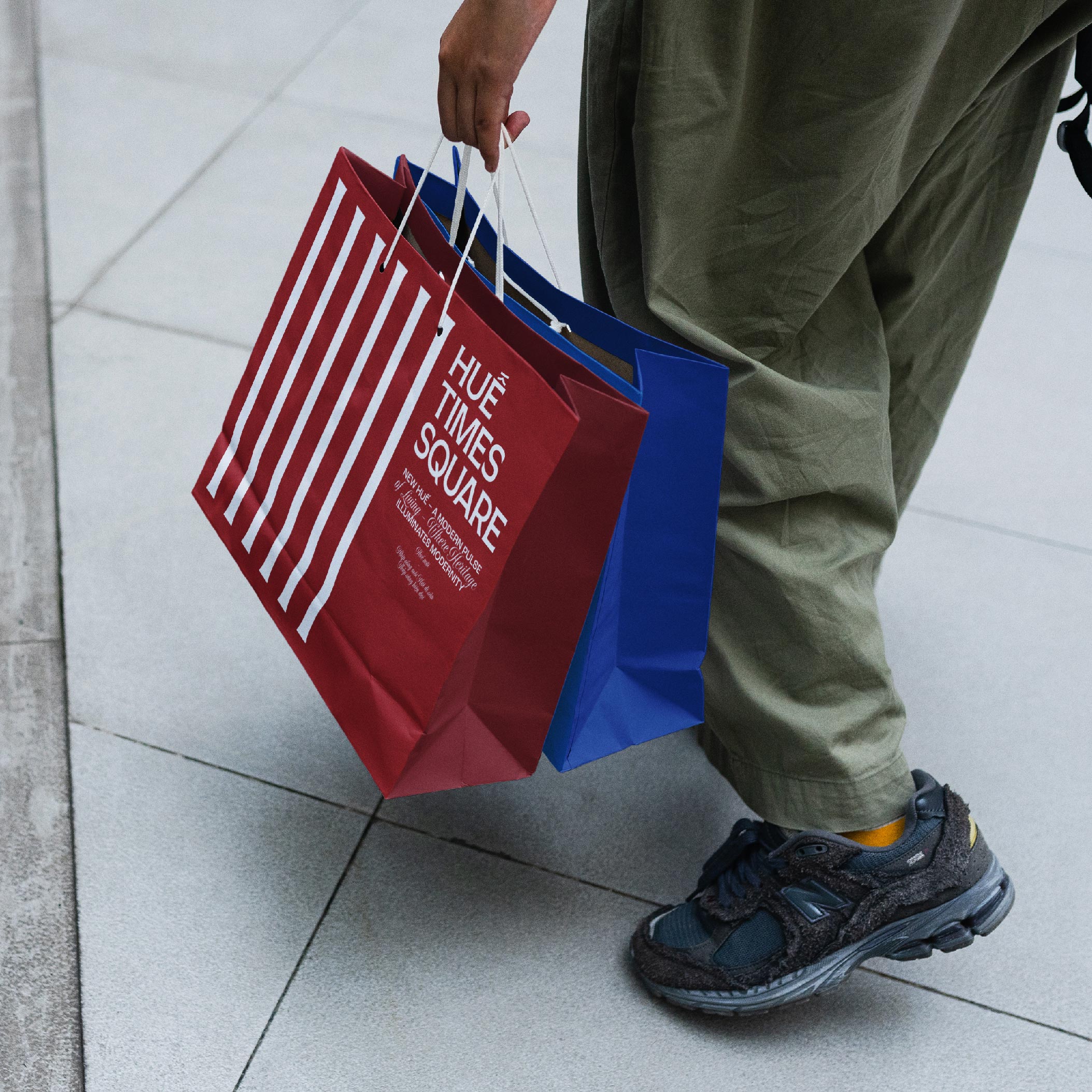
The rich crimson red paired with deep modern blue creates a color palette that harmonizes emotion with reason — the weight of tradition with the ambition to grow. This minimalist yet intentional design ensures flexibility across all applications, from outdoor branding to digital platforms, maintaining the brand’s integrity down to the smallest detail.
Out of these high standards and creative boundaries, the Huế Times Square logo emerges as a visual declaration — a symbol of imperial heritage in a modern flow, affirming Huế’s place on the map of the region’s leading cultural and commercial cities.
Color Palette – Bridging Historical Depth and Contemporary Energy
Imperial Red: As the dominant color in royal attire during the Nguyễn Dynasty, imperial red in the logo evokes the luxurious, noble beauty of Huế’s imperial past. Beyond symbolizing a glorious history, it emphasizes the depth of culture and enduring value of heritage.
Deep Blue: A symbol of depth, stability, and global vision. This color reflects Huế’s vibrant modern rhythm — a city embracing international integration while preserving its unique cultural identity.
Symbol – A Cultural Journey Connecting Past, Present, and Future
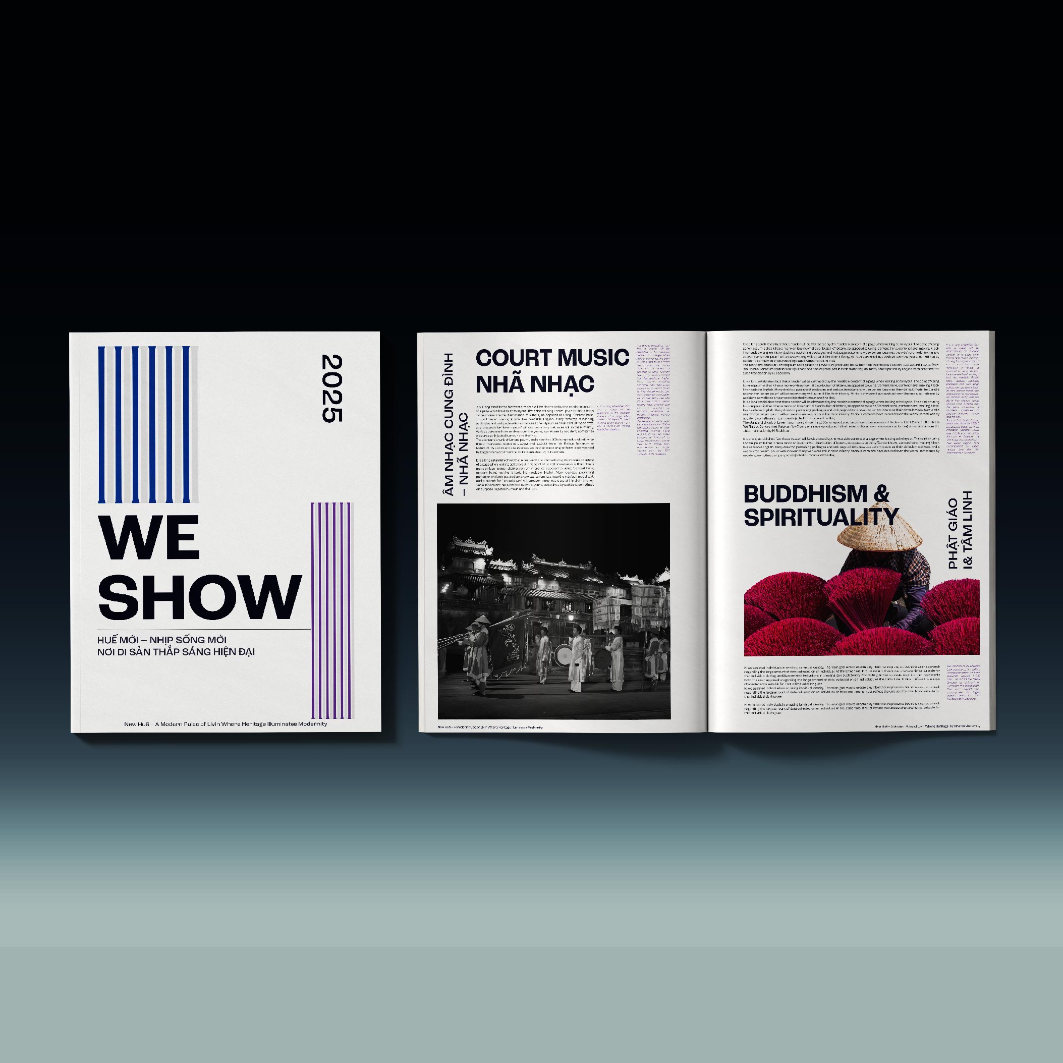
Six Stylized Temple Pillars: Designed as time-bearing columns, these six pillars represent six defining values of Huế:
Imperial architecture
Court music (Nhã nhạc)
Sophisticated cuisine
Poetry and knowledge
Buddhism and spirituality
Folk art and traditional craftsmanship
Tiled Rooflines and Timeline: Each pillar acts as a “pillar of time,” reflecting the parallel progression of tradition and modernity — upholding the memories of the imperial past while reaching forward into the future.
Spaces Between Pillars: These evoke images of traditional Vietnamese rooflines — reminiscent of communal houses, palaces, and the Five Phoenix Pavilion — symbolizing architectural rhythm, order, and cohesion. These negative spaces also represent the flow of time — a continuum where the past and future coexist.
Form – Merging Heritage with a Modern Urban Identity
Column-Inspired Typography: The “Huế Times Square” logotype is crafted with geometric, angular yet softened forms — evoking the structure of the Imperial Citadel while retaining a youthful, dynamic character befitting a contemporary urban center.
The Stylized “Ê” Accent Mark: The circumflex on the letter “Ê” is refined into a tower-like peak or pillar top — serving as a symbolic focal point that merges classical beauty with abstract ambition, representing Huế’s aspiration to rise and reach new heights.
Overall – The Story of a New Symbol in the Heart of the Imperial Capital
The Huế Times Square logo embodies the intersection of memory and modernity — the stillness of heritage and the movement of a new era. It is not merely a brand identity, but a visual declaration reflecting the spirit of:
“Essence of the Imperial Capital – Shaping the Future”
With the ambition to become Huế’s new landmark — a convergence of culture, commerce, cuisine, art, and entertainment — Huế Times Square is more than a physical space. It is the soul of a 21st-century Huế, embedded in the heart of the city’s evolving urban narrative.
Analyzing Logo Usage Across Communication Platforms
A. Traditional Applications (Print)
• Signage & Building Facades:
With its clear, well-balanced structure, the logo makes a strong impression on brick or glass backgrounds, and is ideal for embossed signage or LED lighting.
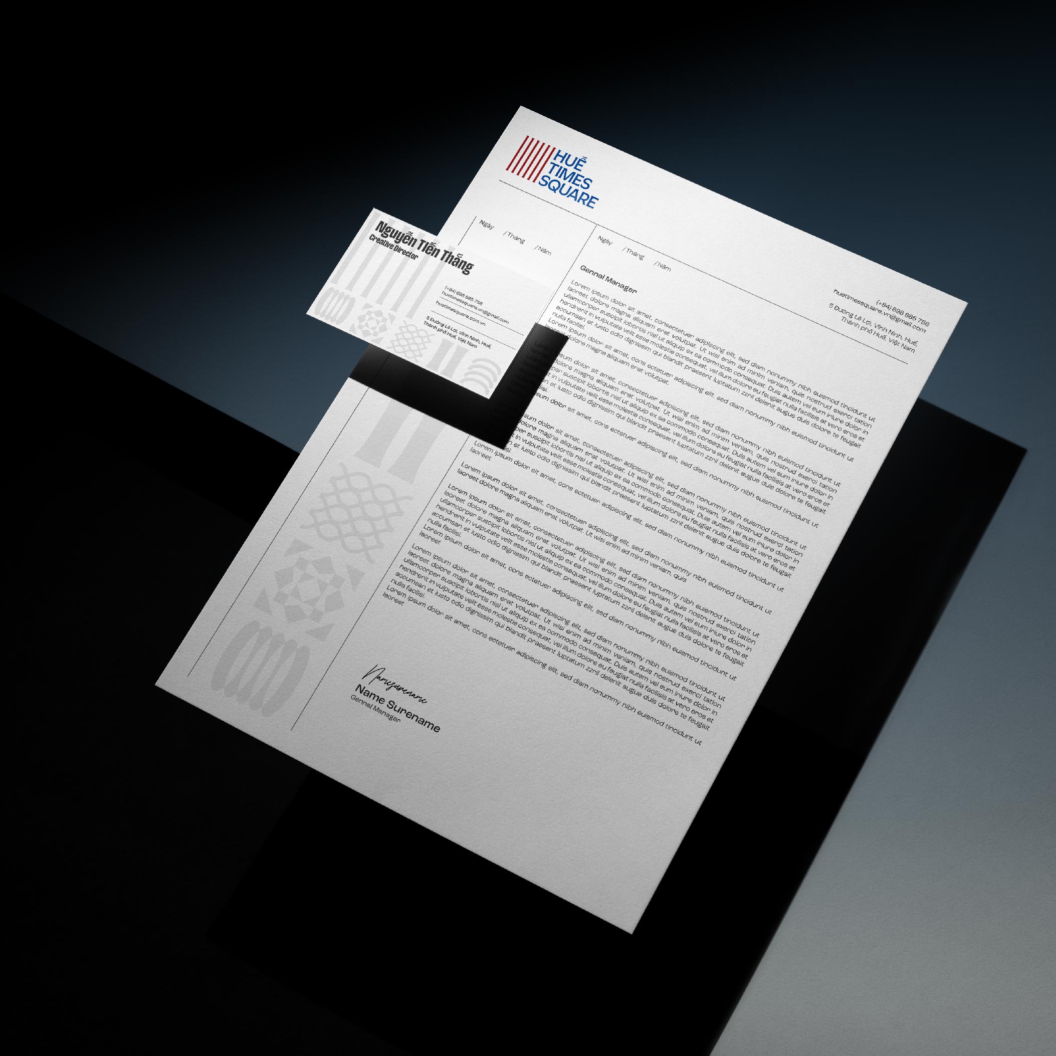
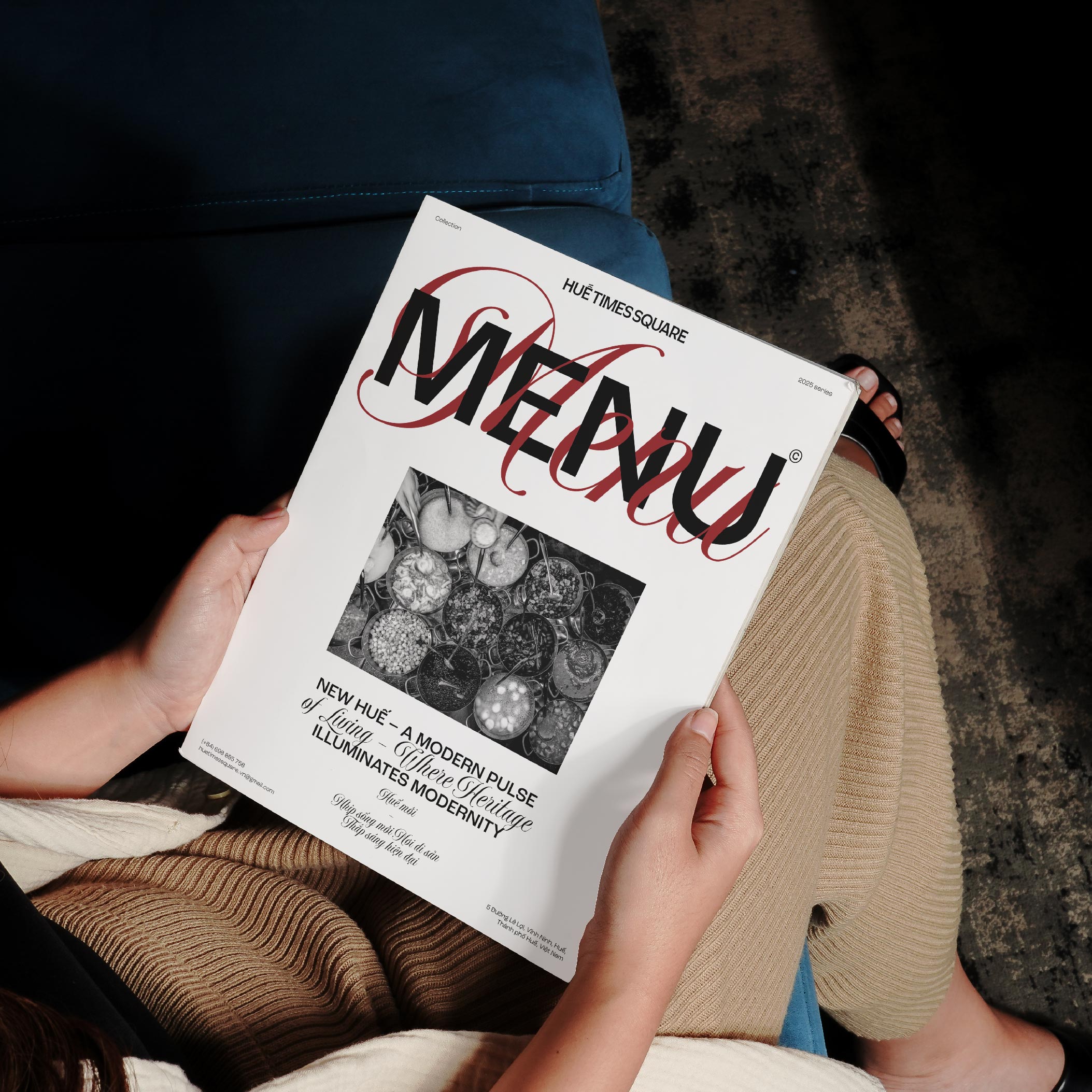
• Posters / Brochures / Business Cards:
The modern color scheme and typography lend a professional feel to printed materials. The column motif and red–blue grid can also serve as eye-catching background textures or graphic patterns.
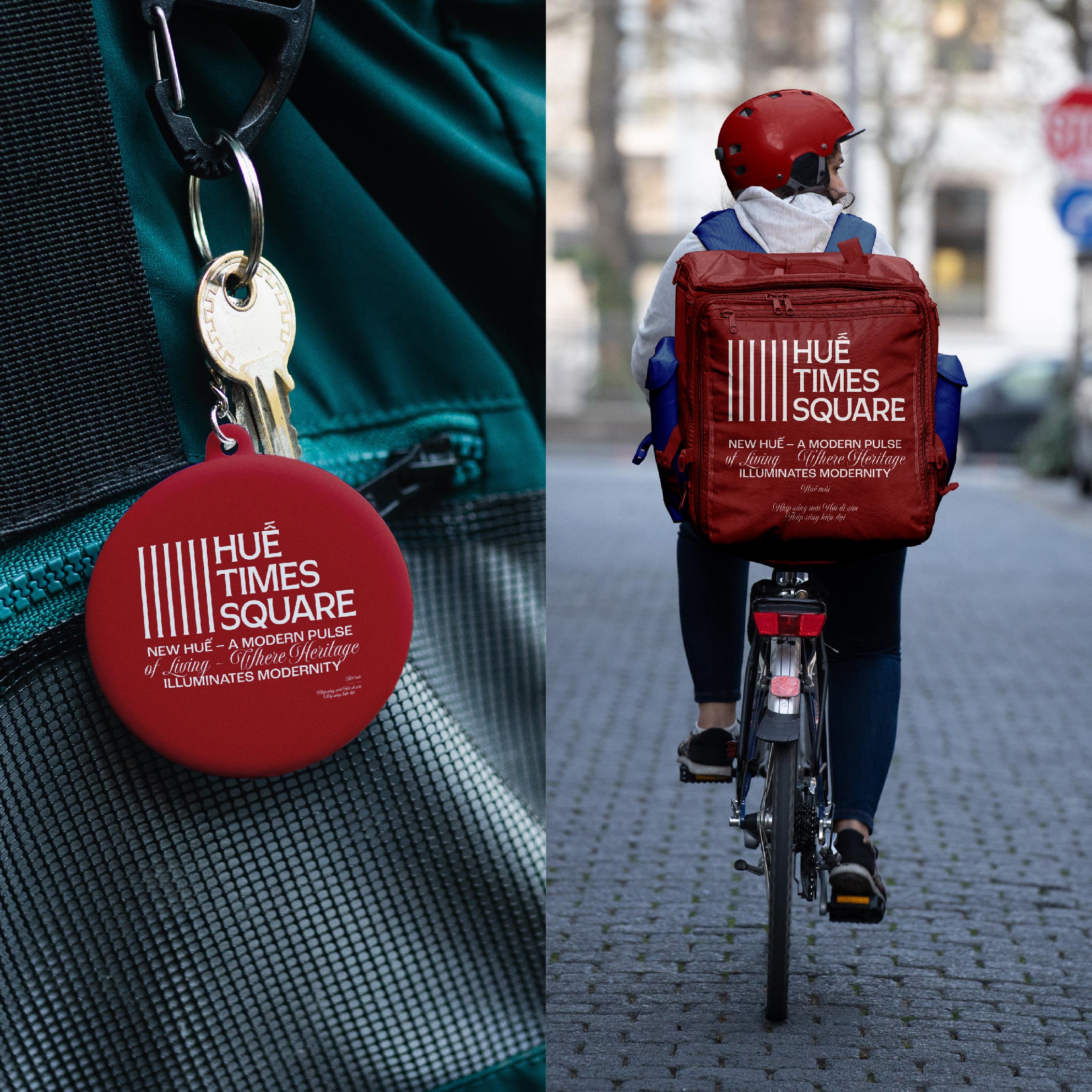
• Souvenirs & Merchandise:
Applied to notebooks, tote bags, desk calendars, T-shirts, and more — the culturally rich yet minimalist logo strongly reinforces brand recall.
Digital Applications
• Website & App:
The logo can be easily scaled down into a favicon or app icon without losing its identity. The column elements can be animated on splash screens to create a visual effect resembling a “timeline flowing through heritage.”
• Social Media (Facebook, Instagram, TikTok):
The bold color palette ensures high visibility and recognition in avatars, cover photos, and story frames.
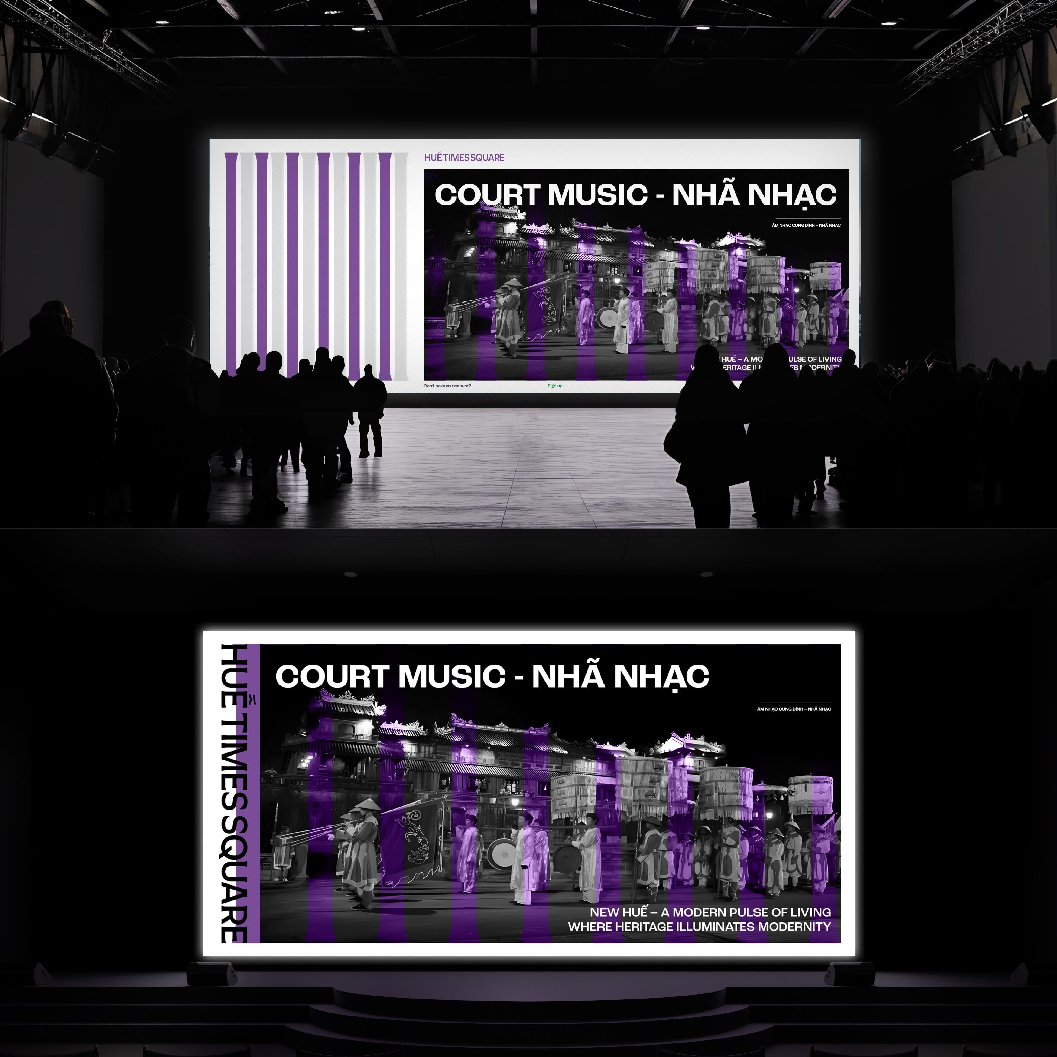
• Outdoor LED Screens / Digital Signage:
Its geometric form and vibrant contrast colors deliver excellent legibility from a distance — ideal for large-format displays in shopping centers and public spaces.
Grid System Application in the Brand Identity of Huế Times Square
Within the entire Huế Times Square brand identity system, the design grid is not merely a technical tool — it functions as a visual language that embodies the brand’s core spirit: the intersection of heritage and modernity.
Grid Ratio: 12 Columns – Symbolizing the Fusion of Heritage and Contemporary Life
The 12-column grid system is developed based on the repetition of Huế’s six core cultural values, bringing balance, rhythm, and harmony — reminiscent of the symmetrical planning of the Nguyễn Dynasty’s Imperial City.
Column, row, and margin ratios are carefully calculated to ensure flexibility, allowing content to adapt across various formats while maintaining a consistent visual identity.
Architectural Inspiration from the Hue Imperial City
The grid structure draws inspiration from the thần đạo (sacred axis) of imperial architecture — where focal elements are traditionally placed at the center or along the vertical axis.
The logo and contact information are typically positioned in the top or bottom third of the layout, echoing the structure of palace gates and royal courtyards — a subtle reference to traditional order without being rigid.
Flexibility and Scalability
The 12-column grid is also designed for compatibility across multiple formats:
• Print applications: letterheads, business cards, folders…
• Digital platforms: presentation slides, emails, websites, digital banners.
• Signage systems: wayfinding, internal signboards, and outdoor billboards — ensuring visual consistency throughout.
Bridging Cultural Depth and Contemporary Rhythm
Viewed as a whole, the grid system is the underlying framework — invisible yet essential in maintaining structure, much like how Huế preserves the memory of the imperial past.
At the same time, it provides a dynamic foundation for the brand to expand and grow — embodying the youthful, energetic spirit that Huế Times Square represents in this new era.
CREDIT
- Agency/Creative: Marvis Nguyen
- Article Title: Marvis Nguyen Merges Imperial Architecture and Modern Flow in Huế Times Square Identity
- Organisation/Entity: Agency
- Project Type: Identity
- Project Status: Published
- Agency/Creative Country: Vietnam
- Agency/Creative City: Hồ Chí Minh
- Market Region: Asia
- Project Deliverables: Brand Identity
- Industry: Hospitality
- Keywords: Huế Times Square™ | Visual identity
-
Credits:
Graphic Design: Marvis Nguyen


