


About
W-TEC Industrial has been operating for 34 years in the industrial engraving sector. A family-owned company, it specializes in machining parts such as steel stamps, engravings, and punches. Over the years, it has become an expert in silicone clichés for hot stamping and heat transfer engraving, focusing on the cosmetics segment, as well as applications in appliances, automotive parts, and plastics.
Challenge
With 34 years of history, W-TEC Industrial has established itself as a benchmark in industrial engraving solutions and silicone clichés, serving industries across various sectors, particularly the cosmetics industry. Guided by quality, precision, and innovation, the company has contributed to technical advancements that have enhanced product efficiency and design in the market.
Facing an ever-evolving industrial landscape, W-TEC is transforming its identity to align with the future, projecting a modern image that reflects its commitment to innovation and sustainability. This renewal reinforces its position as a leader in the sector, differentiating itself through excellence and reliability while sustaining its journey of growth and expansion.
Concept
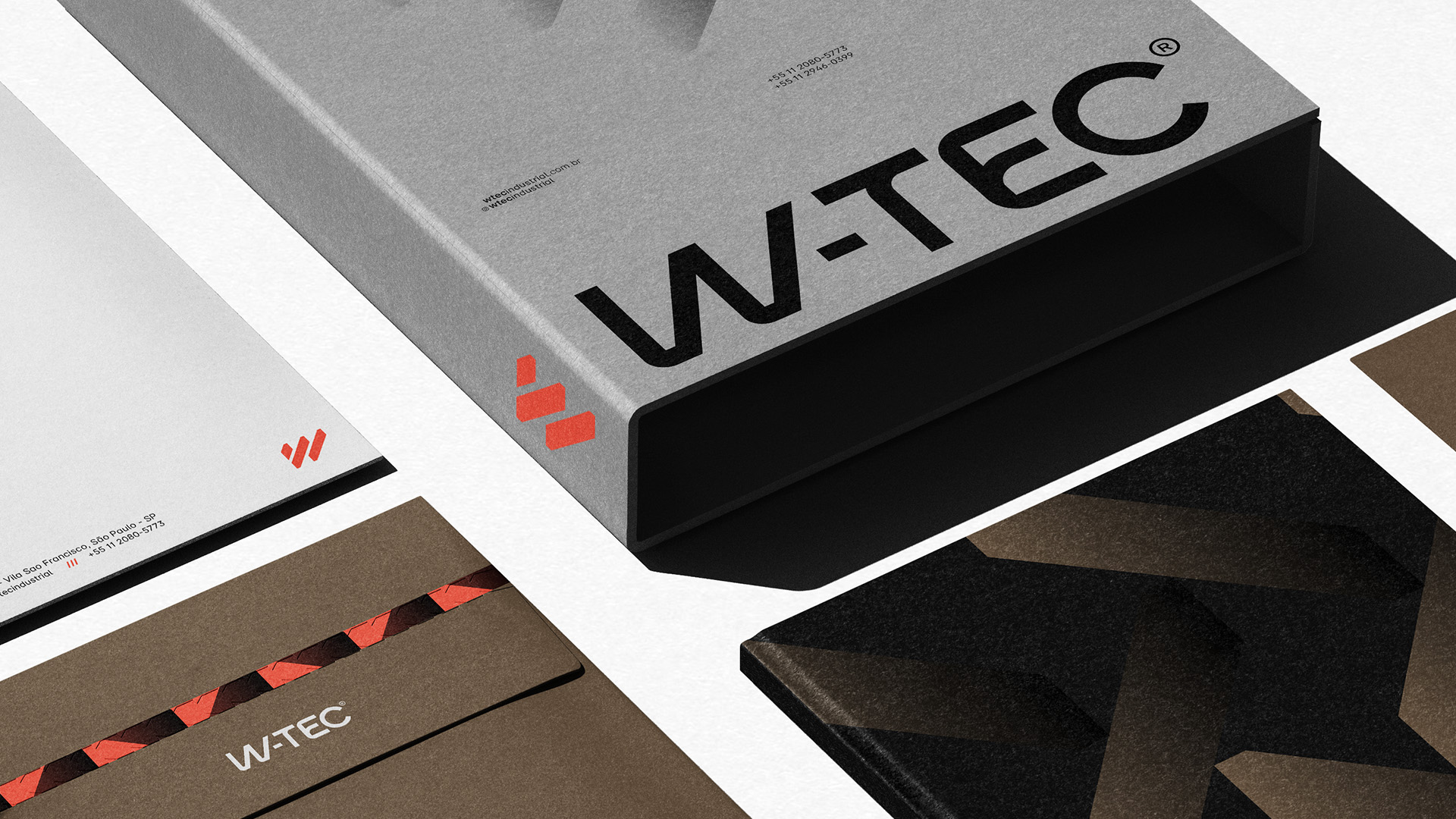
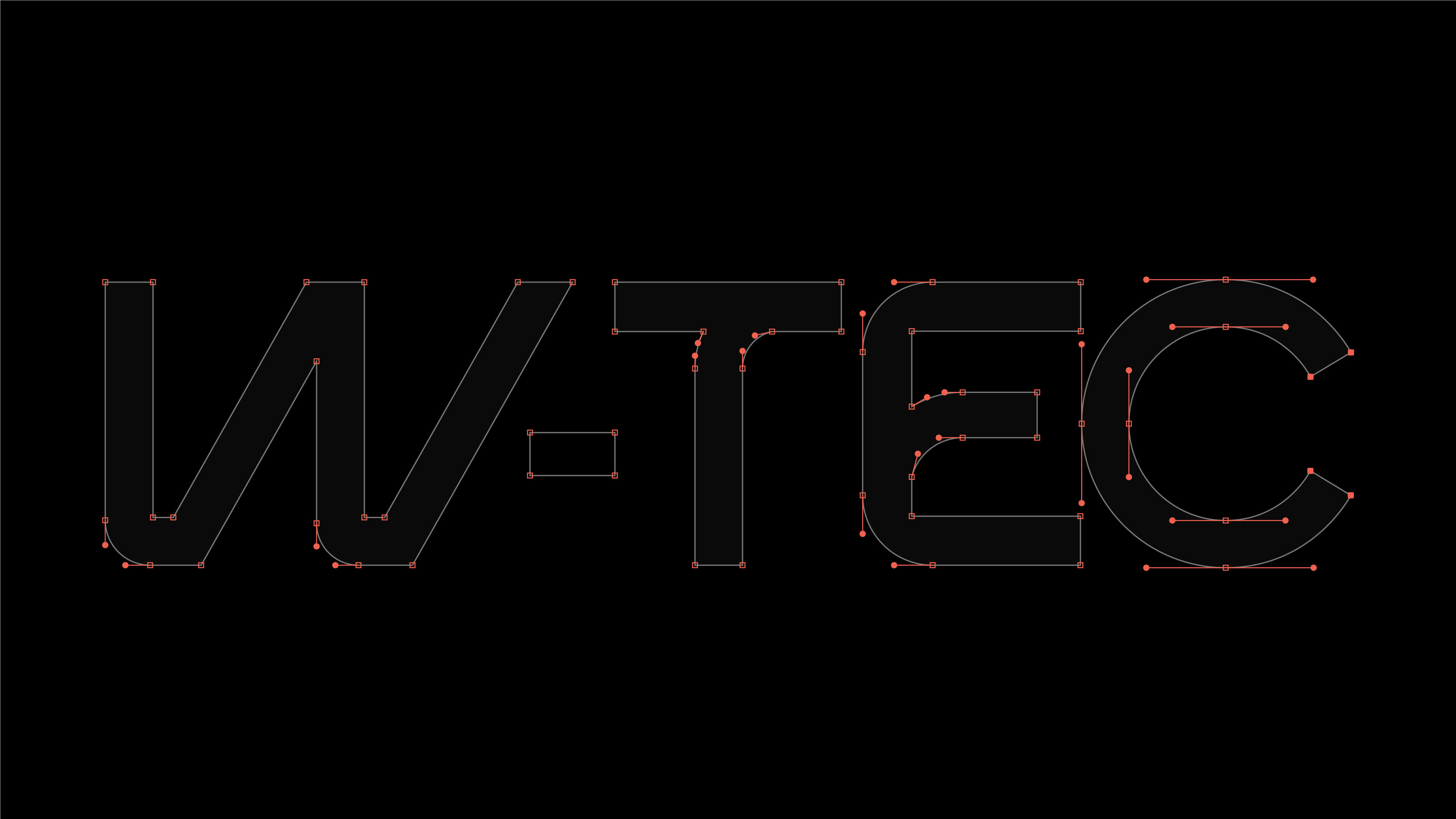
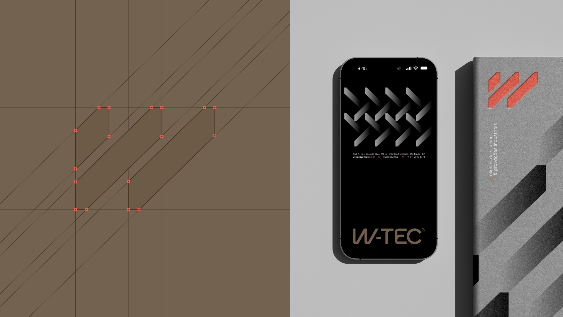
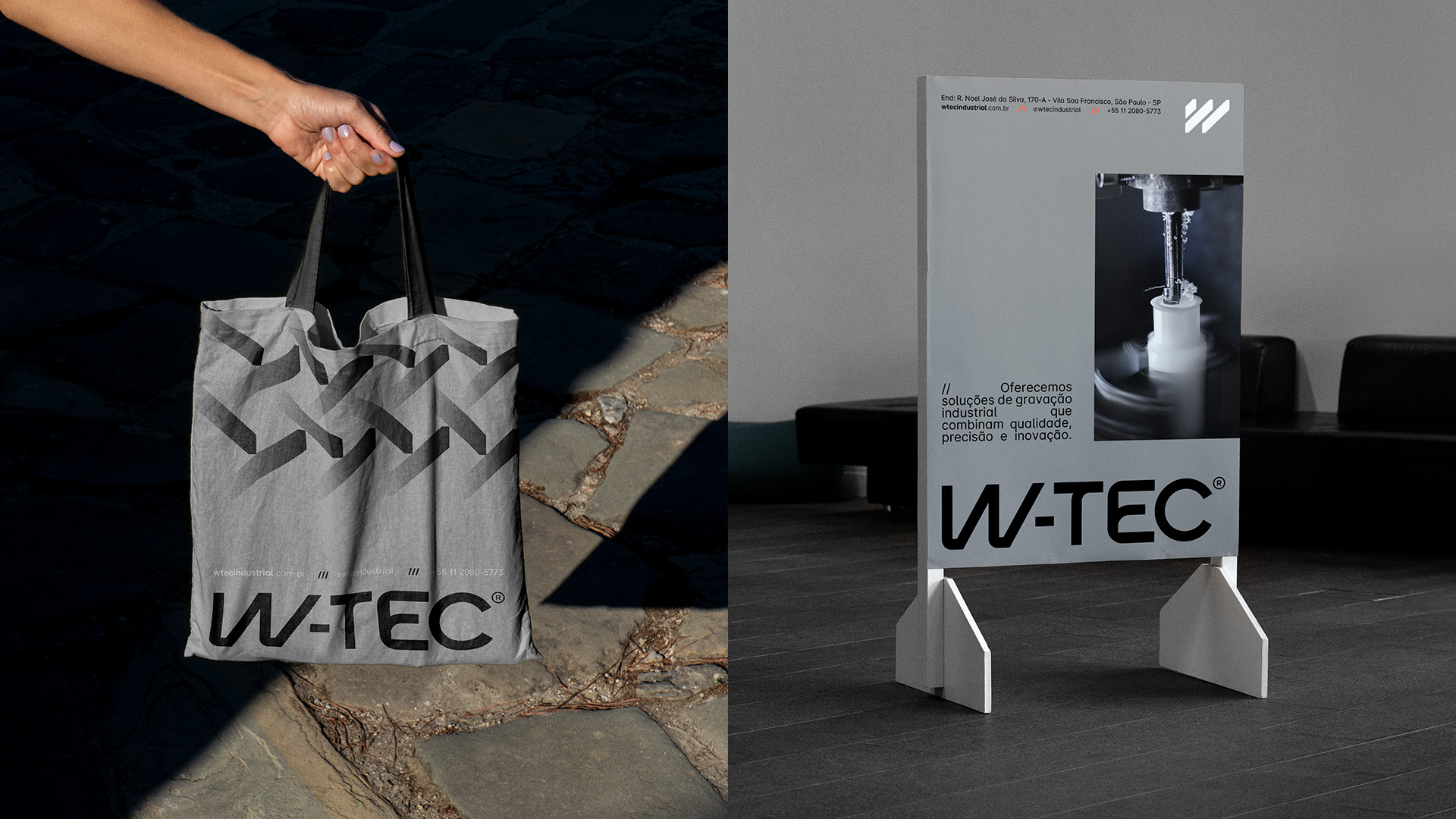
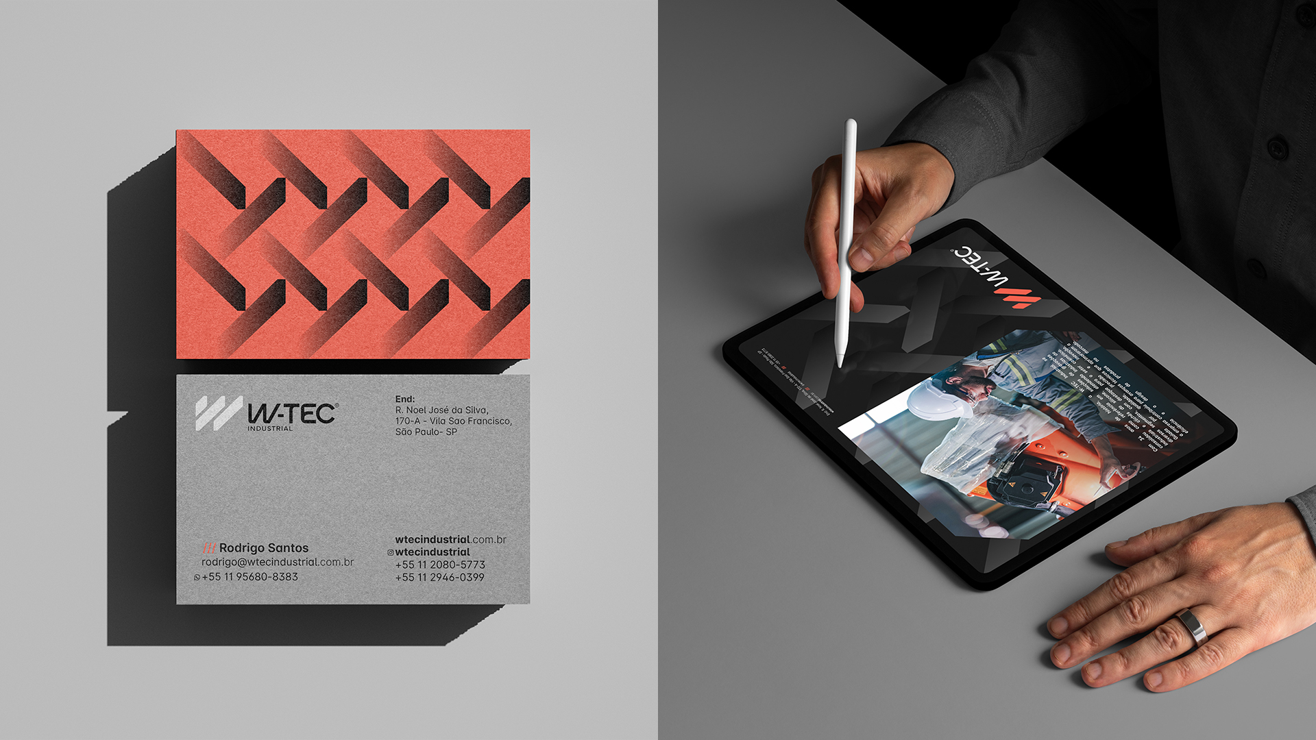
The W-TEC logo was created exclusively to represent everything the company stands for. The design was carefully crafted to meet the demands of the digital future, projecting a visual identity that resonates with technological transformations and the evolution of the industry. The curves in the logo were designed to reflect the dynamism and precision that characterize W-TEC. They symbolize the fluid connection between the different elements of the company’s universe. The unique design ensures that the brand stands out in the market while remaining true to its history and commitment to progress.
The W-TEC symbol was created with a strategic purpose, aligning with its role in the industrial sector. It needed to embody the idea of continuous reproduction and impact on the production process. W-TEC is responsible for creating key parts that serve as molds for the reproduction of countless others, ensuring precision and quality in every piece. The symbol’s design was conceived to convey this continuity and replication, while subtly incorporating the letter “W,” reinforcing the brand’s identity.
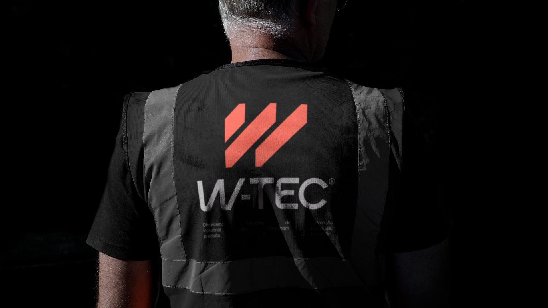
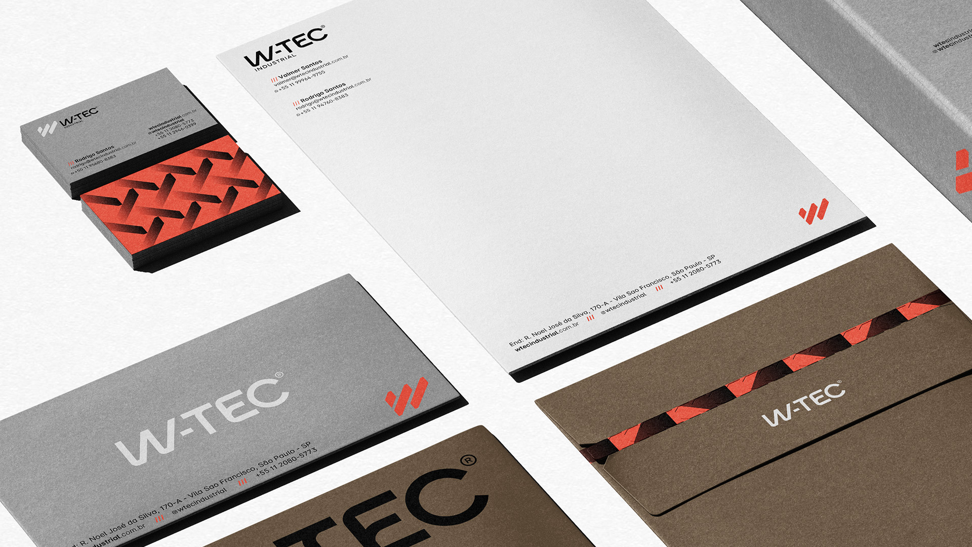
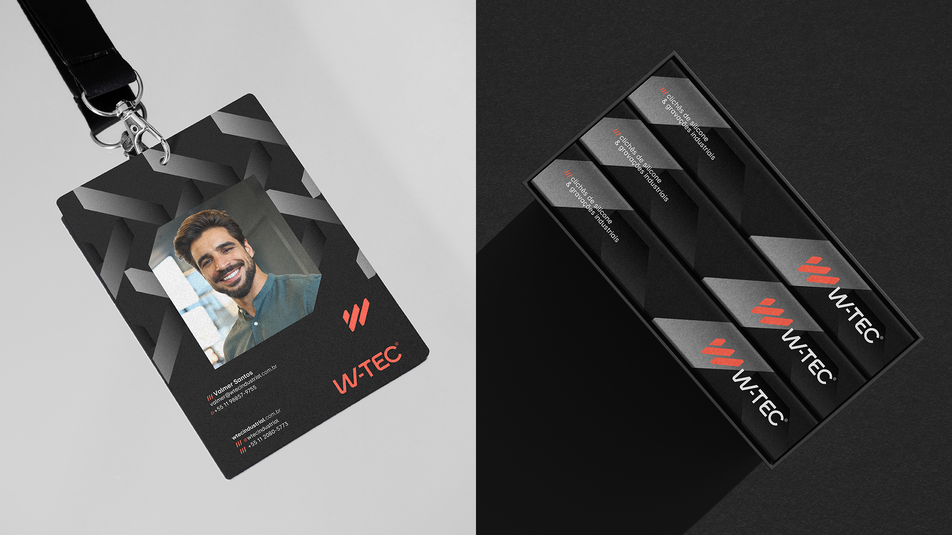
W-TEC Industrial is ready for a new brand experience that prepares the company for a modern and digital future, reflecting its commitment to driving positive change in the industrial engraving market.
CREDIT
- Agency/Creative: Marsi Brand
- Article Title: Marsi Brand Reinvented W-TEC Industrial’s Identity for a Digital Future
- Organisation/Entity: Agency
- Project Type: Identity
- Project Status: Published
- Agency/Creative Country: Brazil
- Agency/Creative City: Governador Valadares
- Market Region: South America
- Project Deliverables: Brand Design
- Industry: Manufacturing
- Keywords: Industria, Visual Identity, W-TEC, brand identity, brand strategy
-
Credits:
Brand Designer: Marcela Ribeiro


