Marshmallow insures people whose circumstances are hard to price, by seeing difference as an opportunity – not a cost. The rebrand positions Marshmallow as the insurance brand that backs the exceptions to the rule.
Insuring difference.
Over 1 million people migrate to the UK from all over the world every year. But most insurance models fail to recognise or value their past experience. This leaves them unnoticed, underinsured and overpriced. As one of the UK’s fastest growing businesses to reach unicorn status, Marshmallow uses technology to fairly price risks and cater for those underserved by traditional insurers. Founded by brothers Oliver and Alexander Kent-Braham alongside David Goaté, the business has grown rapidly and was valued at $1.25 billion in 2021.
Marshmallow worked with Ragged Edge to define and deliver a brand that could accelerate that growth, helping them to become the go-to insurance company for people on the up, while rallying the internal team around a singular mission.
“We built the brand around ‘valuing difference’ – an idea that’s as distinctive as it is relevant to an audience who are consistently penalised for their diverse backgrounds, experiences and circumstances,” says Max Ottignon, Ragged Edge Co-founder. “The new identity celebrates infinite variation in everything from the design to an empathetic tone of voice.”
Characterful, empathetic and inclusive.
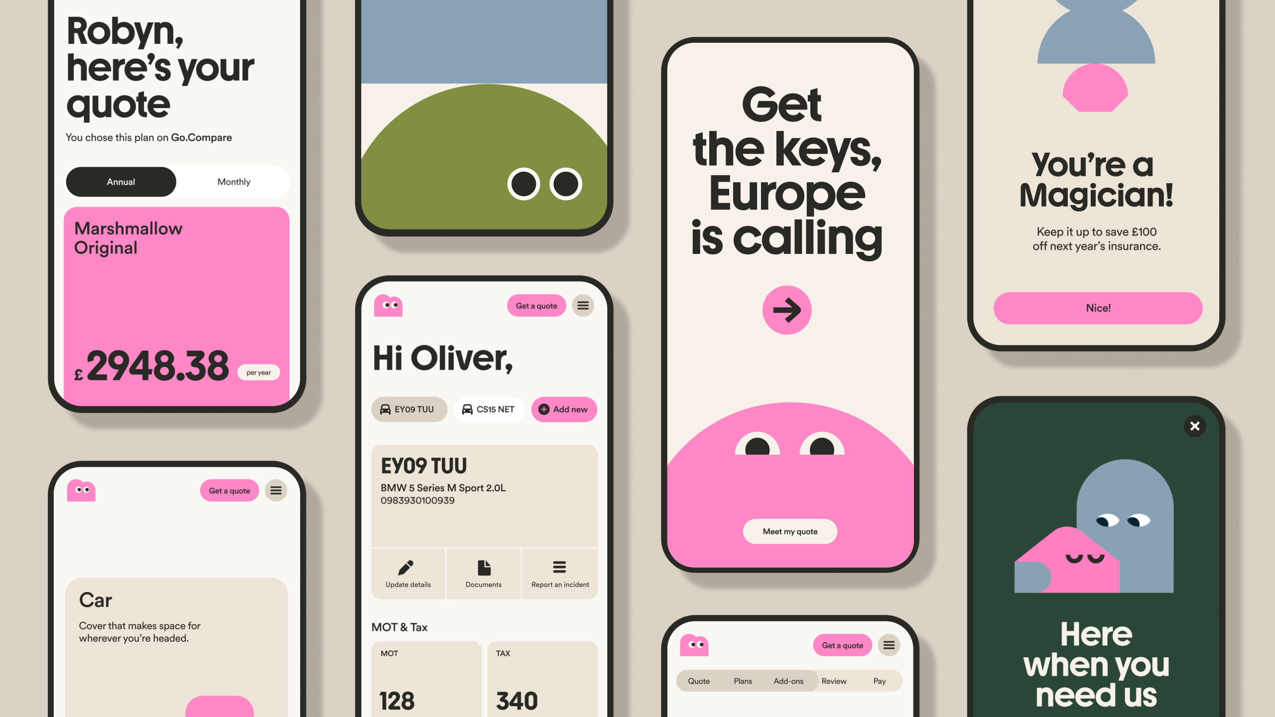
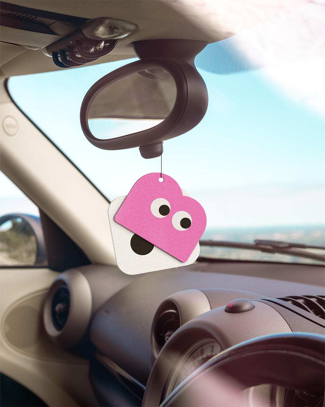
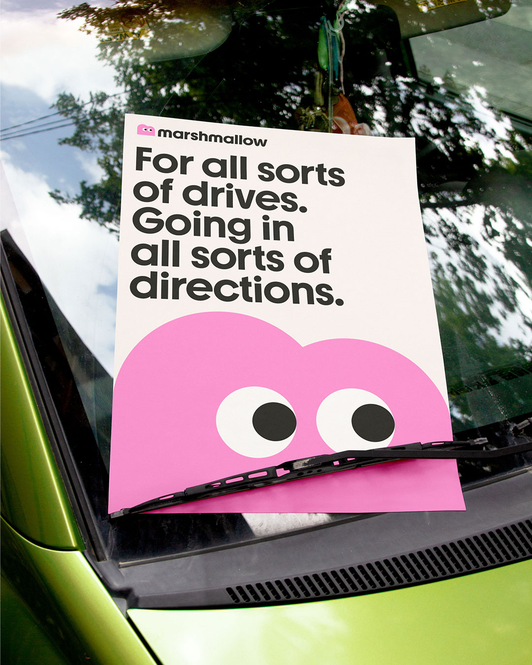
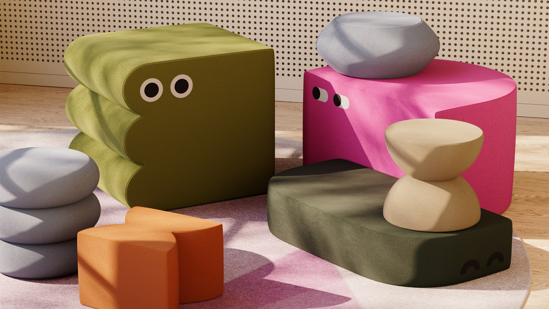
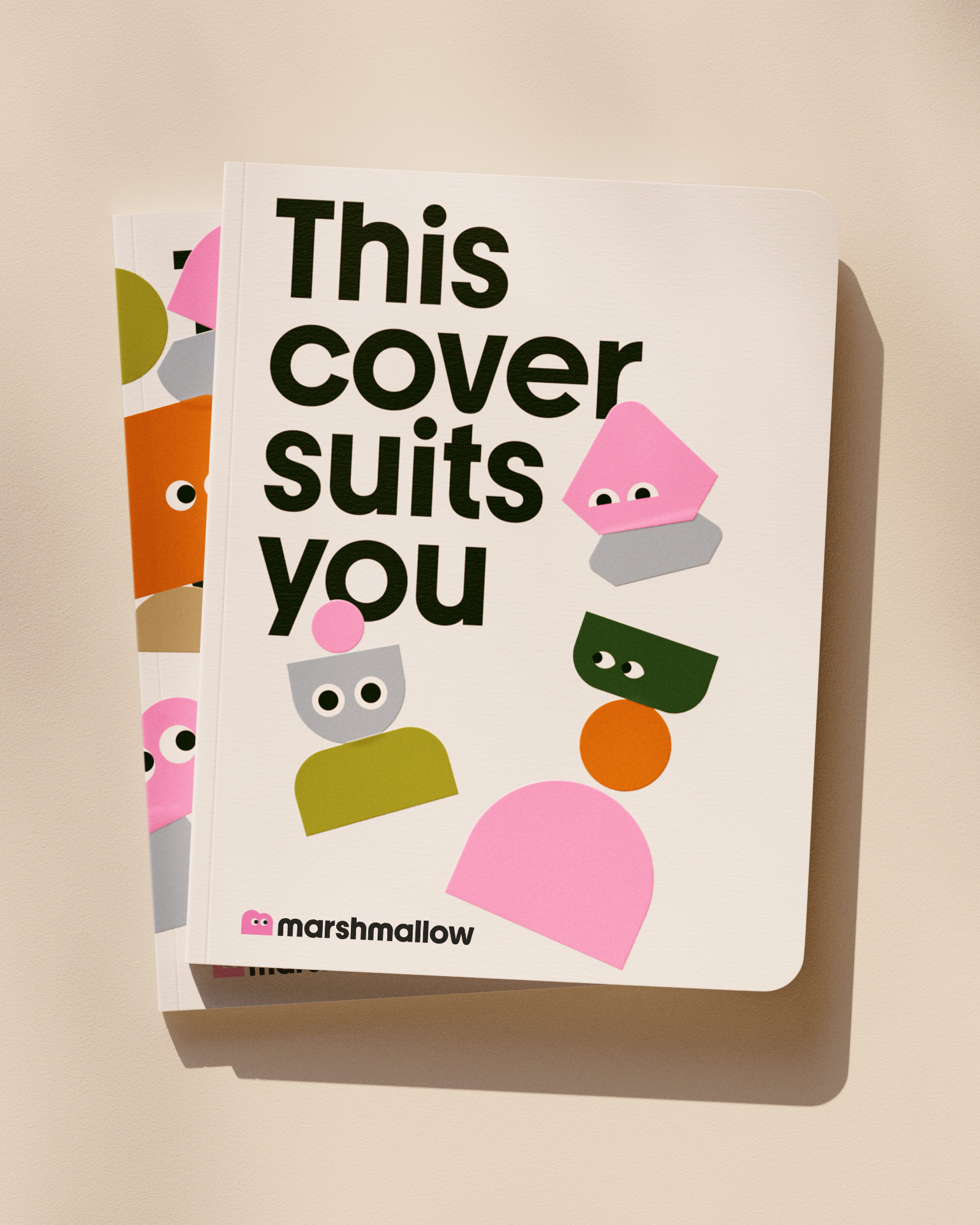
Infinite variation is brought to life by the ‘Marshforms’, a library of endlessly varied characters that bring function, empathy and delight to every part of the experience. The characters are constructed from a vast selection of different shapes, representing the breadth of different experiences that Marshmallow considers when pricing a quote. These shapes form the structure for the rest of the graphic system, ensuring that the visual identity feels coherent across every channel and touchpoint.
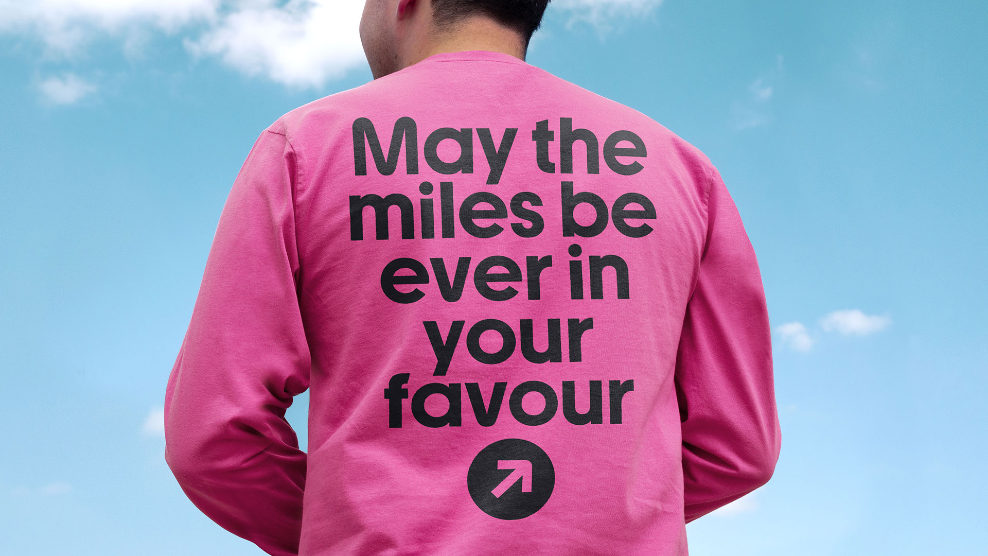
A new tone of voice was created to show empathy and understanding for the varied journeys of the Marshmallow audience. It’s paired with a customised typeface, Marshmallow Youth, which is both highly distinctive and designed for accessibility. Together, the language and typography set out to be inclusive even to those with varying English proficiency levels.
The whole identity is embodied by a logo mascot. Immediately recognisable and full of warmth and character, it sets the tone for the whole brand, welcoming the experiences of the wide array of people Marshmallow serves.
Sam Knott, Vice President of Acquisition (Growth) at Marshmallow says that “we needed the rebrand to speak to individuality without patronising our diverse audience. Ragged Edge has captured that perfectly. The brand allows us to communicate Marshmallow’s vision and strong sense of purpose, empowering us to deepen our customer relationships and expand our offerings while staying true to our mission that we back those who step outside of the norm”.

CREDIT
- Agency/Creative: Ragged Edge
- Article Title: Marshmallow Reimagines Insurance With Ragged Edge Rebrand Celebrating Individuality and Inclusivity
- Organisation/Entity: Agency
- Project Type: Identity
- Project Status: Published
- Agency/Creative Country: United Kingdom
- Agency/Creative City: London
- Market Region: Global
- Project Deliverables: Brand Identity, Brand Redesign, Brand Strategy, Brand Tone of Voice, Branding
- Industry: Information
- Keywords: insurance, inclusivity, characterful, individuality
-
Credits:
Branding agency: Ragged Edge


