What if vitamins played by new rules?
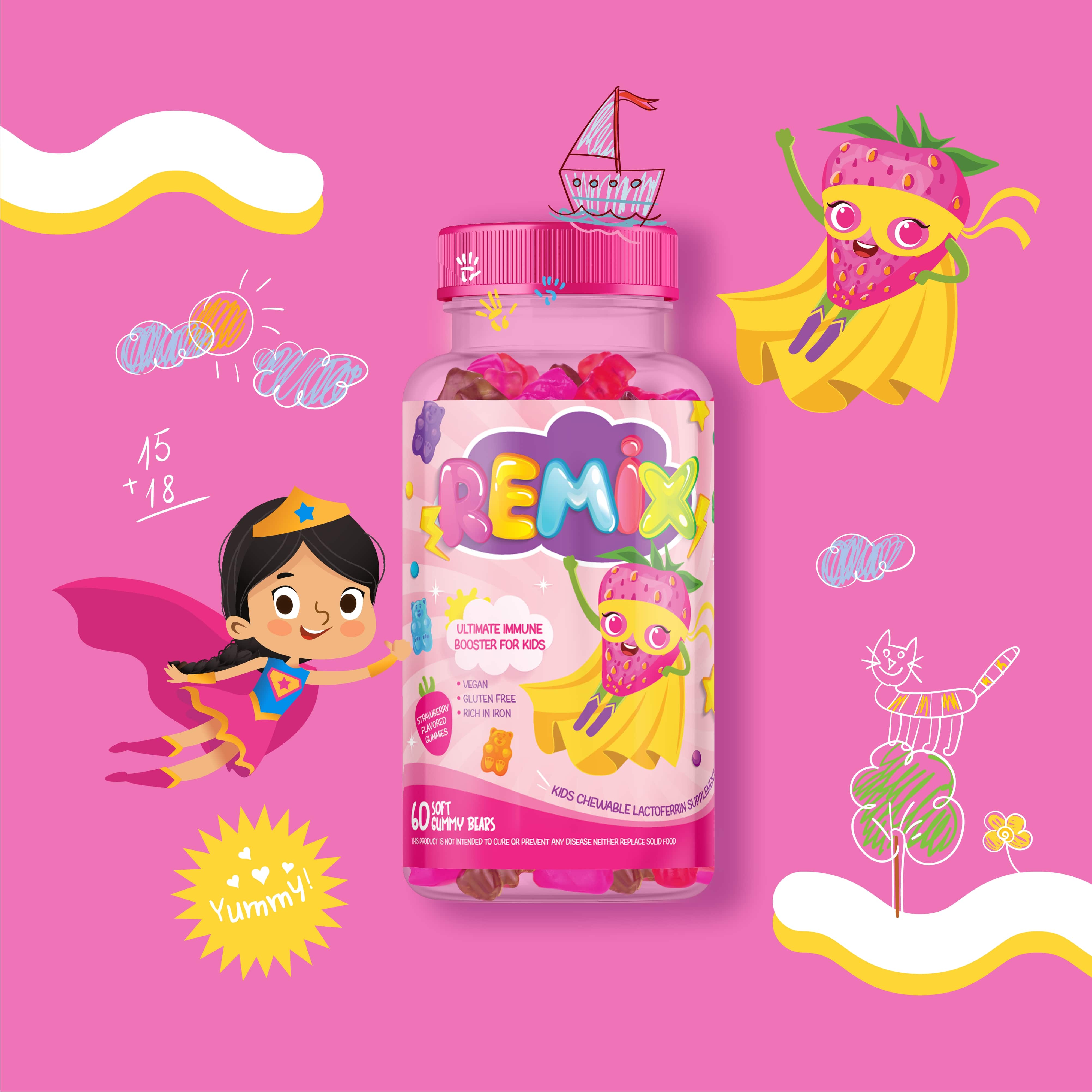
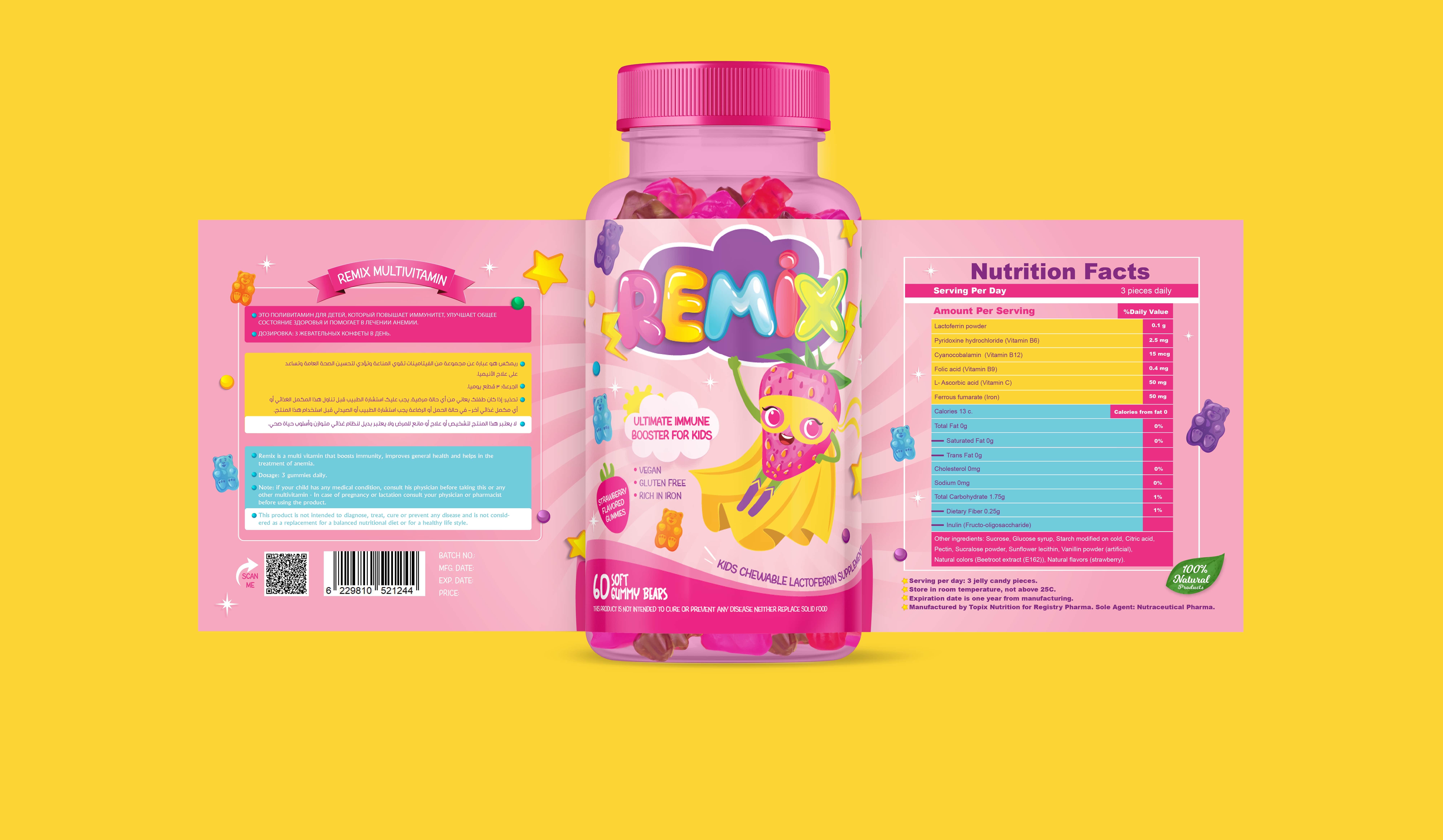
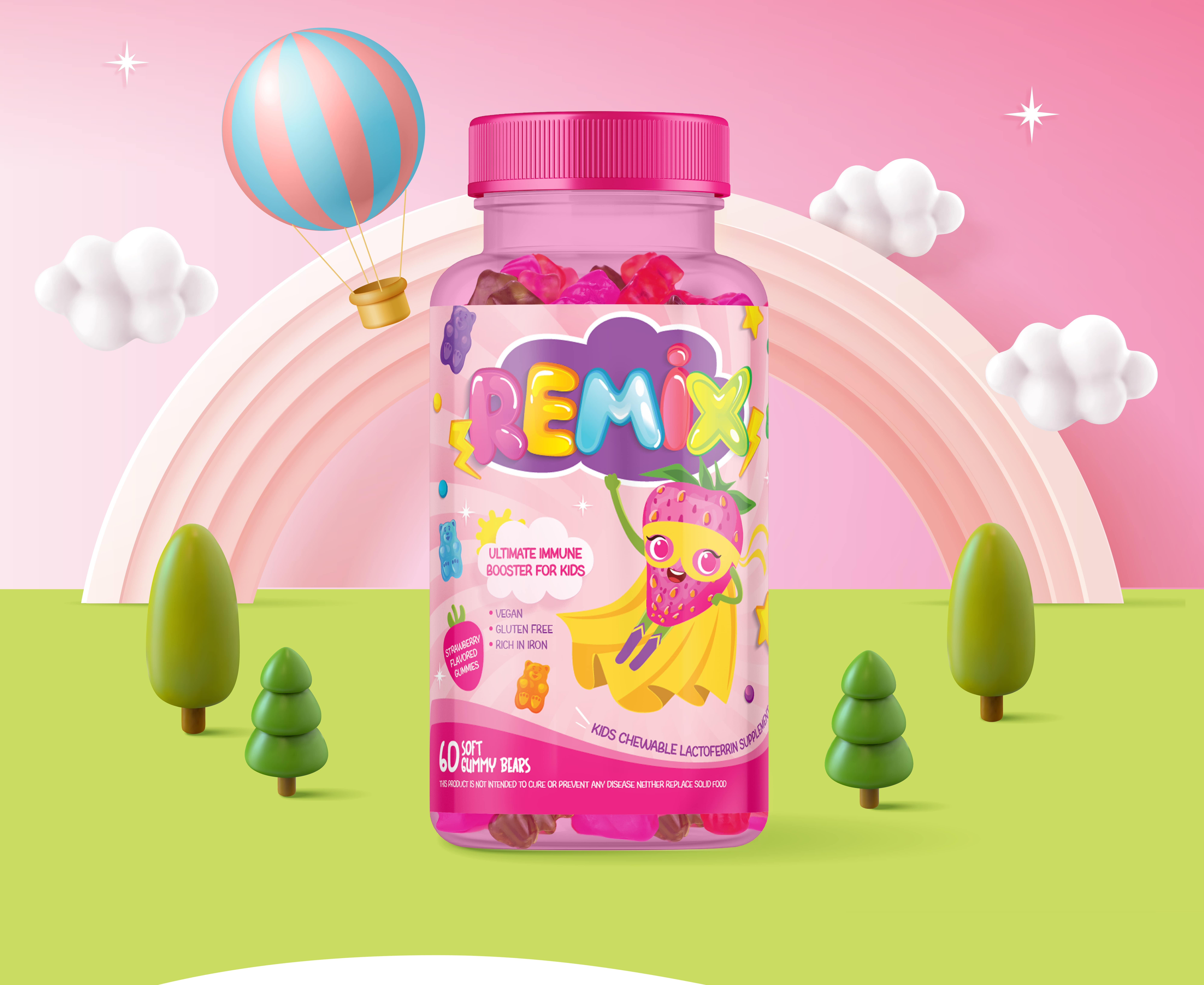
Marklinica partnered with Remix Kids to transform multivitamin gummies into a packaging experience that moves fast, connects instantly, and earns trust at a glance. The project set out to redesign not just how vitamins look but how they feel in the hands of parents and children alike.
The challenge was to make immune support feel like play without losing the clinical integrity that parents count on. The goal was to merge two worlds that rarely meet medical credibility and childhood joy into one coherent, emotionally engaging system.
Marklinica treated the product not as candy, not as medicine, but as a daily badge of health. Every design decision was guided by this principle to create a product that’s fun to use, yet deeply reliable.
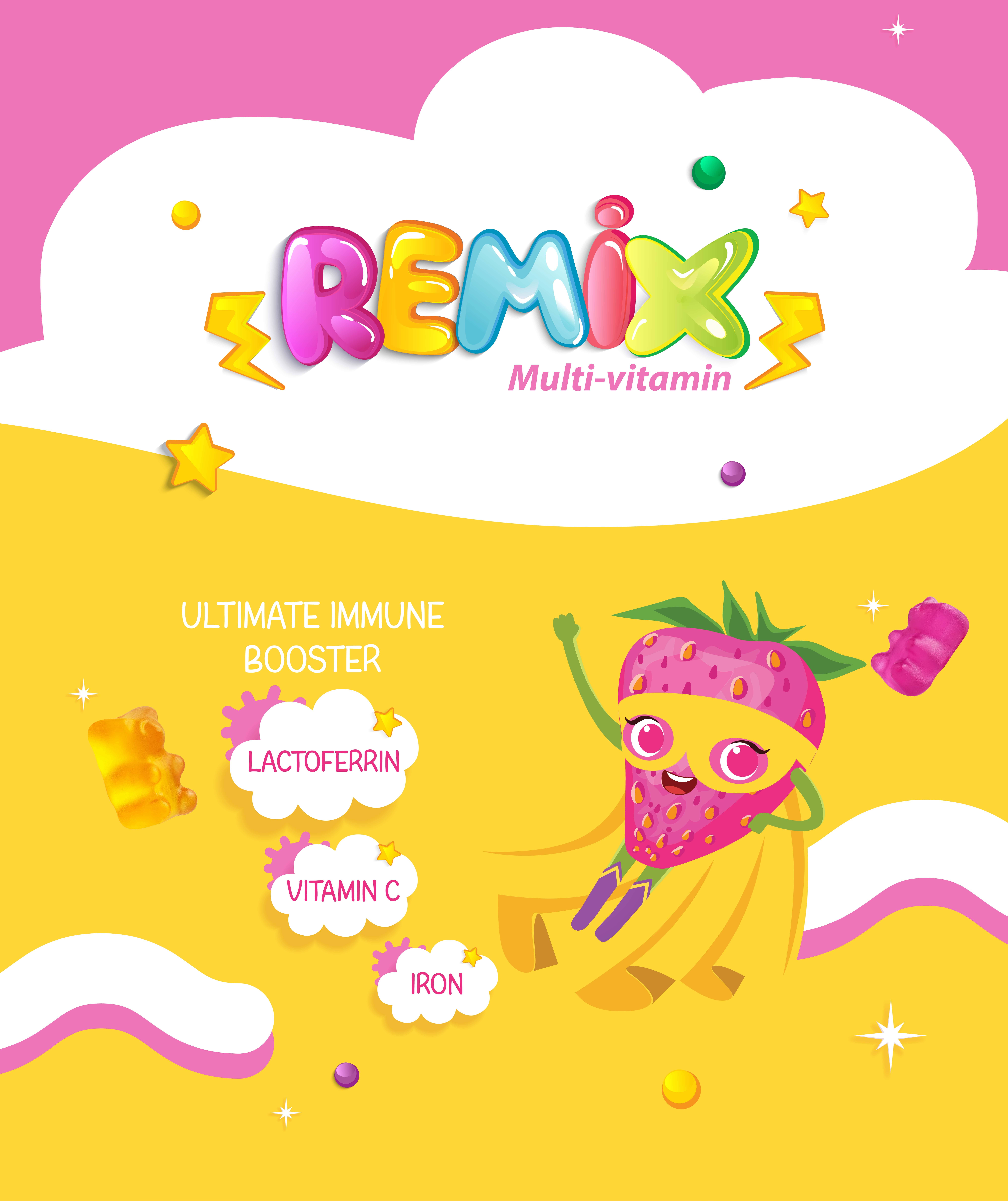
The design language was built on bold, rhythmic structure. Color blocks became the foundation of communication, acting as instant flavor codes and emotional cues. Friendly bear mascots gave the brand its warmth and playfulness, while nutrient icons translated complex science lactoferrin, iron, vitamin C into visual simplicity that children can recognize and parents can trust.
The palette was built to energize bright blues, cheerful ambers, and punchy teals each shade carefully calibrated by Marklinica to signal action, vitality, and delight. Typography balanced confidence with clarity, designed for easy legibility and emotional balance. Layouts flexed with rhythm, echoing the joy and motion of everyday family life.
Art direction focused on movement and tactility. Gummies were photographed mid-jump, shadows soft, and surfaces tactile capturing a sense of playful precision. Lighting avoided gloss and gimmicks; it stayed real, clean, and emotionally uplifting. Every shot felt alive and intentional crafted for shelf impact, digital scroll, and daily use alike.
From snack time to bedtime, from lunchbox swaps to wellness rituals, Remix Kids became more than a supplement. Marklinica designed a world where nutrition meets imagination a system of care built on trust, play, and connection.


CREDIT
- Agency/Creative: Marklinica
- Article Title: Marklinica – Vitamins Redesigned for Little Hands by Remix
- Organisation/Entity: Agency
- Project Type: Packaging
- Project Status: Published
- Agency/Creative Country: Egypt
- Agency/Creative City: Alexandria
- Market Region: Middle East, Global
- Project Deliverables: 2D Design, Advertising, Art Direction, Brand Creation, Brand Design, Brand Experience, Brand Guidelines, Brand Identity, Brand Strategy, Branding, Graphic Design, Identity System, Illustration, Packaging Design, Packaging Guidelines
- Format: Blister-Pack
- Industry: Health Care
- Keywords: Packaging, Branding, Identity, Design, Product, Visual, Photography, Art, Modern, Color, Typography, Minimal, Lifestyle, Kids, Nutrition, Wellness, Health, Play, Motion, Trust, PackagingDesign, BrandIdentity, VisualIdentity, ProductPhotography, KidsBranding, SupplementBranding, VitaminPackaging, FMCGBranding, ColorSystem, CharacterDesign, BoldTypography, CleanLayout, Marklinica, RemixKids, ArtDirection, PlayfulDesign, CreativeBranding, PackagingFirst, ModernAesthetic, ParentalTrust, DailyWellness
-
Credits:
Art Director: Rana Mohsen


