


Marklinica – What if your roots could speak?
What if haircare didn’t just fix strands, but restored their story from the root?
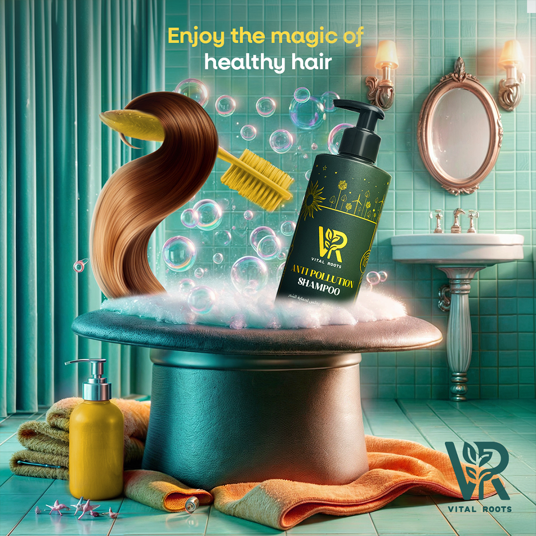
Marklinica redefined Vital Roots not as another cosmetic label, but as a visual language where botanical science meets lifestyle clarity where every element breathes strength, purity, and renewal. Vital Roots already had the science, but it lacked a voice. Its visuals had blended into the glossy noise of the beauty industry: too polished to be trusted, too generic to be remembered.
The mission was to rebuild the brand from the inside out, designing a visual and verbal identity that feels credible, confident, and rooted in care. The goal was to turn formulas into philosophy to make beauty feel intelligent, organic, and emotionally resonant.
Color grounded the narrative. Deep forest green became the anchor of nature, signaling growth, balance, and restoration. Gold accents introduced warmth and quiet confidence, adding a sense of calm luxury without excess. Typography balanced boldness with breath modern sans-serif headlines paired with light, airy text to express both strength and softness.
Layouts followed rhythm, not rigidity. Modular, mobile-first grids were designed to flow across feed, screen, and shelf with effortless coherence. Each composition mirrors the logic of growth flexible, organic, and alive. Visual elements drew metaphors from nature: strands became symbols, leaves and roots transformed into visual cues of care that begins at the source.
Art direction stripped away perfection. No artificial gloss. No overlift serenity. Just textures in real light, human movement, and authentic reflection. Imperfection became honesty every droplet mattered, every frame felt alive. Photography captured the tactile rhythm of renewal, portraying hair not as styled fiber but as living evidence of vitality.
From packaging to digital rollouts, Marklinica transformed Vital Roots into more than a product it became a philosophy. A promise that when care runs deep, beauty grows stronger.


CREDIT
- Agency/Creative: Marklinica
- Article Title: Marklinica Redefines Vital Roots with a Restorative Visual Identity Grounded in Nature
- Organisation/Entity: Agency
- Project Type: Identity
- Project Status: Published
- Agency/Creative Country: Egypt
- Agency/Creative City: Alexandria
- Market Region: Middle East
- Project Deliverables: 2D Design, Brand Architecture, Brand Creation, Brand Design, Brand Experience, Brand Guidelines, Brand Identity, Brand Strategy, Branding, Graphic Design, Identity System, Illustration
- Industry: Beauty/Cosmetics
- Keywords: Haircare Branding, Cosmetic Packaging, Botanical Design, Wellness Branding, Beauty Identity, Skincare Packaging, Natural Cosmetics, Modern Branding, Premium Haircare, Visual Identity, Organic Aesthetic, Minimal Design, Green and Gold Palette, Typography System, Clean Layout, Product Photography, Brand System, Art Direction, Marklinica, Vital Roots, Sustainable Design, Authentic Beauty, Lifestyle Branding
-
Credits:
Art Director: Rana Mohsen
Graphic Designer: Rowan Hamada


