


What if sleep wasn’t a dream?
Marklinica reimagined Dr. Vitaly not as a bedtime supplement, but as a biological mechanism designed with the same precision as the body it’s meant to restore. The mission was to craft a visual identity that communicates trust, calm, and reliability without leaning on fantasy or visual clichés.
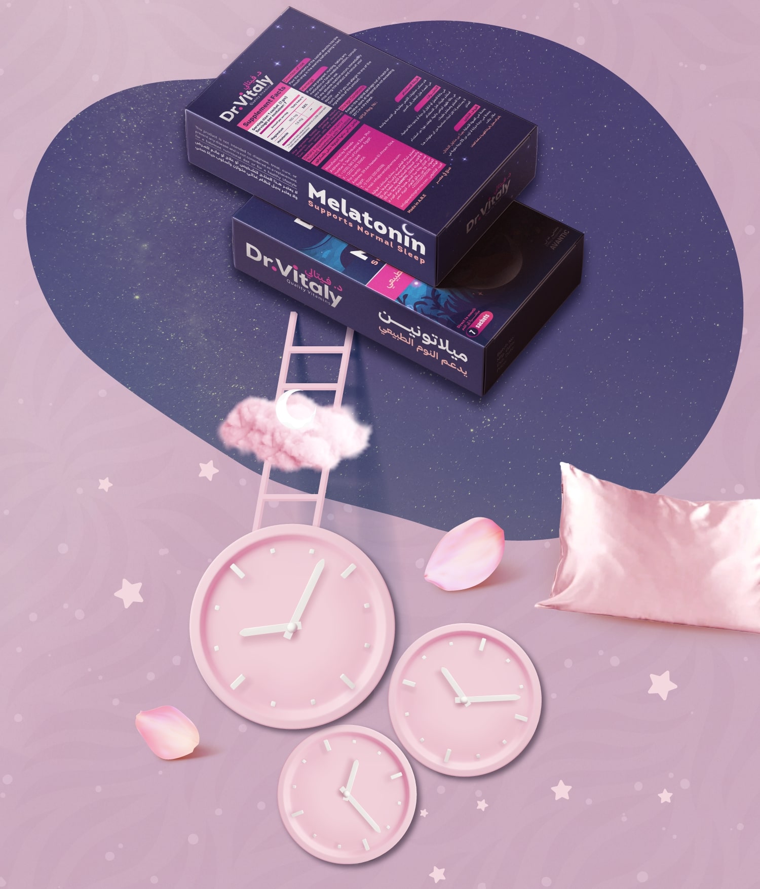
The challenge was clear: the sleep-aid market had become overcrowded with symbols of overpromised calm moons, stars, clouds, and glowing blues that romanticized sleep rather than represented it. People weren’t searching for magic; they were searching for something that works and feels credible. Dr. Vitaly needed to rise above the noise with a brand that signals science over sentiment, and function over fantasy.
The insight behind the design was simple but powerful: sleep isn’t a mood it’s a mechanism. Designing a sleep product meant visualizing biology, not bedtime stories. The packaging had to express rhythm, balance, and circadian precision while giving users confidence at first glance.
The solution was built around a visual language of composure and structure. Deep navy anchors the identity in night and rhythm, while clean white brings clarity, ease, and trust. Together, they form a system that feels composed, credible, and restorative. Typography was chosen for its balance a modern, open sans-serif that stays legible and calm at all scales, speaking softly yet confidently.
Layout and structure follow the same principle: wide margins, modular grids, and generous spacing that allow the design to breathe. Every line break slows the viewer’s pace, every element contributes to a sense of order and ease.
Art direction avoided fantasy entirely. No moons, no clouds, no haze only softly floating capsules, blurred textures, and light that feels human, not artificial. Real calm, engineered.
From packaging to brand visuals, Dr. Vitaly stands as a system of rest and restoration. Marklinica didn’t just design a supplement we designed a mechanism of trust, helping people take sleep, not just dream of it.
CREDIT
- Agency/Creative: Marklinica
- Article Title: Marklinica – From Sleep Fantasy to Scientific Calm by Dr. Vitaly
- Organisation/Entity: Agency
- Project Type: Packaging
- Project Status: Published
- Agency/Creative Country: Egypt
- Agency/Creative City: Alexandria
- Market Region: Middle East
- Project Deliverables: 2D Design, Brand Creation, Brand Design, Brand Experience, Brand Guidelines, Brand Identity, Brand Strategy, Brand World, Branding, Graphic Design, Identity System, Illustration, Packaging Design
- Format: Box, Sachet, Sleeve
- Industry: Pharmaceutical
- Keywords: Pharmaceutical Branding, Supplement Packaging, Sleep Aid Design, Wellness Branding, Healthcare Packaging, Minimal Branding, Calm Design, Scientific Aesthetic, Modern Typography, Blue and White Palette, Brand System, Clean Layout, Packaging Design, Product Photography, Visual Identity, Premium Healthcare, Marklinica, Dr. Vitaly, Functional Design, Art Direction, Mechanism of Trust
-
Credits:
Art Director: Rana Mohsen


