


What does calm look like when it’s designed for motherhood?
For Primerose, Marklinica crafted packaging that redefines prenatal wellness not through decoration, but through design that feels safe, soft, and clinically certain. This wasn’t a supplement story; it was a visual language of care where calm is structured, trust is visible, and motherhood is treated with quiet intelligence.
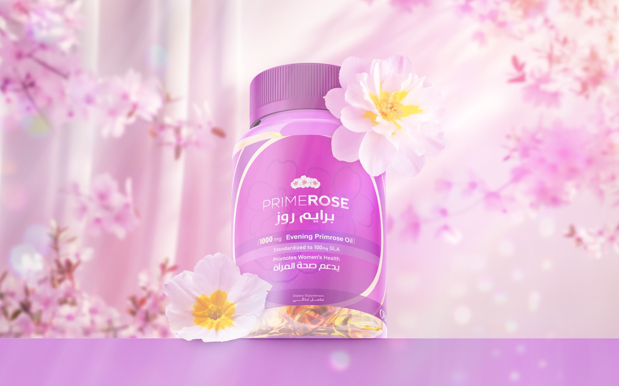
The challenge was to design a supplement identity for women navigating the most delicate balance of all: growing life while staying grounded. Primerose needed to earn trust at first glance, combining clinical reliability with emotional serenity. No green leaves, no promises of miracles only clarity, compassion, and composure.
Marklinica built a visual system rooted equally in science and softness. Every element worked to communicate safety, purity, and balance. The color logic revolved around creamy off-whites and muted blush tones that reflect warmth, maternal calm, and reassurance. The structure followed a clean, grid-based system inspired by medical precision, establishing instant credibility without losing empathy. Typography stayed light, breathable, and modern balanced between clinical confidence and emotional warmth.
Composition itself became an act of communication: generous space, quiet alignment, and thoughtful proportion evoked steadiness and trust. Each component mirrored the product’s promise quiet strength, inner balance, radiant vitality. Capsules were photographed like moments of care, suspended in soft light and treated as beauty objects. Lighting avoided gloss and dramatization, embracing honest diffusion that feels human.
Art direction purposefully moved away from clichés of motherhood. No staged smiles or sentimental softness instead, feminine intelligence expressed through restraint and poise. The result is packaging that speaks wellness before a single word is read.
From product packaging to storytelling and digital rollout, Marklinica transformed Primerose into more than a supplement it became a companion in calm. A brand built not to impress, but to reassure. Because true wellness for mothers doesn’t shout. It whispers trust.


CREDIT
- Agency/Creative: Marklinica
- Article Title: Marklinica – Designing Balance for the Mothers Who Build Life by Primerose
- Organisation/Entity: Agency
- Project Type: Packaging
- Project Status: Published
- Agency/Creative Country: Egypt
- Agency/Creative City: Alexandria
- Market Region: Middle East
- Project Deliverables: 2D Design, Art Direction, Brand Creation, Brand Design, Brand Experience, Brand Guidelines, Brand Identity, Digital Art, Graphic Design, Identity System, Illustration, Packaging Design, Packaging Guidelines
- Format: Blister-Pack
- Industry: Health Care
- Keywords: Packaging, Branding, Identity, Design, Photography, Product, Visual, Minimal, Modern, Beauty, Wellness, Healthcare, Supplement, Motherhood, Calm, Trust, Softness, Science, Premium, PackagingDesign, BrandIdentity, VisualIdentity, ProductPhotography, WellnessBranding, PharmaceuticalBranding, MinimalBranding, MaternalDesign, ClinicalAesthetic, SoftPalette, ModernTypography, CleanLayout, Marklinica, Primerose, ArtDirection, PackagingFirst, EmotionalDesign, Confidence, Clarity
-
Credits:
Art Director: Rana Mohsen
Graphic Designer: Mohamed Gohar


