In the ever-evolving landscape of tea consumption, where tradition meets innovation, Biz Markaworks Agency proudly presents its latest project: “Dose” tea packaging. This project embodies our commitment to redefining the tea experience through thoughtful design, blending aesthetics with functionality. Our goal was to create a packaging solution that not only stands out on the shelf but also enhances the overall tea-drinking ritual for consumers.
The “Dose” tea packaging project is founded on the principle that tea is more than just a beverage; it is a moment of tranquility, a ritual, and a sensory experience. Our vision was to craft a packaging design that reflects the essence of tea as a personal and sophisticated indulgence. The concept revolves around a harmonious balance of elegance, practicality, and environmental responsibility.
To achieve our design objectives, several key aspects were considered. Firstly, the aesthetic appeal of the packaging needed to captivate the consumer’s attention while conveying the premium quality of the tea inside. We aimed to create a visual identity that exudes sophistication and modernity. Functionality was also crucial; the packaging had to be practical and user-friendly, ensuring ease of use and storage while preserving the freshness of the tea. Sustainability was another significant factor, with the packaging incorporating eco-friendly materials and processes. Lastly, the design needed to effectively communicate the brand’s values and message, distinguishing “Dose” from competitors in a crowded market.
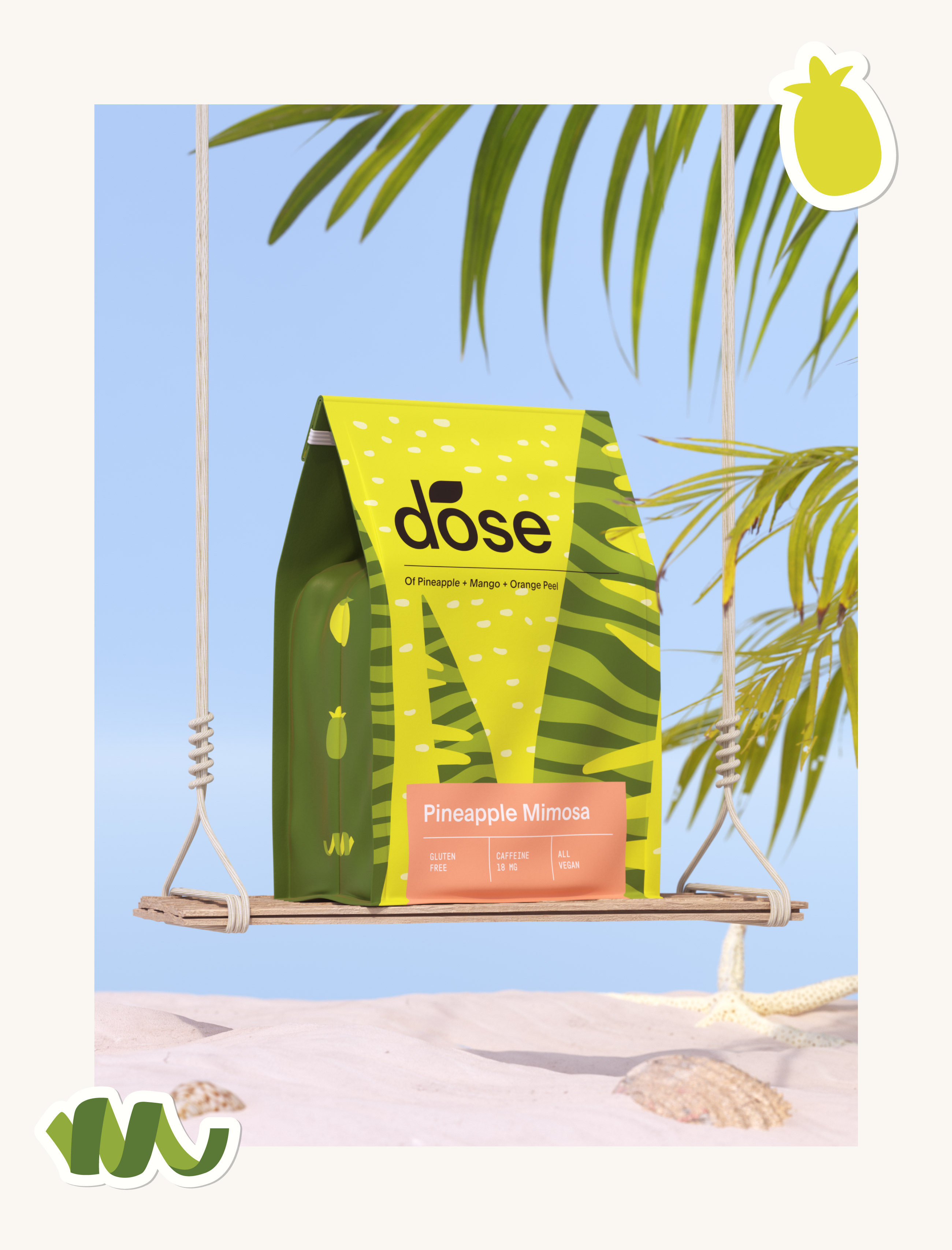
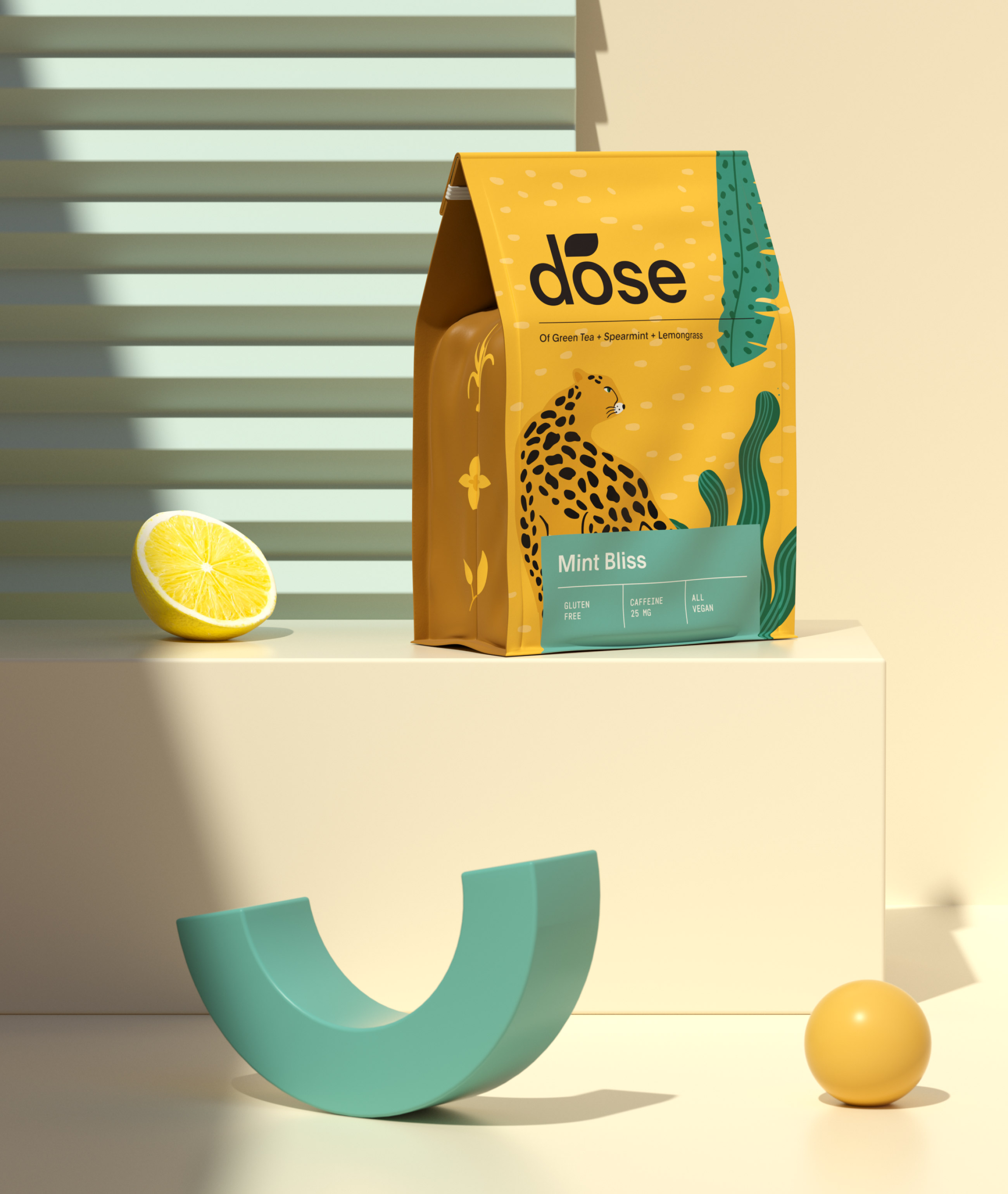
The design elements of the “Dose” tea packaging include a thoughtful combination of structure, visual design, and functional features. For the packaging structure, we chose eco-friendly materials, primarily recyclable kraft paper, known for its durability and environmental benefits. The sleek, cylindrical form of the packaging not only enhances visual appeal but also provides a secure environment for the tea, protecting it from external elements.
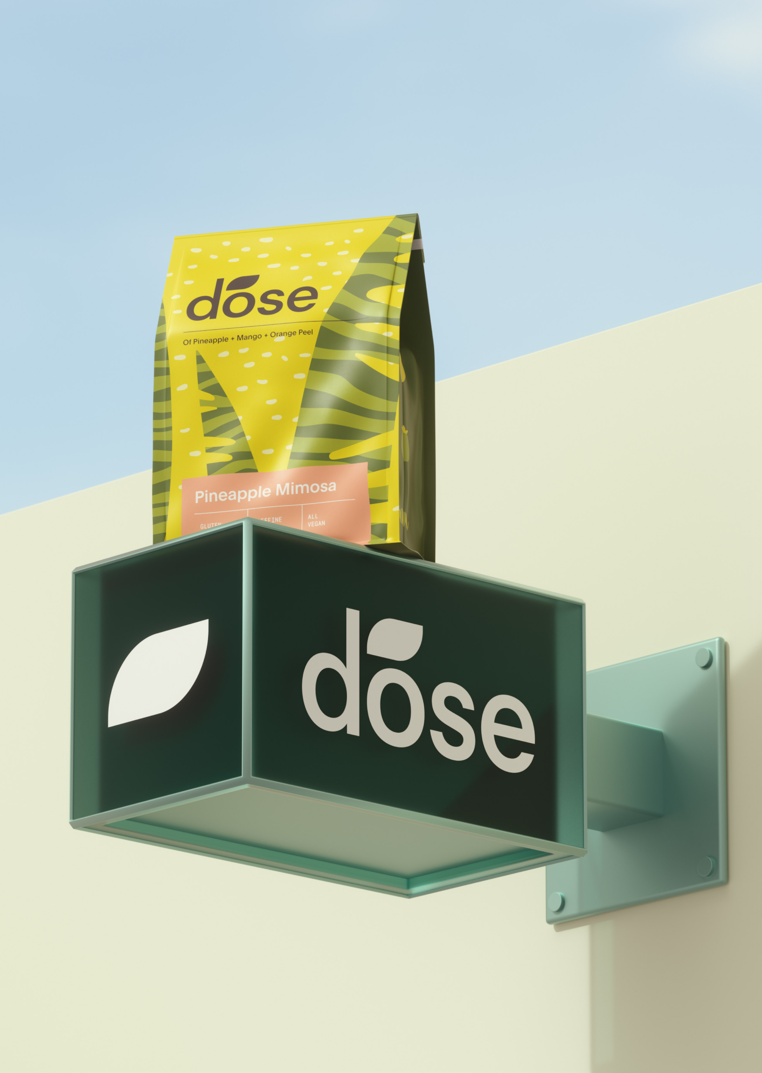
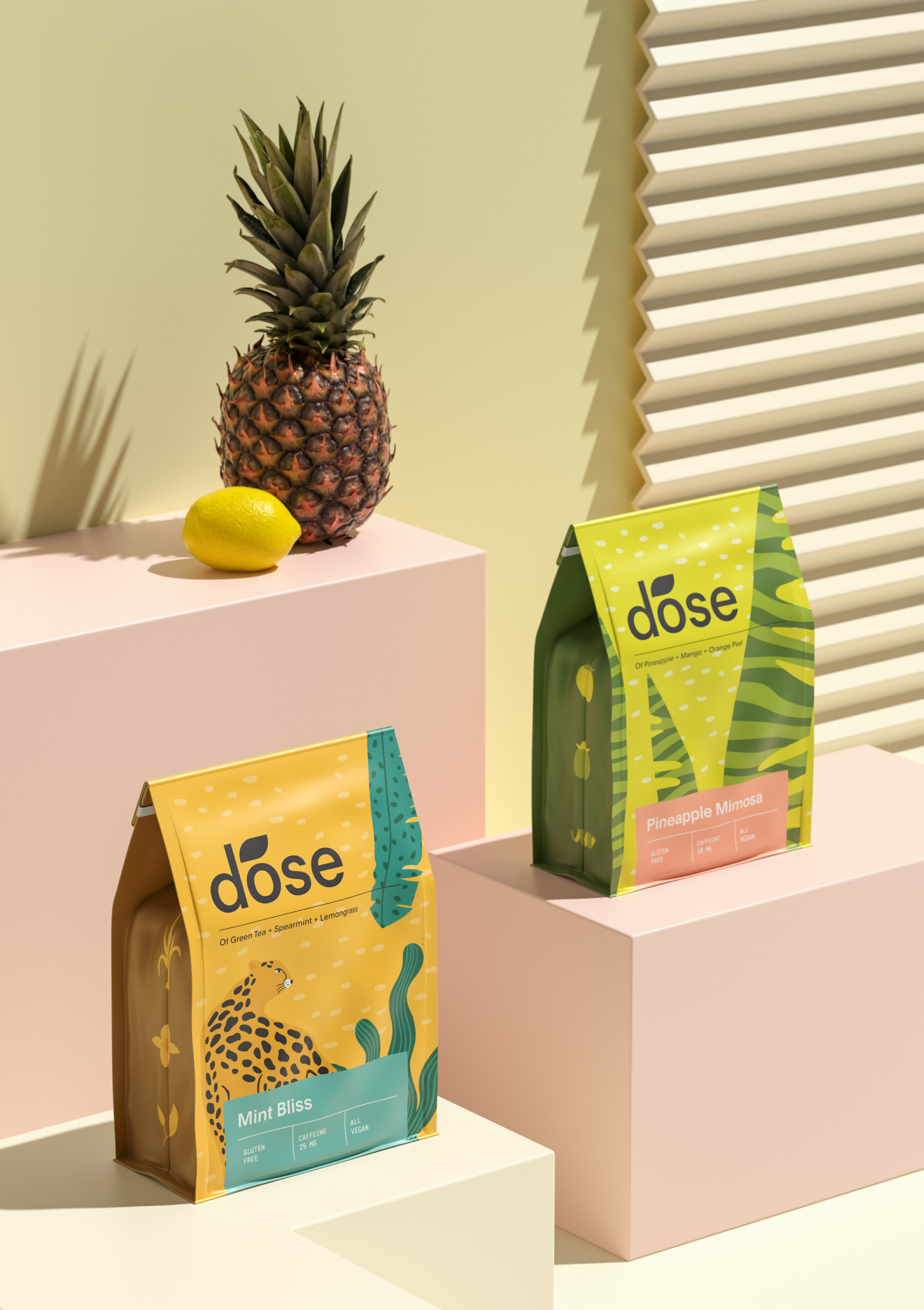
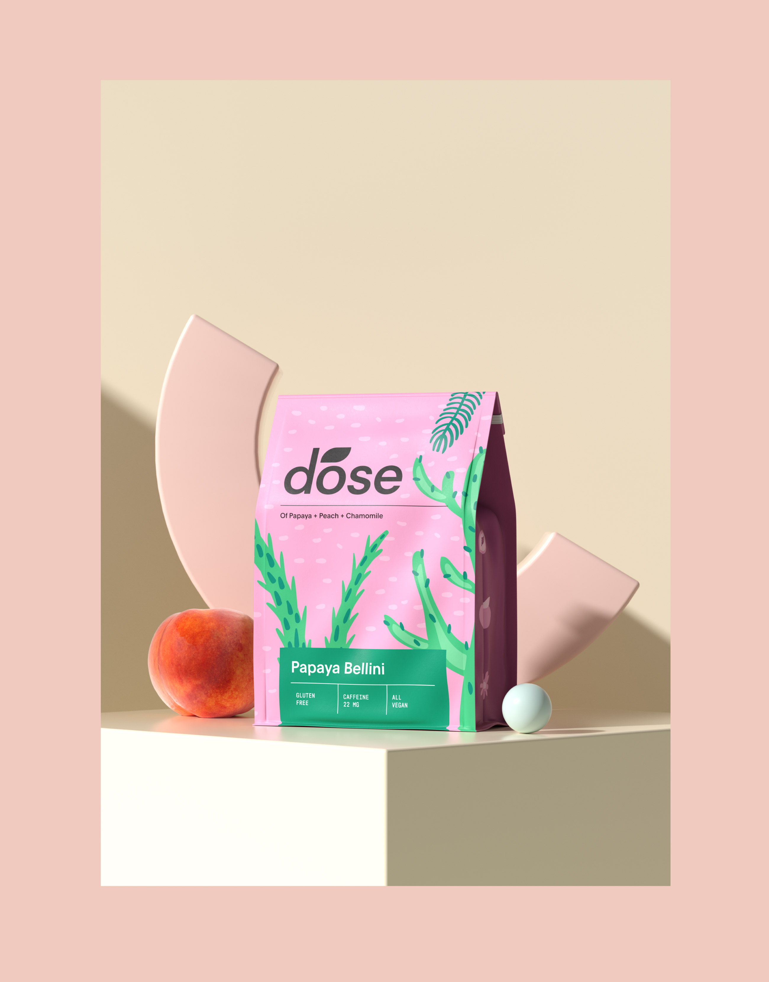
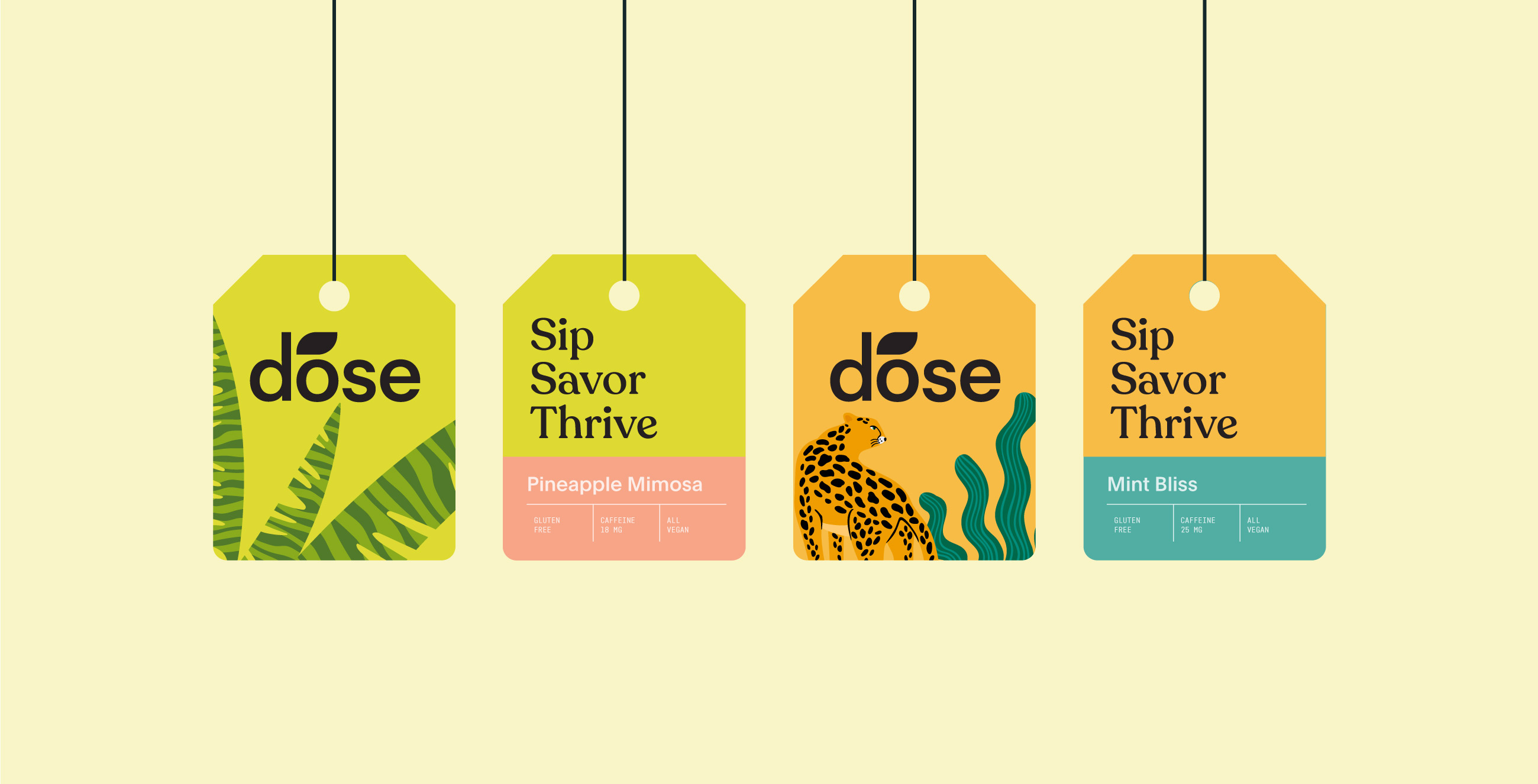
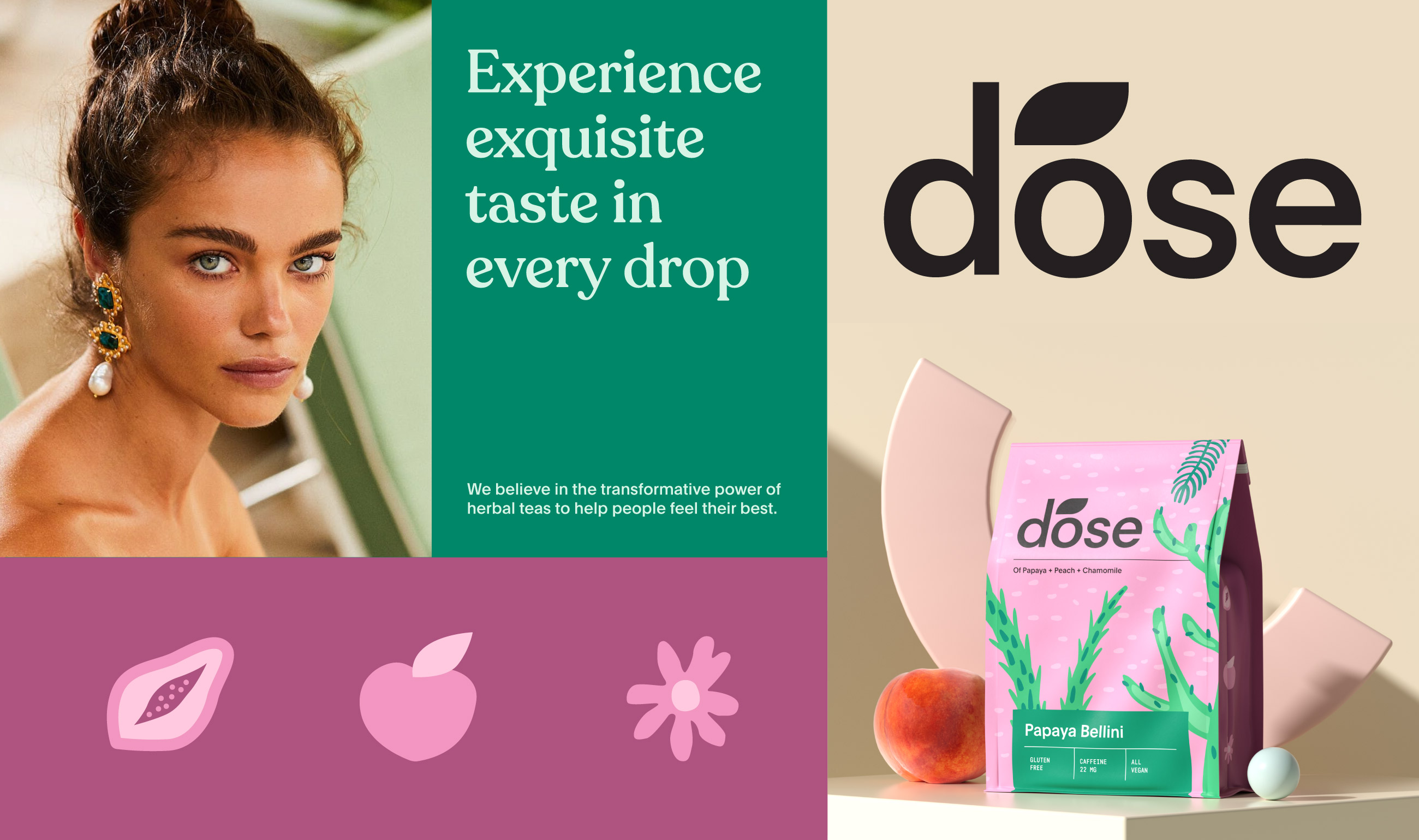
In terms of visual design, the color palette combines muted earth tones with subtle metallic accents. This palette reflects the natural origin of tea and adds a touch of luxury, making the product stand out. The typography features a blend of classic serif and modern sans-serif fonts, designed to be legible and aesthetically pleasing, ensuring that the product name and details are easily recognisable.
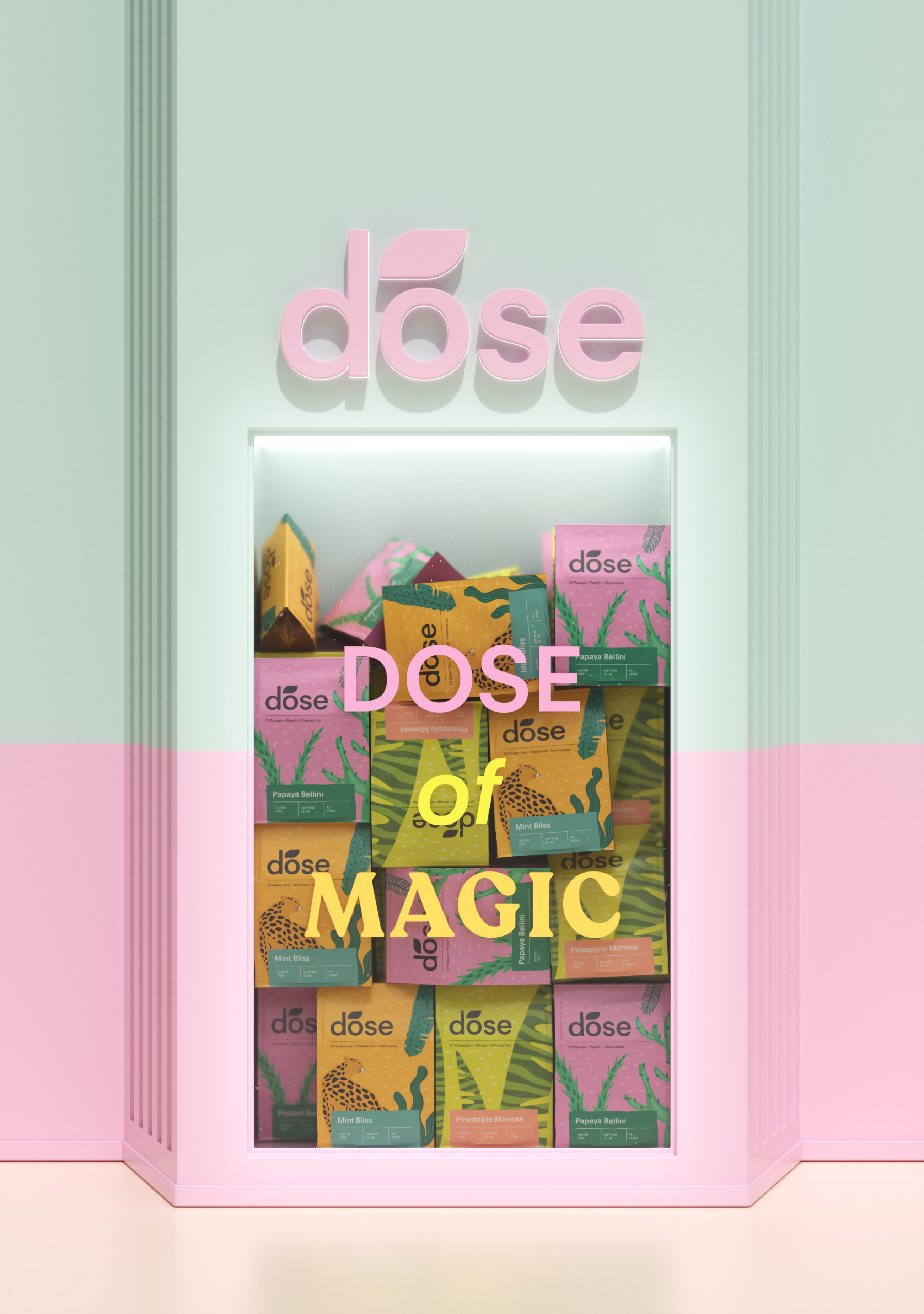
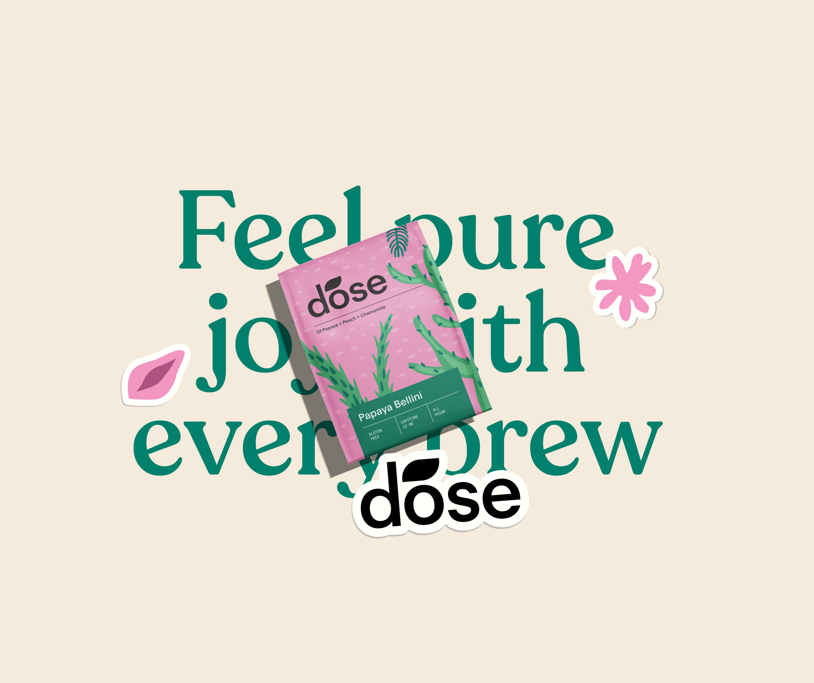
The graphics and imagery used in the design include custom illustrations inspired by tea leaves and traditional tea ceremonies. These illustrations connect the consumer with the rich history and cultural significance of tea. Delicate patterns derived from natural elements create a sophisticated texture on the packaging, enhancing the tactile experience and adding a layer of depth to the design.
Functional features of the packaging include a resealable closure that maintains the freshness of the tea while providing convenience for the consumer. Additionally, key information, including the tea’s origin, flavor profile, and brewing instructions, is clearly presented in an organized manner, ensuring easy access to essential details while maintaining an elegant design.
At Biz Markaworks Agency, we are deeply committed to sustainability. The “Dose” tea packaging reflects this commitment through its choice of materials and design practices. The primary packaging material, kraft paper, is recyclable and sourced from sustainable forestry practices. Additionally, the inks used are eco-friendly, further reducing the environmental impact. The manufacturing process for the “Dose” packaging has been optimized to minimize waste and energy consumption. By partnering with suppliers who adhere to stringent environmental standards, we ensure that our packaging has a minimal carbon footprint. The packaging is designed with the end consumer in mind, making it easy to recycle or repurpose, with clear recycling instructions provided to guide consumers in proper disposal.
The “Dose” tea packaging is strategically positioned to appeal to a discerning audience that values both quality and design. By leveraging elegant design elements and sustainable practices, “Dose” is positioned as a premium product in the tea market. The packaging is designed to resonate with consumers who appreciate a sophisticated tea experience and are conscious of their environmental impact.
The overall goal of the “Dose” tea packaging design is to enhance the consumer’s experience from the moment they encounter the product. The sophisticated aesthetic, combined with practical features and sustainable materials, creates a compelling package that invites consumers to indulge in a moment of relaxation and enjoyment. The packaging’s elegant design and attention to detail make it a visually striking product that attracts attention and invites further exploration. The texture and feel of the packaging enhance the sensory experience, making the act of handling the tea an enjoyable part of the ritual. The resealable closure and clear information layout ensure that the product is user-friendly and practical, meeting the needs of modern consumers.
In conclusion, the “Dose” tea packaging project represents a successful fusion of design, functionality, and sustainability. By creating a packaging solution that reflects the essence of tea as a refined and enjoyable experience, Biz Markaworks Agency has once again demonstrated its ability to deliver innovative and impactful design solutions. The “Dose” tea packaging not only stands as a testament to our design philosophy but also sets a new standard for premium tea packaging in the market. We are proud of the outcome of this project and confident that “Dose” will make a lasting impression on consumers and contribute positively to the tea industry’s evolution.

CREDIT
- Agency/Creative: MarkaWorks
- Article Title: Markaworks Agency Redefines Tea Packaging with Dose’s Modern Design
- Organisation/Entity: Agency
- Project Type: Packaging
- Project Status: Published
- Agency/Creative Country: Turkey
- Agency/Creative City: Antalya
- Market Region: Global
- Project Deliverables: 3D Design, Brand Identity, Branding, Graphic Design, Packaging Design
- Format: Box
- Industry: Food/Beverage
- Keywords: Branding, Logo,
-
Credits:
Creative Director: Mustafa Akülker


