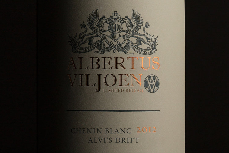
“The premium range of Alvi’s Drift wines required a more traditional design approach. Inspired by the detailed illustration of French estates, the studio created a label that seems almost torn from a buff-paper history book. Foiled text adds to the overall prestige.Albertus Viljoen flagship wineThis wine also forms part of the Alvi’s Drift premium range, and is seen as the flagship. It’s named after the farm’s founder, Albertus Viljoen. The family crest is suitably present, but has been slightly revised and updated for this label. (Note that Albertusis only produced in small quantities, so, if you are fortunate to encounter this gem, pour a big glass.)Alvi’s Drift Signature wine rangeThese wines are easy-drinkers, and necessitated an approachable design feel. Varietals are differentiated by vibrant colours – though Alvi’s family crest is there to add historical ballast. While the range has been created for younger, newer consumers, it’s also important to communicate heritage and tradition as markers for quality.”


CREDIT
- Agency/Creative: MARK Studio
- Article Title: MARK Studio – Alvi’s Drift Wine
- Project Type: Packaging
- Substrate: Glass, Pulp Paper


