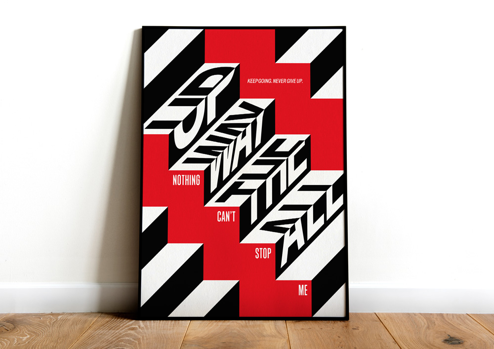
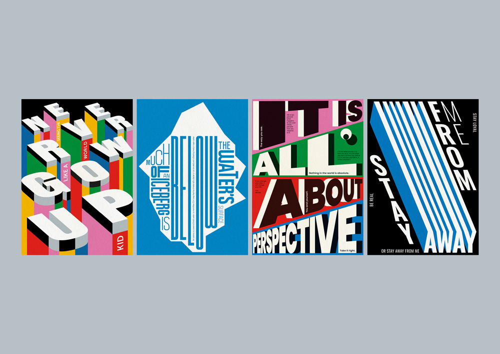
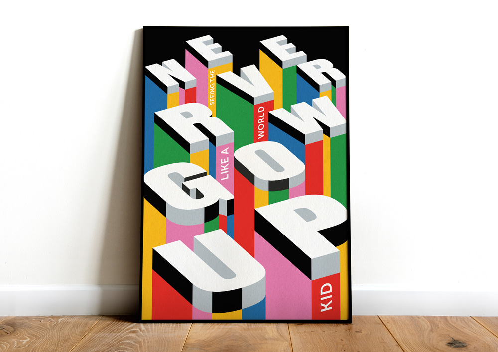
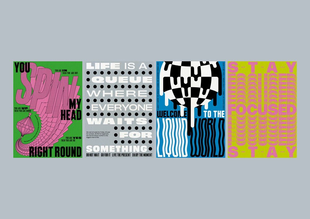
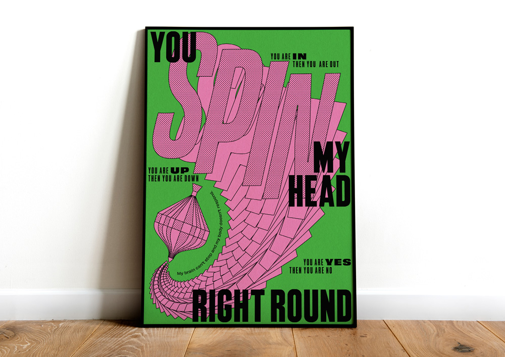
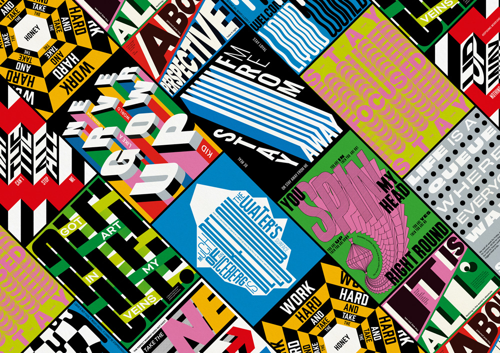
You Are My Type Vol. One is the latest project from Mario Carpe; a Spain-based graphic designer. The print series is a mesmerising journey that highlights the power of typography, delving into the intricate world of letters and fonts.
“I had on my creative checklist to develop a typography-based project for a long time,” says Mario. He continues; “I love to try new things and somehow I wanted to show to myself that I was able to create typographic work.” A step away from his usual illustrative work, this project accumulated so much energy within him that he is already working on volume 2.
When working on a new project, Mario often begins by reading some inspirational quotes to light up his creative spark or provide motivation. You Are My Type Vol. One was no exception and took inspiration from classic quotes that are blended with his thoughts and perspective on social and work life. Mario states; “The key to this project for me is that I wanted to communicate properly through typography. I didn’t want just a nice layout or select a nice font, I wanted to connect the way I play with typography, the way it is displayed, the colors, etc…”
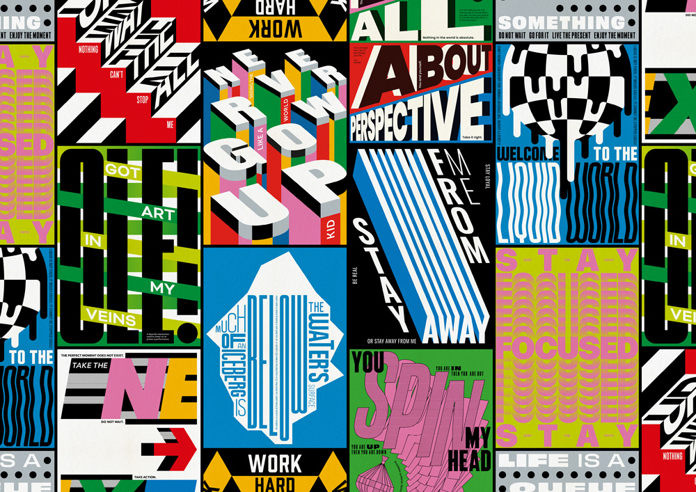
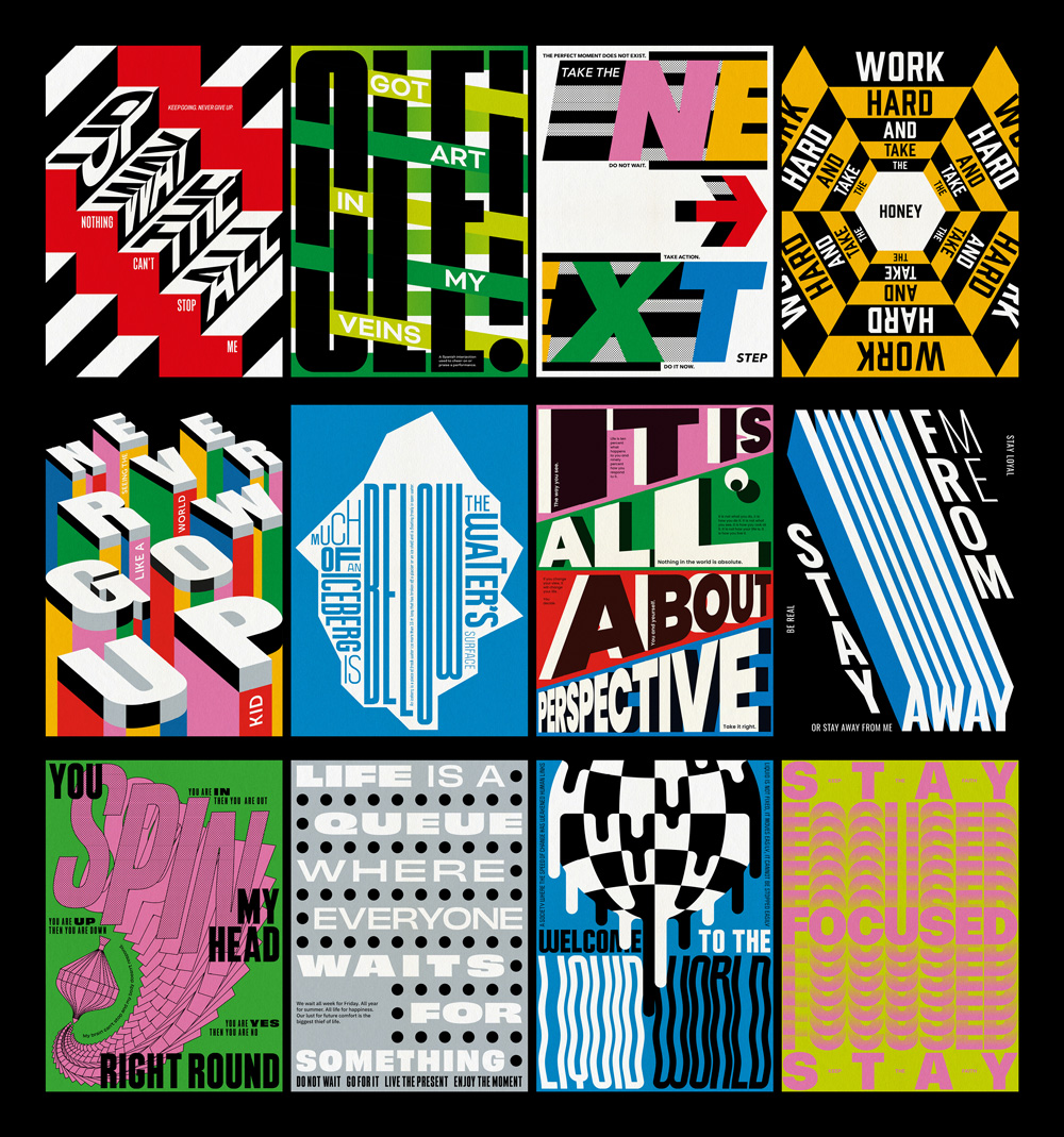
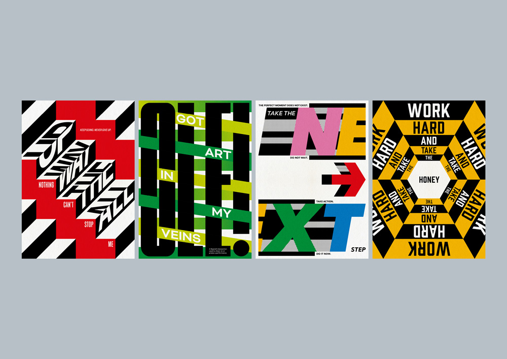
The resulting collection is a celebration of the symbiotic relationship between words and visuals. Each piece within the series presents letters as more than symbols; they are vessels of emotion, meaning, and thought. Mario transforms these characters into a visual language that communicates on a meaningful level, outside of the limitations of conventional communication.
You Are My Type Vol. One explores a diverse range of themes, from love and passion to introspection and social commentary. Each piece provides a glimpse into Mario’s mind and invites the viewer to take their meaning from it too and connect in a personal way. Every work in the series is a thoughtfully crafted composition of fonts, sizes, and styles, arranged to capture the essence of the underlying thought or feeling Mario wishes to convey. From bold, assertive lettering, to more delicate and flowing script, the collection presents the vast spectrum of emotions that can be conveyed through the artful arrangement of letters. His combining of art and language invites dialogue about the impact of typography on our perception of the written word and how it shapes our understanding.
Mario’s design process was fairly straightforward and began with (often, very rough) layout sketches. He then developed these sketches using Adobe Illustrator, manipulating the typography and creating layouts. Aside from that, he also used Adobe InDesign and Photoshop as a second support to check layouts and create the presentation of the project.
In a world where communication is increasingly visual, You Are My Type Vol. One reminds us of the timeless beauty and expressive potential of letters.
CREDIT
- Agency/Creative: Mario Carpe
- Article Title: Mario Carpe’s Typographic Journey: Unveiling You Are My Type Vol. One
- Organisation/Entity: Freelance
- Project Type: Graphic
- Project Status: Published
- Agency/Creative Country: Spain
- Agency/Creative City: Mario Carpe/Cádiz
- Market Region: Europe, Global
- Project Deliverables: Graphic Design, Illustration, Poster Design, Typography
- Industry: Entertainment
- Keywords: Typography, Type, Typeface, Poster, Print, Design, Digital, Vector
-
Credits:
Graphic designer: Mario Carpe


