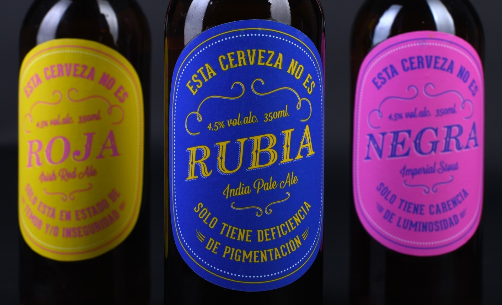
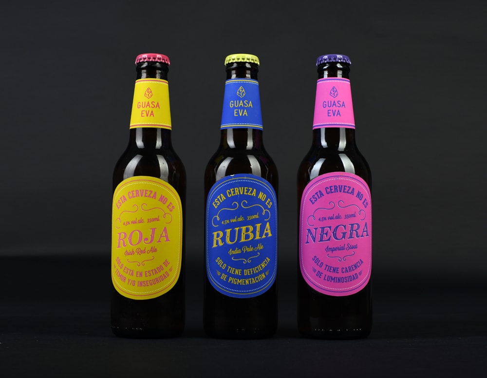
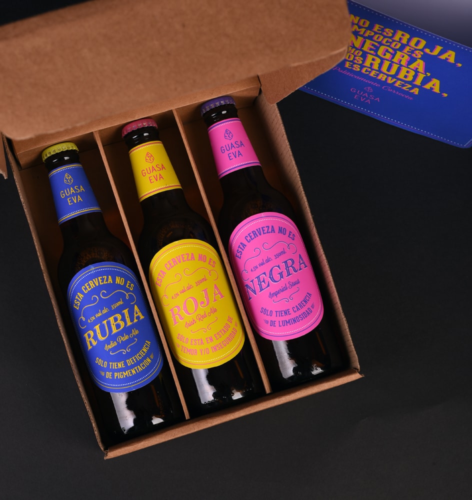
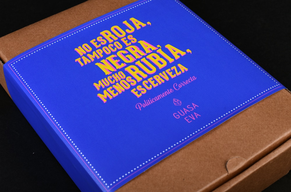
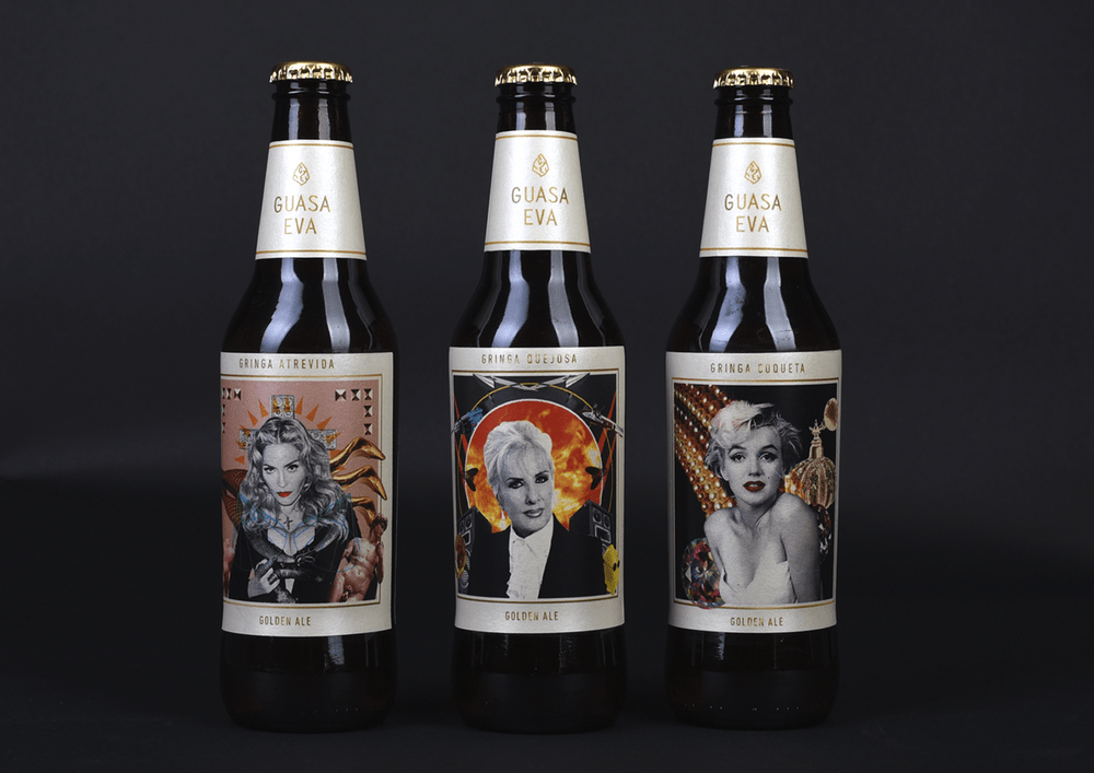
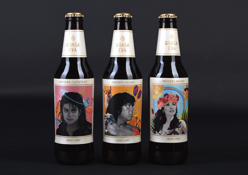
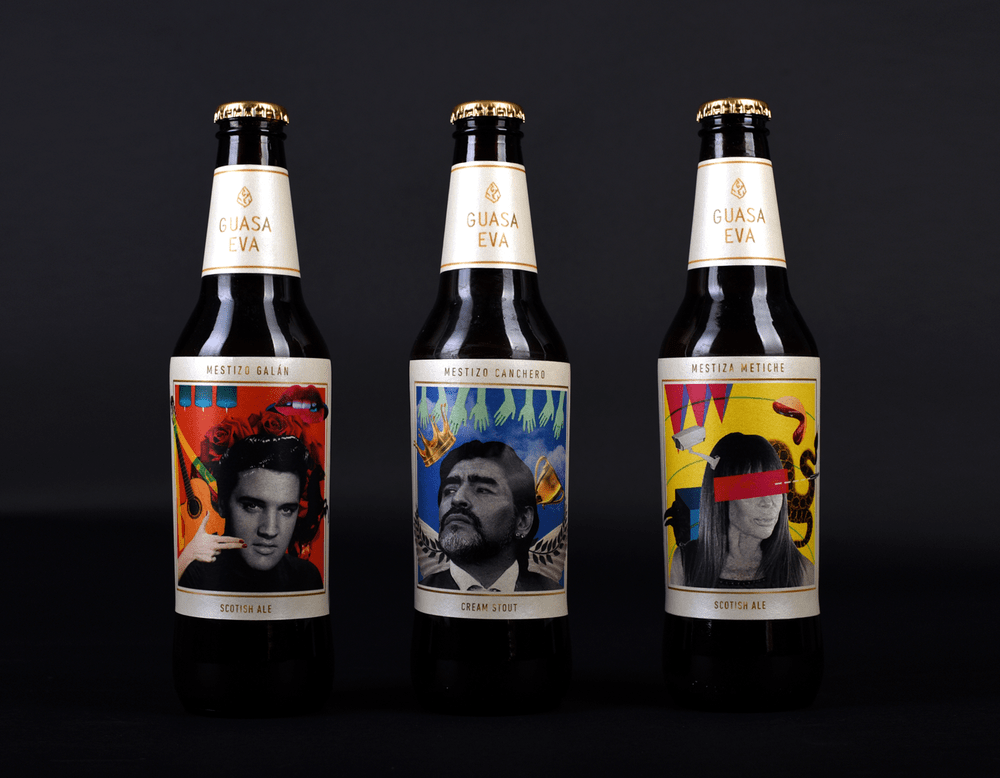
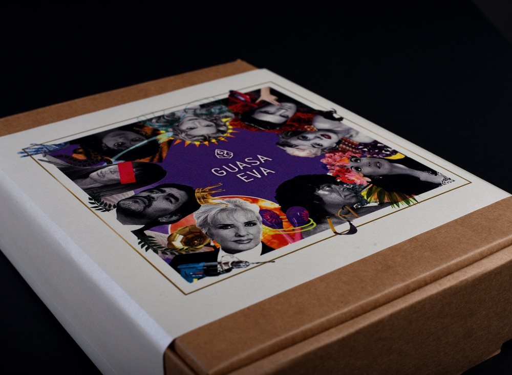
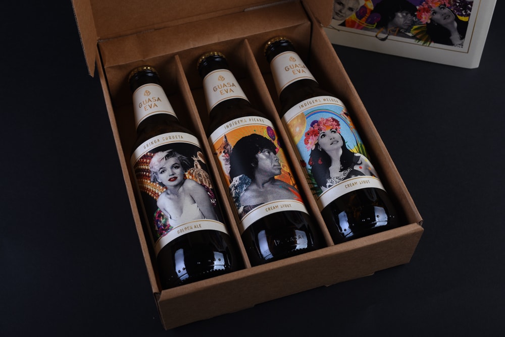
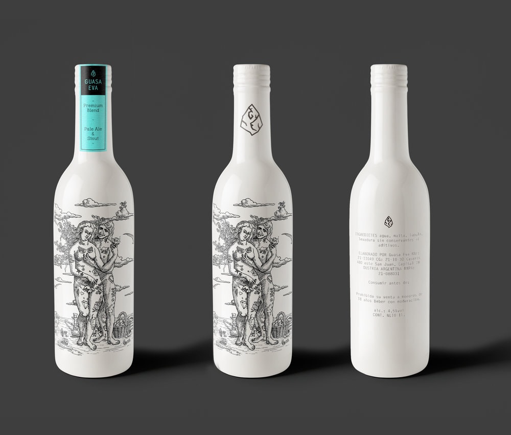
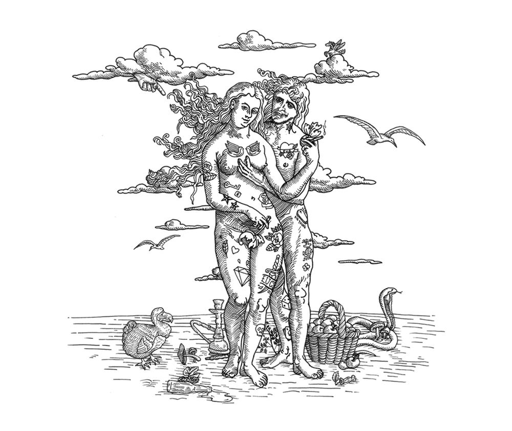
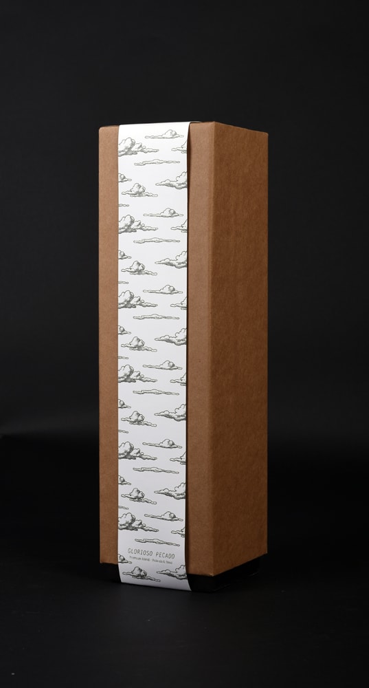
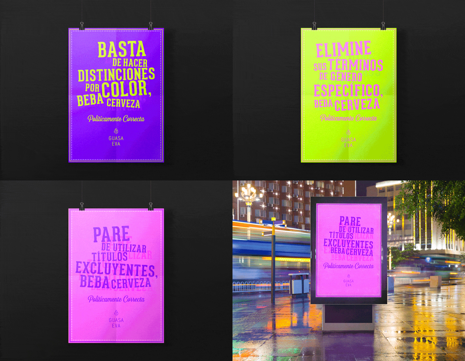
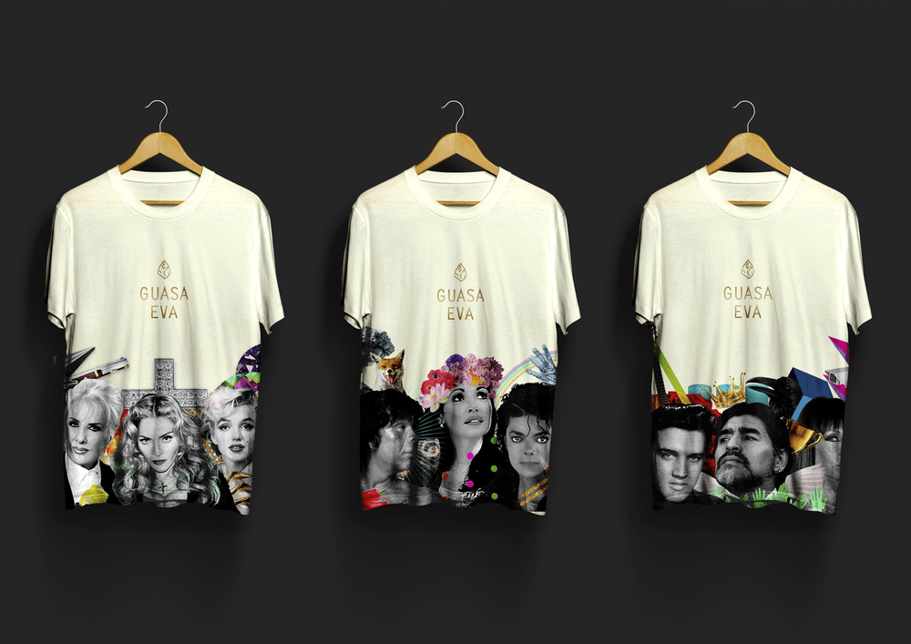
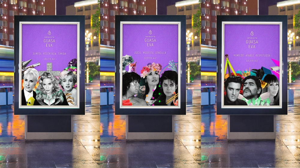
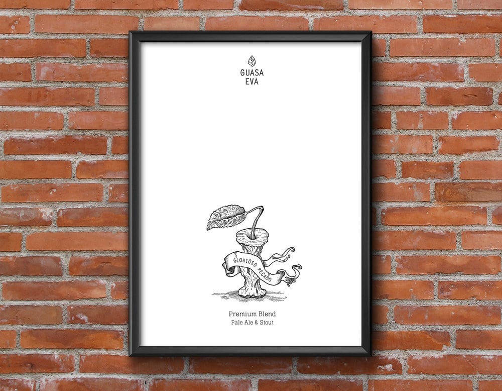
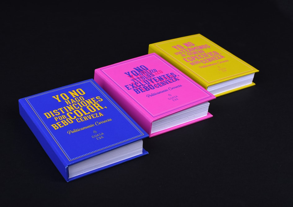
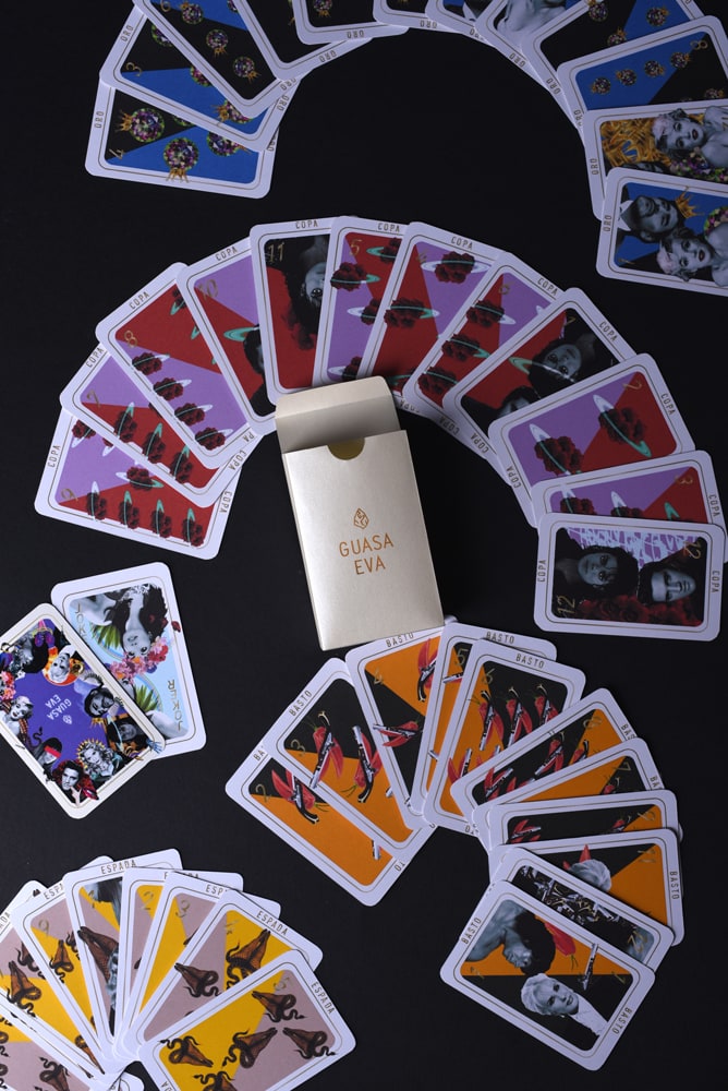
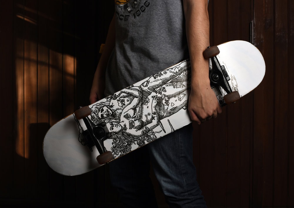
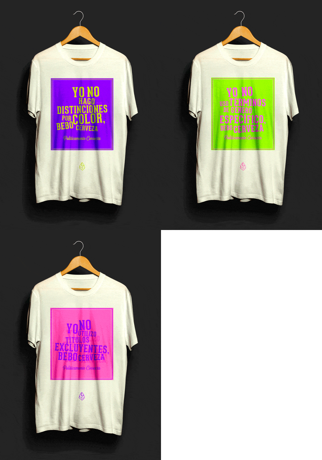
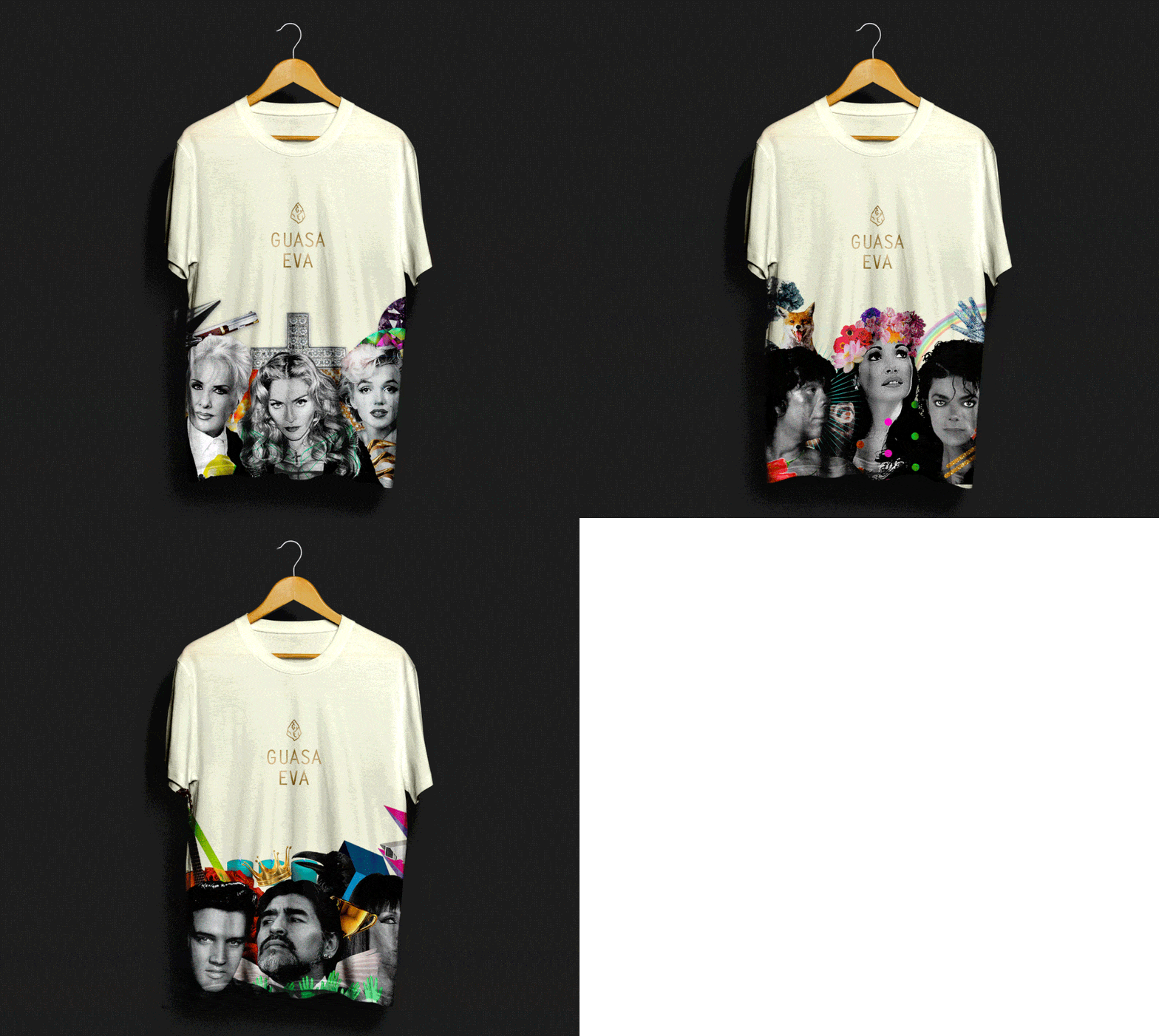
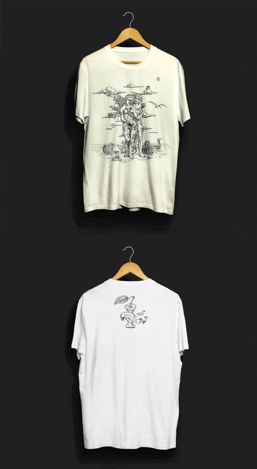
” The goal was to give the beer with a unique personality, rebellious and kind of freaky; matching its consumers. This was achieved by custom styling each of the beer collections (divided by its quality and price), with a touch of humor and irony, using a different technique and aesthetic for each one of them.The first product line makes use of political correctness as a theme, modifying commonly used beer type namesThe labels say:- It’s not blond, it has a pigmentation deficiency- It’s not red, it’s only in a state of fear or insecurity- It’s not black, it only has a lack of luminosityFor the premium product line it was assigned to each type of beer (blond, red and black) a representative character, popular in Argentina or famous all over the world.For Super Premium Beer, it was used a special bottle and packaging, with an illustration made in an old engraving style, which at first sight, it’s looks like a simple image of Adam and Eve, but given a closer look it´’s observed that they are smiling and surrounded by sin.Easy going and fun, it is a unique design, with a subtle humor. Also, because of the diverse techniques used, it becomes a very open system that allows you to launch new lines of product, joined in their attitude and character. “
CREDIT
- Agency/Creative: Maria Oldecop
- Article Title: Maria Oldecop – Guasa Eva Craft beer
- Project Type: Packaging
- Format: Bottle
- Substrate: Ceramic, Glass, Pulp Carton, Pulp Paper


